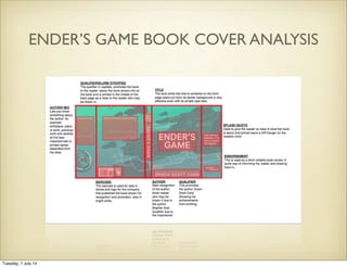
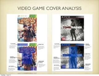
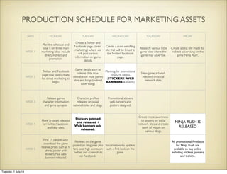
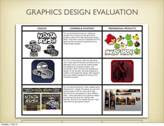
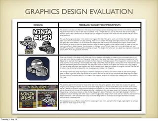
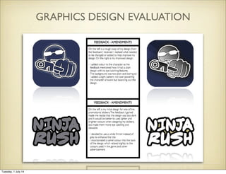
The document contains summaries of analyses and evaluations of various graphic designs, including book covers, magazine covers, video game covers, app icons, web banners, and stickers. It also includes design processes and timelines for creating marketing assets for a game called "Ninja Rush", as well as research on freelance graphic design rates.
12. STICKER RESEARCH
Using stickers as one of our main marketing campaigns will be useful to get our game seen
by not only our target audience but all members of the community who happen to come
across it. It can be put anywhere so that it could be seen when people are getting on with
their day and just traveling around town.They have a similar effect to posters except being
smaller but this allows them to be placed in other areas where posters cannot be placed.
They can be used to decorate personal equipment such as a laptop which will help
advertisement when brought into public.
Tuesday, 1 July 14
14. WEB BANNER RESEARCH
When executed correctly, banner ads
can be a powerful way to drive traffic to
your offers. Unfortunately, many
marketers don’t have the time and
resources to devote to “correctly
executing” banner ad campaigns.What
they need is a formula for designing
banner ads that produce results.
Successful banner ads lie somewhere
between direct marketing and traditional
print work. "Good design and good
marketing are totally different," said
Kenneth Dotson,Vice President of
Marketing with SportLine USA.
1. Use colour.
2. Use animation that doesn't slow
downloading of the ad can attract
attention.
3. Use keywords.
4. Keep it simple.
5. Keep it relevant.
Tuesday, 1 July 14
15. APP ICON RESEARCH
1. Using Contrasting Colours Looks Good
2. Make sure typography doesn’t look squashed
3. 3D Effects are visually striking
4. Make the genre of the game either well known or mysterious to the audience
5.Try not to waste space as it is limited
Tuesday, 1 July 14
19. APP ICON DESIGN PROCESS
LOGOTYPE CLARITYCLARITY
POLISH
CONSISTENCY
RATIONALE
CONSISTENCY
I think it’s quite clear what the game is about here. The setting is
established straight away with the background and the title in a colour
that doesn’t clash with what sits behind it. However, maybe it’s a little too
insightful. Perhaps another idea that doesn’t giveaway so much of the
game’s setting would be better?
For this design I have included the original background we designed and
used in the game as a backdrop, it gives an idea of what gameplay is
involved and also what sort of theme the game is. I have then placed the
Ninja Rush logo in front, which is used in the games artwork.
It’s hard to fault anything in terms of polish. The title is placed perfectly in
the center and is well aligned with the background. I can, however,
notice that the main character is present within the background but is
obscured by the titles. It’d be better to either take the character out of the
icon entirely, or put him in a different spot, so he’s more visible.
This design is very consistent to the game as it uses the game’s exact
setting. I think it’s good that none of the game’s enemies have been used
in this icon as that would probably give away too much. Like I said in
terms of clarity, maybe the use of the exact setting makes it somewhat a
little too consistent.
FEEDBACK 1
Tuesday, 1 July 14
20. APP ICON DESIGN PROCESS
LOGOTYPE CLARITY
POLISH
CONSISTENCY
RATIONALE
I think the design obviously conveys a clear image of the main character
and his choice of weapon. I also like the design, it’s a close yet effective
perspective of the character and produces a cinematic and professional
feel.
In this logo design I have included some themes of the game by including
this particular artwork which involves the main character in the game, a
pistol showing the themes of violence and giving any viewer of this
application an idea of the game.
The character’s colour scheme and shading contrast only a little bit, but
effectively none the less. Different background colours could be
experimented with in order to create more of an effective contrast
between the character’s colour and the background colour as at the
moment they are pretty much the same colour.
The consistency is all pretty much there. You play as that guy, with that
gun and the idea of ninjas being involved, although not conveyed at all in
the design, is present within the title.
FEEDBACK 2
Tuesday, 1 July 14
22. Here I have used a basic design to compare some very
dominant colours such as Purple Iris, Maroon and Chilli Pepper
Red.After experimenting with these colours I have noticed I
should stick to a darker colour which would blend better with
the image instead of using a bright eye catching colour.
I then discovered that a dark blue fitted well with the image,
plus it is the main characters costume colour.These are the
four steps of experimenting with different shades of blue and
also including a shadow behind the image giving it some depth
to the background. I found that a pattern in that background
work better that just fading the colour as that had a clash with
the shadows used in the image of the character.
APP ICON DESIGN PROCESS
Tuesday, 1 July 14
25. WEB BANNERS DESIGN PROCESS
When beginning my design
I went back to the layout
and background used in the
game for a basic design. I
then incorporated the title
text and character art from
the game and began some
drafts.
Tuesday, 1 July 14
27. The colours work well together and do not over complicate the banners. In the rectangular web banner the text seems to fill up
most of the space allowing for allot of information to be included, but it also looks very clustered.
The background is very
effective being from the
original game but when
used with other images it
gets slightly to compact
and does not leave space
for much text. The background is very effective being from the original game but when used with other
images it gets slightly to compact and does not leave space for much text.
WEB BANNERS DESIGN PROCESS
FEEDBACK
Tuesday, 1 July 14
29. STICKERS DESIGN PROCESS
I designed stickers involving
the main character ‘Agent
Slick’,The title of the game
and various assets.
I have made various designs
for the character, some with
more detail and others
brighter and eye catching. I
have based all colours used
on the ones used in the
game, making sure that they
relate.
DESIGN DRAFTS AND IDEAS
Tuesday, 1 July 14
30. STICKERS DESIGN PROCESS
INITIAL FEEDBACK
You have many different styles, however they do appear to follow a theme.This will make
them more identifiable with your brand.This is good for creating a solid marketing
campaign.The designs themselves are very good, have a glossy professional look to them.
All in all a good set of stickers.
From the feedback I received I narrowed down to three main sticker designs which the
clients preferred and reworked them and also incorporating one with another.
Tuesday, 1 July 14
32. DAYS MONDAY TUESDAY WEDNESDAY THURSDAY FRIDAY
WEEK 1
Plan the schedule and
base it on three main
marketing ideas include
direct, indirect and
promotion.
Create aTwitter and
Facebook page (direct
marketing) where we
will post various
information on game
details.
Create a main web/blog
site that will be linked to
theTwitter/ Facebook
page.
Research various Indie
game sites where the
game may advertise.
Create a blog site made for
indirect advertising on the
game ‘Ninja Rush’.
WEEK 2
Twitter and Facebook
page now public ready
for direct marketing to
begin.
Game details such as
release date now
viewable on Indie games
sites and blogs (indirect
advertising)
Planning for promotional
products begins.
(STICKERS/ WEB
BANNERS & events)
New game artwork
released on social
network sites.
WEEK 3
Release games
character information
and game synopsis
Character profiles
released on social
network sites and blogs.
Promotional stickers,
web banners and
posters designed.
WEEK 4
More artwork released
onTwitter, Facebook
and blog sites.
Stickers printed
and released +
Web banners ads
released.
Create more awareness
by posting on social
network sites and create
work of mouth on
various blogs.
NINJA RUSH IS
RELEASED
WEEK 5
First 15 people who
download the game
receive prises such as t-
shirts, poster and
stickers. Plus web
banners released.
Reviews on the game
posted on blog sites plus
fans post high scores on
Twitter and screenshots
on Facebook.
Social networks updated
with a first look on the
game.
All promotional Products
for Ninja Rush are
available to buy online
including stickers, posters
and t-shirts.
PRODUCTION SCHEDULE FOR MARKETING ASSETS
Tuesday, 1 July 14
38. FREELANCE RATES
After research I have discovered that freelance rates are approximately £20 an hour in this particular sector. However,
as noted by PatriciaVan Den Akker, it is an extremely competitive area to work in and that frequently the rate is
decided by the employer, and that also this depends on several different aspects including (viaTheDesignTrust):
• what experience you need for the job and how unique your skill set is
• where the work is e.g. London pays higher hourly rates
• how long the work is for: if the work is for a longer period then often the daily rate goes down
• when the work is: for night or weekend work you get obviously paid more, or if there is an emergency or a speed job
to be done
• the market rate
• your ability to negotiate
Therefore, taking into count that i am just starting in this industry, and that i have some but not extensive experience
in this particular area, i would be expecting a lower rate of pay of around 10 pound per hour, also taking into count
the amount of hours i have put into the work:
- 3 hours into extensive app research & target audience research, including creating a schedule and other planning
activities.
- 4 hours overall into web banners research and production, merchandise drafts and designs, and several other graphic
design activities.
- Overall i would ultimately expect to be paid around £70 for this work.
Tuesday, 1 July 14
39. FIT FOR PURPOSE
Each design is very visual and all relate completely to the video game in the sense of using similar colours, fonts,
characters and background designs. For both the App icon and web banners I have used the correct sizing when
creating my final designs, which makes them acceptable for use.The way in which my graphics design assets fit the
target audience is firstly that the stickers were designed to attract the younger range of our audience in the sense
that the designs are exiting to look at and collect, therefore creating a fan base/ audience and further spreading the
word about the game.Whereas compared to the younger audience, the older demographic for for the game or
the assets with be interested in the quirky style and design.
Tuesday, 1 July 14