The document provides details on pre-production work for a game project, including color schemes, fonts, HUD designs, character sketches, and a production schedule. Key aspects include:
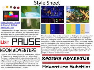
- Choosing brighter colors inspired by adventure games like Monkey Island.
- Selecting pixelated fonts to match the retro style and ensure legibility when pixelated.
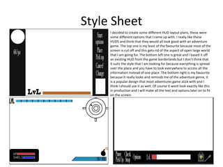
- Favoring a bottom-right HUD layout that resembles common adventure game designs.
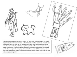
- Initial sketches exploring flag, character, and robotic arm concepts to develop the visual style.
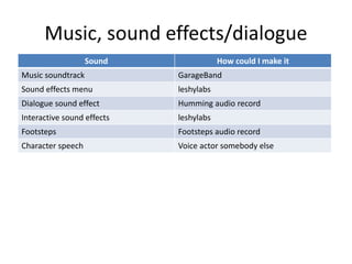
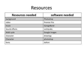
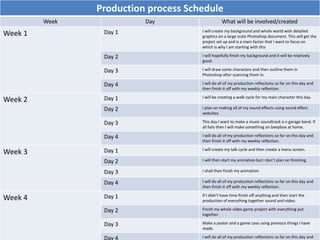
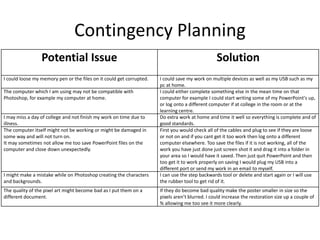
- A 3-week production schedule outlining tasks like background art, sound effects, and animation.
How to Split Bills in the Odoo 17 POS ModuleCeline George
Bills have a main role in point of sale procedure. It will help to track sales, handling payments and giving receipts to customers. Bill splitting also has an important role in POS. For example, If some friends come together for dinner and if they want to divide the bill then it is possible by POS bill splitting. This slide will show how to split bills in odoo 17 POS.
The French Revolution, which began in 1789, was a period of radical social and political upheaval in France. It marked the decline of absolute monarchies, the rise of secular and democratic republics, and the eventual rise of Napoleon Bonaparte. This revolutionary period is crucial in understanding the transition from feudalism to modernity in Europe.
For more information, visit-www.vavaclasses.com
We all have good and bad thoughts from time to time and situation to situation. We are bombarded daily with spiraling thoughts(both negative and positive) creating all-consuming feel , making us difficult to manage with associated suffering. Good thoughts are like our Mob Signal (Positive thought) amidst noise(negative thought) in the atmosphere. Negative thoughts like noise outweigh positive thoughts. These thoughts often create unwanted confusion, trouble, stress and frustration in our mind as well as chaos in our physical world. Negative thoughts are also known as “distorted thinking”.
Unit 8 - Information and Communication Technology (Paper I).pdfThiyagu K
This slides describes the basic concepts of ICT, basics of Email, Emerging Technology and Digital Initiatives in Education. This presentations aligns with the UGC Paper I syllabus.
The Indian economy is classified into different sectors to simplify the analysis and understanding of economic activities. For Class 10, it's essential to grasp the sectors of the Indian economy, understand their characteristics, and recognize their importance. This guide will provide detailed notes on the Sectors of the Indian Economy Class 10, using specific long-tail keywords to enhance comprehension.
For more information, visit-www.vavaclasses.com
Ethnobotany and Ethnopharmacology:
Ethnobotany in herbal drug evaluation,
Impact of Ethnobotany in traditional medicine,
New development in herbals,
Bio-prospecting tools for drug discovery,
Role of Ethnopharmacology in drug evaluation,
Reverse Pharmacology.
Palestine last event orientationfvgnh .pptxRaedMohamed3
An EFL lesson about the current events in Palestine. It is intended to be for intermediate students who wish to increase their listening skills through a short lesson in power point.
This is a presentation by Dada Robert in a Your Skill Boost masterclass organised by the Excellence Foundation for South Sudan (EFSS) on Saturday, the 25th and Sunday, the 26th of May 2024.
He discussed the concept of quality improvement, emphasizing its applicability to various aspects of life, including personal, project, and program improvements. He defined quality as doing the right thing at the right time in the right way to achieve the best possible results and discussed the concept of the "gap" between what we know and what we do, and how this gap represents the areas we need to improve. He explained the scientific approach to quality improvement, which involves systematic performance analysis, testing and learning, and implementing change ideas. He also highlighted the importance of client focus and a team approach to quality improvement.
2. Style Sheet
I used adobe colour cc to get some colour schemes because
it is much easier than creating my own colour pallete which
would have taken up some precious time in my production. I
also used coolors.co which was a useful website to find
colours.
https://coolors.co/bde
de0-fed4e7-4b88a2-
a09abc-9b1d20
The colours that I chose for this are majority on the brighter side even the darker
colour scheme came from a night cycle on a game and that still looks brighter
than usual. The brighter colours came from an existing game known as monkey
island which is a great adventure game which I want to do a similar idea. The two
close up colour pallets came from real images which I then used the filter gallery
tool on in Photoshop and zoomed it in on all the different colours which most of
them I will be using because they are similar setting scenes that I want. The
browns will be used for trees and paths/roads on the game because that is the
general colour of these. The colours on the top left are the colours that I am
going to be choosing for the main character
I chose all these fonts of similar style because I want the title
of the game to be large and fairly bold so it will stand out.
These were my favourite fonts because they really match the
style that I am planning on well. The pixelated texts are what
I will most likely end up using though because that is what I
will be designing my game with so I could actually just use
one of the dafont fonts and pixelate it but when doing this I
need to make sure that it doesn’t go blurry.
3. Style Sheet
HUD Plan
I decided to create some different HUD layout plans, these were
some different options that I came up with. I really like these
HUDS and think that they would all look good with an adventure
game. The top one is my least of the favourite because most of the
screen is cut off and this gets rid of the aspect of open large world
that I am going for. The bottom left one is great and I based it off
an existing HUD from the game borderlands but I don’t think that
it suits the style that I am looking for because everything is spread
over the place and you have to look everywhere to access all the
information instead of one place. The bottom right is my favourite
because it really looks and reminds me of the adventure genre, it
is a popular design that most adventures game stick with and I
think I should use it as well. Of course it wont look exactly like this
in production and I will make all the text and options later on to fit
on the screen.
4. I decided to do a few sketches before making the game and I was playing with the idea of
implementing the idea of an island so it should have its own flag design, so I created a few
mock ups of flags, this one I like the best and then I went on to designing a look for the
main character which will probably change later but I like it. The main character also has a
dog as a companion. I thought it would be great to implement a robotic part so I made a
hand and arm design in their to play with the idea. This was a helpful part of my process
and I have a clear vision of what I want from this project when making these they will look
and visually appear greater.
5. Layout 2
LvL
Pause
Pick up
Check
Stop
Options
This is what I would like my
game to look like however I
do not know if I will have
enough time for everything
in production, definitely for
my background but I would
like a little bit of this style as
well as another in to mix the
game up a little.
The colours on this are much brighter and that is
because it is the colour schemes of adventure genre
games also it gives the character I sense of
victory/achievement which makes them want to play
the game more.
The perspective of the game will
be different and change
depending on the character, this
is better and makes the audience
more engaged and lets them
decide on their gameplay
experience. It will however never
go 1st person because this will be
too difficult and complicated for
me to make.
The background that I used for the game was a
picture of a forest. I chose this image because it
makes an interesting looking game which isn't boring
because it gives of a sense of adventure and open
free roam world so it keeps you on edge exploring the
fast open area where you can find anything that can
please or displease.
The fonts will be pixelated because I will be drawing
them in pixels on Photoshop but they will be in exactly
the same lactations throughout the game, these are
for the HuD and are important to the game. The fonts
will be white because this is the only colour that
contrasts well with black. Black is the colour of the
game because it is associated with power, elegance,
formality, death, evil, and mystery. Black is a
mysterious colour associated with fear and the
unknown.
This is a similar look to what my final product is going
to be I like the look of this and think the audience will
enjoy it too I could just include some more tool
options along the bottom.
6. Poster 1
TitleThe background I used was a lighter beige misty colour
with a black bottom just like the background design on
most of the posters that I researched up. I chose these
because it makes the images in the foreground stand
out on the poster and really pop to attract the
audience.
The title I have used in the layout is a pixel font style
which tells people it is a gaming poster because pixel is
a very computer gaming font. The colour I would
choose for the font is black/darker to make it stand out
and pop in the center of a lighter background using
contrast very well.
I have included some images of characters on the
foreground, I am going to use very similar looking
designs for the real one. This allows the audience to
know what the game includes and it shows off the main
features and the audience will know they are important
because they are used and centered.
The dragon goes behind the character with wings
making it the main attraction whilst looking at the
poster. Also the black bottom goes over the feet of the
character making it look like its been dragged and
shaped so it doesn’t look out of place.
7. Poster 2
Title!I made this layout plan for a poster. I chose the title to
be central and large with an explanation mark on at
the end because it is eye catching and makes the title
seem important as well as to show that it is important
because it needs to be shouted. Just like the title the
main image is also central among the chaos and this is
so the audience is drawn in on these two factors. The
image will be fairly large and the main aesthetical
point of the poster.
I decided to add a stroke around to define the edges of
the poster and then use white and a black box tilted on
top of each other, this is a really interesting design
which looks fabulous and adds that extra layer of
depth as well as it contrasts the colours of black and
white well. The text is going to be slightly offset and
their isn't going to be much of it because it is not the
main focus of a poster. The text is offset because it
makes it fit with the rest of the theme of the poster.
Every single piece I place on the poster will stay on the
black and this is too keep it more interesting placing
everything in one smaller space, I like the design but
this means I will have to keep it very simplistic and
barely include anything.
8. Front Cover
Creating a game case cover for my final production should not be that difficult it all
just depends on if I have time. The reason why is because all game cases require
similar text and legal restrictions which are easy to place on and then some content
from the game all of which I will have created earlier on in production. The layout is
very simple and this is the most effective way to make a front cover because if it was
too full then it would get too complicated, I will want to include the main character
on the front so people can know a little bit about the game and understand what
the character looks like and what is too come, or if the audience is the character
than a just as important person, a character should always be on a game case
because I believe they make it look better and spice it up a little. Nearly all game
cases use brighter colours and this is for advertisement because bright colours draw
in peoples eyes more when shopping on a shelf.
9. Music, sound effects/dialogue
Sound How could I make it
Music soundtrack GarageBand
Sound effects menu leshylabs
Dialogue sound effect Humming audio record
Interactive sound effects leshylabs
Footsteps Footsteps audio record
Character speech Voice actor somebody else
10. Resources
Resources needed software needed
background Photoshop
video Premier Pro
music GarageBand
Sound effects LeshyLabs
Walk cycle Google images
character drawings
Character photoshop
fonts dafont
11. Production process Schedule
Week Day What will be involved/created
Week 1 Day 1 I will create my background and whole world with detailed
graphics on a large scale Photoshop document. This will get the
project set up and is a main factor that I want to focus on
which is why I am starting with this
Day 2 I will hopefully finish my background and it will be relatively
good.
Day 3 I will draw some characters and then outline them in
Photoshop after scanning them in.
Day 4 I will do all of my production reflections so far on this day and
then finish it off with my weekly reflection.
Week 2 Day 1 I will be creating a walk cycle for my main character this day.
Day 2 I plan on making all of my sound effects using sound effect
websites.
Day 3 This day I want to make a music soundtrack o n garage band. If
all fails then I will make something on beepbox at home.
Day 4 I will do all of my production reflections so far on this day and
then finish it off with my weekly reflection.
Week 3 Day 1 I will create my talk cycle and then create a menu screen.
Day 2 I will then start my animation but I don’t plan on finishing.
Day 3 I shall then finish my animation.
Day 4 I will do all of my production reflections so far on this day and
then finish it off with my weekly reflection.
Week 4 Day 1 If I didn't have time finish off anything and then start the
production of everything together sound and video.
Day 2 Finish my whole video game project with everything put
together.
Day 3 Make a poster and a game case using previous things I have
made.
Day 4 I will do all of my production reflections so far on this day and
12. Contingency Planning
Potential Issue Solution
I could loose my memory pen or the files on it could get corrupted. I could save my work on multiple devices as well as my USB such as my
pc at home.
The computer which I am using may not be compatible with
Photoshop, for example my computer at home.
I could either complete something else in the mean time on that
computer for example I could start writing some of my PowerPoint's up,
or log onto a different computer if at college in the room or at the
learning centre.
I may miss a day of college and not finish my work on time due to
illness.
Do extra work at home and time it well so everything is complete and of
good standards.
The computer itself might not be working or might be damaged in
some way and will not turn on.
It may sometimes not allow me too save PowerPoint files on the
computer and close down unexpectedly.
First you would check all of the cables and plug to see if they are loose
or not on and if you cant get it too work then log onto a different
computer elsewhere. Too save the files if it is not working, all of the
work you have just done just screen shot it and drag it into a folder in
your area so I would have it saved. Then just quit PowerPoint and then
too get it to work properly on saving I would plug my USB into a
different port or send my work in an email to myself.
I might make a mistake while on Photoshop creating the characters
and backgrounds.
I can use the step backwards tool or delete and start again or I will use
the rubber tool to get rid of it.
The quality of the pixel art might become bad as I put them on a
different document.
If they do become bad quality make the poster smaller in size so the
pixels aren’t blurred. I could increase the restoration size up a couple of
% allowing me too see it more clearly.
13. Health and Safety
Potential Issue How will the issue be
avoided?
I may create Strain on your eyes when using the computer not
allowing you too be able to see properly.
Take regular breaks to stop your eyes being damaged or you can
turn down the brightness of the screen.
I can get a painful cramp in your neck making it harder for you to
continue on working.
You can adjust your chair so you are at the height in level with the
screen and then you can tilt the screen up or down until it suits the
height the your at.
Back pain from sitting down making it harder for you to continue on
working.
Take regular breaks or get an adjustable chair which has a
comfortable and soft back and seating or you could sit on a
pillow/cushion.
Don’t spill food and drink on the computer because it disrupts your
area and can potentially break your computer.
Take regular breaks so can eat and drink outside the room but
mainly you should not bring these in because of the damage that
they can cause.
There should be no trailing wires because you could trip or unplug a
computer and loose all of the work that you have just done.
All of the wires should be fastened down tight and not loose, if
they are you can tape them down or tie them all together and
make sure they are out of the way behind the computer.
electrical sockets must not be overloaded because it could overload
the computer and all your work will vanish. Or this could even
ensure an electrical shock.
Make sure that the plugs are not loose and you only have one per
socket for one computer keeping electricity good with not too
much power in one.
Editor's Notes
Mock up of a potential design using the colours and fonts established in your style sheet and sourced images.
Alter this slide to make it appropriate for your planned product types. Add further layout slides to create at least one for each product you plan to make.