Download to read offline
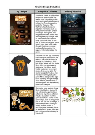


The document evaluates the graphic design work done to promote a mobile game called Snake Escape. It compares the poster, t-shirt, and sticker designs to existing examples from other games. Feedback was received that prompted changes to declutter the poster, make the game more accessible, and unite the visual elements of the stickers. The work was done using pencil, Photoshop, Illustrator, and a graphics tablet to design assets and products for promoting the game. While the t-shirt design fits its purpose to promote brand recognition, the app icon design may need changes based on further feedback to better fit the target audience and game.


