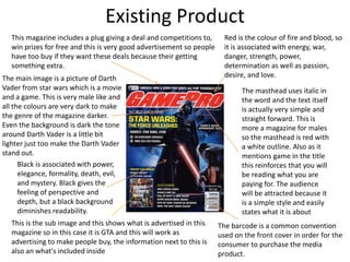
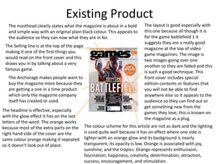
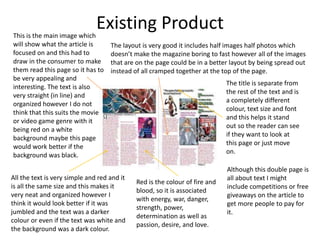
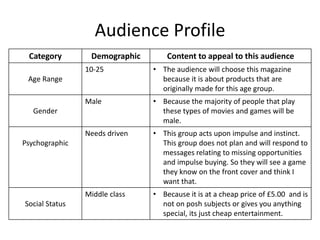
Research
Jay birkin
Existing Product
The masthead uses italic in
the word and the text itself
is actually very simple and
straight forward. This is
more a magazine for males
so the masthead is red with
a white outline. Also as it
mentions game in the title
this reinforces that you will
be reading what you are
paying for. The audience
will be attracted because it
is a simple style and easily
states what it is about
The barcode is a common convention
used on the front cover in order for the
consumer to purchase the media
product.
This is the sub image and this shows what is advertised in this
magazine so in this case it is GTA and this will work as
advertising to make people buy, the information next to this is
also an what's included inside
The main image is a picture of Darth
Vader from star wars which is a movie
and a game. This is very male like and
all the colours are very dark to make
the genre of the magazine darker.
Even the background is dark the tone
around Darth Vader is a little bit
lighter just too make the Darth Vader
stand out.
This magazine includes a plug giving a deal and competitions to,
win prizes for free and this is very good advertisement so people
have too buy if they want these deals because their getting
something extra.
Red is the colour of fire and blood, so
it is associated with energy, war,
danger, strength, power,
determination as well as passion,
desire, and love.
Black is associated with power,
elegance, formality, death, evil,
and mystery. Black gives the
feeling of perspective and
depth, but a black background
diminishes readability.
Existing Product
The layout is good especially with
this one because all though it is
for the game battlefield 1 it
suggests they are a really good
magazine at the top of video
game magazines. The image is
two images going over one
another so they are faded and this
is such a good technique. This
front cover includes special
edition contents or features that
you will not be able to find
anywhere else so it appeals to the
audience so they can find out or
get something new from the
games they love, this is known on
the magazine as a plug.
The masthead clearly states what the magazine is about in a bold
and simple way with an original plain black colour. This appeals to
the audience so they can now what they are in for.
The headline is effective, especially
with the glow effect it has on the last
letters of the word. The orange works
because most of the extra parts on the
right hand side of the cover are the
same colour orange making it repeated
so it doesn’t look out of place.
The colour scheme for this article are not as dark and the lighting
is used quite well because it has an effect where one side is
lighter with an orange glow and its background is nearly
transparent, its opacity is low. Orange is associated with joy,
sunshine, and the tropics. Orange represents enthusiasm,
fascination, happiness, creativity, determination, attraction,
success, encouragement, and stimulation.
The Anchorage makes people want to
buy the magazine more because they
are getting a one in a time product
which only the magazine company
itself has created or used.
The Selling line is at the top of the page
making it one of the first things you
would read on the front cover and this
draws you in by talking about a very
famous game.
Existing ProductThis is the main image which
will show what the article is
focused on and this had to
draw in the consumer to make
them read this page so it has to
be very appealing and
interesting. The text is also
very straight (in line) and
organized however I do not
think that this suits the movie
or video game genre with it
being red on a white
background maybe this page
would work better if the
background was black.
Although this double page is
all about text I might
include competitions or free
giveaways on the article to
get more people to pay for
it.
All the text is very simple and red and it
is all the same size and this makes it
very neat and organized however I
think it would look better if it was
jumbled and the text was a darker
colour or even if the text was white and
the background was a dark colour.
The layout is very good it includes half images half photos which
doesn’t make the magazine boring to fast however all of the images
that are on the page could be in a better layout by being spread out
instead of all cramped together at the top of the page.
The title is separate from
the rest of the text and is
a completely different
colour, text size and font
and this helps it stand
out so the reader can see
if they want to look at
this page or just move
on.
Red is the colour of fire and
blood, so it is associated
with energy, war, danger,
strength, power,
determination as well as
passion, desire, and love.
Research Analysis
• What common features do the researched
products have?
The common conventions of the gaming style which are repeated through the
magazines are the images on all of the products, they are all mostly brighter colours, I
think that this doesn’t really relate to the gaming genre very well. All of the text across
the front covers are very big and bold fonts which really brings out the power of the
magazine.
• What aspects of the research will you include
within your on work?
My existing products will help in the making of my final magazine. I will use all similar
colours based on each different product. For the front cover I will make it dark at the
bottom by being black and use a gradient or different colour making it lighter at the
top. My text will not go over the top of the image it will either go above or below.
Audience
Audience Profile
Category Demographic Content to appeal to this audience
Age Range
10-25 • The audience will choose this magazine
because it is about products that are
originally made for this age group.
Gender
Male • Because the majority of people that play
these types of movies and games will be
male.
Psychographic
Needs driven • This group acts upon impulse and instinct.
This group does not plan and will respond to
messages relating to missing opportunities
and impulse buying. So they will see a game
they know on the front cover and think I
want that.
Social Status
Middle class • Because it is at a cheap price of £5.00 and is
not on posh subjects or gives you anything
special, its just cheap entertainment.

2. research(3)

  • 1.
  • 2.
    Existing Product The mastheaduses italic in the word and the text itself is actually very simple and straight forward. This is more a magazine for males so the masthead is red with a white outline. Also as it mentions game in the title this reinforces that you will be reading what you are paying for. The audience will be attracted because it is a simple style and easily states what it is about The barcode is a common convention used on the front cover in order for the consumer to purchase the media product. This is the sub image and this shows what is advertised in this magazine so in this case it is GTA and this will work as advertising to make people buy, the information next to this is also an what's included inside The main image is a picture of Darth Vader from star wars which is a movie and a game. This is very male like and all the colours are very dark to make the genre of the magazine darker. Even the background is dark the tone around Darth Vader is a little bit lighter just too make the Darth Vader stand out. This magazine includes a plug giving a deal and competitions to, win prizes for free and this is very good advertisement so people have too buy if they want these deals because their getting something extra. Red is the colour of fire and blood, so it is associated with energy, war, danger, strength, power, determination as well as passion, desire, and love. Black is associated with power, elegance, formality, death, evil, and mystery. Black gives the feeling of perspective and depth, but a black background diminishes readability.
  • 3.
    Existing Product The layoutis good especially with this one because all though it is for the game battlefield 1 it suggests they are a really good magazine at the top of video game magazines. The image is two images going over one another so they are faded and this is such a good technique. This front cover includes special edition contents or features that you will not be able to find anywhere else so it appeals to the audience so they can find out or get something new from the games they love, this is known on the magazine as a plug. The masthead clearly states what the magazine is about in a bold and simple way with an original plain black colour. This appeals to the audience so they can now what they are in for. The headline is effective, especially with the glow effect it has on the last letters of the word. The orange works because most of the extra parts on the right hand side of the cover are the same colour orange making it repeated so it doesn’t look out of place. The colour scheme for this article are not as dark and the lighting is used quite well because it has an effect where one side is lighter with an orange glow and its background is nearly transparent, its opacity is low. Orange is associated with joy, sunshine, and the tropics. Orange represents enthusiasm, fascination, happiness, creativity, determination, attraction, success, encouragement, and stimulation. The Anchorage makes people want to buy the magazine more because they are getting a one in a time product which only the magazine company itself has created or used. The Selling line is at the top of the page making it one of the first things you would read on the front cover and this draws you in by talking about a very famous game.
  • 4.
    Existing ProductThis isthe main image which will show what the article is focused on and this had to draw in the consumer to make them read this page so it has to be very appealing and interesting. The text is also very straight (in line) and organized however I do not think that this suits the movie or video game genre with it being red on a white background maybe this page would work better if the background was black. Although this double page is all about text I might include competitions or free giveaways on the article to get more people to pay for it. All the text is very simple and red and it is all the same size and this makes it very neat and organized however I think it would look better if it was jumbled and the text was a darker colour or even if the text was white and the background was a dark colour. The layout is very good it includes half images half photos which doesn’t make the magazine boring to fast however all of the images that are on the page could be in a better layout by being spread out instead of all cramped together at the top of the page. The title is separate from the rest of the text and is a completely different colour, text size and font and this helps it stand out so the reader can see if they want to look at this page or just move on. Red is the colour of fire and blood, so it is associated with energy, war, danger, strength, power, determination as well as passion, desire, and love.
  • 5.
    Research Analysis • Whatcommon features do the researched products have? The common conventions of the gaming style which are repeated through the magazines are the images on all of the products, they are all mostly brighter colours, I think that this doesn’t really relate to the gaming genre very well. All of the text across the front covers are very big and bold fonts which really brings out the power of the magazine. • What aspects of the research will you include within your on work? My existing products will help in the making of my final magazine. I will use all similar colours based on each different product. For the front cover I will make it dark at the bottom by being black and use a gradient or different colour making it lighter at the top. My text will not go over the top of the image it will either go above or below.
  • 6.
  • 7.
    Audience Profile Category DemographicContent to appeal to this audience Age Range 10-25 • The audience will choose this magazine because it is about products that are originally made for this age group. Gender Male • Because the majority of people that play these types of movies and games will be male. Psychographic Needs driven • This group acts upon impulse and instinct. This group does not plan and will respond to messages relating to missing opportunities and impulse buying. So they will see a game they know on the front cover and think I want that. Social Status Middle class • Because it is at a cheap price of £5.00 and is not on posh subjects or gives you anything special, its just cheap entertainment.

Editor's Notes

  • #3 Choose a recent product similar to your own and annotate it Type of image- studio/location, angle, effects, post-production Use of lighting/composition/mise en scene/costume/props/location/colours/fonts etc. Audience appeal- how does it make its audience want to buy/watch/play it?
  • #4 Choose a recent product similar to your own and annotate it Type of image- studio/location, angle, effects, post-production Use of lighting/composition/mise en scene/costume/props/location/colours/fonts etc. Audience appeal- how does it make its audience want to buy/watch/play it?
  • #5 Choose a recent product similar to your own and annotate it Type of image- studio/location, angle, effects, post-production Use of lighting/composition/mise en scene/costume/props/location/colours/fonts etc. Audience appeal- how does it make its audience want to buy/watch/play it?