Download to read offline
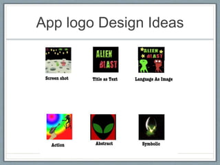
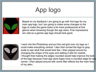
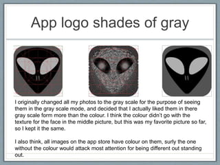
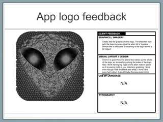
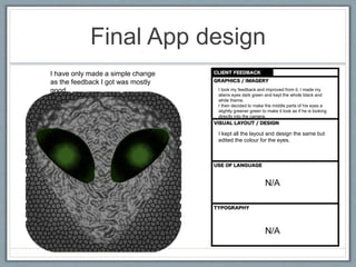
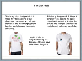
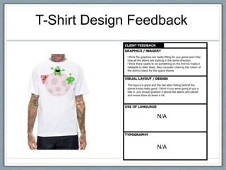
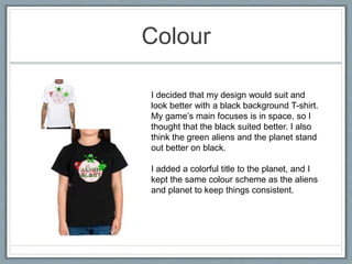
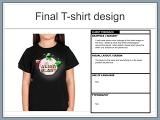
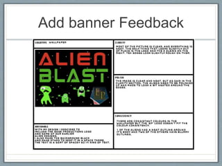
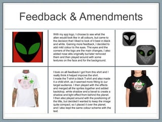

The document provides examples of graphic design work for an app called Alien Blast, including a logo, box art, banners, and t-shirt designs. Feedback was gathered on each design from others and improvements were made. The logo was refined to add subtle color to the eyes. The t-shirt design was changed to use a black background and rearrange elements based on feedback. Overall, the designs evolved to better target teenage audiences and look more professional based on feedback received.


![5G Explained! A High Level Overview [Introduction]](https://cdn.slidesharecdn.com/ss_thumbnails/5gexplainedahighleveloverview-260119165306-cc137a3e-thumbnail.jpg?width=640&height=640&fit=bounds)


