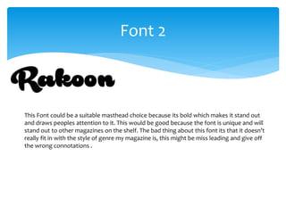
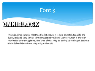
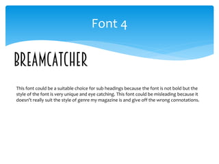
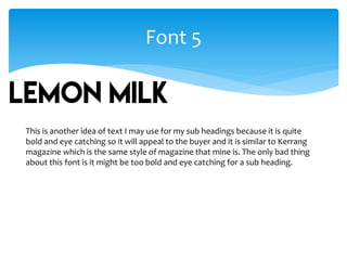
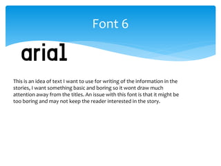
This document evaluates 6 different fonts for use in a magazine masthead and subheadings. Font 1 is similar to an existing music magazine and has a style that fits the genre. Font 2 is bold but may not fit the genre. Font 3 is bold but plain. Font 4 has a unique style but may misrepresent the genre. Font 5 is bold and eye-catching like an existing magazine, but may be too bold for a subheading. Font 6 is basic for articles but risks boring readers.