Aisha Touray
The main aim of analysing
typefaces is to find out which fonts
will suit my genre of music and
also which ones will appeal more
to my target audience.
Masthead Ideas
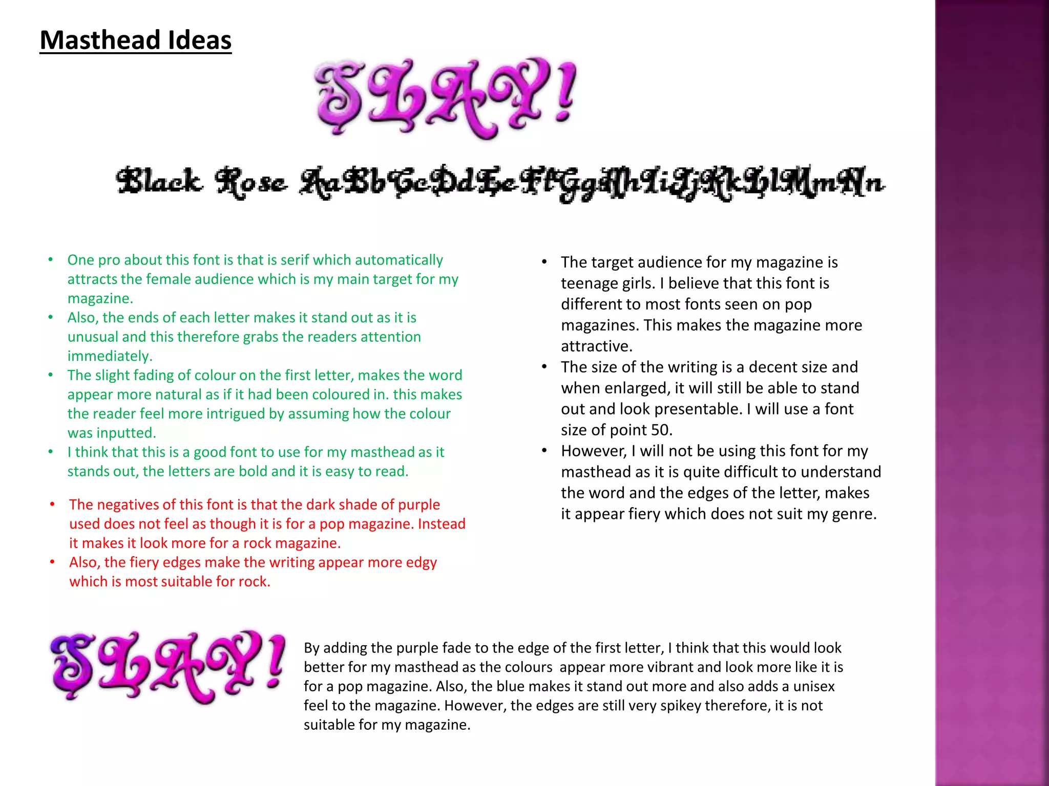
• One pro about this font is that is serif which automatically
attracts the female audience which is my main target for my
magazine.
• Also, the ends of each letter makes it stand out as it is
unusual and this therefore grabs the readers attention
immediately.
• The slight fading of colour on the first letter, makes the word
appear more natural as if it had been coloured in. this makes
the reader feel more intrigued by assuming how the colour
was inputted.
• I think that this is a good font to use for my masthead as it
stands out, the letters are bold and it is easy to read.
• The negatives of this font is that the dark shade of purple
used does not feel as though it is for a pop magazine. Instead
it makes it look more for a rock magazine.
• Also, the fiery edges make the writing appear more edgy
which is most suitable for rock.
• The target audience for my magazine is
teenage girls. I believe that this font is
different to most fonts seen on pop
magazines. This makes the magazine more
attractive.
• The size of the writing is a decent size and
when enlarged, it will still be able to stand
out and look presentable. I will use a font
size of point 50.
• However, I will not be using this font for my
masthead as it is quite difficult to understand
the word and the edges of the letter, makes
it appear fiery which does not suit my genre.
By adding the purple fade to the edge of the first letter, I think that this would look
better for my masthead as the colours appear more vibrant and look more like it is
for a pop magazine. Also, the blue makes it stand out more and also adds a unisex
feel to the magazine. However, the edges are still very spikey therefore, it is not
suitable for my magazine.
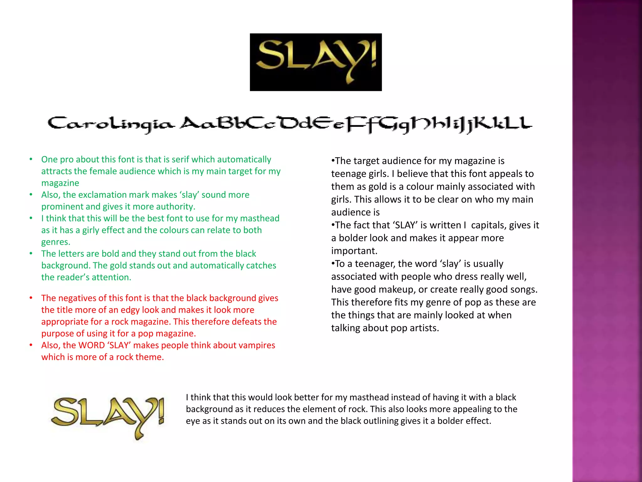
• One pro about this font is that is serif which automatically
attracts the female audience which is my main target for my
magazine
• Also, the exclamation mark makes ‘slay’ sound more
prominent and gives it more authority.
• I think that this will be the best font to use for my masthead
as it has a girly effect and the colours can relate to both
genres.
• The letters are bold and they stand out from the black
background. The gold stands out and automatically catches
the reader’s attention.
• The negatives of this font is that the black background gives
the title more of an edgy look and makes it look more
appropriate for a rock magazine. This therefore defeats the
purpose of using it for a pop magazine.
• Also, the WORD ‘SLAY’ makes people think about vampires
which is more of a rock theme.
•The target audience for my magazine is
teenage girls. I believe that this font appeals to
them as gold is a colour mainly associated with
girls. This allows it to be clear on who my main
audience is
•The fact that ‘SLAY’ is written I capitals, gives it
a bolder look and makes it appear more
important.
•To a teenager, the word ‘slay’ is usually
associated with people who dress really well,
have good makeup, or create really good songs.
This therefore fits my genre of pop as these are
the things that are mainly looked at when
talking about pop artists.
I think that this would look better for my masthead instead of having it with a black
background as it reduces the element of rock. This also looks more appealing to the
eye as it stands out on its own and the black outlining gives it a bolder effect.
Contents page Ideas
• I think that this would be a good font to use for my
page as it is bubbly and automatically attracts the
readers attention.
• Even though it is written in capital letters makes it
appear more fun and less serious as the bubble
writing gives it a ‘comic’ look.
• The fact that the writing is bubbly links to my genre of
pop as the writing looks as though it is being inflated
as it about to pop.
• The negatives of this font is that the outline makes the
writing appear less formal and may discourage readers
outside my target audience who may read my magazine.
• Also, the fact that some of the letters are slightly bigger
than others makes it look child like and not very mature. This
is a disadvantage as it may make some older teens (15 and
above) feel as though the magazine is too ‘childish’ for their
age group.
I think that this would look better for my contents page as the colours are more
calming as it uses beach type colours. This makes it appealing as it is not a typical
colour that you would find on a contents page. The deep shadow in the background
makes the text appear more prominent and makes it look as though the words are
being pushed into the reader’s face. This therefore makes the text more eye-
catching.
• I would use this for my contents page as it is fun
and bubbly. This will allow the reader to engage
more with the page as it looks interesting without
looking boring.
• The fact that the letters are written in capital
letters, allows the writing to stand out and look
dominant. This is effective as it will automatically
grab the readers attention and make them want
to read on.
• The only thing I would change from this font is the
colour to make it more soothing and make it
relate more to my genre.
• This would look good on my contents page, as it
will blend in with my lilac background. This is
useful as it means that I will not have to change
my colour scheme in order to use this font.
• This is not a suitable font to use for my magazine as it is quite
difficult to read what it is saying. As a result of this, people
may be discouraged to read the page and possibly miss out on
information that could save them time.
• Also, the font looks like roman numbers. This makes the font
appear more historic, which is not good for my magazine as it
makes the page appear old fashioned.
• I think that this would be a good font to use for my
feature page as it is looks different to other fonts that
are used for contents pages. This makes the magazine
more appealing as it not the same as other fonts.
• This would also be a good font to use as the letters
are bold enough to see, but not so bold that it is
difficult to read what it says.
• I would not use this font as id does not feel like it
belongs in a pop magazine.
• The black writing makes it appear dark and
gloomy instead of bright and fun like the pop
genre. This therefore means that if I was to
use this font, it would contradict with my
genre of music.
• Also, even though the text is written in serif
font, I think that the edges are a bit to
dramatic and due to some of the letters are
unclear.
• This would also not appeal to my target
audience, as the writing looks to historic to be
taken seriously for a pop magazine. Due to
this, I think that using this font would not be a
good idea as it will not portray pop music
now.
I don’t think that this font would look good for my feature page as there is a natural
white background surrounding the font. This means that the text cannot be easily
blended to fit my colour scheme. Also, it is quite difficult to read the words due to
the ends of each letter. This would most likely discourage readers into reading what
is actually on the page.
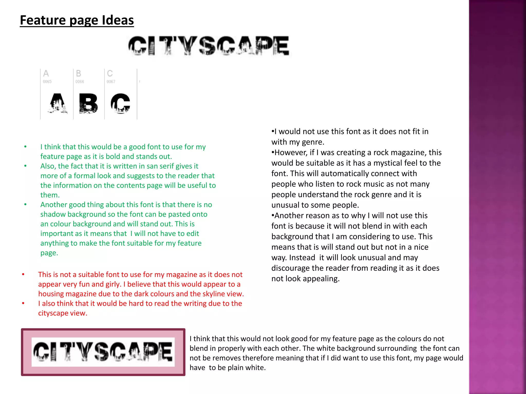
• This is not a suitable font to use for my magazine as it does not
appear very fun and girly. I believe that this would appear to a
housing magazine due to the dark colours and the skyline view.
• I also think that it would be hard to read the writing due to the
cityscape view.
Feature page Ideas
• I think that this would be a good font to use for my
feature page as it is bold and stands out.
• Also, the fact that it is written in san serif gives it
more of a formal look and suggests to the reader that
the information on the contents page will be useful to
them.
• Another good thing about this font is that there is no
shadow background so the font can be pasted onto
an colour background and will stand out. This is
important as it means that I will not have to edit
anything to make the font suitable for my feature
page.
•I would not use this font as it does not fit in
with my genre.
•However, if I was creating a rock magazine, this
would be suitable as it has a mystical feel to the
font. This will automatically connect with
people who listen to rock music as not many
people understand the rock genre and it is
unusual to some people.
•Another reason as to why I will not use this
font is because it will not blend in with each
background that I am considering to use. This
means that is will stand out but not in a nice
way. Instead it will look unusual and may
discourage the reader from reading it as it does
not look appealing.
I think that this would not look good for my feature page as the colours do not
blend in properly with each other. The white background surrounding the font can
not be removes therefore meaning that if I did want to use this font, my page would
have to be plain white.
• This is not a suitable font to use for my magazine as it is very
dark and the shadow in the background gives off a gloomy
effect. This des not match my genre of music.
• Also, the writing is too formal for a feature page. This would
make the page appear for formal and boring than interesting
and informative in a more bubbly way.
• I think that this would be a good font to use for my
feature page as it is looks sophisticated due to the
joining up of the letters. This makes the page appear
more professional as the font looks very neat.
• The fact that not all the edges of the writing are
straight, makes this font appear more natural as if
someone has actually written it. This is effective as it
makes the reader believe that someone has taken the
time to hand write everything on the page.
• This also makes the artists ‘story more believable.
I think that this would look better for feature page instead as the bright pink
shadow, makes the text appear more girly and also relates more to pop music. By
using blue, it allows the title to become more unisex and appeal to boys as well as
girls. Also, the fact that not all girls like the colour pink, the blue allows the text to
appeal mainly to girls who like less vibrant colours.
• I think that this will be the best font to use for
my feature page as it will appeal more to my
genre of music as the writing is sophisticated
whilst also being girly as it is in a serif font.
• Also, the size of the font can be altered to
make it stand out more at the top of the page.
This is effective as it means that I will not need
to worry about the font looking blurry when
enlarged.
• The only thing I would change about this font
to make it more suitable for magazine, is the
colours. I will use brighter colours such as: pink
and baby blue. I think that these colours will
contrast well with each other and they will also
blend in with the colour I choose for my
background.

Typefaces

  • 1.
    Aisha Touray The mainaim of analysing typefaces is to find out which fonts will suit my genre of music and also which ones will appeal more to my target audience.
  • 2.
    Masthead Ideas • Onepro about this font is that is serif which automatically attracts the female audience which is my main target for my magazine. • Also, the ends of each letter makes it stand out as it is unusual and this therefore grabs the readers attention immediately. • The slight fading of colour on the first letter, makes the word appear more natural as if it had been coloured in. this makes the reader feel more intrigued by assuming how the colour was inputted. • I think that this is a good font to use for my masthead as it stands out, the letters are bold and it is easy to read. • The negatives of this font is that the dark shade of purple used does not feel as though it is for a pop magazine. Instead it makes it look more for a rock magazine. • Also, the fiery edges make the writing appear more edgy which is most suitable for rock. • The target audience for my magazine is teenage girls. I believe that this font is different to most fonts seen on pop magazines. This makes the magazine more attractive. • The size of the writing is a decent size and when enlarged, it will still be able to stand out and look presentable. I will use a font size of point 50. • However, I will not be using this font for my masthead as it is quite difficult to understand the word and the edges of the letter, makes it appear fiery which does not suit my genre. By adding the purple fade to the edge of the first letter, I think that this would look better for my masthead as the colours appear more vibrant and look more like it is for a pop magazine. Also, the blue makes it stand out more and also adds a unisex feel to the magazine. However, the edges are still very spikey therefore, it is not suitable for my magazine.
  • 3.
    • One proabout this font is that is serif which automatically attracts the female audience which is my main target for my magazine • Also, the exclamation mark makes ‘slay’ sound more prominent and gives it more authority. • I think that this will be the best font to use for my masthead as it has a girly effect and the colours can relate to both genres. • The letters are bold and they stand out from the black background. The gold stands out and automatically catches the reader’s attention. • The negatives of this font is that the black background gives the title more of an edgy look and makes it look more appropriate for a rock magazine. This therefore defeats the purpose of using it for a pop magazine. • Also, the WORD ‘SLAY’ makes people think about vampires which is more of a rock theme. •The target audience for my magazine is teenage girls. I believe that this font appeals to them as gold is a colour mainly associated with girls. This allows it to be clear on who my main audience is •The fact that ‘SLAY’ is written I capitals, gives it a bolder look and makes it appear more important. •To a teenager, the word ‘slay’ is usually associated with people who dress really well, have good makeup, or create really good songs. This therefore fits my genre of pop as these are the things that are mainly looked at when talking about pop artists. I think that this would look better for my masthead instead of having it with a black background as it reduces the element of rock. This also looks more appealing to the eye as it stands out on its own and the black outlining gives it a bolder effect.
  • 4.
    Contents page Ideas •I think that this would be a good font to use for my page as it is bubbly and automatically attracts the readers attention. • Even though it is written in capital letters makes it appear more fun and less serious as the bubble writing gives it a ‘comic’ look. • The fact that the writing is bubbly links to my genre of pop as the writing looks as though it is being inflated as it about to pop. • The negatives of this font is that the outline makes the writing appear less formal and may discourage readers outside my target audience who may read my magazine. • Also, the fact that some of the letters are slightly bigger than others makes it look child like and not very mature. This is a disadvantage as it may make some older teens (15 and above) feel as though the magazine is too ‘childish’ for their age group. I think that this would look better for my contents page as the colours are more calming as it uses beach type colours. This makes it appealing as it is not a typical colour that you would find on a contents page. The deep shadow in the background makes the text appear more prominent and makes it look as though the words are being pushed into the reader’s face. This therefore makes the text more eye- catching. • I would use this for my contents page as it is fun and bubbly. This will allow the reader to engage more with the page as it looks interesting without looking boring. • The fact that the letters are written in capital letters, allows the writing to stand out and look dominant. This is effective as it will automatically grab the readers attention and make them want to read on. • The only thing I would change from this font is the colour to make it more soothing and make it relate more to my genre. • This would look good on my contents page, as it will blend in with my lilac background. This is useful as it means that I will not have to change my colour scheme in order to use this font.
  • 5.
    • This isnot a suitable font to use for my magazine as it is quite difficult to read what it is saying. As a result of this, people may be discouraged to read the page and possibly miss out on information that could save them time. • Also, the font looks like roman numbers. This makes the font appear more historic, which is not good for my magazine as it makes the page appear old fashioned. • I think that this would be a good font to use for my feature page as it is looks different to other fonts that are used for contents pages. This makes the magazine more appealing as it not the same as other fonts. • This would also be a good font to use as the letters are bold enough to see, but not so bold that it is difficult to read what it says. • I would not use this font as id does not feel like it belongs in a pop magazine. • The black writing makes it appear dark and gloomy instead of bright and fun like the pop genre. This therefore means that if I was to use this font, it would contradict with my genre of music. • Also, even though the text is written in serif font, I think that the edges are a bit to dramatic and due to some of the letters are unclear. • This would also not appeal to my target audience, as the writing looks to historic to be taken seriously for a pop magazine. Due to this, I think that using this font would not be a good idea as it will not portray pop music now. I don’t think that this font would look good for my feature page as there is a natural white background surrounding the font. This means that the text cannot be easily blended to fit my colour scheme. Also, it is quite difficult to read the words due to the ends of each letter. This would most likely discourage readers into reading what is actually on the page.
  • 6.
    • This isnot a suitable font to use for my magazine as it does not appear very fun and girly. I believe that this would appear to a housing magazine due to the dark colours and the skyline view. • I also think that it would be hard to read the writing due to the cityscape view. Feature page Ideas • I think that this would be a good font to use for my feature page as it is bold and stands out. • Also, the fact that it is written in san serif gives it more of a formal look and suggests to the reader that the information on the contents page will be useful to them. • Another good thing about this font is that there is no shadow background so the font can be pasted onto an colour background and will stand out. This is important as it means that I will not have to edit anything to make the font suitable for my feature page. •I would not use this font as it does not fit in with my genre. •However, if I was creating a rock magazine, this would be suitable as it has a mystical feel to the font. This will automatically connect with people who listen to rock music as not many people understand the rock genre and it is unusual to some people. •Another reason as to why I will not use this font is because it will not blend in with each background that I am considering to use. This means that is will stand out but not in a nice way. Instead it will look unusual and may discourage the reader from reading it as it does not look appealing. I think that this would not look good for my feature page as the colours do not blend in properly with each other. The white background surrounding the font can not be removes therefore meaning that if I did want to use this font, my page would have to be plain white.
  • 7.
    • This isnot a suitable font to use for my magazine as it is very dark and the shadow in the background gives off a gloomy effect. This des not match my genre of music. • Also, the writing is too formal for a feature page. This would make the page appear for formal and boring than interesting and informative in a more bubbly way. • I think that this would be a good font to use for my feature page as it is looks sophisticated due to the joining up of the letters. This makes the page appear more professional as the font looks very neat. • The fact that not all the edges of the writing are straight, makes this font appear more natural as if someone has actually written it. This is effective as it makes the reader believe that someone has taken the time to hand write everything on the page. • This also makes the artists ‘story more believable. I think that this would look better for feature page instead as the bright pink shadow, makes the text appear more girly and also relates more to pop music. By using blue, it allows the title to become more unisex and appeal to boys as well as girls. Also, the fact that not all girls like the colour pink, the blue allows the text to appeal mainly to girls who like less vibrant colours. • I think that this will be the best font to use for my feature page as it will appeal more to my genre of music as the writing is sophisticated whilst also being girly as it is in a serif font. • Also, the size of the font can be altered to make it stand out more at the top of the page. This is effective as it means that I will not need to worry about the font looking blurry when enlarged. • The only thing I would change about this font to make it more suitable for magazine, is the colours. I will use brighter colours such as: pink and baby blue. I think that these colours will contrast well with each other and they will also blend in with the colour I choose for my background.