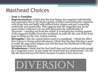
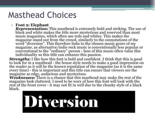
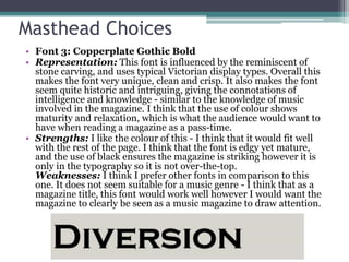
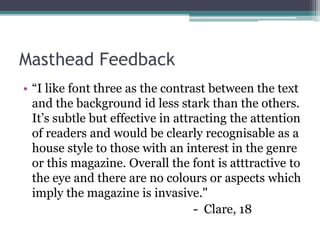
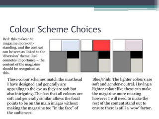
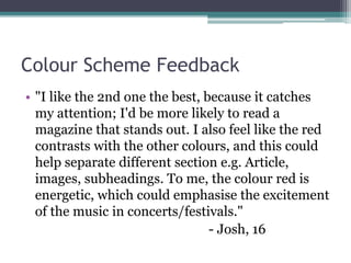
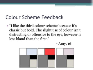
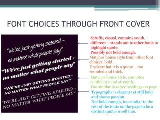
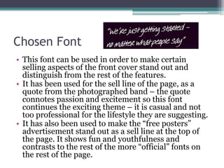
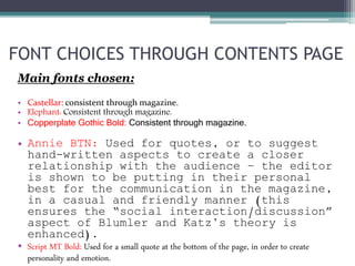
The document outlines the research and decisions regarding font and color choices for a magazine focused on the indie/alternative music genre. It includes feedback on proposed masthead names and font representations, emphasizing individuality, maturity, and visual appeal while also considering audience preferences. Various color schemes are discussed for their psychological effects and aesthetic qualities, highlighting the need for clarity and professionalism in attracting the target demographic.