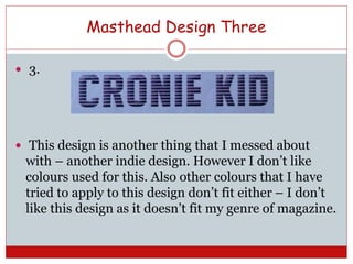
Mastheads
First designs & final – with analysis.
Masthead Design One
ď‚— 1.
ď‚— This is the first masthead that I created I was playing
about with different fonts, I like this font as its
simple and bold, also I was looking at different
colours. This pink colour is one that I really like so I
decided to incorporate it into my work.
Masthead Design Two
ď‚— 2.
ď‚— This is my second masthead design, I love the font
and think that it is a very Indie design – I like that
about this design because to me it represents the
genre of the magazine. Also I love the colours – black
and white stand out which is exactly what I want my
magazine to do.
Masthead Design Three
ď‚— 3.
ď‚— This design is another thing that I messed about
with – another indie design. However I don’t like
colours used for this. Also other colours that I have
tried to apply to this design don’t fit either – I don’t
like this design as it doesn’t fit my genre of magazine.
Masthead Design Four
ď‚— 4.
ď‚— Also like design 2 I love the colours for this design as
it makes a statement, it is not as bold as design 2
which makes me like the design a little less. I want
an indie design to represent my magazine and its
genre. The font used here is one that I like, yet I feel
like it doesn’t quite fit the theme I am going for.
Masthead Design Five
ď‚— 6.
ď‚— I love this masthead! I love that one letter looks
different to all the others. This shows the genre of my
magazine; how my magazine is an indie rock
magazine and that the name is a representation of
that

Mastheads presentation

  • 1.
    Mastheads First designs &final – with analysis.
  • 2.
    Masthead Design One ď‚—1. ď‚— This is the first masthead that I created I was playing about with different fonts, I like this font as its simple and bold, also I was looking at different colours. This pink colour is one that I really like so I decided to incorporate it into my work.
  • 3.
    Masthead Design Two 2.  This is my second masthead design, I love the font and think that it is a very Indie design – I like that about this design because to me it represents the genre of the magazine. Also I love the colours – black and white stand out which is exactly what I want my magazine to do.
  • 4.
    Masthead Design Three 3.  This design is another thing that I messed about with – another indie design. However I don’t like colours used for this. Also other colours that I have tried to apply to this design don’t fit either – I don’t like this design as it doesn’t fit my genre of magazine.
  • 5.
    Masthead Design Four 4.  Also like design 2 I love the colours for this design as it makes a statement, it is not as bold as design 2 which makes me like the design a little less. I want an indie design to represent my magazine and its genre. The font used here is one that I like, yet I feel like it doesn’t quite fit the theme I am going for.
  • 6.
    Masthead Design Five ď‚—6. ď‚— I love this masthead! I love that one letter looks different to all the others. This shows the genre of my magazine; how my magazine is an indie rock magazine and that the name is a representation of that