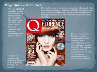
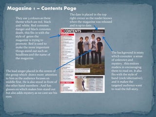
This document analyzes magazine covers and contents pages. It discusses how the use of bold colors and text on the cover helps attract the target audience. A close-up photo of the model makes readers feel more involved. On the contents page, a misty background creates intrigue and fits the style of the band featured. Color themes are also important - red connotes danger and black connotes death, fitting the alternative/rock genre. Placing the lead singer in the center draws more attention to him. Date and price information is placed strategically for visibility. In conclusion, color, images, and design elements should fit the magazine's genre to effectively engage readers.


![Media studies front cover[1]](https://cdn.slidesharecdn.com/ss_thumbnails/mediastudies-frontcover1-120410062901-phpapp01-thumbnail.jpg?width=640&height=640&fit=bounds)