
Recommended
More Related Content
What's hot
What's hot (20)
Viewers also liked
Viewers also liked (18)
Similar to Analysis of magazines
Similar to Analysis of magazines (20)
More from GeorgeAnderton21
Recently uploaded
Recently uploaded (20)
Analysis of magazines
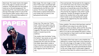
- 1. Mast head: The master head is the largest font on the page so it stands out to the audience. The bold white font also helps it stand out on the pink background. The positioning of the mast head written across the top of the page so that it is one of the first thing the reader notices, which is very important, as they want they audience to remember the magazine. Main image: The main image is a mid- shot of Travis Scott is positioned right in the centre of the page, with his eyes looking directly into the lens of the camera. This front cover highlights Travis Scott as superior because he is much darker than all colours in the back ground and writing. Cover Line: The cover line “Travis Scott” informs the readers who the main image is and lets an insight of what’s going to be inside the magazine. The cover line is white and bold so it stands how to the audience. The smaller cover line below “Living for Fashion” also stands out very well as it’s a white bold text on a dark background, this cover line also tells the reader about what’s inside so that it may draw more interest to the audience to try and make them buy this magazine over the others on sale. Price and barcode: The barcode for this magazine isn’t of the front cover, this means it may either be on the inside cover or the back. They have done this as it would take some of the effect of the front cover and also to make it more unique. The price for this magazine is $10, which is quite expensive. Therefor the designer has place the price in the smallest font so the reader would find it harder to see and hopefully be already drawn to the magazine buy the cover and the contents in side. Colour palettes: The colours that have been used are very different and unique to any other Hip hop magazine as these are Black, white and Pink. By using these colours, it will make the magazine stand out when it’s on sale so more people will notice it, which is very important as Paper want to sell their magazine more than their competitors. The design of this front cover is very simplistic but effective as it shows Travis Scott is very important as he is the only image on the page. As there is hardly any writing apart from Travis’s name and the master head, the readers eye would automatically be drawn to the main image, which is what paper magazine wanted as they hope the audience would buy it more.
- 2. Mast head: The mast head XXL is boxed out with big, bold, red writing so that it stands out over everything on the page, which is important as this is what people will remember in order to buy it again. Colour Palettes: The colour in the back ground is been made very light, along with the city, this is to bring out Jay Z as he is dressed in black, this is to show that he is dominant and important. The red writing on ‘XXL’ and ‘Jay Z’ is also helped stand out by the very light background. Also XXL has used these colours which are used very often as they can be very effective. Main image: The main image of Jay Z is positioned around two sets of buildings and shows him to be much taller than them, which is to show he is the king of his hometown, and could even means he is the king of hip hop. As well as that his facial expression is very serious. All of this is to show that Jay Z is very important and superior. Also, XXL has tried to make this image appeal to both male and female as he is position with his hands half in his pocket looking very manly. Tag lines: The tag lines on the right are to show the reader what’s important inside the magazine and to attract attention from the audience. The tag lines on the left side are extras which the reader can see and will help them chose whether they want to buy the magazine. The fonts used are very basic which fits in with the simply layout and text.
- 3. Title/Mast head: this show to the readers the name of the magazine, so that people can remember the magazine and buy it again, this is normally big and bold so that it stands out that the rest of the magazine. Sometimes half/abit of the master head is covered, this is because the company feels that the magazine name is big and the public only need to see half of it to recognize it. Tag line: these tag lines show other stories inside the magazine and other advertisement to draw attention from buyers. The that are in bigger and bolder text help draw attention to the reader as the editor wants them to think these are more important The main image of a huge Hip-hop star that most people of the genre like will straight away be looking at him. He is positioned mainly in the center and looking directly at the camera, the clothes he is wear link to the rest of the page as they are dull colors but the rest of him stands out. Barcode: this is to allow the shop to scan the magazine so that the public can buy it. This also has the price of the magazine, in very small print; this is because it is fairly expensive. Tag line: the tag line is linked to the main cover image, as it is showing who is on the front, this tag line is normally the biggest and the brightest, as Jay-Z is the main story in this magazine and that would attract people to buy it The have added the website link at the bottom of the magazine so that readers can find out more information. The lay out of this magazine is very simply, as it has the main image in the center of the page and then little writing around it. This is to make it easy on on the readers eye and so that the readers attention is only drawn to certain information. The colors of this magazine is a simply choice chosen by most Hip Hop magazines, this is red white and black.
- 4. A Large ‘v’ in the background to indicate that the V in vibe is important as it symbolises the magazine to the readers. The title ‘contents’ is layed out in a different way so that it catches the reader’s eye and makes it different to other magazines. The dark black colour on a light background also helps the words stand out. The colour of the back ground is extremely light, which helps the writing stand and the main image stand out. This is very which important as these are the main features on the page. Main image of Kanye West stands out as it is at the centre of the page, also he is much darker than the back ground which helps him stand out, also he has a very serious face looking directly into the camera, this is to connect him with the reader and show that he is serious about his work. The red hand and hand coming over his chest can be part of the male gaze to try and connect the magazine with women as they may feel he has a passion for love. The main title ‘features’ is in a different font so that it stands out and has a traditional hip hop look to it so it fits with the specific genre. The tag lines are there so that it is easy for the readers to find the subject they want to read about.
- 5. The main image is of a rapper in the centre of the page looking directly into the camera. He is wearing a lot of golden and silver chains, this may identify him ass rich and also create a unique image of himself. The big mask and nasty look on his face may identify his back ground as he may come from a gang like a lot of hip hop artists. Also this helps him stand out. This image appeals has been made to appeal to women as well as he is wearing least clothes as possible and got tattoos over his chest. Title: The big “V” in the back ground is there to represent the Vibe magazine and to show its importance. Also the “V” is a darker colour which makes it more noticeable. The word “contents” is set out in a different way to any other magazine, this is to make it more unique and would help it stand out over competitors. The use of the big white bold text makes in contrast with the dark background so that it stands out and shows it’s important. About the contents word, there is the vibe logo and the issue date so show readers when the magazine was published and lets them know who it’s by to re ensure the reader remembers so that they can buy it again. The sub headings on the left side of the page are in a bolder and more stylish text, this is to help the reader rememorize the magazine but also high lights the words more which makes it easier for the reader to identify the certain pages they want to read. This chosen text also makes the magazine look classy which separates the magazine from their competitors which mostly use more basic texts. Colour palettes: The colour of this contents page is Red, Dark red and white. The dark back ground helps bring out the main image even more which puts the artist in the spot light and shows he is the main story and is very important.
- 6. Down the side there is all the page numbers in a small font, this may be difficult for the readers to read, however there is a lot of them which can be helpful as readers can find the page they want and what’s on that page. The main title is big and bold to stand out, but also XXL have used slang words, “doin’ lines” they have done this to make it fit in with the relevant gender. Also they have used this term as it fits in with the article and that a lot of hip hop artist have had history with drugs. Main image of BoB is on the left side of the page; with him wearing jacket bright orange, and this attracts him to the reader so they instantly know what the main story is about. At the bottom of the page there is the XXL logo to make sure readers know what the make of the magazine is so that they can buy it again if they like it. Also there is the date, this is so that the reader knows when it was issued and may help when they are reading certain articles. The color scheme for this contents page is red black and white/grey. This is one of the most common color choices for this type of magazine as it is very basic but effective. The lay out of this magazine is basic but effective as it is easy on the eye and can be read easy. The text is set out in columns so that the reader doesn't’t find it hard to read and its also easy to find the page they want, due to the big and bolder page numbers.
- 7. Colour palettes: The colours used at just black and white, this has a massive effect as it makes the magazine look good and smart, just like Rick Ross. The use of the extremely white back ground makes the make image and title stand out, this is important as it is what the reader looks for. The title “man made” is in big capitals in black bold writing, this makes it stand out massively which is very important as this is what attracts the reader to the page. Also the text is set out very uniquely as it is mirrored upside down. This will draw more attention to the magazine as it different to any other magazines. The colour scheme for this magazine is very simple and completely different to any other magazine, the editor has taken a different approach by choosing colours that are extremely basic, which makes this magazine more unique. These colours are Black and white. The main article is in a single column which makes it very easy for the reader to read. Also the text has a huge block capital T on the first word, this makes the look different and adds a good effect to the page, adding more class to it.
- 8. The colour scheme for this page is black, white and orange. This is a different colour choice to other magazines which may have been done because Wiz has a different style of rapping to other artists. Also, the orange has been used to identify the important parts in the article and makes it more effective for the reader. The black on the page has been used for the title and the sub headings; this shows makes these words stand out over the white back ground as these are important to the reader. As well as that, the orange represents happiness and success, but the black identifies darkness and evil, this may be telling the reader that there are two sides of Wiz in which we don’t see. The lay out of the page is very simple, as there is one main image covering on side of the page and then the text in two simply columns on the other side. This is to make it much easier for the reader so that the text isn’t spread around the page and covering the image, so that it’s harder to read. Also the dark background behind Wiz helps make him stand out and shows his importance, as he is the main story. The image used of Wiz Khalifa is a close up that has filled the whole left page, so that it focuses on his face and the smoke coming out his mouth. As Wiz is a hip hop artist commonly know for smoking cannabis which is his signature look. This relates to the tag lien “how high” as this relates to smoking, and the common subjects in his songs and the article.
- 9. The main title on this page is a quote of what Justin Bieber saying Girls give him a headache, this is to attract attention to the audience so that they will read on. The use of different colour helps it stand out so that the reader doesn’t miss it. The lay out of this double page spread is very complex as there is a lot writing and lines going over the page. On the left side there is the main image that covers pretty much all the page, this is to show that he is the main story and that he is important. The lay out of the title is vey bold and in two different colours, this is because the editor wants it to stand out as its important to the reader. The articles below are layed put in different columns this is to make it easier for the reader and also separate different parts of the article. Colour pallets, the colours on this page are pink, white and black. These colour appeal to mainly girls, which would be the intended audiences. In the text the editor has used to the use of colours to high light the important parts, so that it stands out more to the readers eye. The main image has been done to appeal to girls as Justin Bieber is wearing little clothes and showing off a tattoo. This is to attract and audience as many girls love him. He is also looking directly into the lens of the camera, this is connect him more with the reader.