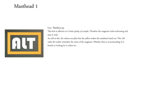
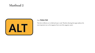
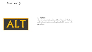
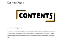
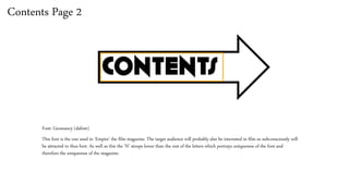
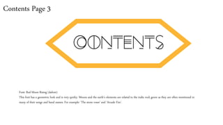
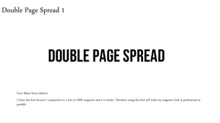
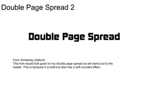
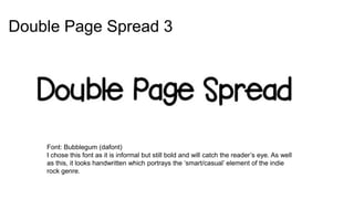
This document discusses font choices for various elements of a magazine mock-up, including the masthead, contents pages, and double page spreads. For the masthead, a quirky yet simple font and a bold, easy-to-read font were chosen. Fonts for the contents pages were selected to draw the reader's eye and match the target audience's interests. Fonts for the double page spreads were picked for their professional look, ability to stand out, and portrayal of the genre's style. Overall font choices were made based on readability, attracting the reader, and representing the magazine's intended tone.

