
Recommended
More Related Content
What's hot
What's hot (19)
Similar to Font analysis
Similar to Font analysis (20)
More from ShaniRoss
Font analysis
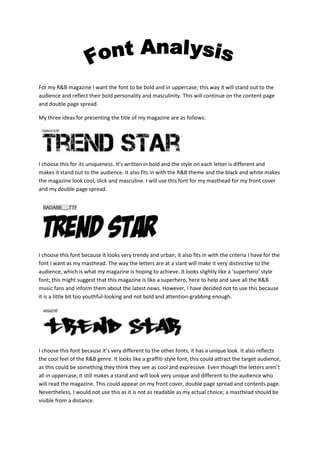
- 1. For my R&B magazine I want the font to be bold and in uppercase; this way it will stand out to the audience and reflect their bold personality and masculinity. This will continue on the content page and double page spread. My three ideas for presenting the title of my magazine are as follows: I choose this for its uniqueness. It’s written in bold and the style on each letter is different and makes it stand out to the audience. It also fits in with the R&B theme and the black and white makes the magazine look cool, slick and masculine. I will use this font for my masthead for my front cover and my double page spread. I choose this font because it looks very trendy and urban; it also fits in with the criteria I have for the font I want as my masthead. The way the letters are at a slant will make it very distinctive to the audience, which is what my magazine is hoping to achieve. It looks slightly like a ‘superhero’ style font; this might suggest that this magazine is like a superhero, here to help and save all the R&B music fans and inform them about the latest news. However, I have decided not to use this because it is a little bit too youthful-looking and not bold and attention-grabbing enough. I choose this font because it’s very different to the other fonts; it has a unique look. It also reflects the cool feel of the R&B genre. It looks like a graffiti-style font; this could attract the target audience, as this could be something they think they see as cool and expressive. Even though the letters aren’t all in uppercase, it still makes a stand and will look very unique and different to the audience who will read the magazine. This could appear on my front cover, double page spread and contents page. Nevertheless, I would not use this as it is not as readable as my actual choice; a masthead should be visible from a distance.
- 2. I thought of this font for my sell-lines and other writing that’s will be featured on my magazine because it’s easy to read, it is written in lowercase which might make it stand out to the audience. Its thickness makes it look trendy, manly and unique. This font stood out to me because it suits the criteria of the font I want. It’s in capitals and it’s bold which will make it easier for the fans of the magazine to read. It will match the masthead of the page and continue the trend throughout the whole magazine. This font is different to the other to because it’s bold and uppercase, this would give a masculine feel to the magazine especially when my target audience are males. The font itself is very unique and distinctive if a fan of the magazine was to see it. For my masthead I am planning on using: For my font I will be using: