My Individual Mise En 
Scene Analysis
Magazine 1 – Front cover 
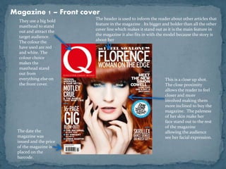
They use a big bold 
masthead to stand 
out and attract the 
target audience. 
The colour the 
have used are red 
and white. The 
colour choice 
makes the 
masthead stand 
out from 
everything else on 
the front cover. 
The header is used to inform the reader about other articles that 
feature in the magazine . Its bigger and bolder than all the other 
cover line which makes it stand out as it is the main feature in 
the magazine it also fits in with the model because the story is 
about her 
This is a close up shot. 
The close proximity 
allows the reader to feel 
closer and more 
involved making them 
more inclined to buy the 
magazine. The paleness 
of her skin make her 
face stand out to the rest 
of the magazine 
allowing the audience 
see her facial expression. 
The date the 
magazine was 
issued and the price 
of the magazine is 
placed on the 
barcode.
Magazine 1 – Contents Page 
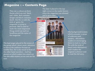
The background is misty 
which connotes a sense 
of unknown and 
mystery . this entices 
readers in encouraging 
them to read on. It also 
fits with the style of 
band (rock/alternative), 
and it makes the 
targeted audience want 
to read the full story. 
They use 3 colours as there 
theme which are red, black 
and white. Red connotes 
danger and black connotes 
death, this fits in with the 
style of genre the 
magazine is trying to 
promote. Red is used to 
make the more important 
things stand out such as: 
headlines and the name of 
the magazine. 
The lead singer placed in the centre of 
the group which draws more attention 
to him as the audience focuses on 
middle first. He is also stood in front of 
the other band members . And has 
glasses on which makes him stand out 
but also adds mystery as we cant see his 
eyes. 
The date is placed in the top 
right corner so the reader knows 
when the magazine was released 
and is up to date.
 To conclude I have learnt that colour is very important 
when designing a front cover and contents page. 
Certain colours have certain connotations such as red 
which connotes danger. Therefore I will use 
appropriate colours to my genre. My model is also 
important as if I use a close up it allows the audience to 
feel more involved and are more likely to buy it. Also, 
the background and costume will give connotations 
therefore they need to fit with the genre and style of 
band. I am doing a alternative/rock magazine and 
therefore will use locations, costume and makeup to fit 
with that genre.

Tom mise en scene

  • 1.
    My Individual MiseEn Scene Analysis
  • 2.
    Magazine 1 –Front cover They use a big bold masthead to stand out and attract the target audience. The colour the have used are red and white. The colour choice makes the masthead stand out from everything else on the front cover. The header is used to inform the reader about other articles that feature in the magazine . Its bigger and bolder than all the other cover line which makes it stand out as it is the main feature in the magazine it also fits in with the model because the story is about her This is a close up shot. The close proximity allows the reader to feel closer and more involved making them more inclined to buy the magazine. The paleness of her skin make her face stand out to the rest of the magazine allowing the audience see her facial expression. The date the magazine was issued and the price of the magazine is placed on the barcode.
  • 3.
    Magazine 1 –Contents Page The background is misty which connotes a sense of unknown and mystery . this entices readers in encouraging them to read on. It also fits with the style of band (rock/alternative), and it makes the targeted audience want to read the full story. They use 3 colours as there theme which are red, black and white. Red connotes danger and black connotes death, this fits in with the style of genre the magazine is trying to promote. Red is used to make the more important things stand out such as: headlines and the name of the magazine. The lead singer placed in the centre of the group which draws more attention to him as the audience focuses on middle first. He is also stood in front of the other band members . And has glasses on which makes him stand out but also adds mystery as we cant see his eyes. The date is placed in the top right corner so the reader knows when the magazine was released and is up to date.
  • 4.
     To concludeI have learnt that colour is very important when designing a front cover and contents page. Certain colours have certain connotations such as red which connotes danger. Therefore I will use appropriate colours to my genre. My model is also important as if I use a close up it allows the audience to feel more involved and are more likely to buy it. Also, the background and costume will give connotations therefore they need to fit with the genre and style of band. I am doing a alternative/rock magazine and therefore will use locations, costume and makeup to fit with that genre.