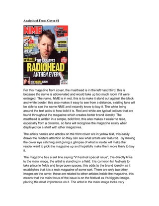
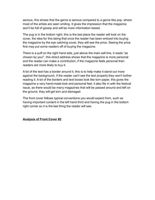
This document analyzes the front covers of two music magazines. For the first magazine, NME, the analysis notes that the masthead is abbreviated and in bold red text to stand out. Yellow text highlights artist names and articles. A "V Festival special issue" sell line links to the main image of an artist at a festival. For the second magazine, Q, the logo is at the front to avoid being covered. It uses black, red and gold text in varying sizes on a light gray background. A pull quote teases drama. Both magazines follow conventions like the price being in the bottom right.