The document discusses how the student's magazine product uses and develops conventions of real music magazines. Specifically:
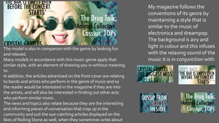
- The magazine takes inspiration from Rolling Stone, NME, and Kerrang in terms of style and genre coverage.
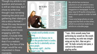
- Key conventions used include a large masthead, cover images with eye contact, coverlines, and similar clean font and palette as Rolling Stone.
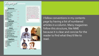
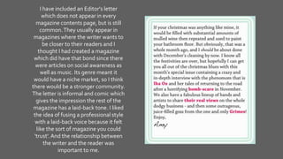
- Inside pages also use conventions like numbered article listings, related images, clear section headings, and an editor's letter.
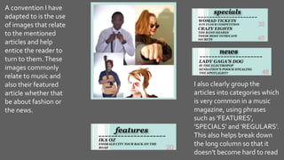
- Individual articles follow conventions like multiple columns, large photos paired with text on opposite pages, and eye-catching titles.


![Planning power point [autosaved]](https://cdn.slidesharecdn.com/ss_thumbnails/planningpowerpointautosaved-170226154859-thumbnail.jpg?width=640&height=640&fit=bounds)


