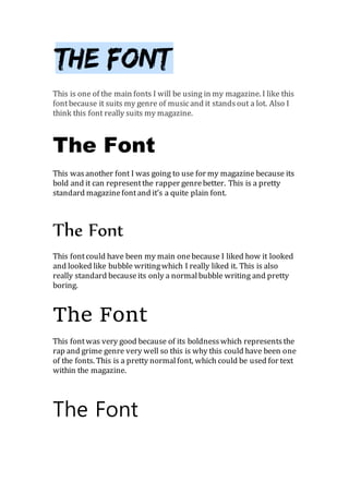
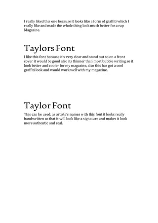
Andreas Schleicher presents at the launch of What does child empowerment mean...
ย
Fonts 4
1. This is one of the main fonts I will be using in my magazine. I like this
fontbecause it suits my genre of musicand it standsout a lot. Also I
think this font really suits my magazine.
The Font
This wasanother font I was going to use for my magazine because its
bold and it can representthe rapper genrebetter. This is a pretty
standard magazinefontand itโs a quite plain font.
This fontcould have been my main onebecause I liked how it looked
and looked like bubble writingwhich I really liked it. This is also
really standard because itโs only a normalbubble writingand pretty
boring.
This fontwas very
good because of its boldnesswhich representsthe rap and grime
genre very wellso this is why this could have been oneof the fonts.
This is a pretty normalfont, which could be used for text within the
magazine.
I really liked this one because it looks like a form of graffiti which I
really like and madethe whole thing look much better for a rap
Magazine.
2. I like this font because itโs very clear and stand out so on a front
cover it would be good also its thinner than most bubble writing so it
look better and cooler for my magazine, also this has got a cool
graffiti look and would work wellwith my magazine.
This can be used, as artisteโs nameswith this fontit looks really
handwritten so that it will look like a signatureand makesit look
moreauthentic and real.