The document evaluates four different font options for a magazine masthead:
1) Zwodrei font with a thick, rectangular border that would stand out on any page color
2) Ailerons font with a thinner style that looks cleaner than the first option
3) Manifesto font featuring only uppercase letters without a border that may be too unique and cause confusion
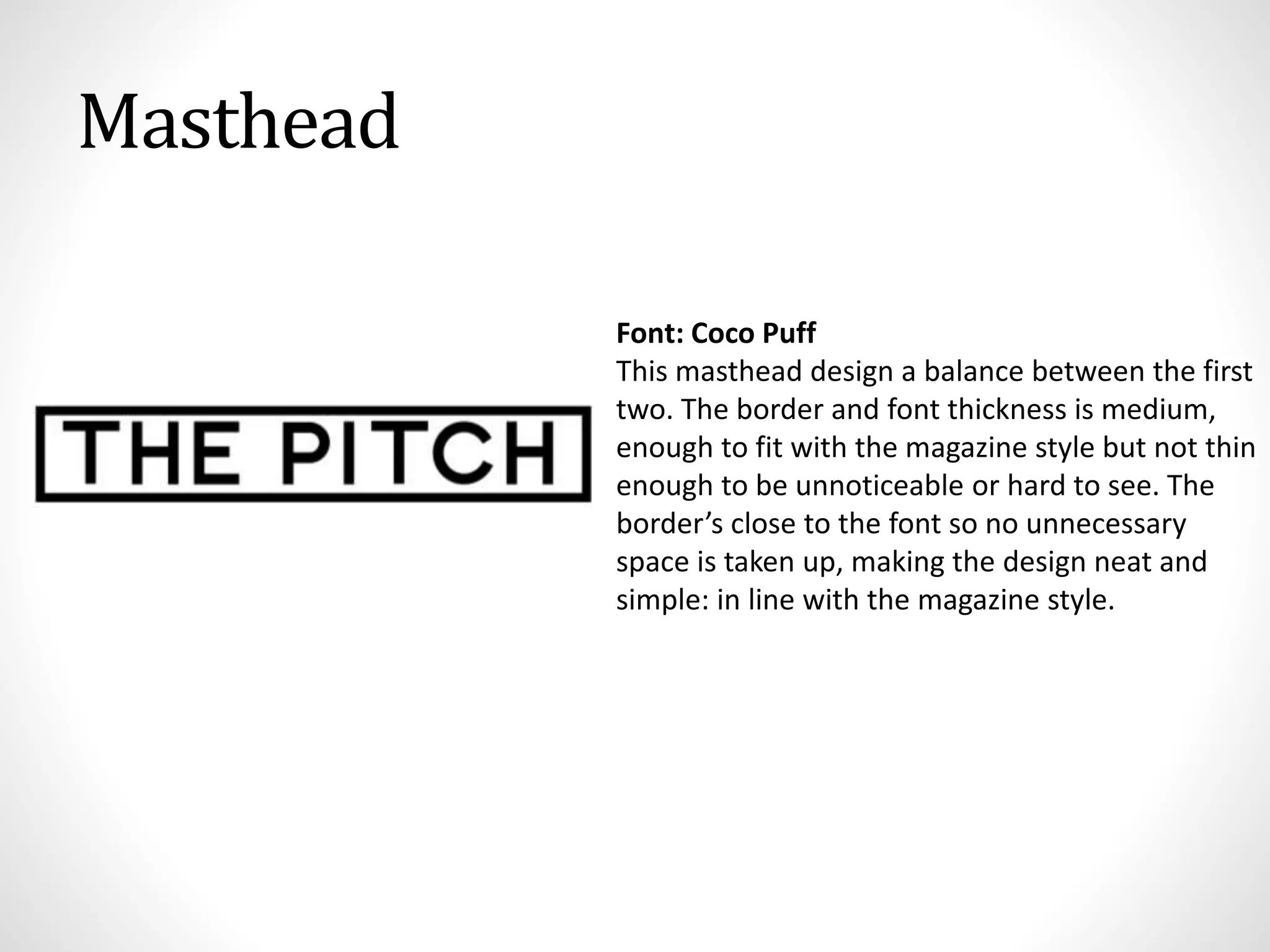
4) Coco Puff font with a medium thickness and border that achieves a balance between options one and two in line with the magazine's style.
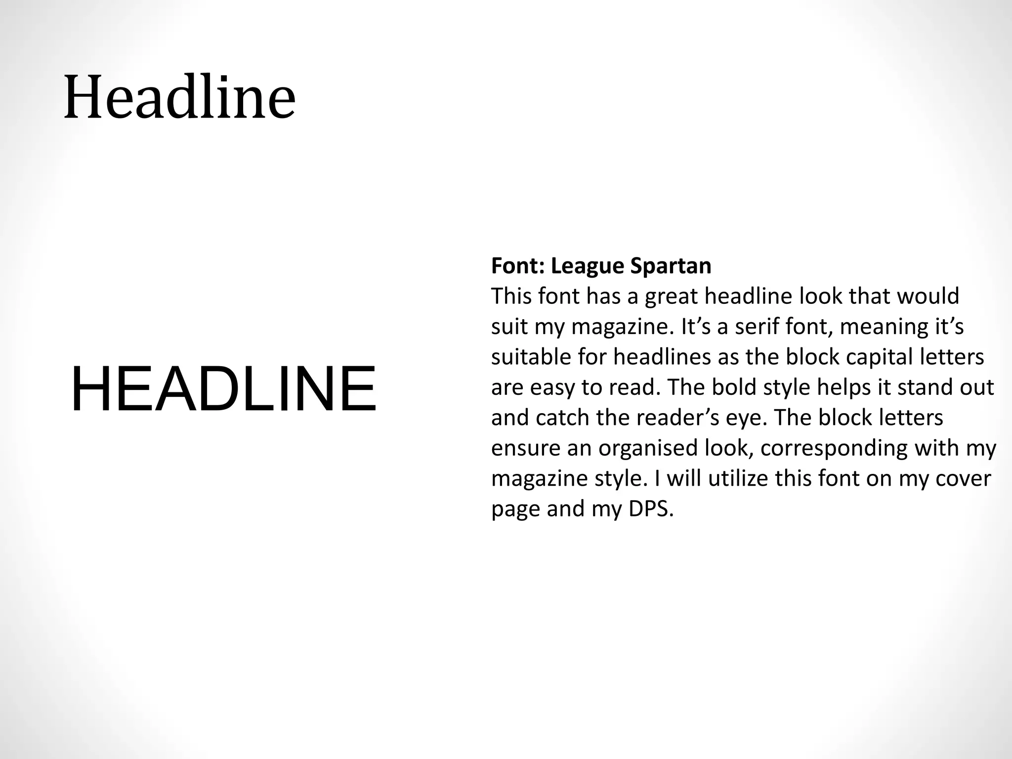
The document also selects League Spartan for headlines, Droid Serif for body text, and establishes a primary color scheme of black, white, and red.


![Reading Techniques [Autosaved].pptxReading Techniques [Autosaved].pptx](https://cdn.slidesharecdn.com/ss_thumbnails/readingtechniquesautosaved-251211193055-b8821f9d-thumbnail.jpg?width=640&height=640&fit=bounds)


