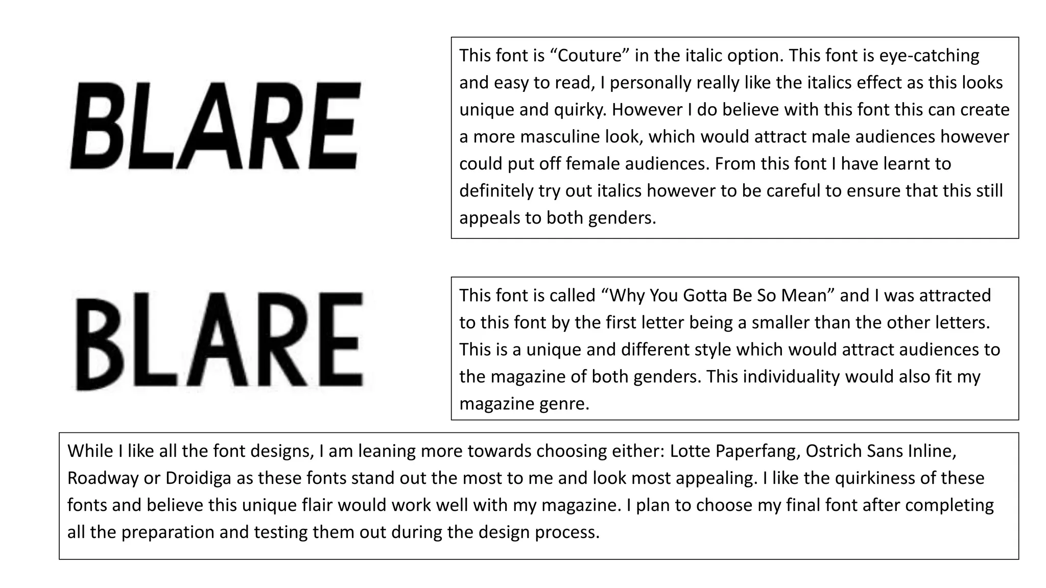
The document tests out various fonts for a magazine called "Blare" and evaluates their suitability. It discusses fonts like "Ostrich Sans Inline", "Roadway", "Droidiga", and "Lotte Paperfang" which appeal due to their unique styling, quirkiness, and ability to attract audiences. While several fonts are eye-catching, some have wide letter spacing or simpler designs that may not suit a magazine masthead well. The document concludes by noting a preference for four fonts that stand out the most for their appeal and uniqueness.