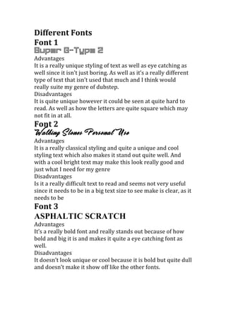
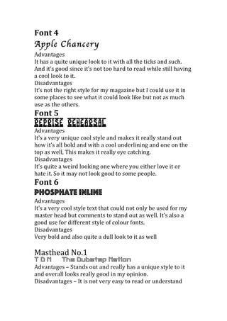
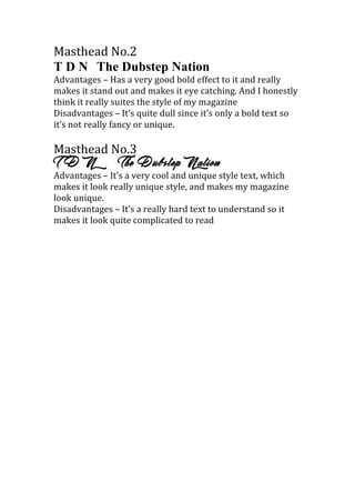
The document compares 6 different fonts and 3 masthead designs for a dubstep music magazine. Each font and masthead is described in terms of advantages like eye-catching appearance or uniqueness, and disadvantages like difficulty to read. Some fonts are seen as too dull or hard to read, while others are praised as standing out well for the genre of dubstep music. The best masthead is said to have a unique yet readable style that suits the magazine well.