Download to read offline


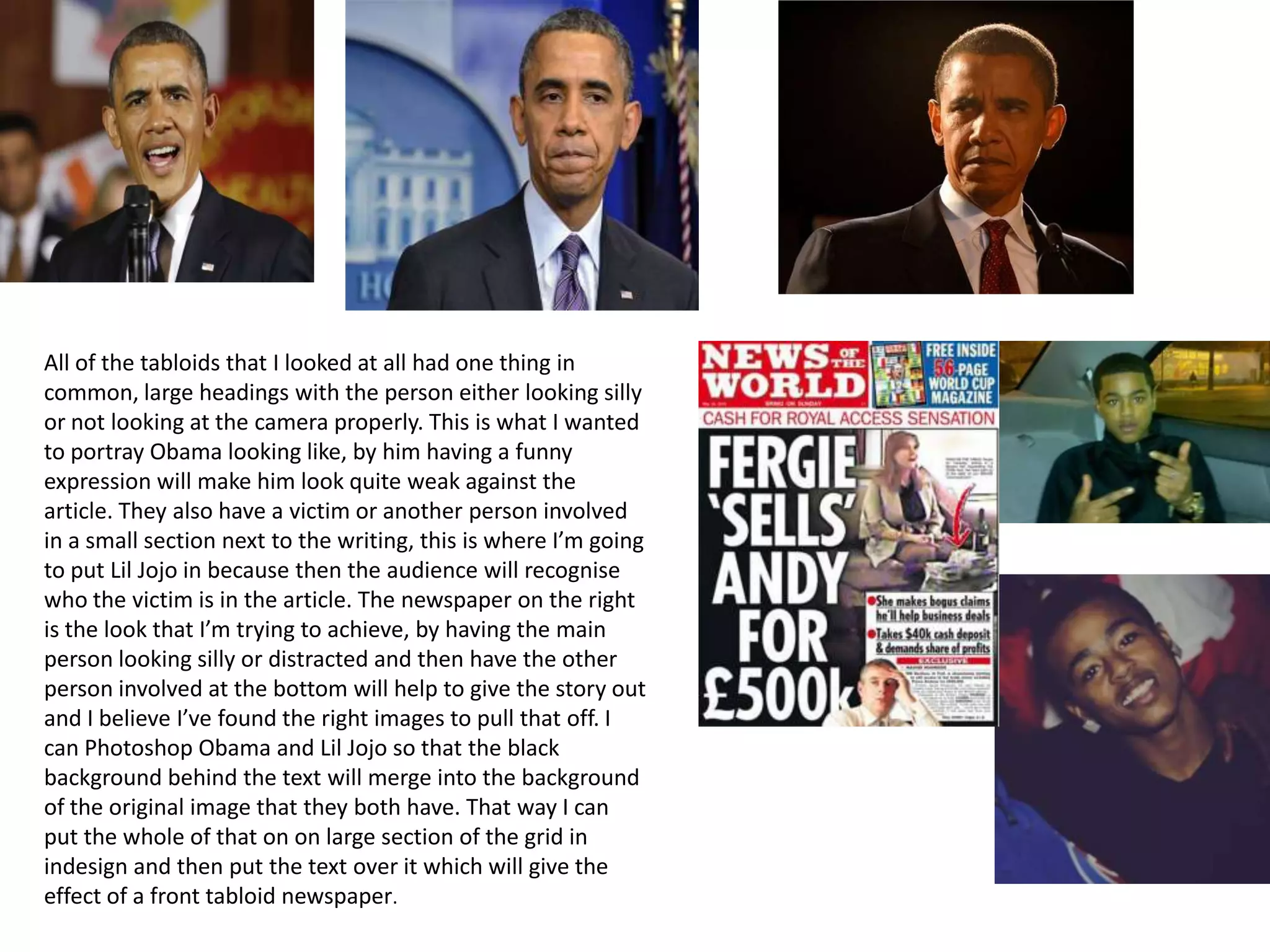
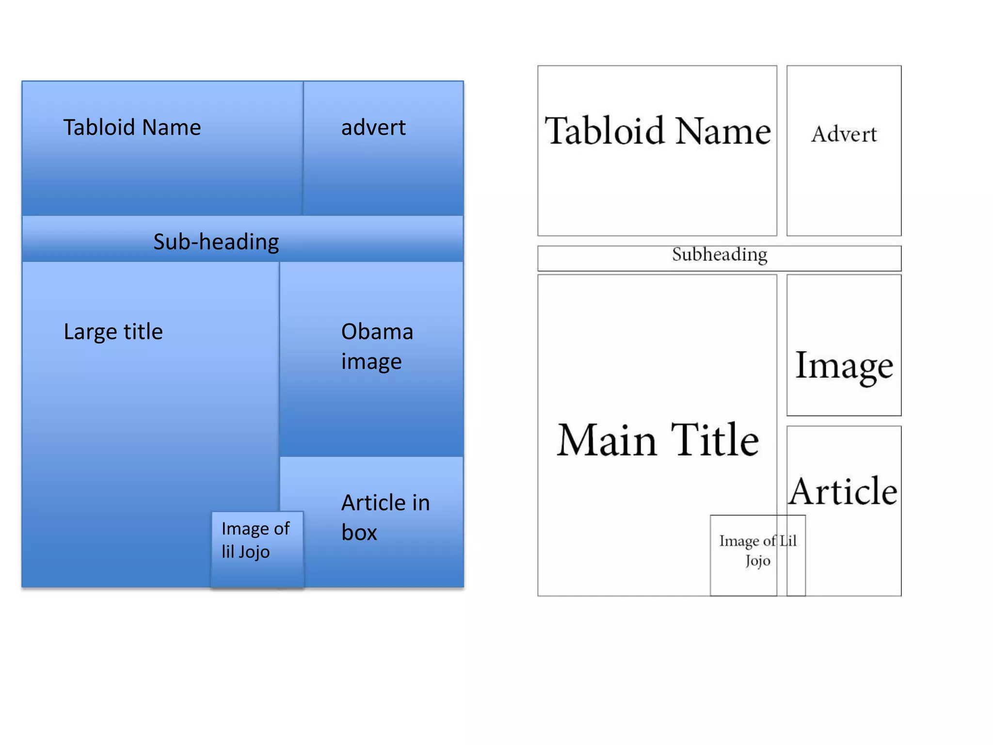
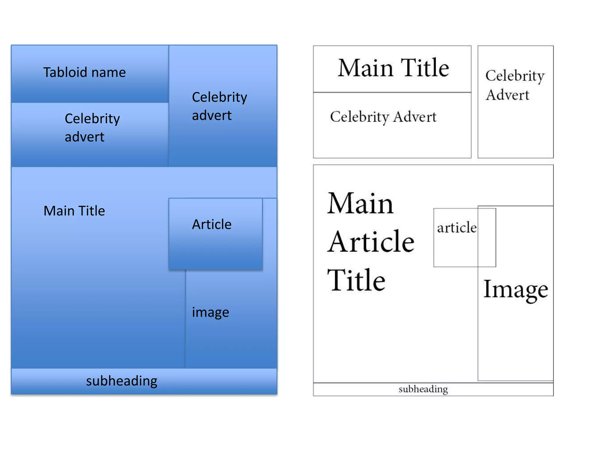
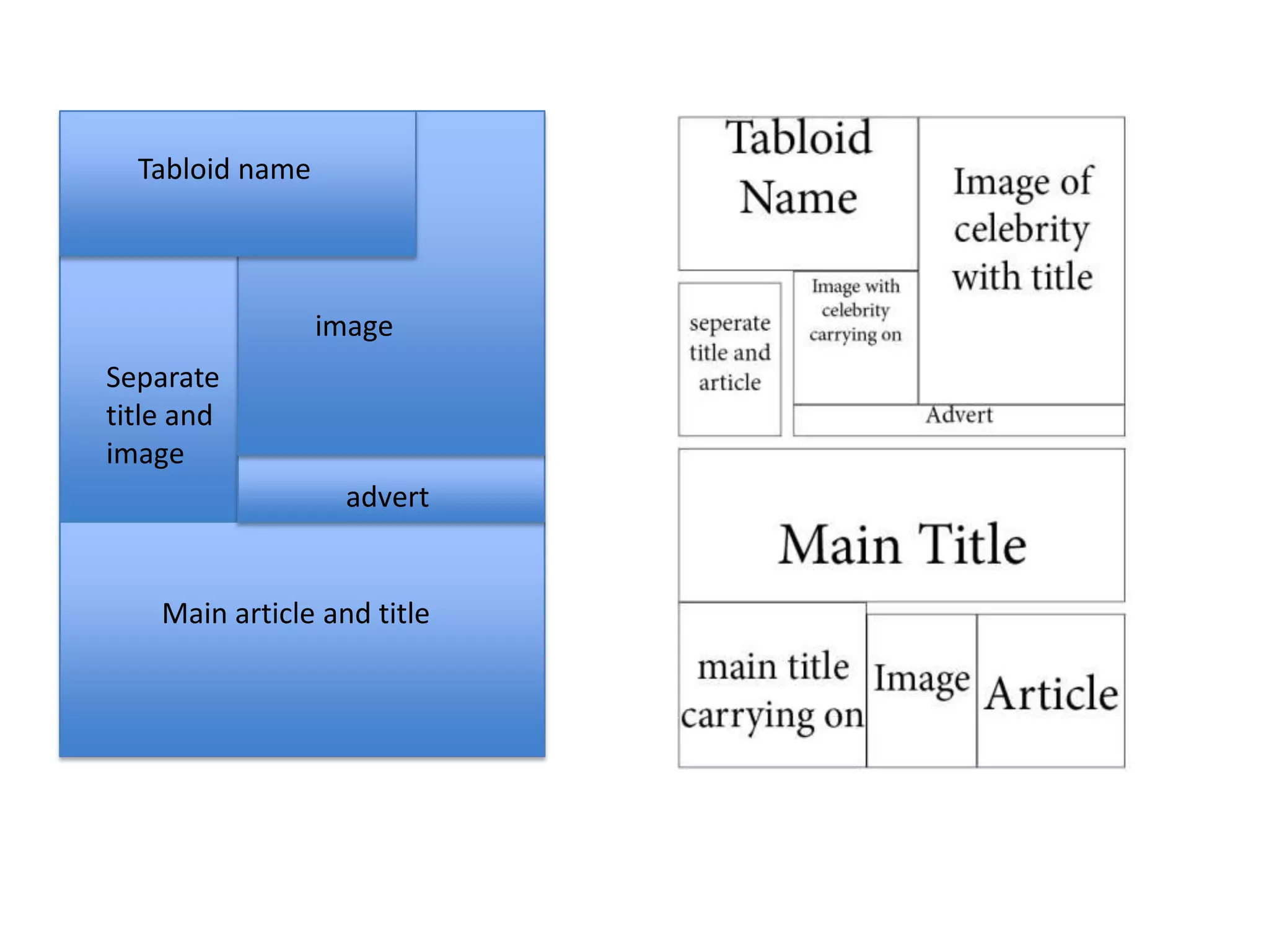


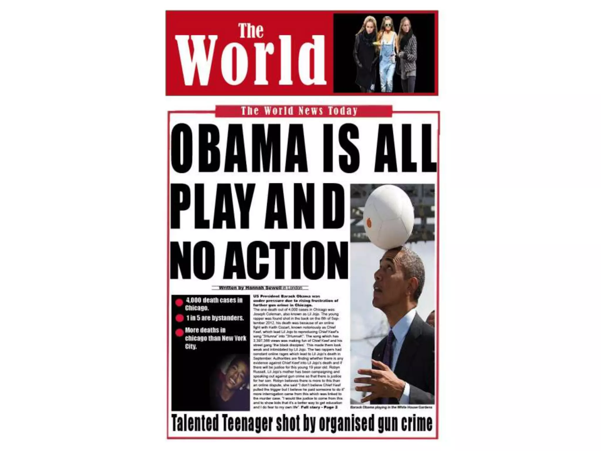


The document discusses font selection and layout design for a student project creating a mock tabloid newspaper. It examines different fonts for headlines, subheadings, and articles, evaluating fonts based on boldness, clarity, and suitability for a tabloid style. Sample fonts considered include Impact, Arial Rounded, and Times New Roman. The document also explores image selection, considering photos of Obama and Lil Jojo to accompany an article, and references layout elements of real tabloids to guide the design, such as large headlines and images with related stories in boxes below.


