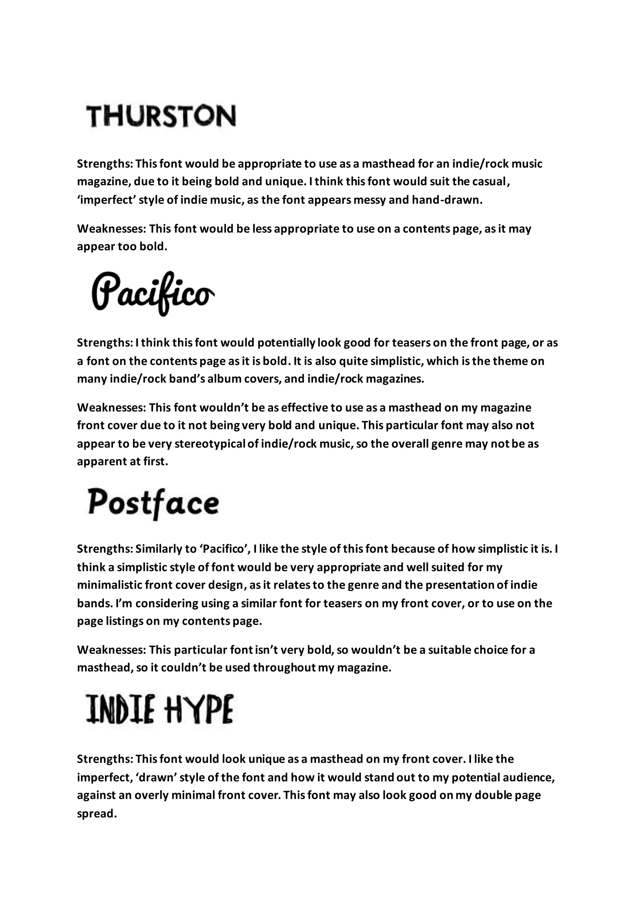
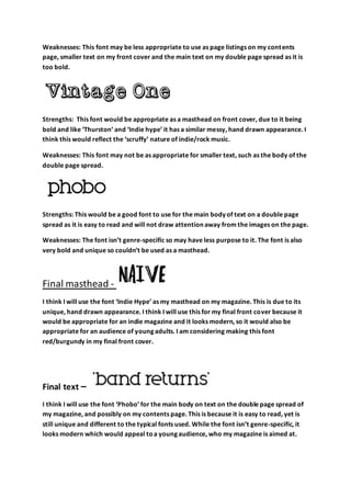
This document evaluates several fonts for their suitability in different elements of an indie/rock music magazine. It considers fonts for the masthead, contents page, front cover teasers, and double page article text. The "Indie Hype" font is selected for the masthead due to its unique, hand-drawn appearance being appropriate for an indie magazine. The "Phobo" font is chosen for the double page text and possibly contents page as it is easy to read while still looking modern to appeal to young audiences.

