Question 1 of 7
•Download as DOC, PDF•
0 likes•247 views
This document discusses how the author's media product, a hip-hop magazine, both uses conventions from real music magazines and challenges them. The author took elements like boxed lettering and cover photo styles from magazines like Fader and Paper but adapted them. Sell lines were placed like in XXL and contents pages followed Vibe's style but with extra photos and spacing. The double-page spread emulated XXL's black and white colors but with a different layout. Column writing and extra information on articles made the magazine more reader-friendly and distinct from competitors like XXL. Overall, the author drew from real magazines but modified elements and added their own touches to develop and challenge existing forms and conventions.
Report
Share
Report
Share

Recommended
Analysis of magazines
The document summarizes the front cover design of a magazine. It discusses several key design elements:
- The masthead is large and bold to stand out as the name of the magazine.
- The main image of Travis Scott is centered to be the focal point. He is darker than the background to make him stand out as superior.
- Cover lines introduce Travis Scott and indicate what's inside the magazine. They are also large and bold to attract attention.
- Non-essential elements like the price and barcode are de-emphasized to not distract from the cover's focus on Travis Scott.
Question 1 evaluation
This document discusses how the author's media product both uses conventions from and challenges real music magazines. Some conventions that were used include taking the boxed lettering style of the masthead from Fader magazine and the sell lines on the front cover from XXL magazine. However, the author also challenged conventions by adding the barcode and price on the front cover to make it easier to see, pricing the magazine cheaper than competitors, including two photos on the contents page for more interest, and using a column layout for articles that is different from XXL. The goal was to both draw from real magazines but also make the design stand out in unique ways.
Evaluation Question 1
AS media evaluations question 1.
In what ways does your media product use, develop or challenge forms and conventions of real media products? - Josh Webb
Billboards research pdf
The document discusses the research done on magazine billboard codes and conventions. It first looked at regional magazines, then fashion magazines like Vogue and Elle to inform a new magazine. It found magazine billboards were rare so also examined newspaper and advertising billboards. By combining codes from magazines, it hopes to create an effective billboard for its new magazine.
Editors page research pdf
The document discusses research conducted on editorial page codes and conventions in regional magazines and fashion magazines. It was found that both types of magazines followed similar conventions. These included using welcoming titles, pictures of smiling editors, easy-to-read editorial notes in black serif font signed by the editor, and a white background. The goal is to combine these conventions from the research into the editorial page design for the author's own fashion magazine.
Evaluation 1
The document discusses the conventions and forms used across various elements of a regional magazine media product, including the front cover, advertisement page, editorial page, contents page, billboard, and website.
For each element, conventions from real regional magazines are followed, such as using a serif masthead in a contrasting color on the front cover. Common visual conventions like airbrushing cover stars and using high key lighting are also employed. Across elements, conventions like including the magazine logo and using short, simple text help guide the audience and maintain consistency. While many conventions are followed, some elements also challenge conventions to further engage audiences.
Conventions of my magazine
Here I'm looking at how my magazine uses, follows and challenges conventions of real media products for my AS Media Studies coursework.
Dizee rascal analysis finished
The document analyzes the design elements of a music magazine cover and contents page. The magazine cover uses bold colors, prominent artist names and images to attract its target audience of teenage music fans. Key elements like the masthead, cover lines and main image are carefully placed following design principles. The contents page similarly uses clear layout, images and offers to guide readers through the magazine in an appealing way for its youthful readership.
Question One Evaluation
This document discusses how the media product challenges conventions of real magazines.
The front cover uses large central images and positioning of the masthead to draw attention, while changing the usual placement of the strapline. The contents page separates articles into boxes and includes a section from the staff writer for personalization.
The double page spread continues the color scheme and features the main article band. It includes polaroid images, an exclusive interview in different colors, and a dotted line to allow cutting out the poster image - challenging conventions by making the image take over one page without other text.
Nme analysis
The magazine cover features Dizzee Rascal as the main image and cover line. Various design elements are used to draw attention to key information, such as the title in red capital letters and a pull quote from Dizzee Rascal. Inside, the contents page lists the articles and bands featured, while the editorial previews an upcoming 16-page tour special section. Dizzee Rascal's interview spreads over two pages, with large quotes and images used to give a sense of what he discusses around topics like fame and his past.
Question 1 done
My media product conforms to magazine conventions by using teasers, captions, and a direct address interview style. It challenges conventions by using a unique black and white masthead title "Giant Step" inspired by jazz musician John Coltrane. The magazine aims to appeal to both young and older readers by including a spotlight column on up-and-coming artists to attract younger readers as they become fans of the magazine over time, helping to build a stable readership. Formal elements like layout, cover design, typography, and contents page follow magazine conventions while the overall presentation style focuses on black and white photography to create a distinctive and memorable style.
Question 1 in what ways does your media
This document discusses how the author's media product of a magazine, billboard, and radio ad uses and develops conventions of real media while also challenging some conventions.
The magazine cover, layout, and elements like the masthead, selling line, barcode, and cover lines follow conventions of real magazines. However, some elements are developed differently, like changing fonts and layouts.
Individual pages also use conventions from example magazines but make some challenges, like including fewer articles on the contents page. Advertisements and interviews are similarly modeled after real media examples but with some unique elements.
The billboard keeps information minimal as is conventional but links to social media, developing the convention. Overall, the author strives to
Nme mag analysis task 1
The document summarizes the layout and design elements of a magazine cover and articles. Key elements include a masthead in the top left, grab quotes and cover lines to attract readers, sans serif fonts for simplicity, prominent images featuring important artists, and a limited color palette sticking to traditional red and white colors. The target audience appears to be middle brow and between the ages of 16 to 30 based on the design's emphasis on prominent artists and informal language.
Dizee rascal analysis
The document analyzes the design elements of a music magazine cover and contents page. It discusses how the masthead, images, text, and color scheme are used to attract the target audience of teenage music fans. Elements like the cover stars, headline, and price make the magazine appealing to buyers. The contents page then lists the articles in an easy-to-read format to encourage readers to explore the issues.
Question 1
The document provides details about the design choices for various elements of a music magazine cover and contents page. For the cover, the designer placed the masthead at the top in large typography and included a tagline. The main image features a female artist looking at the camera to draw attention. Cover lines along the right promote various artists. On the contents page, images of the front cover artist and another are included along with section headings and editor's notes. Social media links are also included. The double page article spread features a large image of the artist and headings that overlap the image. The article text includes paragraph separation lines and a pull quote.
Question 1
The document provides details about the design choices for various elements of a music magazine cover and contents page. For the cover, the masthead and tagline are placed at the top in large typography. The dominant image features a female artist looking at the camera to draw attention. Cover lines along the right promote artists and articles. On the contents page, the layout and elements are modeled after other magazines, including a large dominant image and editors note at the bottom. Social media links are included to promote the magazine across platforms.
Question 1
The document provides details about the design choices for various elements of a mock music magazine cover and contents page. For the cover, the designer drew inspiration from other magazines for elements like the masthead, dominant image, banner placements, and cover lines. They aimed to feature a variety of popular R&B artists. The contents page layout mimicked another magazine, with a large cover image and editor's note. Social media links were included to promote the magazine across platforms.
Analysis of professional magazine covers.pptx
The document analyzes conventions used in magazine covers, specifically rock magazines like Kerrang. It discusses several common elements and their purposes, including the positioning statement, masthead, splash, main headline, coverlines, barcode/date/price, main image, and color scheme. For each element, it provides examples from Kerrang magazines of how they follow or adapt typical conventions, such as using distinctive fonts, solid colors, sizes and positioning to draw attention and make elements readable.
Textual analysis
The document analyzes the design elements of magazine covers for Q magazine and Mojo magazine. For Q, the red masthead stands out to attract readers' attention. Photos use medium close-ups to feel personal. Pull quotes and headlines entice readers to learn more inside. Mojo also uses bold design and photos to attract readers. A free CD inclusion and cover details about articles are meant to increase interest and sales. Both magazines employ consistent color schemes and layouts to build recognizability.
Textual analysis
The document analyzes the design elements of magazine covers for Q magazine and Mojo magazine. For Q, the red masthead stands out to attract readers' attention. Photos use medium close-ups to feel personal. Pull quotes and headlines entice readers to learn more inside. Mojo also uses bold design and photos to attract readers. A free CD inclusion and cover details on articles aim to increase interest and sales. Both magazines employ consistent color schemes and layouts to build recognizability.
Textual analysis
The document analyzes the textual elements and design choices on the cover and contents page of a Q magazine issue. On the cover, the masthead, color scheme, headline, featured image, pull quotes, and other elements are intended to attract readers' attention and make the magazine stand out. Similarly, the main image, headings, pull quotes, and boxes on the contents page are hierarchical in order to guide readers' eyes to the most important information. Throughout, the magazine employs consistent design and formatting elements to clearly convey information and build recognizability with its audience.
Tasks 1 4 and hwk 1
The document provides an analysis of the design elements used in a magazine cover and contents pages, focusing on typography, color, images, layout, and language. For the magazine cover, serif fonts in bold are used to catch attention, and varying font sizes draw the eye to different areas. Blacks and reds set a moody tone. Celebrity images promote the magazine's genre. The formal layout contrasts the genre's rule-breaking attitude.
The contents pages continue the color scheme and reference cover images. Numbers clearly label sections to aid navigation. Columns organize information neatly. Band names in bold capitals further entice readers. Overall the design solidifies the magazine's brand identity as focused on dark emotions within the rock
Contents page overview
Each contents page from We Love Pop magazine maintains the brand's signature style through consistent layout and design elements that allow readers to easily identify each issue as belonging to the magazine. Key recurring visuals include the "We Love This" masthead at the top, photos of featured artists, a letter from the editor, and the "Inside This Month" section listing articles. While the color scheme and smaller details vary, the overall structure and features remain the same across issues to reinforce the magazine's brand identity and attract its target audience of young female pop fans.
Ben fox
This document provides guidance on presentation methods for evaluations, including Popplet, Prezi, Padlet, and video/screen recordings. It also includes evaluation questions about representing social groups in media products and distributing media products through publishing houses. Students are asked to discuss how their media product uses or challenges conventions of real media products, represents particular social groups, and which media institution might distribute their product. Suggested publishing houses include Bauer Media, which distributes magazines like Kerrang. Students are asked to consider revenue expectations in the first year of distribution.
Magazine analysis
The document discusses magazine design elements like mastheads, coverlines, images, and fonts used to attract readers and highlight key articles. Specific magazines discussed include NME and Kerrang, focusing on how they organize content and advertise music articles, interviews, and other features to appeal to their target audiences. Color schemes, layouts, and promotional elements like competitions are described as ways magazines engage readers and motivate purchases.
Magazine analysis
This document provides a detailed analysis and summary of the key design elements and conventions used across magazine covers and interior pages. Some of the main points summarized are:
- Magazine covers use celebrity images, pull quotes from articles, and lists of features to attract and engage readers. Interior pages employ columnar text, varied image sizes, and lists of articles to guide readers through content.
- Common conventions like placement of barcodes, prices and mastheads are analyzed. Design choices aim to highlight important information while de-emphasizing less important details.
- Color schemes, fonts, image compositions and other mise-en-scene elements are chosen deliberately based on the target audience and topic. For example, a music
Contents page overview edited
The document analyzes the contents pages of four issues of "We Love Pop" magazine. It finds that the contents pages all maintain the magazine's brand identity through consistent stylistic features. These include displaying the magazine title "We Love This" in signature font at the top, presenting a letter from the editor alongside the cover artist, and using a color scheme of black text with a contrasting bright color. The layout also consistently features the largest image of the cover artist, additional celebrity photos, and smaller poster images at the bottom. These elements create a recognizable identity while still allowing for uniqueness between issues.
Contents page analysis
The contents page uses the same house style, font, and masthead as the rest of the magazine to provide familiarity and recognizability for the reader. A large central image is used to draw the eye in, with contents listed on either side in columns. Sections are made distinct through bold headings, and minimal descriptive text keeps the layout clean and easy to navigate.
Evaluation activity 1
The document summarizes how the student's media product uses and develops conventions of real magazines. For the cover title, the font fits conventions but challenges conventions by using different fonts on interior pages. Page layouts are similar to Q Magazine. Images use close-ups and framing like real magazines. The article font and layout is readable like Q Magazine but the header style is more centralized. The magazine represents the alternative rock genre through clothing and lipstick. Artists are depicted simply to avoid distraction from their image. The color scheme develops conventions from magazines like Q and Vibe.
Colour palette 9
Red and white colors were used in a palette to make the red color stand out more prominently compared to other colors. A limited color scheme of red and white was selected to emphasize the red hue. The document provides a brief description of a color palette using red and white to highlight the red color.
More Related Content
What's hot
Question One Evaluation
This document discusses how the media product challenges conventions of real magazines.
The front cover uses large central images and positioning of the masthead to draw attention, while changing the usual placement of the strapline. The contents page separates articles into boxes and includes a section from the staff writer for personalization.
The double page spread continues the color scheme and features the main article band. It includes polaroid images, an exclusive interview in different colors, and a dotted line to allow cutting out the poster image - challenging conventions by making the image take over one page without other text.
Nme analysis
The magazine cover features Dizzee Rascal as the main image and cover line. Various design elements are used to draw attention to key information, such as the title in red capital letters and a pull quote from Dizzee Rascal. Inside, the contents page lists the articles and bands featured, while the editorial previews an upcoming 16-page tour special section. Dizzee Rascal's interview spreads over two pages, with large quotes and images used to give a sense of what he discusses around topics like fame and his past.
Question 1 done
My media product conforms to magazine conventions by using teasers, captions, and a direct address interview style. It challenges conventions by using a unique black and white masthead title "Giant Step" inspired by jazz musician John Coltrane. The magazine aims to appeal to both young and older readers by including a spotlight column on up-and-coming artists to attract younger readers as they become fans of the magazine over time, helping to build a stable readership. Formal elements like layout, cover design, typography, and contents page follow magazine conventions while the overall presentation style focuses on black and white photography to create a distinctive and memorable style.
Question 1 in what ways does your media
This document discusses how the author's media product of a magazine, billboard, and radio ad uses and develops conventions of real media while also challenging some conventions.
The magazine cover, layout, and elements like the masthead, selling line, barcode, and cover lines follow conventions of real magazines. However, some elements are developed differently, like changing fonts and layouts.
Individual pages also use conventions from example magazines but make some challenges, like including fewer articles on the contents page. Advertisements and interviews are similarly modeled after real media examples but with some unique elements.
The billboard keeps information minimal as is conventional but links to social media, developing the convention. Overall, the author strives to
Nme mag analysis task 1
The document summarizes the layout and design elements of a magazine cover and articles. Key elements include a masthead in the top left, grab quotes and cover lines to attract readers, sans serif fonts for simplicity, prominent images featuring important artists, and a limited color palette sticking to traditional red and white colors. The target audience appears to be middle brow and between the ages of 16 to 30 based on the design's emphasis on prominent artists and informal language.
Dizee rascal analysis
The document analyzes the design elements of a music magazine cover and contents page. It discusses how the masthead, images, text, and color scheme are used to attract the target audience of teenage music fans. Elements like the cover stars, headline, and price make the magazine appealing to buyers. The contents page then lists the articles in an easy-to-read format to encourage readers to explore the issues.
Question 1
The document provides details about the design choices for various elements of a music magazine cover and contents page. For the cover, the designer placed the masthead at the top in large typography and included a tagline. The main image features a female artist looking at the camera to draw attention. Cover lines along the right promote various artists. On the contents page, images of the front cover artist and another are included along with section headings and editor's notes. Social media links are also included. The double page article spread features a large image of the artist and headings that overlap the image. The article text includes paragraph separation lines and a pull quote.
Question 1
The document provides details about the design choices for various elements of a music magazine cover and contents page. For the cover, the masthead and tagline are placed at the top in large typography. The dominant image features a female artist looking at the camera to draw attention. Cover lines along the right promote artists and articles. On the contents page, the layout and elements are modeled after other magazines, including a large dominant image and editors note at the bottom. Social media links are included to promote the magazine across platforms.
Question 1
The document provides details about the design choices for various elements of a mock music magazine cover and contents page. For the cover, the designer drew inspiration from other magazines for elements like the masthead, dominant image, banner placements, and cover lines. They aimed to feature a variety of popular R&B artists. The contents page layout mimicked another magazine, with a large cover image and editor's note. Social media links were included to promote the magazine across platforms.
Analysis of professional magazine covers.pptx
The document analyzes conventions used in magazine covers, specifically rock magazines like Kerrang. It discusses several common elements and their purposes, including the positioning statement, masthead, splash, main headline, coverlines, barcode/date/price, main image, and color scheme. For each element, it provides examples from Kerrang magazines of how they follow or adapt typical conventions, such as using distinctive fonts, solid colors, sizes and positioning to draw attention and make elements readable.
Textual analysis
The document analyzes the design elements of magazine covers for Q magazine and Mojo magazine. For Q, the red masthead stands out to attract readers' attention. Photos use medium close-ups to feel personal. Pull quotes and headlines entice readers to learn more inside. Mojo also uses bold design and photos to attract readers. A free CD inclusion and cover details about articles are meant to increase interest and sales. Both magazines employ consistent color schemes and layouts to build recognizability.
Textual analysis
The document analyzes the design elements of magazine covers for Q magazine and Mojo magazine. For Q, the red masthead stands out to attract readers' attention. Photos use medium close-ups to feel personal. Pull quotes and headlines entice readers to learn more inside. Mojo also uses bold design and photos to attract readers. A free CD inclusion and cover details on articles aim to increase interest and sales. Both magazines employ consistent color schemes and layouts to build recognizability.
Textual analysis
The document analyzes the textual elements and design choices on the cover and contents page of a Q magazine issue. On the cover, the masthead, color scheme, headline, featured image, pull quotes, and other elements are intended to attract readers' attention and make the magazine stand out. Similarly, the main image, headings, pull quotes, and boxes on the contents page are hierarchical in order to guide readers' eyes to the most important information. Throughout, the magazine employs consistent design and formatting elements to clearly convey information and build recognizability with its audience.
Tasks 1 4 and hwk 1
The document provides an analysis of the design elements used in a magazine cover and contents pages, focusing on typography, color, images, layout, and language. For the magazine cover, serif fonts in bold are used to catch attention, and varying font sizes draw the eye to different areas. Blacks and reds set a moody tone. Celebrity images promote the magazine's genre. The formal layout contrasts the genre's rule-breaking attitude.
The contents pages continue the color scheme and reference cover images. Numbers clearly label sections to aid navigation. Columns organize information neatly. Band names in bold capitals further entice readers. Overall the design solidifies the magazine's brand identity as focused on dark emotions within the rock
Contents page overview
Each contents page from We Love Pop magazine maintains the brand's signature style through consistent layout and design elements that allow readers to easily identify each issue as belonging to the magazine. Key recurring visuals include the "We Love This" masthead at the top, photos of featured artists, a letter from the editor, and the "Inside This Month" section listing articles. While the color scheme and smaller details vary, the overall structure and features remain the same across issues to reinforce the magazine's brand identity and attract its target audience of young female pop fans.
Ben fox
This document provides guidance on presentation methods for evaluations, including Popplet, Prezi, Padlet, and video/screen recordings. It also includes evaluation questions about representing social groups in media products and distributing media products through publishing houses. Students are asked to discuss how their media product uses or challenges conventions of real media products, represents particular social groups, and which media institution might distribute their product. Suggested publishing houses include Bauer Media, which distributes magazines like Kerrang. Students are asked to consider revenue expectations in the first year of distribution.
Magazine analysis
The document discusses magazine design elements like mastheads, coverlines, images, and fonts used to attract readers and highlight key articles. Specific magazines discussed include NME and Kerrang, focusing on how they organize content and advertise music articles, interviews, and other features to appeal to their target audiences. Color schemes, layouts, and promotional elements like competitions are described as ways magazines engage readers and motivate purchases.
Magazine analysis
This document provides a detailed analysis and summary of the key design elements and conventions used across magazine covers and interior pages. Some of the main points summarized are:
- Magazine covers use celebrity images, pull quotes from articles, and lists of features to attract and engage readers. Interior pages employ columnar text, varied image sizes, and lists of articles to guide readers through content.
- Common conventions like placement of barcodes, prices and mastheads are analyzed. Design choices aim to highlight important information while de-emphasizing less important details.
- Color schemes, fonts, image compositions and other mise-en-scene elements are chosen deliberately based on the target audience and topic. For example, a music
Contents page overview edited
The document analyzes the contents pages of four issues of "We Love Pop" magazine. It finds that the contents pages all maintain the magazine's brand identity through consistent stylistic features. These include displaying the magazine title "We Love This" in signature font at the top, presenting a letter from the editor alongside the cover artist, and using a color scheme of black text with a contrasting bright color. The layout also consistently features the largest image of the cover artist, additional celebrity photos, and smaller poster images at the bottom. These elements create a recognizable identity while still allowing for uniqueness between issues.
Contents page analysis
The contents page uses the same house style, font, and masthead as the rest of the magazine to provide familiarity and recognizability for the reader. A large central image is used to draw the eye in, with contents listed on either side in columns. Sections are made distinct through bold headings, and minimal descriptive text keeps the layout clean and easy to navigate.
What's hot (20)
Viewers also liked
Evaluation activity 1
The document summarizes how the student's media product uses and develops conventions of real magazines. For the cover title, the font fits conventions but challenges conventions by using different fonts on interior pages. Page layouts are similar to Q Magazine. Images use close-ups and framing like real magazines. The article font and layout is readable like Q Magazine but the header style is more centralized. The magazine represents the alternative rock genre through clothing and lipstick. Artists are depicted simply to avoid distraction from their image. The color scheme develops conventions from magazines like Q and Vibe.
Colour palette 9
Red and white colors were used in a palette to make the red color stand out more prominently compared to other colors. A limited color scheme of red and white was selected to emphasize the red hue. The document provides a brief description of a color palette using red and white to highlight the red color.
Bauer publishing
Bauer Media Groups is a large European media publisher based in Hamburg, Germany that manages over 600 magazine titles including Empire, Q, Kerrang and Heat. They have experience publishing various music magazines and would be a suitable publisher for a new magazine.
Stages of cover
Cover bands typically go through three stages as they develop their skills and popularity. In the beginning, cover bands focus on learning other artists' songs and performing regularly to gain experience. As the band improves, they may start to write some original music while still performing covers to draw larger crowds. More established cover bands have honed their skills and may choose to focus more on original songs while occasionally playing well-known covers that their audience enjoys.
Stages Of Double Page Spread
Double page spreads in books or magazines have two main stages of development. First, the left and right pages are designed separately with independent visual elements, headlines, images and copy. Second, the pages are brought together and final layout is done to create unity and visual flow between the facing pages through alignment of elements and use of common colors or graphics.
Mini clase
Este documento habla sobre la deforestación y busca concientizar a estudiantes de secundaria sobre la importancia de conservar los bosques. Explica que la deforestación es causada principalmente por la expansión agrícola y ganadera, así como por la extracción de productos forestales. Sus principales consecuencias son la pérdida de sumideros de carbono, cambios en los suelos y sequías. Propone educar a los estudiantes sobre las causas y consecuencias de la deforestación y formas de combatirla para promover un desarrollo sosten
Herramientas web 2.0
El documento habla sobre las herramientas de la Web 2.0 y sus usos. Describe brevemente el origen del término Web 2.0 y algunas herramientas populares como blogs, Twitter y Dropbox. Finalmente, concluye que la Web 2.0 ha permitido una mayor difusión de información de manera masiva y a bajo costo.
Evaluation 1
The document provides details on the design and layout choices for various elements of an indie music magazine created by the author. Key influences included magazines like Loud and Quiet, Fader, and Dazed. Simplistic fonts and a black and white color scheme were used to conform to indie magazine conventions. Photographs were composed and lit to draw attention to the featured artist. Unconventional elements like tilted frames and layered text were included to make the magazine unique. Overall, the design aims to represent the indie genre through a clean, minimal aesthetic while adding some distinguishing characteristics.
Question 2
This document discusses how the media product represents particular social groups through the styling of artists in the magazine. Research was conducted into the target audience, which fits into the "Leading Edge Tribe" that combines influences to create their own individual style. The artists were styled to look fashionable yet relatable by mixing statement pieces like cardigans with more mainstream items. Casual but polished outfits featuring brands like Adidas represent the social group's interest in being on-trend while expressing individuality. The artists' ages of 16-17 make the magazine realistic for its audience.
Double page spread 1
The document discusses the layout and design choices in a double page magazine spread. Various design elements are used to attract the target audience of rebellious teens and young adults. The title is slanted to add visual interest, while images and artist names are positioned in overlapping sizes and bold red text to guide the eye across the page quickly. The small, easy-to-read text is appropriate for the intended audience. Comedy is also used to draw in readers of different types through a lighthearted questioning of a band. Strategic use of red further engages the reader with exciting connotations.
Viewers also liked (12)
Similar to Question 1 of 7
Evaluation question 5
This document discusses how the media producer's magazine product uses and develops conventions from real magazines.
The producer researched magazines like Mixmag and Vibe to gather ideas for layouts. Elements copied from Mixmag include a large rectangular cover image, contents listing with date and title in the same place, and double page spreads with one large image and columns of text.
Elements developed from Vibe include a simple masthead, highlighted cover lines, centrally placed cover image and title, and split contents title stacked on top of each other. The producer challenged conventions by placing the main cover line in the center rather than right.
Overall, the producer aimed to make the magazine look professional by copying proven layout techniques from
Evaluation
The document discusses how the media product Pulverizer uses and challenges conventions of real heavy metal magazines. It follows many conventions from magazines like Terrorizer in terms of cover design, masthead placement, barcode positioning, and contents page layout. However, it also challenges some conventions by using an aged paper background on the contents page and excluding drop capitals. The goal is to create a magazine that looks professional but also stands out from its peers.
Music Magazine Evaluation
The document discusses the process of researching and analyzing other magazines to inform the creation of an RnB magazine. It describes finding magazines aimed at similar audiences, such as Q magazine, and analyzing their front covers, contents pages, and spreads. The document then analyzes how the author's magazine does or does not follow conventions from these reference magazines in terms of things like mastheads, color schemes, plugs, pictures, headlines, and writing styles.
Evaluation Of My Music Magazine
- The document evaluates the student's music magazine project in terms of how it uses and develops conventions of real magazines.
- Key conventions used include featuring an artist on the front cover, using consistent colors as a brand, and including article titles and page numbers.
- Some conventions were challenged, such as placing the barcode in the bottom left instead of right.
- Overall the student learned about magazine design conventions and technologies like InDesign through completing this project.
Evaluationneed to finish
The document discusses the process of creating a magazine. It begins by outlining how the creator used conventions from similar magazines like We Love Pop and Top of the Pops as inspiration, while also trying to challenge some conventions. Details are provided on specific design choices for the magazine cover, layout, and content that both follow and challenge industry conventions. Throughout the document, the creator reflects on targeting their magazine at a slightly older demographic of 12-18 year olds and focusing on female artists. The goal was to create a magazine that would appeal to mainstream audiences while putting a new spin on standard magazine conventions.
Evaluation
The document discusses how the creator of a new magazine used conventions from similar magazines like We Love Pop and Top of the Pops as inspiration, but also challenged some conventions. The creator analyzed what elements the magazines had in common and experimented with things like title design, image placement, backgrounds, and text formatting to make the new magazine stand out while still looking professional. The goal was to attract the target teenage audience and compete with other magazines in the genre.
Evaluation question 1
The document analyzes the ways in which the author's mock magazine cover and contents follow or challenge conventions of real hip hop magazines. It finds that some elements are conventional - like using a masthead in the top left, cover lines in the left and right thirds, a bold main cover line, and columns of text. However, other aspects are unconventional, such as placing the masthead over the image, using a handwritten font, and including black and white photos. Overall, the author aimed to be both conventional to attract readers but also unconventional to make the magazine stand out.
Harry seager
The document provides details about the design and content of a magazine coursework project. It summarizes the key design elements and conventions used from real magazines for the front cover, contents page, and double page spread. These include using a large central image on the front cover, splitting the contents into numbered sections, and including quotes and multiple columns of text for articles. The target audience is described as teenagers and young adults, and the document discusses using young, cool artists and some informal language to attract this age group. Finally, it outlines the software and design process used to construct the magazine, including using Word for initial planning and Publisher, Fireworks, and Paint for layout, images, and masthead design.
Harry seager
The document provides details about the design and content of a magazine coursework project. It describes how the student used conventions from real magazines for the front cover, contents page, and double page spread layout. This included using large cover images, section headings on the contents page, and columns of text and images on the double page spread. The intended audience is described as teenagers and young adults, and the color scheme and article topics were chosen to attract this demographic. Feedback from peers praised the color scheme and engaging article topics. The student also reflects on using software like Word, Publisher, Paint, and Fireworks to design the magazine pages.
Evaluation question 5
The author modeled their magazine after Rocksound magazine in terms of structure, colors, and positioning of elements like the masthead and sell lines. While similar overall, some differences exist like additional sell lines and improved spacing on the author's magazine based on feedback. Inside content is arranged similarly to Kerrang with images on the left and text on the right. Models, poses, and props indicate the genre. The author aims to make the magazine feel professional and relatable to the target audience.
Evaluation media powerpoint
The document provides an evaluation of the student's media magazine product. It discusses how the magazine challenges conventions of real magazines through its design elements like cover lines and masthead placement. It also compares the magazine's design to professional magazines, noting similarities like strong central images and differences like additional banners. The student learned about magazine design conventions by researching different genres. Overall, the document evaluates how the student's magazine represents the drum and bass music audience and how it compares to professional magazines.
Question 1
The document summarizes the layout and design choices for a student-created hip hop magazine. Consistency of style across pages was a key goal, using colors like red, black, white and gold inspired by existing magazines. Font choices, image placement and sections like features and editor's notes follow conventions of the genre. The front cover masthead, headline and banner are designed to stand out and attract readers, while interior pages group content clearly and include relevant photos matching the theme. Overall the magazine layout aims to engage the target youth audience while developing conventions of established publications.
Media task 1 and 2 evaluation
1) The document discusses the process of creating a magazine focused on the hip-hop genre. Research was conducted on existing hip-hop magazines to determine conventions.
2) The front cover was designed to replicate a cover from Vibe magazine, including using a similar photo of Drake, color scheme, and font. Additional details were included to match industry standards.
3) The contents page was modeled after formats from different versions of Vibe but with adjusted colors and text positioning. Elements like masthead, images, and page numbers were included to match the house style.
4) The double page spread copied magazine conventions like close-up images, columns, and capital letters at paragraph starts, while adapting the color
My evaluation
Will Harris evaluates his music magazine project. He based his magazine style on The Wire, Clash, Dazed, and Sneeze magazines, using conventions like fixed-width fonts and centering the masthead at the top of the cover page. He developed conventions further, like using minimal cover lines to focus on the artist. He challenged conventions with an unstructured double-page spread. His target audience is 20-year-olds, and he represents them through images of individuals expressing themselves through fashion and music. He aims to attract this audience with affordable price, interviews, and casual tone. He thinks Dazed Media would be a good distributor because they celebrate youth culture through multiple platforms.
Human: Thank you for
Question 1
The document discusses how the media producer's magazine follows and challenges conventions of real magazines.
It follows conventions in its logo design by using red and a simple font, including a tagline. The front cover image has eye contact and a plain background like other magazines. The double page layout uses standard column sizes and includes large titles and pull quotes. The contents page has a large image and subscription box. It keeps a consistent house style of red, white and black throughout.
Some ways it challenges conventions are through its front cover image editing style, choice of clothing on the cover model, and use of a pattern in the background of one page.
Music Magazine Evaluaion
The document summarizes how the magazine uses, develops, and challenges conventions of real magazines in its design. For the front cover, it follows conventions like including a masthead, main image, price and date, but challenges conventions by placing the masthead sideways and not including additional design elements. For the contents page, it uses conventional elements like columns and main images but challenges conventions by omitting the editor's letter. The double page spread develops conventions through the main image but also follows conventions with design choices like drop caps and bylines.
Evaluation
The document discusses the evaluation of a media magazine product. It summarizes how the magazine uses conventions of real magazines through its bold front cover design and use of images. It organizes content through clear section headings and uses double page spreads of artists consistently. The magazine represents young black audiences interested in grime music through its photos and topics. It would be well-suited for distribution by Bauer Media given their audience. The target audience is described as young people aged 16-25 interested in grime music, clothing and careers in the industry.
Media evaluation question 1
My media product challenges some conventions of magazines while developing and using others. It challenges conventions by stating "Inside this week" instead of "Contents" on the contents page and by focusing solely on British artists, which hasn't been done before. It develops conventions by using more than one image on the front cover and three columns on the double page spread instead of two. The product also uses conventions like placing the masthead in the top left of the front cover and including a quote on the double page spread.
Q1 evaluation
Throughout the document, the author discusses how their media product, a music magazine, uses and develops conventions from real music magazines like Kerrang and Rock Sound. The author chose conventional colors like black, red, white and yellow for the magazine's color scheme. Fonts, mastheads, barcodes, pull quotes, and other design elements were modeled after examples from existing magazines. While conforming to typical magazine conventions, the author also made some unconventional changes like removing a puff piece and adjusting colors and sizes. The goal was to create a realistic magazine that would appeal to readers while also developing the conventions in minor ways.
Evaluation
- The document provides an evaluation of the student's music magazine project, analyzing how it uses and challenges conventions of real magazines.
- Key conventions included are a central cover image, house colors, article listings on the inside, pull quotes, and page numbers. Some conventions were challenged like barcode placement.
- The magazine represents and targets London youth aged 15-19 interested in genres like grime, R&B, and hip-hop through the included content, language, and price.
- Distribution through a company like IPC would allow wider reach and cross-promotion across media.
Similar to Question 1 of 7 (20)
More from GeorgeAnderton21
Evaluation question 1 final.
1) The document discusses the process of creating a music video for an indie/rock band. It outlines researching conventions of the genre and choosing to focus on a "performance video" style.
2) Key conventions incorporated included linking lyrics and visuals, matching the energetic music with movement in the video, and using camera techniques common in other indie/rock music videos.
3) Specific techniques explored were close-ups, handheld camera shots from different angles, and negative color filters during editing to make the video stand out. Attention was paid to balancing conventions with originality.
Evaluation question 2 draft
The document discusses how the creator linked three media products - two ancillary products and a music video - by using consistent conventions. Specifically, the creator used similar costumes, fonts, and color schemes across all three products to make clear they were all from the same band. Casual costumes were chosen to fit the indie/rock genre. Bold, large fonts in titles were used on the digipak and advert to stand out, as bands in the genre traditionally do. Pink, black, and white colors were featured on all products as they are commonly used in the genre and help the products be recognized as coming from the same band.
Kasabian advert analysis
Kasabian's debut album advertisement uses a black and white color scheme like the Arctic Monkeys to draw attention. It splits the ad into quarters with the band name in large white font at the top to ensure recognition. In the middle is a simple masked image that captures the eye. At the bottom are details of the debut album, including popular singles to entice purchases and boost sales.
AM advert analysis
The document describes the advertising for Arctic Monkeys' album AM. It uses a simple black and white color scheme that stands out and complies with the band's retro style. The advertisement features the band name in large white text at the top, the album cover photo in the center, and the album name and release date at the bottom to clearly communicate the key information to fans. The basic layout and consistent font help fans instantly recognize the band and album.
Double page preliminary
This document contains a series of repeated words and images with some text fragments. It does not appear to convey a clear message or idea due to the lack of coherent sentences, context or structure. The summary cannot extract any essential information from the document as it stands.
Final evaluation 5
The document summarizes how the creator attracted and addressed their intended audience for a magazine. They targeted 16-30 year olds, mostly African American men. To appeal to this group, they used a 17-year-old black male model wearing fashionable, hip-hop inspired clothing and accessories like chains in their designs. The creator also researched popular rappers to understand hip-hop fashion trends. The magazine pages used bold, easy-to-read text styles and incorporated some slang words and a relatable story to connect with African American readers. Following conventions of existing magazines helped the creator's magazine look professional.
Final Evaluation question 7
The student learned a great deal from their preliminary continuity editing task to creating a full magazine product. Initially, their preliminary work was poor due to little research. They improved by doing more research on magazine layouts and content, which helped create a better magazine. They also learned from researching color palettes, fonts, covers, and spreads. This knowledge helped them create audience and fashion profiles to inform their work. The student progressed by learning software like Photoshop and tools like the magnetic lasso. They learned to add layers to make the magazine more professional. Receiving feedback helped them improve spacing and symmetry. In the end, they learned to better present their work on platforms like Blogger, SlideShare, and Scribed and
More from GeorgeAnderton21 (7)
Recently uploaded
The Diamonds of 2023-2024 in the IGRA collection
A review of the growth of the Israel Genealogy Research Association Database Collection for the last 12 months. Our collection is now passed the 3 million mark and still growing. See which archives have contributed the most. See the different types of records we have, and which years have had records added. You can also see what we have for the future.
PCOS corelations and management through Ayurveda.
This presentation includes basic of PCOS their pathology and treatment and also Ayurveda correlation of PCOS and Ayurvedic line of treatment mentioned in classics.
Assessment and Planning in Educational technology.pptx
In an education system, it is understood that assessment is only for the students, but on the other hand, the Assessment of teachers is also an important aspect of the education system that ensures teachers are providing high-quality instruction to students. The assessment process can be used to provide feedback and support for professional development, to inform decisions about teacher retention or promotion, or to evaluate teacher effectiveness for accountability purposes.
ANATOMY AND BIOMECHANICS OF HIP JOINT.pdf
it describes the bony anatomy including the femoral head , acetabulum, labrum . also discusses the capsule , ligaments . muscle that act on the hip joint and the range of motion are outlined. factors affecting hip joint stability and weight transmission through the joint are summarized.
The History of Stoke Newington Street Names
Presented at the Stoke Newington Literary Festival on 9th June 2024
www.StokeNewingtonHistory.com
CACJapan - GROUP Presentation 1- Wk 4.pdf
Macroeconomics- Movie Location
This will be used as part of your Personal Professional Portfolio once graded.
Objective:
Prepare a presentation or a paper using research, basic comparative analysis, data organization and application of economic information. You will make an informed assessment of an economic climate outside of the United States to accomplish an entertainment industry objective.
বাংলাদেশ অর্থনৈতিক সমীক্ষা (Economic Review) ২০২৪ UJS App.pdf
বাংলাদেশের অর্থনৈতিক সমীক্ষা ২০২৪ [Bangladesh Economic Review 2024 Bangla.pdf] কম্পিউটার , ট্যাব ও স্মার্ট ফোন ভার্সন সহ সম্পূর্ণ বাংলা ই-বুক বা pdf বই " সুচিপত্র ...বুকমার্ক মেনু 🔖 ও হাইপার লিংক মেনু 📝👆 যুক্ত ..
আমাদের সবার জন্য খুব খুব গুরুত্বপূর্ণ একটি বই ..বিসিএস, ব্যাংক, ইউনিভার্সিটি ভর্তি ও যে কোন প্রতিযোগিতা মূলক পরীক্ষার জন্য এর খুব ইম্পরট্যান্ট একটি বিষয় ...তাছাড়া বাংলাদেশের সাম্প্রতিক যে কোন ডাটা বা তথ্য এই বইতে পাবেন ...
তাই একজন নাগরিক হিসাবে এই তথ্য গুলো আপনার জানা প্রয়োজন ...।
বিসিএস ও ব্যাংক এর লিখিত পরীক্ষা ...+এছাড়া মাধ্যমিক ও উচ্চমাধ্যমিকের স্টুডেন্টদের জন্য অনেক কাজে আসবে ...
Main Java[All of the Base Concepts}.docx
This is part 1 of my Java Learning Journey. This Contains Custom methods, classes, constructors, packages, multithreading , try- catch block, finally block and more.
Natural birth techniques - Mrs.Akanksha Trivedi Rama University
Natural birth techniques - Mrs.Akanksha Trivedi Rama UniversityAkanksha trivedi rama nursing college kanpur.
Natural birth techniques are various type such as/ water birth , alexender method, hypnosis, bradley method, lamaze method etcISO/IEC 27001, ISO/IEC 42001, and GDPR: Best Practices for Implementation and...
Denis is a dynamic and results-driven Chief Information Officer (CIO) with a distinguished career spanning information systems analysis and technical project management. With a proven track record of spearheading the design and delivery of cutting-edge Information Management solutions, he has consistently elevated business operations, streamlined reporting functions, and maximized process efficiency.
Certified as an ISO/IEC 27001: Information Security Management Systems (ISMS) Lead Implementer, Data Protection Officer, and Cyber Risks Analyst, Denis brings a heightened focus on data security, privacy, and cyber resilience to every endeavor.
His expertise extends across a diverse spectrum of reporting, database, and web development applications, underpinned by an exceptional grasp of data storage and virtualization technologies. His proficiency in application testing, database administration, and data cleansing ensures seamless execution of complex projects.
What sets Denis apart is his comprehensive understanding of Business and Systems Analysis technologies, honed through involvement in all phases of the Software Development Lifecycle (SDLC). From meticulous requirements gathering to precise analysis, innovative design, rigorous development, thorough testing, and successful implementation, he has consistently delivered exceptional results.
Throughout his career, he has taken on multifaceted roles, from leading technical project management teams to owning solutions that drive operational excellence. His conscientious and proactive approach is unwavering, whether he is working independently or collaboratively within a team. His ability to connect with colleagues on a personal level underscores his commitment to fostering a harmonious and productive workplace environment.
Date: May 29, 2024
Tags: Information Security, ISO/IEC 27001, ISO/IEC 42001, Artificial Intelligence, GDPR
-------------------------------------------------------------------------------
Find out more about ISO training and certification services
Training: ISO/IEC 27001 Information Security Management System - EN | PECB
ISO/IEC 42001 Artificial Intelligence Management System - EN | PECB
General Data Protection Regulation (GDPR) - Training Courses - EN | PECB
Webinars: https://pecb.com/webinars
Article: https://pecb.com/article
-------------------------------------------------------------------------------
For more information about PECB:
Website: https://pecb.com/
LinkedIn: https://www.linkedin.com/company/pecb/
Facebook: https://www.facebook.com/PECBInternational/
Slideshare: http://www.slideshare.net/PECBCERTIFICATION
Recently uploaded (20)
Pride Month Slides 2024 David Douglas School District
Pride Month Slides 2024 David Douglas School District
Liberal Approach to the Study of Indian Politics.pdf
Liberal Approach to the Study of Indian Politics.pdf
Assessment and Planning in Educational technology.pptx
Assessment and Planning in Educational technology.pptx
বাংলাদেশ অর্থনৈতিক সমীক্ষা (Economic Review) ২০২৪ UJS App.pdf
বাংলাদেশ অর্থনৈতিক সমীক্ষা (Economic Review) ২০২৪ UJS App.pdf
Natural birth techniques - Mrs.Akanksha Trivedi Rama University
Natural birth techniques - Mrs.Akanksha Trivedi Rama University
ISO/IEC 27001, ISO/IEC 42001, and GDPR: Best Practices for Implementation and...
ISO/IEC 27001, ISO/IEC 42001, and GDPR: Best Practices for Implementation and...
Question 1 of 7
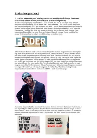
- 1. Evaluation question 1 1. In what ways does your media product use, develop or challenge forms and conventions of real media products? (i.e. of music magazines) When I was designing my magazine I did a lot of research, this was by looking at many different magazines, mainly Hip-Hop such as: Fader, XXL, Vibe and Paper, I also looked at other magazines that were different genres like Clash, Billboard and MNE. I looked at these magazines to get an idea of the style, layout and the context. I then took some of these conventions and added it to my magazine. For example: I used the idea of the box around the lettering idea on the mast head, from the Fader magazine and then added it to mine. However, I adapted the style a bit and choose to add the box around the hole masthead to make it look different and to stand out more. After I had done the mast head, I looked at many designs for my main image and looked at many hip- hop artists doing photo shoots and on magazine covers. There were many to choose from but the one that stood out was the paper magazine featuring Travis Scott. I decided to take the idea and use it for my own as I really liked the way that it was basic but effective as it has Travis Scott stood right in the middle staring at the camera looking serious. To make mine different I changed the way that Fabian (my model) was looking and had him looking happy which may make it stand out more and the readers may get a different vibe when reading this. As well as that I chose to use a black person for my main image as most of the hip-hop artists are African American and I felt that using a white person wouldn’t look right and wouldn’t go with my chosen genre. As well as that, when I was looking through magazine ideas, I saw this Travis Scott cover and I felt I really liked that design. Also on my magazine I added in some sell lines on my front cover to show the readers what’s inside, I was inspired by the XXL magazine as they had their sell lines to the left of the main image. To make mine stand out I chose to used the colours on my front cover (red and black) to make it fit in and also used the same text as my masthead to make it look neat but also stand out and look different to other magazines.
- 2. To follow the conventions of other magazines I added in a sub title and tag line which I used the same style of the paper magazine, because I like how basic it was but It stood out, also I liked how it was near the bottom of the page, right in the centre. To make mine stand out from the crown I decided to use two colours which fitted with the rest of the magazine. To challenge one of my competitors, Paper Mag, I decided to add the barcode and price on the front of the magazine so that it is easier to see and scan when they buy it. Also I chose I price around what my questionnaire said but also I wanted to make it cheaper than the other magazines like Paper mag which is £8.09 and mine is much cheaper at £3.99. This makes means I am challenging my competitors as some people may choose to buy mine because it is cheaper. For my contents page I added in two photos towards the bottom of the page so that it may interest the reader even more and then I left a lot of space at the bottom so it had a different design to other magazine to compete against them. Also I chose this lay out because It is very easy to read unlike the Vibe contents page which is very chaotic, this I feel makes mine better and more challenging as many people who buy magazines want it to be easy to read, which mine is. I also followed the same style and colour scheme from my front cover, as I used the same font for my masthead and sub heading, so that the reader would notice that it is the contents page of a Coordinate magazine, due to the same font and style. I took this idea front Vibe as they have a huge V placed behind the main image. What else makes my contents challenge other magazine is the way my text is layed out, as I have the page number and subheading in a different shade and size, this makes it easy to find the right page and know what’s on it. Then under that I had a small bit of text giving away information of what’s on the page. This makes mine different to Vibe and some other magazines as they haven’t used this idea and it makes mine easier to read which some people like.
- 3. On my double page spread I chose this lay out as it different to many of the other magazines I looked at during my research, as mine has two images on which makes it challenge others such as the XXL double page spread featuring Rick Ross, as some people may look for more photos. When I was doing my research I came across this XXL double page spread which caught my eye because of the plain black and white colours. As I really liked this I thought I’d take the idea and use it myself. However I changed it as I used different fonts and a different layout. So that it would stand out from the crowd, which could mean I may get more people buying my magazine. I chose to write my articles in columns, which makes my magazine different to some and more challenging, as some magazines haven’t used them, such as the XXL one below. Also, by doing it this way it makes it easier for the readers as the words are neat and not spread across the page. Below my title I have added in a small paragraph about ‘Lil Fabes’ album ‘Katrina’, this makes my magazine more challenging compared to others as I am giving the readers some extra information, which I haven’t seen used in other magazines.