How to Make a Field invisible in Odoo 17Celine George
It is possible to hide or invisible some fields in odoo. Commonly using “invisible” attribute in the field definition to invisible the fields. This slide will show how to make a field invisible in odoo 17.
Read| The latest issue of The Challenger is here! We are thrilled to announce that our school paper has qualified for the NATIONAL SCHOOLS PRESS CONFERENCE (NSPC) 2024. Thank you for your unwavering support and trust. Dive into the stories that made us stand out!
Instructions for Submissions thorugh G- Classroom.pptxJheel Barad
This presentation provides a briefing on how to upload submissions and documents in Google Classroom. It was prepared as part of an orientation for new Sainik School in-service teacher trainees. As a training officer, my goal is to ensure that you are comfortable and proficient with this essential tool for managing assignments and fostering student engagement.
Ethnobotany and Ethnopharmacology:
Ethnobotany in herbal drug evaluation,
Impact of Ethnobotany in traditional medicine,
New development in herbals,
Bio-prospecting tools for drug discovery,
Role of Ethnopharmacology in drug evaluation,
Reverse Pharmacology.
This is a presentation by Dada Robert in a Your Skill Boost masterclass organised by the Excellence Foundation for South Sudan (EFSS) on Saturday, the 25th and Sunday, the 26th of May 2024.
He discussed the concept of quality improvement, emphasizing its applicability to various aspects of life, including personal, project, and program improvements. He defined quality as doing the right thing at the right time in the right way to achieve the best possible results and discussed the concept of the "gap" between what we know and what we do, and how this gap represents the areas we need to improve. He explained the scientific approach to quality improvement, which involves systematic performance analysis, testing and learning, and implementing change ideas. He also highlighted the importance of client focus and a team approach to quality improvement.
Welcome to TechSoup New Member Orientation and Q&A (May 2024).pdfTechSoup
In this webinar you will learn how your organization can access TechSoup's wide variety of product discount and donation programs. From hardware to software, we'll give you a tour of the tools available to help your nonprofit with productivity, collaboration, financial management, donor tracking, security, and more.
The Art Pastor's Guide to Sabbath | Steve ThomasonSteve Thomason
What is the purpose of the Sabbath Law in the Torah. It is interesting to compare how the context of the law shifts from Exodus to Deuteronomy. Who gets to rest, and why?
CLASS 11 CBSE B.St Project AIDS TO TRADE - INSURANCE
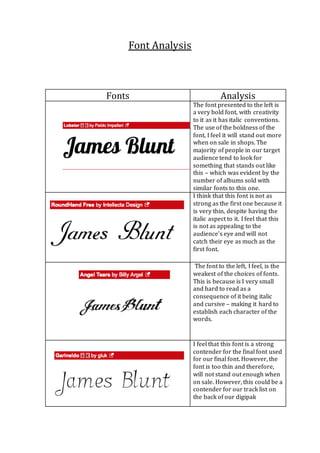
Font analysis
1. Font Analysis
Fonts Analysis
The font presented to the left is
a very bold font, with creativity
to it as it has italic conventions.
The use of the boldness of the
font, I feel it will stand out more
when on sale in shops. The
majority of people in our target
audience tend to look for
something that stands out like
this – which was evident by the
number of albums sold with
similar fonts to this one.
I think that this font is not as
strong as the first one because it
is very thin, despite having the
italic aspect to it. I feel that this
is not as appealing to the
audience’s eye and will not
catch their eye as much as the
first font.
The font to the left, I feel, is the
weakest of the choices of fonts.
This is because is I very small
and hard to read as a
consequence of it being italic
and cursive – making it hard to
establish each character of the
words.
I feel that this font is a strong
contender for the final font used
for our final font. However, the
font is too thin and therefore,
will not stand out enough when
on sale. However, this could be a
contender for our track list on
the back of our digipak
2. I feel that this is very similar to
the first font presented above.
However, the only criticism I
have for this is that it is not as
bold and defined as the first
font. Therefore, this will not be
used as the main font but could
possibly used for the track list
on the back of the advert.
I feel that this final font is
appealing to the eye as it is
unique and includes a variety of
different aspects to it. However,
it is not bold enough to catch the
audience’s eye as a consequence
of it having an ombre effect
towards the bottom of the font.
Therefore, I will not be
including this for my advert and
digipak.