Downloaded 114 times
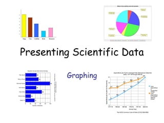
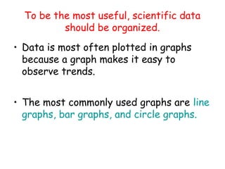
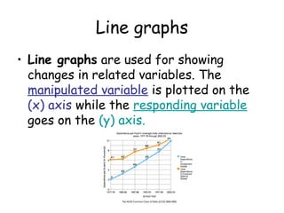
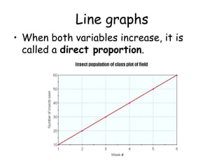
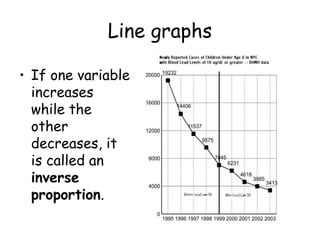
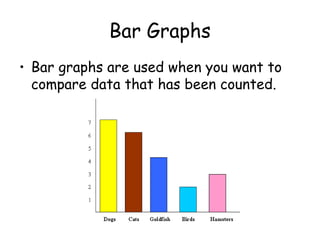
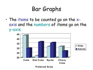
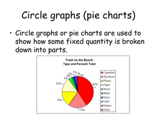
This document discusses different types of graphs used to present scientific data: - Line graphs are used to show changes in related variables over time or against each other, and can show direct or inverse proportions. - Bar graphs compare counted data by displaying items on the x-axis and their quantities on the y-axis. - Circle graphs or pie charts show how a fixed quantity is divided into parts. The document provides examples of different graphs and how to interpret the relationships between variables displayed in each type of graph.


![Ocean acidification will-the_reef_survive-non-narrated[1]](https://cdn.slidesharecdn.com/ss_thumbnails/oceanacidification-willthereefsurvive-non-narrated1-110422200153-phpapp02-thumbnail.jpg?width=640&height=640&fit=bounds)
![Ocean acidification will-the_reef_survive-non-narrated[1]](https://cdn.slidesharecdn.com/ss_thumbnails/oceanacidification-willthereefsurvive-non-narrated1-110422195610-phpapp02-thumbnail.jpg?width=640&height=640&fit=bounds)


![Atomos[1]](https://cdn.slidesharecdn.com/ss_thumbnails/atomos1-110307195510-phpapp02-thumbnail.jpg?width=640&height=640&fit=bounds)

![Atomos[1]](https://cdn.slidesharecdn.com/ss_thumbnails/atomos1-110307193532-phpapp02-thumbnail.jpg?width=640&height=640&fit=bounds)
![Atomos[1]](https://cdn.slidesharecdn.com/ss_thumbnails/atomos1-110307193046-phpapp02-thumbnail.jpg?width=640&height=640&fit=bounds)


