INTRODUCTION
Analyzing, presenting andusing od data to make decisions is an essential function for
professionals in variety of fields. The ability to organize and share data increases the impact
of your research, spread awareness and can motivate others to take desired actions.
Learning what data presentation is and how you can use it may help you to improve your
communication skills and make your research more effective.
3.
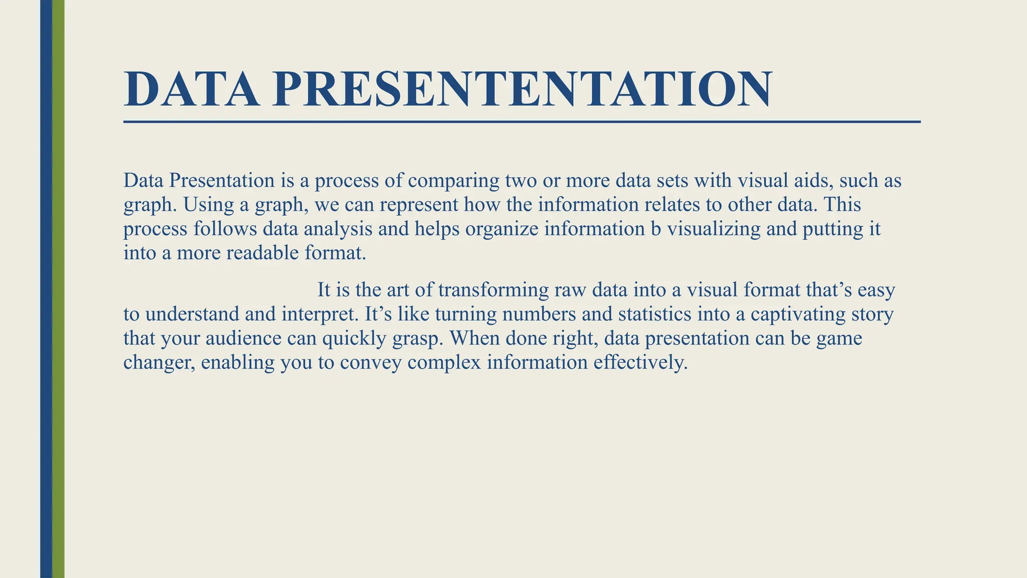
DATA PRESENTENTATION
Data Presentationis a process of comparing two or more data sets with visual aids, such as
graph. Using a graph, we can represent how the information relates to other data. This
process follows data analysis and helps organize information b visualizing and putting it
into a more readable format.
It is the art of transforming raw data into a visual format that’s easy
to understand and interpret. It’s like turning numbers and statistics into a captivating story
that your audience can quickly grasp. When done right, data presentation can be game
changer, enabling you to convey complex information effectively.
4.
TYPES OF DATAPRESENTATION
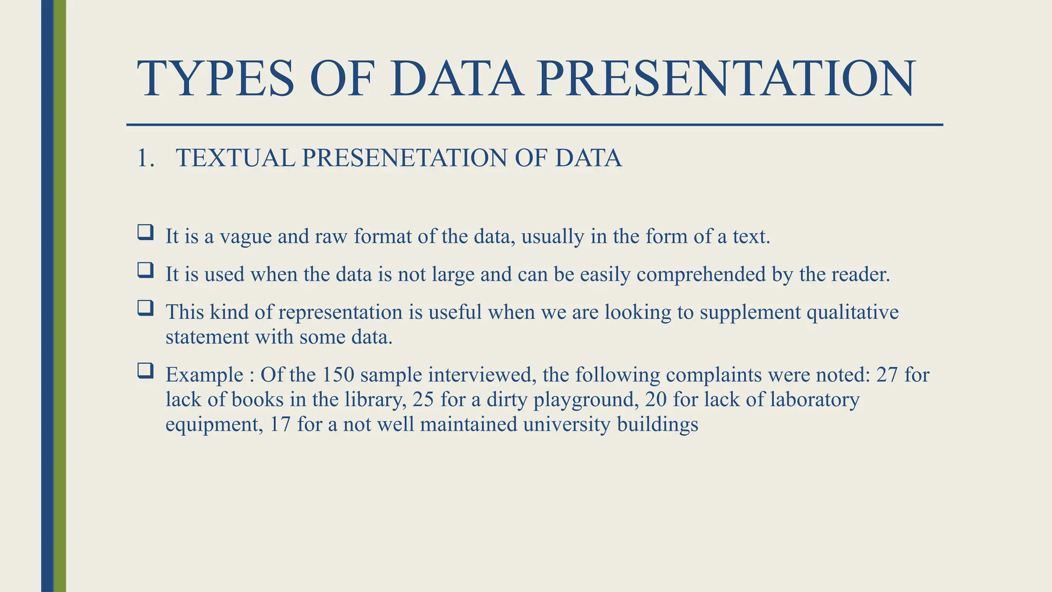
1. TEXTUAL PRESENETATION OF DATA
It is a vague and raw format of the data, usually in the form of a text.
It is used when the data is not large and can be easily comprehended by the reader.
This kind of representation is useful when we are looking to supplement qualitative
statement with some data.
Example : Of the 150 sample interviewed, the following complaints were noted: 27 for
lack of books in the library, 25 for a dirty playground, 20 for lack of laboratory
equipment, 17 for a not well maintained university buildings
5.
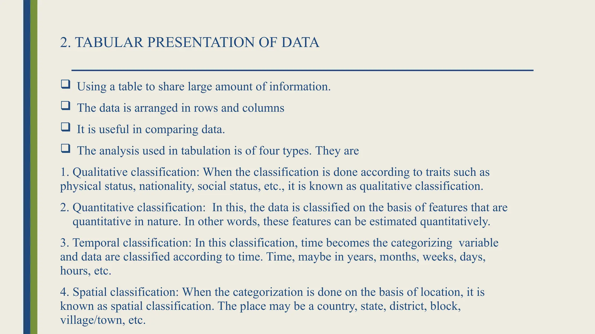
2. TABULAR PRESENTATIONOF DATA
Using a table to share large amount of information.
The data is arranged in rows and columns
It is useful in comparing data.
The analysis used in tabulation is of four types. They are
1. Qualitative classification: When the classification is done according to traits such as
physical status, nationality, social status, etc., it is known as qualitative classification.
2. Quantitative classification: In this, the data is classified on the basis of features that are
quantitative in nature. In other words, these features can be estimated quantitatively.
3. Temporal classification: In this classification, time becomes the categorizing variable
and data are classified according to time. Time, maybe in years, months, weeks, days,
hours, etc.
4. Spatial classification: When the categorization is done on the basis of location, it is
known as spatial classification. The place may be a country, state, district, block,
village/town, etc.
6.
3. DIAGRAMATIC PRESENTATIONOF DATA
Diagrammatic presentation of data uses visual representations like graphs, charts, and
diagrams to make complex information more accessible and easier to understand, aiding
in data analysis and communication.
They allow for quick comprehension and analysis of data.
Diagrammatic representation transforms abstract numerical data into a more concrete
and easily understandable format.
The common types of geometric diagrams are:
1. Bar diagram
2. Frequency Diagram
3. Arithmetic Line Graph
7.
GEOMETRIC DIAGRAM
Bar diagramand pie diagram comes
in the category of geometric diagram.
BAR DIAGRAM
A bar diagram (also called a bar chart or bar
graph) visually represents data using
rectangular bars, where the length or height
of each bar is proportional to the value it
represents, facilitating comparisons
between categories.
8.
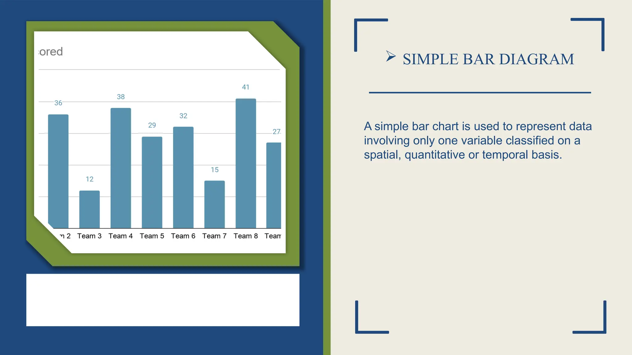
SIMPLE BARDIAGRAM
A simple bar chart is used to represent data
involving only one variable classified on a
spatial, quantitative or temporal basis.
9.
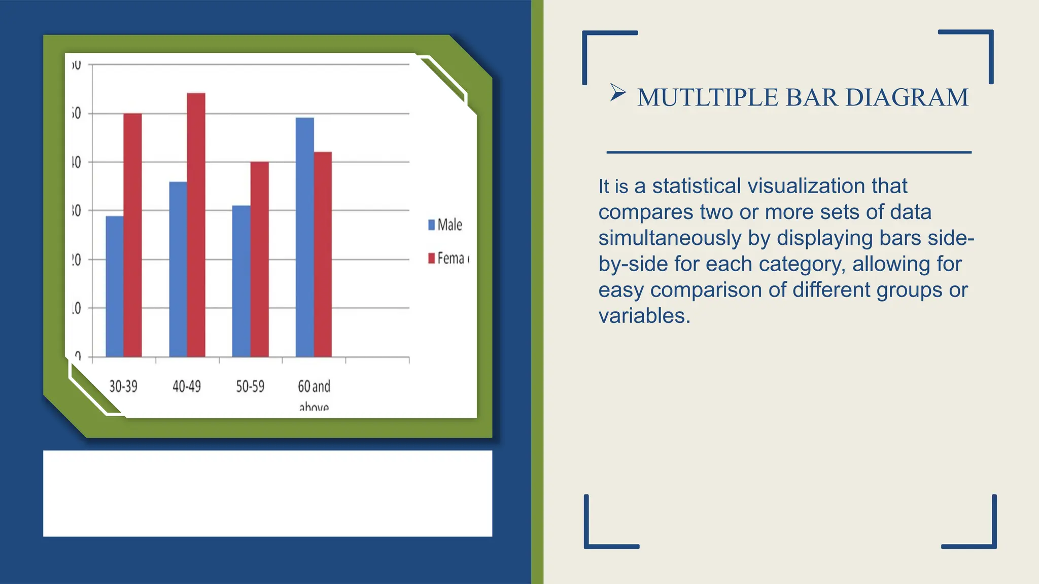
MUTLTIPLE BARDIAGRAM
It is a statistical visualization that
compares two or more sets of data
simultaneously by displaying bars side-
by-side for each category, allowing for
easy comparison of different groups or
variables.
10.
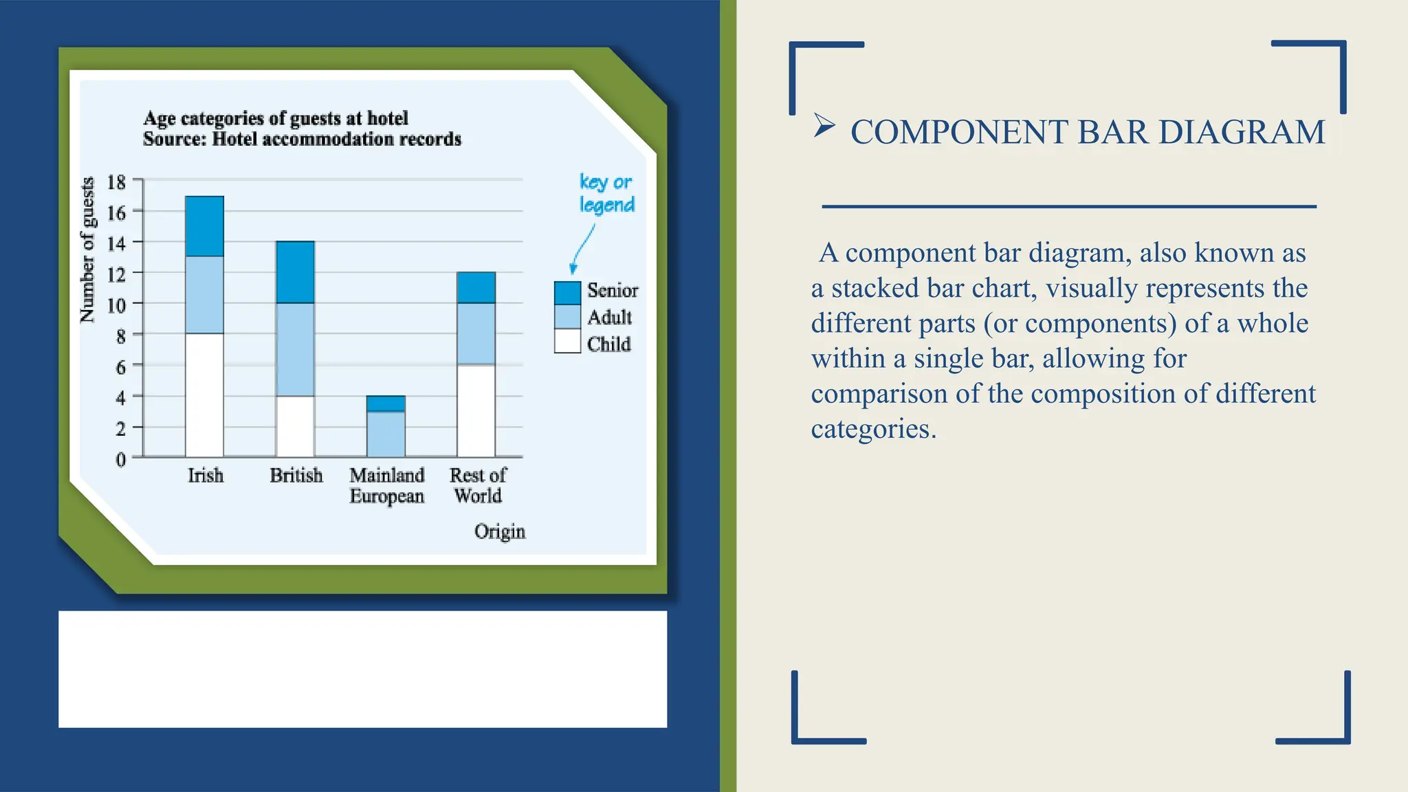
COMPONENT BARDIAGRAM
A component bar diagram, also known as
a stacked bar chart, visually represents the
different parts (or components) of a whole
within a single bar, allowing for
comparison of the composition of different
categories.
11.
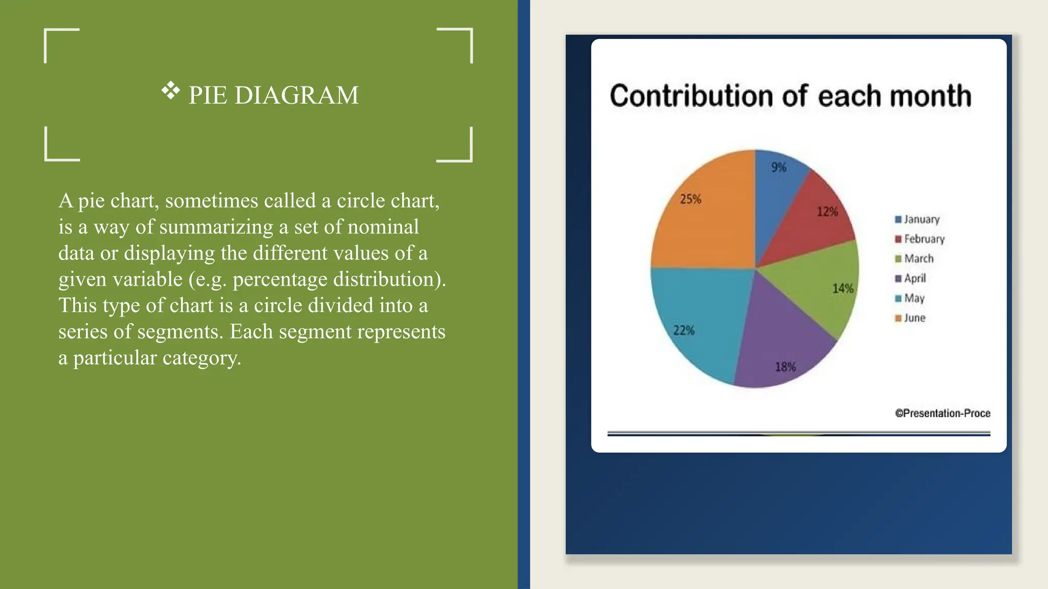
PIE DIAGRAM
Apie chart, sometimes called a circle chart,
is a way of summarizing a set of nominal
data or displaying the different values of a
given variable (e.g. percentage distribution).
This type of chart is a circle divided into a
series of segments. Each segment represents
a particular category.
12.
FREQUENCY DIAGRAM
• Afrequency diagram, also known as a frequency graph, is a visual representation of data
that shows how often different values or categories occur within a dataset, using bars or
lines to represent frequencies.
• The diagram typically shows the frequency (or count) of each value or group of values
on the vertical axis, while the values themselves are plotted on the horizontal axis.
• Types of frequency diagram are;
1. Histograms
2. Frequency Polygon
3. Cumulative Frequency Curve / Ogive
13.
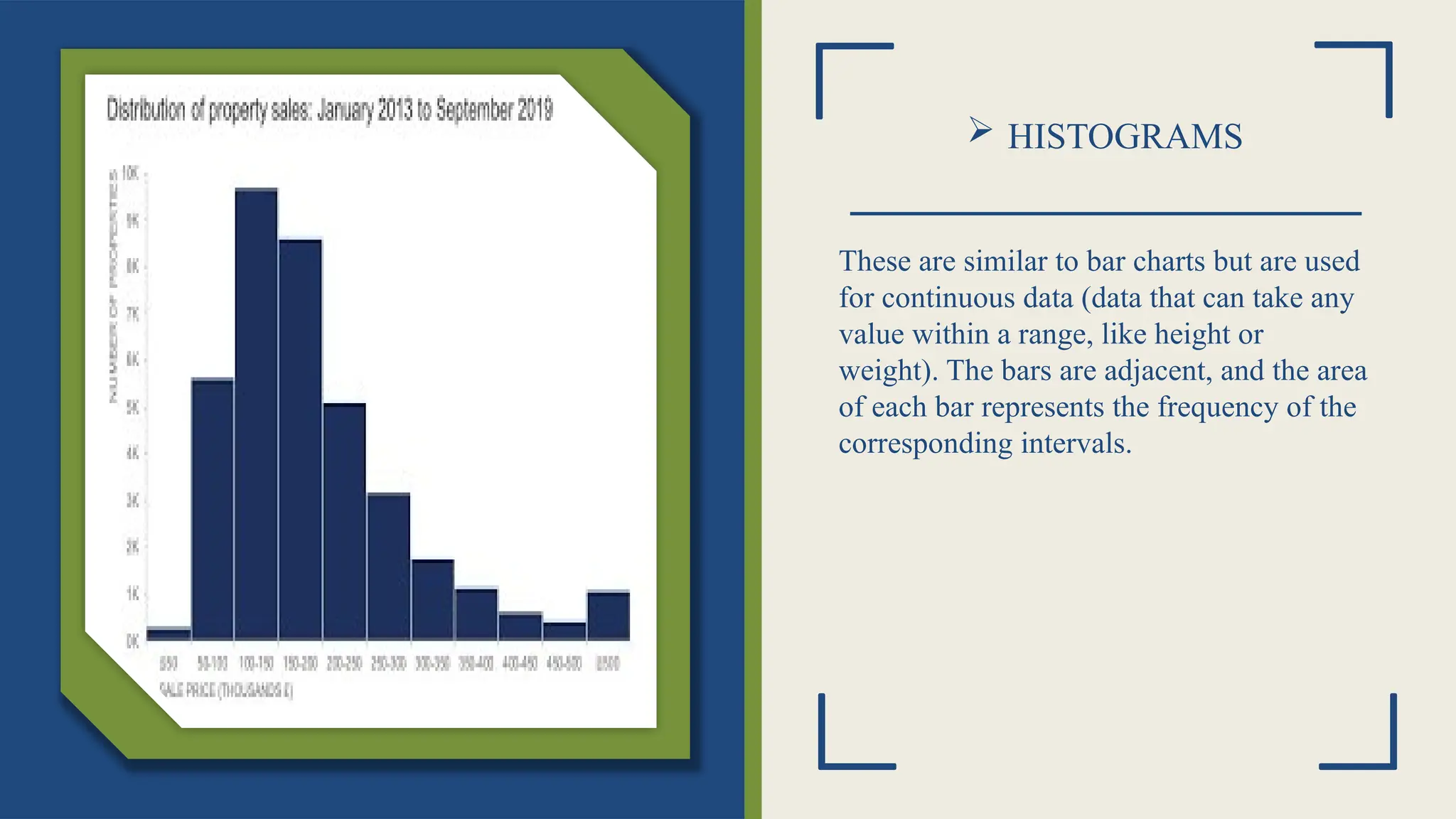
HISTOGRAMS
These aresimilar to bar charts but are used
for continuous data (data that can take any
value within a range, like height or
weight). The bars are adjacent, and the area
of each bar represents the frequency of the
corresponding intervals.
14.
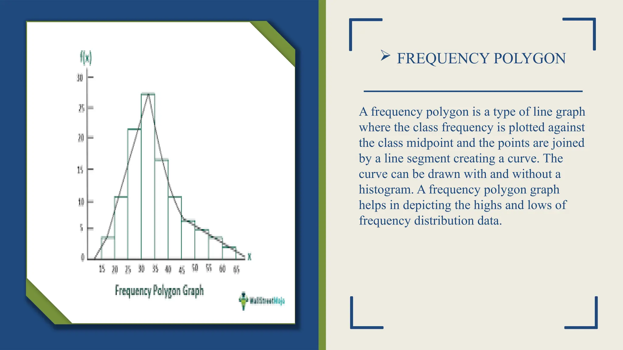
FREQUENCY POLYGON
Afrequency polygon is a type of line graph
where the class frequency is plotted against
the class midpoint and the points are joined
by a line segment creating a curve. The
curve can be drawn with and without a
histogram. A frequency polygon graph
helps in depicting the highs and lows of
frequency distribution data.
15.
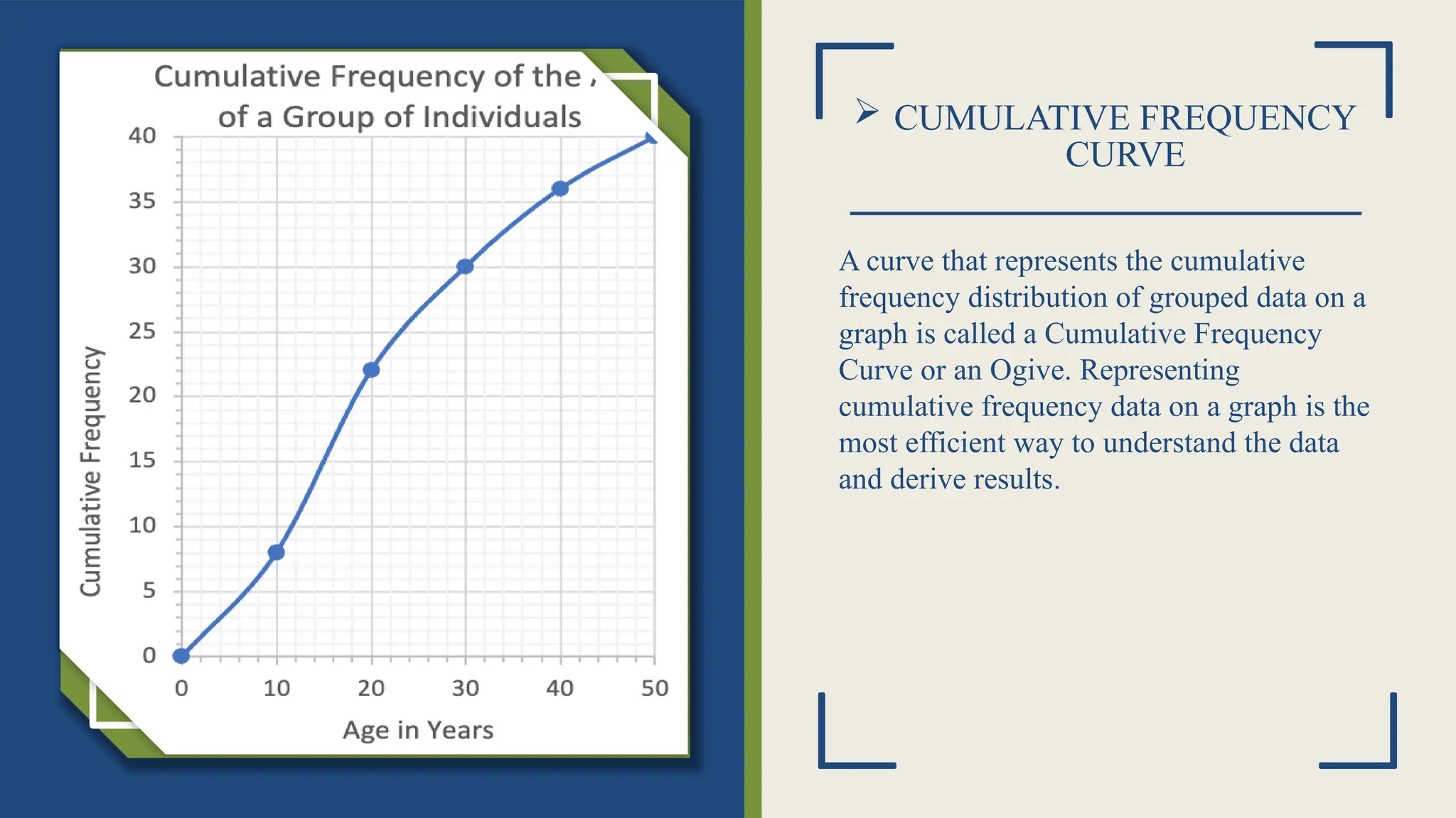
CUMULATIVE FREQUENCY
CURVE
Acurve that represents the cumulative
frequency distribution of grouped data on a
graph is called a Cumulative Frequency
Curve or an Ogive. Representing
cumulative frequency data on a graph is the
most efficient way to understand the data
and derive results.
Click icon to add picture
16.
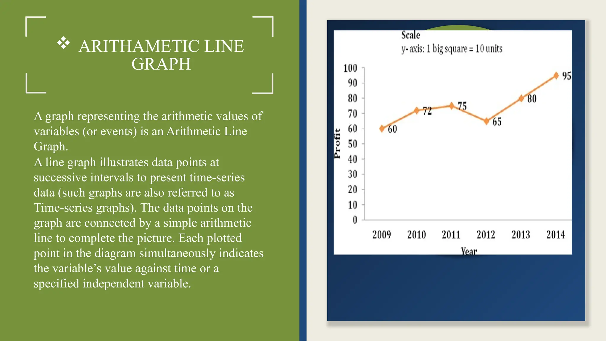
ARITHAMETIC LINE
GRAPH
Agraph representing the arithmetic values of
variables (or events) is an Arithmetic Line
Graph.
A line graph illustrates data points at
successive intervals to present time-series
data (such graphs are also referred to as
Time-series graphs). The data points on the
graph are connected by a simple arithmetic
line to complete the picture. Each plotted
point in the diagram simultaneously indicates
the variable’s value against time or a
specified independent variable.
17.
CONCLUSION
In research andanalysis, the presentation of data plays a crucial role in effectively
communicating findings. The choice of data presentation method—whether through textual,
tabular, or graphical formats, depends on the nature of the data and the intended audience.
Proper data presentation not only enhances clarity and comprehension but also supports
informed decision-making. By employing suitable data representation methods, researchers
and professionals can ensure accuracy, accessibility, and meaningful insights from their
data, ultimately contributing to better research outcomes and policy formulations.