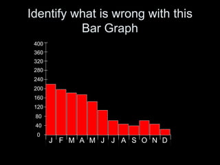
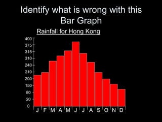
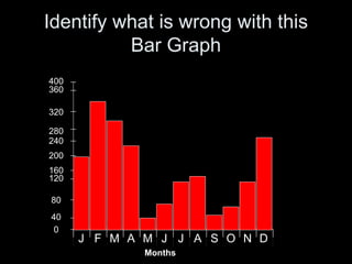
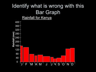
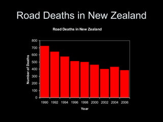
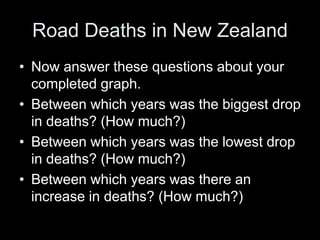
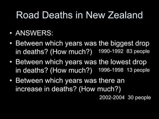
Skills in Social
Studies
The Bar Graph
Key Features of a Bar Graph
A Bar Graph must have the following:
• A Title
• Both axis ruled
• Clearly labelled unit of measurement on
both axis
• Equal spacing on both axis
• Numbers increasing at regular intervals
Identify what is wrong with this
Bar Graph
400
360
0
40
80
120
160
200
240
280
320
DNOSJ AJMAMFJ
Identify what is wrong with this
Bar Graph
Rainfall for Hong Kong
400
375
0
20
80
150
200
210
240
310
315
DNOSJ AJMAMFJ
Identify what is wrong with this
Bar Graph
DNOSJ AJMAMFJ
400
360
0
40
80
120
160
200
240
280
320
Months
Identify what is wrong with this
Bar Graph
Rainfall for Kenya
400
360
0
40
80
120
160
200
240
280
320
Rainfall(mm)
DNOSJ AJMAMFJ
Bar Graph of Rainfall in Darwin
Rainfall for Darwin, Australia
10 lines down your page
12cms across your page
400
360
0
40
80
120
160
200
240
280
320
Rainfall(mm)
DNOSJ AJMAMFJ
Months
Month Rainfall
Jan 380mm
Feb 315mm
Mar 260mm
Apr 100mm
May 30mm
June 10mm
July 0mm
Aug 20mm
Sep 40mm
Oct 60mm
Nov 130mm
Dec 245mm
Create your own Bar Graph
• Use these figures to create your
own bar graph.
• Remember the Key Features of a
Bar Graph.
• Hint: Decide on vertical axis
spacing now.
• Try to make you graph as
accurate as possible
• Complete graph and then put
your hand up so I can check your
graph.
Year Road Deaths in NZ
1990 729
1992 646
1994 580
1996 514
1998 501
2000 462
2002 405
2004 435
2006 387
Road Deaths in New Zealand
0
100
200
300
400
500
600
700
800
1990 1992 1994 1996 1998 2000 2002 2004 2006
Year
NumberofDeaths
Road Deaths in New Zealand
• Now you have completed your graph I
want you to write 2-3 sentences describing
what your graph is showing.
• e.g. The above graph is showing . . .
Road Deaths in New Zealand
• Now answer these questions about your
completed graph.
• Between which years was the biggest drop
in deaths? (How much?)
• Between which years was the lowest drop
in deaths? (How much?)
• Between which years was there an
increase in deaths? (How much?)
Road Deaths in New Zealand
• ANSWERS:
• Between which years was the biggest drop
in deaths? (How much?)
• Between which years was the lowest drop
in deaths? (How much?)
• Between which years was there an
increase in deaths? (How much?)
1990-1992 83 people
1996-1998 13 people
2002-2004 30 people
THE END

Bar graphs for slideshare jwt

  • 1.
  • 2.
    Key Features ofa Bar Graph A Bar Graph must have the following: • A Title • Both axis ruled • Clearly labelled unit of measurement on both axis • Equal spacing on both axis • Numbers increasing at regular intervals
  • 3.
    Identify what iswrong with this Bar Graph 400 360 0 40 80 120 160 200 240 280 320 DNOSJ AJMAMFJ
  • 4.
    Identify what iswrong with this Bar Graph Rainfall for Hong Kong 400 375 0 20 80 150 200 210 240 310 315 DNOSJ AJMAMFJ
  • 5.
    Identify what iswrong with this Bar Graph DNOSJ AJMAMFJ 400 360 0 40 80 120 160 200 240 280 320 Months
  • 6.
    Identify what iswrong with this Bar Graph Rainfall for Kenya 400 360 0 40 80 120 160 200 240 280 320 Rainfall(mm) DNOSJ AJMAMFJ
  • 7.
    Bar Graph ofRainfall in Darwin Rainfall for Darwin, Australia 10 lines down your page 12cms across your page 400 360 0 40 80 120 160 200 240 280 320 Rainfall(mm) DNOSJ AJMAMFJ Months Month Rainfall Jan 380mm Feb 315mm Mar 260mm Apr 100mm May 30mm June 10mm July 0mm Aug 20mm Sep 40mm Oct 60mm Nov 130mm Dec 245mm
  • 8.
    Create your ownBar Graph • Use these figures to create your own bar graph. • Remember the Key Features of a Bar Graph. • Hint: Decide on vertical axis spacing now. • Try to make you graph as accurate as possible • Complete graph and then put your hand up so I can check your graph. Year Road Deaths in NZ 1990 729 1992 646 1994 580 1996 514 1998 501 2000 462 2002 405 2004 435 2006 387
  • 9.
    Road Deaths inNew Zealand Road Deaths in New Zealand 0 100 200 300 400 500 600 700 800 1990 1992 1994 1996 1998 2000 2002 2004 2006 Year NumberofDeaths
  • 10.
    Road Deaths inNew Zealand • Now you have completed your graph I want you to write 2-3 sentences describing what your graph is showing. • e.g. The above graph is showing . . .
  • 11.
    Road Deaths inNew Zealand • Now answer these questions about your completed graph. • Between which years was the biggest drop in deaths? (How much?) • Between which years was the lowest drop in deaths? (How much?) • Between which years was there an increase in deaths? (How much?)
  • 12.
    Road Deaths inNew Zealand • ANSWERS: • Between which years was the biggest drop in deaths? (How much?) • Between which years was the lowest drop in deaths? (How much?) • Between which years was there an increase in deaths? (How much?) 1990-1992 83 people 1996-1998 13 people 2002-2004 30 people
  • 13.