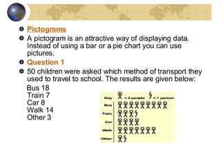
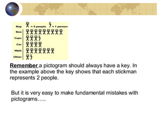
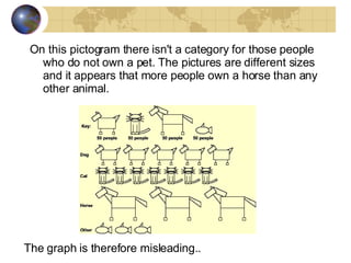
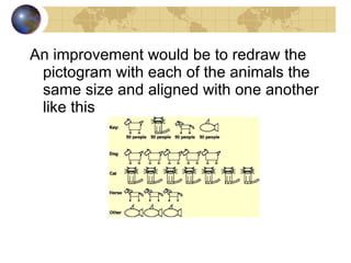
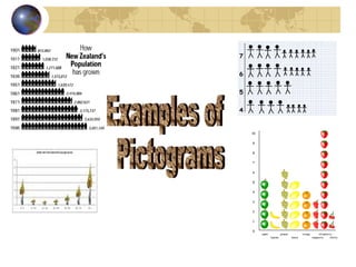
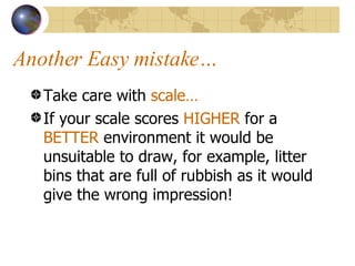
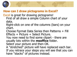
Data Presentation How to achieve a level 3 on your GCSE coursework for data presentation.
Lesson objectives To appreciate how  more complex  data presentation techniques enable you to access  level 3  of the AQA mark scheme. To produce techniques such as  pictogram s to show changes in the street quality from the Promenade to further inland. To  recognise patterns  created by the pictograms and to be able to  analyse  them in detail.
Data presentation The examiner will be looking for: The use of a range of  more complex data presentation techniques, some of which are ICT based , to present and develop information. Techniques that are  appropriate  to your investigation The use of a  clear ,  fluent and logical format using precise and accurate English.
Graphs….. Use a  range of graphs  (not just pie charts or bar charts). Proportional graphs are a good technique. Consider divided bar graphs, scatter graphs or multiple line graphs. Try combining graphs with maps. Ensure that the graphs are appropriate for the data you have collected- particularly regarding line graphs. If you use ICT don’t go OTT with fancy 3D effects. A graph produced on ICT is not necessarily a complex technique Common mistakes….  People forget to label axes, fail to state units of measurement, no titles. Graphs can be annotated to point out trends and anomalies.
Statistical techniques and others.. There is a range of simple statistical techniques that you can use such as  mean, median and mode. You may want to use these when writing about the overall trends of results. Use neat ordered tables for data. Flow lines are also a good presentation technique when used appropriately.
Pictograms A pictogram is an attractive way of displaying data. Instead of using a bar or a pie chart you can use pictures. Question 1 50 children were asked which method of transport they used to travel to school. The results are given below: Bus 18 Train 7 Car 8 Walk 14 Other 3
But it is very easy to make fundamental mistakes with pictograms….. Remember  a pictogram should always have a key. In the example above the key shows that each stickman represents 2 people.     
On this pictogram there isn't a category for those people who do not own a pet. The pictures are different sizes and it appears that more people own a horse than any other animal.  The graph is therefore misleading..
An improvement would be to redraw the pictogram with each of the animals the same size and aligned with one another like this
Examples of Pictograms
Another Easy mistake… Take care with  scale…   If your scale scores  HIGHER  for a  BETTER  environment it would be unsuitable to draw, for example, litter bins that are full of rubbish as it would give the wrong impression!
How can I draw pictograms in Excel? Excel  is great for drawing pictograms! First of all draw a simple Column chart of your data. Right-click on one of the columns (bars) on your chart. Choose F o rmat Data Series then Patterns + Fill Effects + Picture + Select Picture. You now need to find some clipart - there are usually lots within the  msoffice  folder. Select your picture and then OK. A "stretched" picture will have replaced each bar. If you retrace your steps you will see that you can have "stacks" of pictures instead.  

Data Presentation

  • 1.
    Data Presentation Howto achieve a level 3 on your GCSE coursework for data presentation.
  • 2.
    Lesson objectives Toappreciate how more complex data presentation techniques enable you to access level 3 of the AQA mark scheme. To produce techniques such as pictogram s to show changes in the street quality from the Promenade to further inland. To recognise patterns created by the pictograms and to be able to analyse them in detail.
  • 3.
    Data presentation Theexaminer will be looking for: The use of a range of more complex data presentation techniques, some of which are ICT based , to present and develop information. Techniques that are appropriate to your investigation The use of a clear , fluent and logical format using precise and accurate English.
  • 4.
    Graphs….. Use a range of graphs (not just pie charts or bar charts). Proportional graphs are a good technique. Consider divided bar graphs, scatter graphs or multiple line graphs. Try combining graphs with maps. Ensure that the graphs are appropriate for the data you have collected- particularly regarding line graphs. If you use ICT don’t go OTT with fancy 3D effects. A graph produced on ICT is not necessarily a complex technique Common mistakes…. People forget to label axes, fail to state units of measurement, no titles. Graphs can be annotated to point out trends and anomalies.
  • 5.
    Statistical techniques andothers.. There is a range of simple statistical techniques that you can use such as mean, median and mode. You may want to use these when writing about the overall trends of results. Use neat ordered tables for data. Flow lines are also a good presentation technique when used appropriately.
  • 6.
    Pictograms A pictogramis an attractive way of displaying data. Instead of using a bar or a pie chart you can use pictures. Question 1 50 children were asked which method of transport they used to travel to school. The results are given below: Bus 18 Train 7 Car 8 Walk 14 Other 3
  • 7.
    But it isvery easy to make fundamental mistakes with pictograms….. Remember a pictogram should always have a key. In the example above the key shows that each stickman represents 2 people.     
  • 8.
    On this pictogramthere isn't a category for those people who do not own a pet. The pictures are different sizes and it appears that more people own a horse than any other animal. The graph is therefore misleading..
  • 9.
    An improvement wouldbe to redraw the pictogram with each of the animals the same size and aligned with one another like this
  • 10.
  • 11.
    Another Easy mistake…Take care with scale… If your scale scores HIGHER for a BETTER environment it would be unsuitable to draw, for example, litter bins that are full of rubbish as it would give the wrong impression!
  • 12.
    How can Idraw pictograms in Excel? Excel is great for drawing pictograms! First of all draw a simple Column chart of your data. Right-click on one of the columns (bars) on your chart. Choose F o rmat Data Series then Patterns + Fill Effects + Picture + Select Picture. You now need to find some clipart - there are usually lots within the msoffice folder. Select your picture and then OK. A "stretched" picture will have replaced each bar. If you retrace your steps you will see that you can have "stacks" of pictures instead. Â