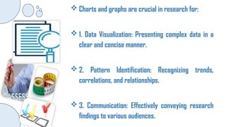
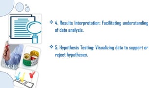
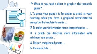
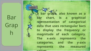
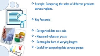
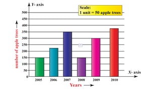
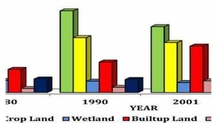
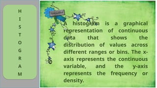
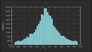
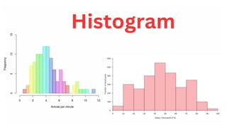
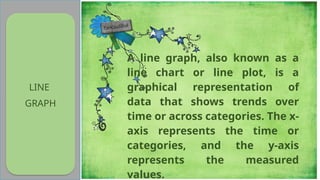
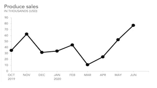
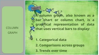
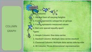
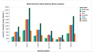
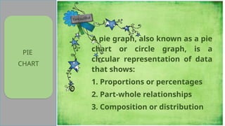
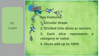
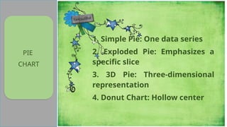
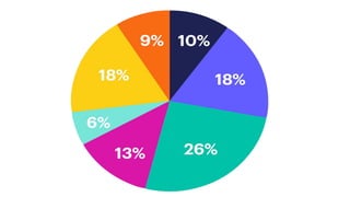
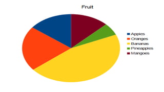
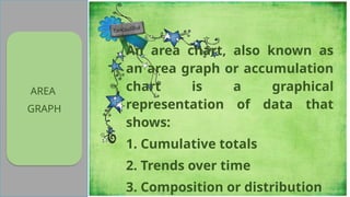
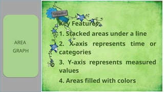
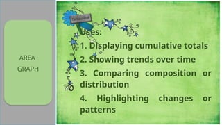
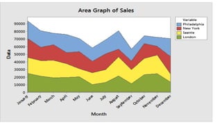
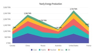
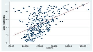
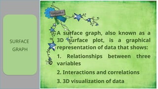
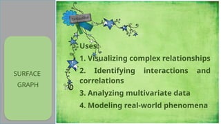
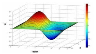
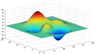
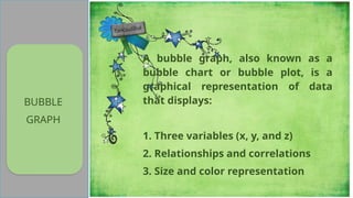
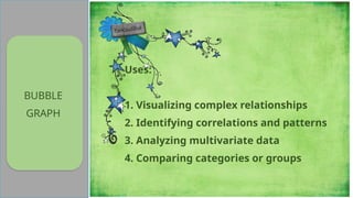
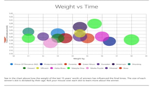
 Charts and graphs are crucial in research for:
 1. Data Visualization: Presenting complex data in a
clear and concise manner.
 2. Pattern Identification: Recognizing trends,
correlations, and relationships.
 3. Communication: Effectively conveying research
findings to various audiences.
 4. Results Interpretation: Facilitating understanding
of data analysis.
 5. Hypothesis Testing: Visualizing data to support or
reject hypotheses.
 When do you need a chart or graph in the research
paper?
1. To prove your point It is far easier to attest to your
standing when you have a graphical representation
alongside the tabulated results. ...
2. To make your information more comprehensive ...
3. A graph can describe more information with
minimum real estate ...
4. Deliver complicated points ...
5. Compare data ...
Bar
Grap
h
A bar graph, also known as a
bar chart, is a graphical
representation of categorical
data that uses rectangular bars
to display the frequency or
magnitude of each category.
The x-axis represents the
categories, and the y-axis
represents the measured
 Example: Comparing the sales of different products
across regions.
 Key Features:
 - Categorical data on x-axis
 - Measured values on y-axis
 - Rectangular bars of varying lengths
 - Useful for comparing data across groups
H
I
S
T
O
G
R
A
M
A histogram is a graphical
representation of continuous
data that shows the
distribution of values across
different ranges or bins. The x-
axis represents the continuous
variable, and the y-axis
represents the frequency or
density.
Example: Displaying the distribution of exam
scores.
Key Features:
- Continuous data on x-axis
- Frequency or density on y-axis
- Rectangular bins of varying widths
- Useful for understanding data distribution
LINE
GRAPH
A line graph, also known as a
line chart or line plot, is a
graphical representation of
data that shows trends over
time or across categories. The x-
axis represents the time or
categories, and the y-axis
represents the measured
values.
LINE
GRAPH
Types:
1. Simple Line: One data series
2. Multiple Line: Multiple data series
3. Stacked Line: Cumulative totals
4. 3D Line: Three-dimensional
representation
5. Line with Markers: Data points
highlighted
LINE
GRAPH
Uses:
1. Showing trends over time
2. Comparing data series
3. Identifying patterns or
correlations
4. Visualizing forecasts or
predictions
Example: Tracking stock prices over time.
Key Features:
- Time or categories on x-axis
- Measured values on y-axis
- Continuous line connecting data points
- Useful for showing trends and patterns
COLUMN
GRAPH
A column graph, also known as a
bar chart or column chart, is a
graphical representation of data
that uses vertical bars to display:
1. Categorical data
2. Comparisons across groups
3. Trends over time
COLUMN
GRAPH
Key Features:
1. Vertical bars of varying heights
2. X-axis represents categories or groups
3. Y-axis represents measured values
4. Bars are spaced equally apart
Types:
1. Simple Column: One data series
2. Stacked Column: Multiple data series stacked
3. Clustered Column: Multiple data series side-by-side
4. 3D Column: Three-dimensional representation
PIE
CHART
A pie graph, also known as a pie
chart or circle graph, is a
circular representation of data
that shows:
1. Proportions or percentages
2. Part-whole relationships
3. Composition or distribution
PIE
CHART
Key Features:
1. Circular shape
2. Divided into slices or sectors
3. Each slice represents a
category or value
4. Slices add up to 100%
PIE
CHART
1. Simple Pie: One data series
2. Exploded Pie: Emphasizes a
specific slice
3. 3D Pie: Three-dimensional
representation
4. Donut Chart: Hollow center
AREA
GRAPH
An area chart, also known as
an area graph or accumulation
chart is a graphical
representation of data that
shows:
1. Cumulative totals
2. Trends over time
3. Composition or distribution
AREA
GRAPH
Key Features:
1. Stacked areas under a line
2. X-axis represents time or
categories
3. Y-axis represents measured
values
4. Areas filled with colors
AREA
GRAPH
Uses:
1. Displaying cumulative totals
2. Showing trends over time
3. Comparing composition or
distribution
4. Highlighting changes or
patterns
Develops leaners’
discovery
hyphothetical,
critical thinking,
and problem-
solving skills as
well as their
decision making
practice.
SCATTER
A scatter graph, also known as a
scatter plot or scatter diagram, is a
graphical representation of data
that shows:
1. Relationships between two
variables
2. Correlations or patterns
3. Distribution of data points
Develops leaners’
discovery
hyphothetical,
critical thinking,
and problem-
solving skills as
well as their
decision making
practice.
SCATTER
Uses:
1. Identifying correlations or
relationships
2. Detecting patterns or outliers
3. Visualizing distribution of
data
4. Analyzing cause-and-effect
relationships
SURFACE
GRAPH
A surface graph, also known as a
3D surface plot, is a graphical
representation of data that shows:
1. Relationships between three
variables
2. Interactions and correlations
3. 3D visualization of data
SURFACE
GRAPH
Uses:
1. Visualizing complex relationships
2. Identifying interactions and
correlations
3. Analyzing multivariate data
4. Modeling real-world phenomena
BUBBLE
GRAPH
A bubble graph, also known as a
bubble chart or bubble plot, is a
graphical representation of data
that displays:
1. Three variables (x, y, and z)
2. Relationships and correlations
3. Size and color representation
For me, same
with other
assessment
practices, it may
also be time
consuming and
limited in scope
because this
may not capture
all the aspects of
performance.
Lastly; there
might have a
problem in
accessibilty
because there
are some
students who
physically
disadvantaged
and many other
personal reason
to participate in
simulation as
practice in
assessment.
BUBBLE
GRAPH
Uses:
1. Visualizing complex relationships
2. Identifying correlations and patterns
3. Analyzing multivariate data
4. Comparing categories or groups
REPORT ON BASIC STATISTICS Graphs, Plots, and Charts.pptx

REPORT ON BASIC STATISTICS Graphs, Plots, and Charts.pptx

  • 1.
     Charts andgraphs are crucial in research for:  1. Data Visualization: Presenting complex data in a clear and concise manner.  2. Pattern Identification: Recognizing trends, correlations, and relationships.  3. Communication: Effectively conveying research findings to various audiences.
  • 2.
     4. ResultsInterpretation: Facilitating understanding of data analysis.  5. Hypothesis Testing: Visualizing data to support or reject hypotheses.
  • 3.
     When doyou need a chart or graph in the research paper? 1. To prove your point It is far easier to attest to your standing when you have a graphical representation alongside the tabulated results. ... 2. To make your information more comprehensive ... 3. A graph can describe more information with minimum real estate ... 4. Deliver complicated points ... 5. Compare data ...
  • 4.
    Bar Grap h A bar graph,also known as a bar chart, is a graphical representation of categorical data that uses rectangular bars to display the frequency or magnitude of each category. The x-axis represents the categories, and the y-axis represents the measured
  • 5.
     Example: Comparingthe sales of different products across regions.  Key Features:  - Categorical data on x-axis  - Measured values on y-axis  - Rectangular bars of varying lengths  - Useful for comparing data across groups
  • 8.
    H I S T O G R A M A histogram isa graphical representation of continuous data that shows the distribution of values across different ranges or bins. The x- axis represents the continuous variable, and the y-axis represents the frequency or density.
  • 9.
    Example: Displaying thedistribution of exam scores. Key Features: - Continuous data on x-axis - Frequency or density on y-axis - Rectangular bins of varying widths - Useful for understanding data distribution
  • 12.
    LINE GRAPH A line graph,also known as a line chart or line plot, is a graphical representation of data that shows trends over time or across categories. The x- axis represents the time or categories, and the y-axis represents the measured values.
  • 13.
    LINE GRAPH Types: 1. Simple Line:One data series 2. Multiple Line: Multiple data series 3. Stacked Line: Cumulative totals 4. 3D Line: Three-dimensional representation 5. Line with Markers: Data points highlighted
  • 14.
    LINE GRAPH Uses: 1. Showing trendsover time 2. Comparing data series 3. Identifying patterns or correlations 4. Visualizing forecasts or predictions
  • 15.
    Example: Tracking stockprices over time. Key Features: - Time or categories on x-axis - Measured values on y-axis - Continuous line connecting data points - Useful for showing trends and patterns
  • 18.
    COLUMN GRAPH A column graph,also known as a bar chart or column chart, is a graphical representation of data that uses vertical bars to display: 1. Categorical data 2. Comparisons across groups 3. Trends over time
  • 19.
    COLUMN GRAPH Key Features: 1. Verticalbars of varying heights 2. X-axis represents categories or groups 3. Y-axis represents measured values 4. Bars are spaced equally apart Types: 1. Simple Column: One data series 2. Stacked Column: Multiple data series stacked 3. Clustered Column: Multiple data series side-by-side 4. 3D Column: Three-dimensional representation
  • 21.
    PIE CHART A pie graph,also known as a pie chart or circle graph, is a circular representation of data that shows: 1. Proportions or percentages 2. Part-whole relationships 3. Composition or distribution
  • 22.
    PIE CHART Key Features: 1. Circularshape 2. Divided into slices or sectors 3. Each slice represents a category or value 4. Slices add up to 100%
  • 23.
    PIE CHART 1. Simple Pie:One data series 2. Exploded Pie: Emphasizes a specific slice 3. 3D Pie: Three-dimensional representation 4. Donut Chart: Hollow center
  • 26.
    AREA GRAPH An area chart,also known as an area graph or accumulation chart is a graphical representation of data that shows: 1. Cumulative totals 2. Trends over time 3. Composition or distribution
  • 27.
    AREA GRAPH Key Features: 1. Stackedareas under a line 2. X-axis represents time or categories 3. Y-axis represents measured values 4. Areas filled with colors
  • 28.
    AREA GRAPH Uses: 1. Displaying cumulativetotals 2. Showing trends over time 3. Comparing composition or distribution 4. Highlighting changes or patterns
  • 31.
    Develops leaners’ discovery hyphothetical, critical thinking, andproblem- solving skills as well as their decision making practice. SCATTER A scatter graph, also known as a scatter plot or scatter diagram, is a graphical representation of data that shows: 1. Relationships between two variables 2. Correlations or patterns 3. Distribution of data points
  • 32.
    Develops leaners’ discovery hyphothetical, critical thinking, andproblem- solving skills as well as their decision making practice. SCATTER Uses: 1. Identifying correlations or relationships 2. Detecting patterns or outliers 3. Visualizing distribution of data 4. Analyzing cause-and-effect relationships
  • 34.
    SURFACE GRAPH A surface graph,also known as a 3D surface plot, is a graphical representation of data that shows: 1. Relationships between three variables 2. Interactions and correlations 3. 3D visualization of data
  • 35.
    SURFACE GRAPH Uses: 1. Visualizing complexrelationships 2. Identifying interactions and correlations 3. Analyzing multivariate data 4. Modeling real-world phenomena
  • 38.
    BUBBLE GRAPH A bubble graph,also known as a bubble chart or bubble plot, is a graphical representation of data that displays: 1. Three variables (x, y, and z) 2. Relationships and correlations 3. Size and color representation
  • 39.
    For me, same withother assessment practices, it may also be time consuming and limited in scope because this may not capture all the aspects of performance. Lastly; there might have a problem in accessibilty because there are some students who physically disadvantaged and many other personal reason to participate in simulation as practice in assessment. BUBBLE GRAPH Uses: 1. Visualizing complex relationships 2. Identifying correlations and patterns 3. Analyzing multivariate data 4. Comparing categories or groups