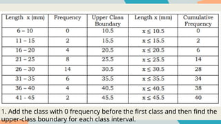
The graphshould have a title,
labels on both the horizontal and
vertical scales, and heading for
each scale.
3.
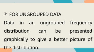
FOR UNGROUPEDDATA
Data in an ungrouped frequency
distribution can be presented
graphically to give a better picture of
the distribution.
5.
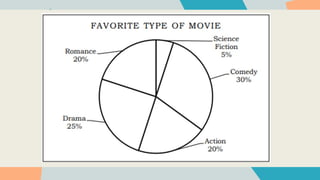
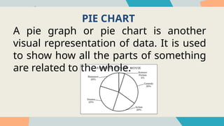
PIE CHART
A piegraph or pie chart is another
visual representation of data. It is used
to show how all the parts of something
are related to the whole.
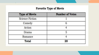
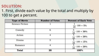
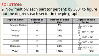
SOLUTION:
2. Now multiplyeach part (or percent) by 360° to figure
out the degrees each sector in the pie graph.
9.
SOLUTION:
3. Use compassto draw the circle and a protractor to
draw the “pie slices” or sectors. Label each sector of the
circle and give the graph a title.
10.
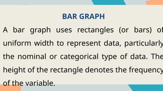
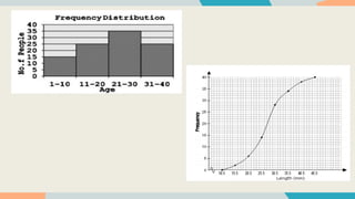
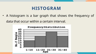
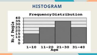
BAR GRAPH
A bargraph uses rectangles (or bars) of
uniform width to represent data, particularly
the nominal or categorical type of data. The
height of the rectangle denotes the frequency
of the variable.
11.
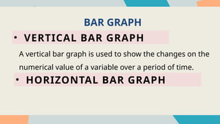
BAR GRAPH
• VERTICALBAR GRAPH
• HORIZONTAL BAR GRAPH
A vertical bar graph is used to show the changes on the
numerical value of a variable over a period of time.
13.
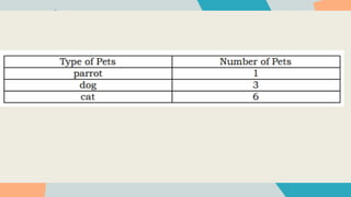
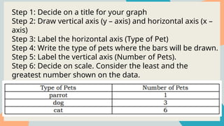
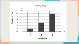
Step 1: Decideon a title for your graph
Step 2: Draw vertical axis (y – axis) and horizontal axis (x –
axis)
Step 3: Label the horizontal axis (Type of Pet)
Step 4: Write the type of pets where the bars will be drawn.
Step 5: Label the vertical axis (Number of Pets).
Step 6: Decide on scale. Consider the least and the
greatest number shown on the data.
Step 7: Draw a bar to show the total for each item.
15.
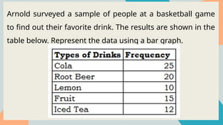
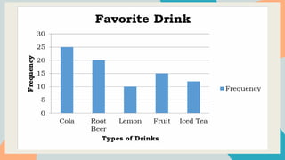
Arnold surveyed asample of people at a basketball game
to find out their favorite drink. The results are shown in the
table below. Represent the data using a bar graph.
17.
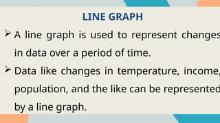
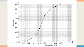
LINE GRAPH
Aline graph is used to represent changes
in data over a period of time.
Data like changes in temperature, income,
population, and the like can be represented
by a line graph.
18.
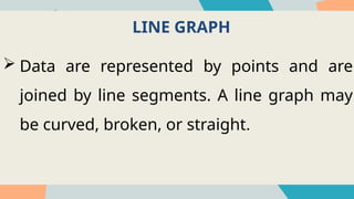
LINE GRAPH
Dataare represented by points and are
joined by line segments. A line graph may
be curved, broken, or straight.
19.
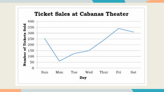
The table showsticket sales of the Cabanas Theater
during a typical week.
• We use horizontal axis for the days and the vertical axis
for the number of tickets sold.
21.
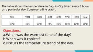
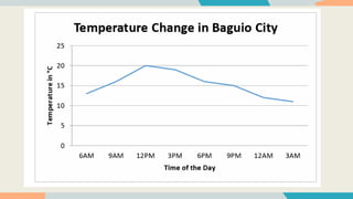
The table showsthe temperature in Baguio City taken every 3 hours
on a particular day. Construct a line graph.
Questions:
a.When was the warmest time of the day?
b.When was it coolest?
c.Discuss the temperature trend of the day.


![Presenting-Experimental-Data-Grade-8 [Autosaved].pptx](https://cdn.slidesharecdn.com/ss_thumbnails/presenting-experimental-data-grade-8autosaved-240925105557-9775d0ae-thumbnail.jpg?width=640&height=640&fit=bounds)
![Presenting-Experimental-Data-Grade-8 [Autosaved].pptx](https://cdn.slidesharecdn.com/ss_thumbnails/presenting-experimental-data-grade-8autosaved-240925104859-008a237a-thumbnail.jpg?width=640&height=640&fit=bounds)


![제 23회 보아즈(BOAZ) 빅데이터 컨퍼런스 - [MBOAX] : ABSA를 활용한 소비자 반응 분석 기반 운영 효율화 대시보드 설계](https://cdn.slidesharecdn.com/ss_thumbnails/3-1boaz23rdconferencemboax-260203102709-9d519923-thumbnail.jpg?width=640&height=640&fit=bounds)


