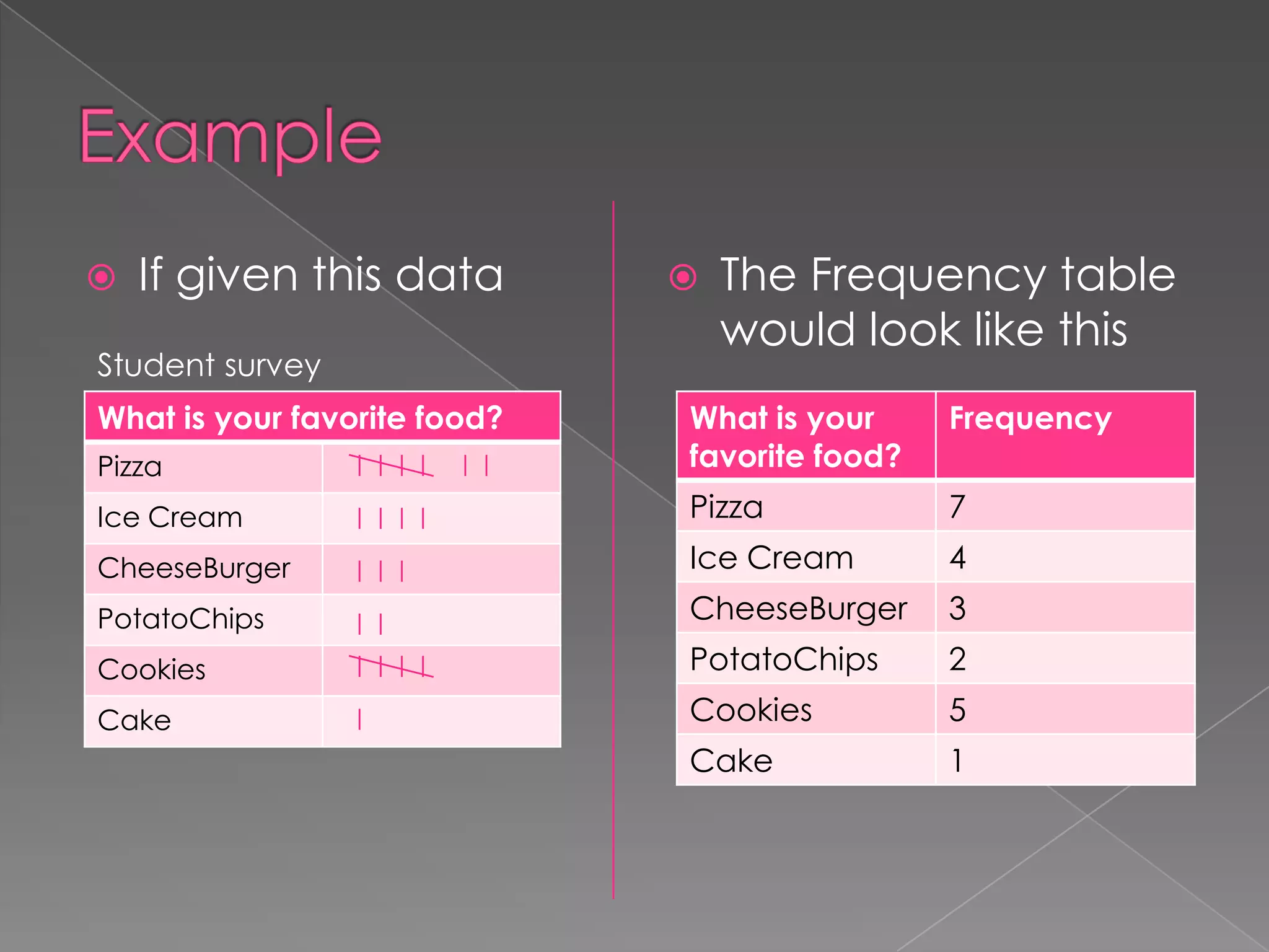
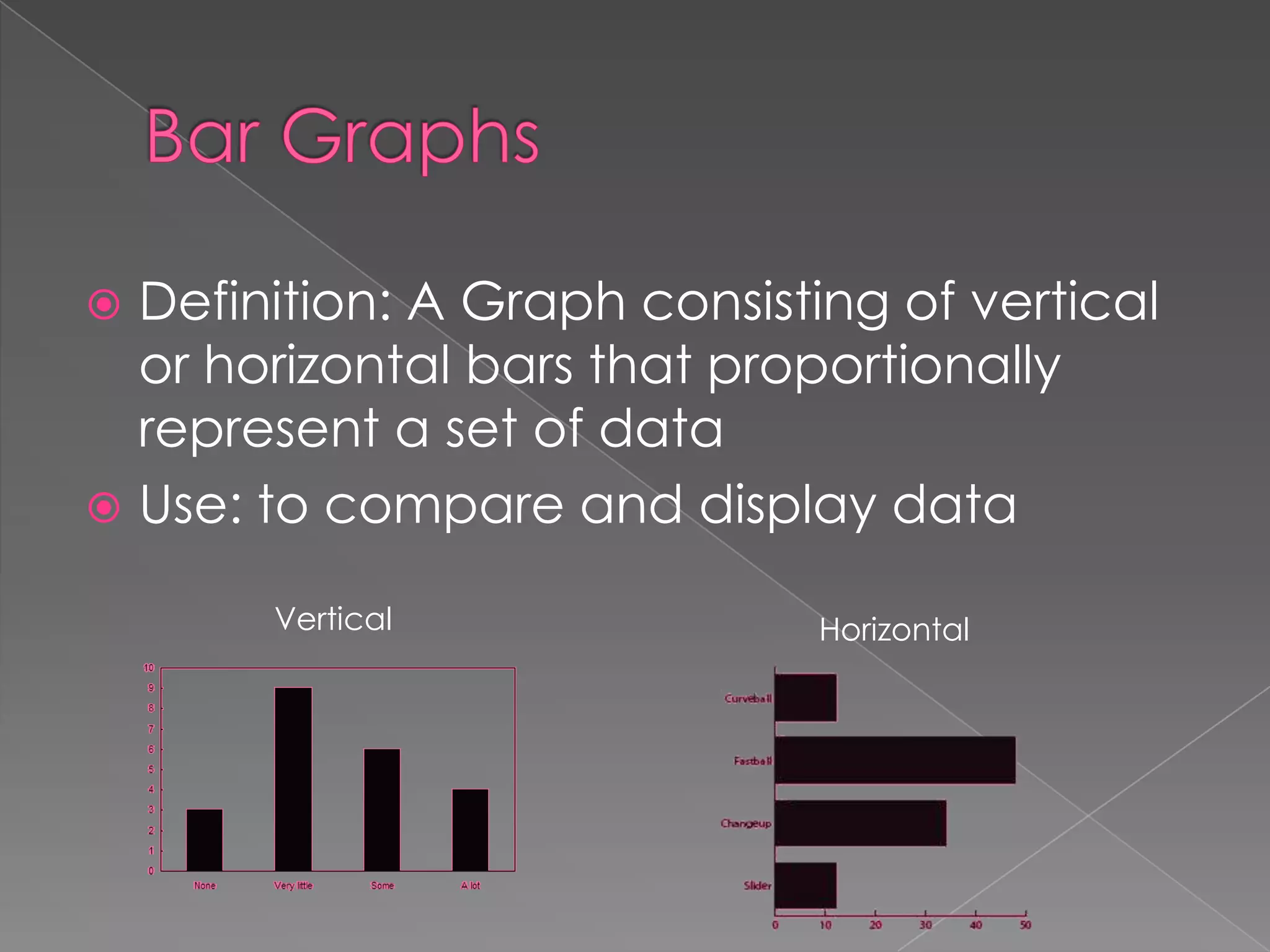
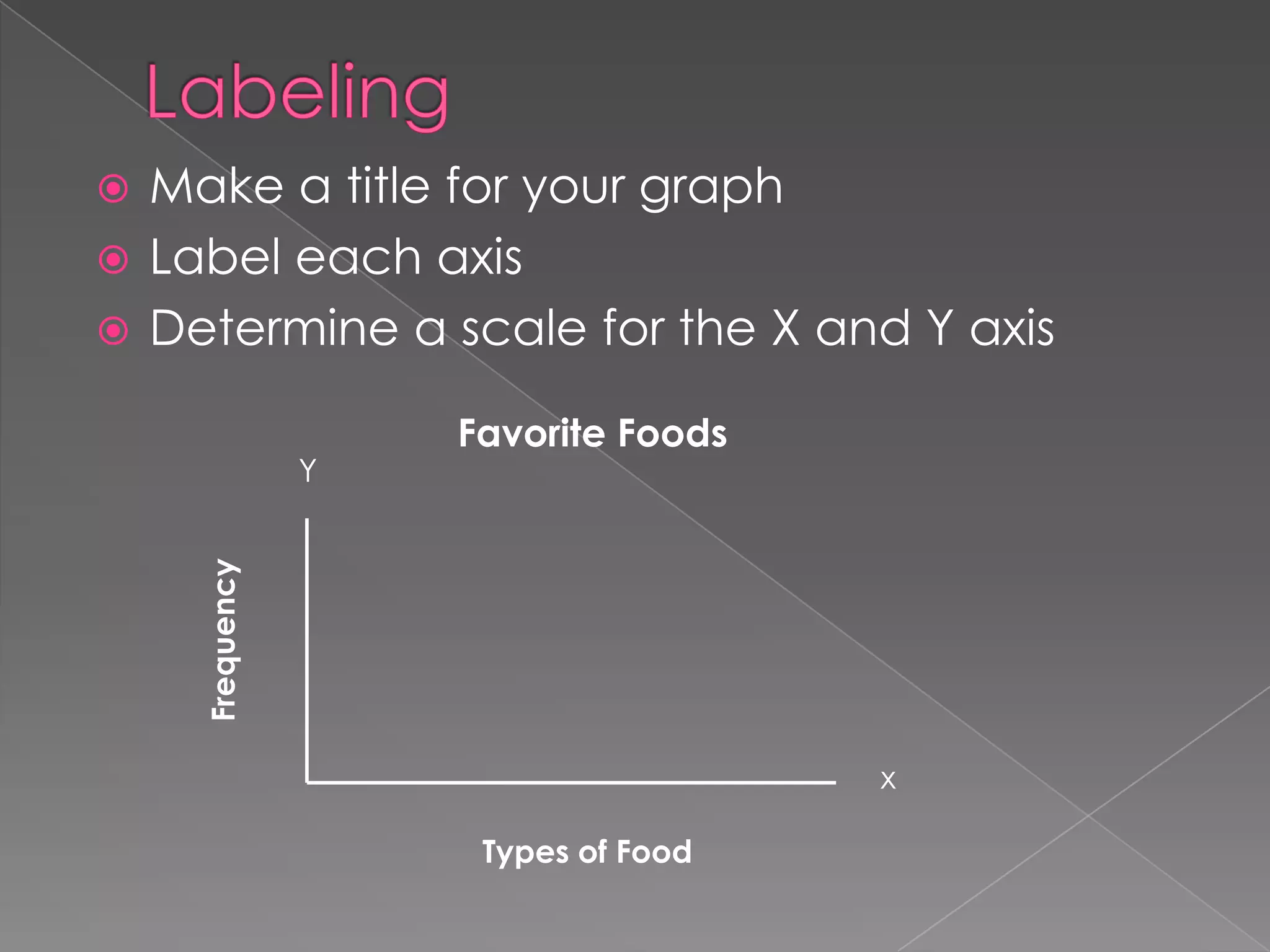
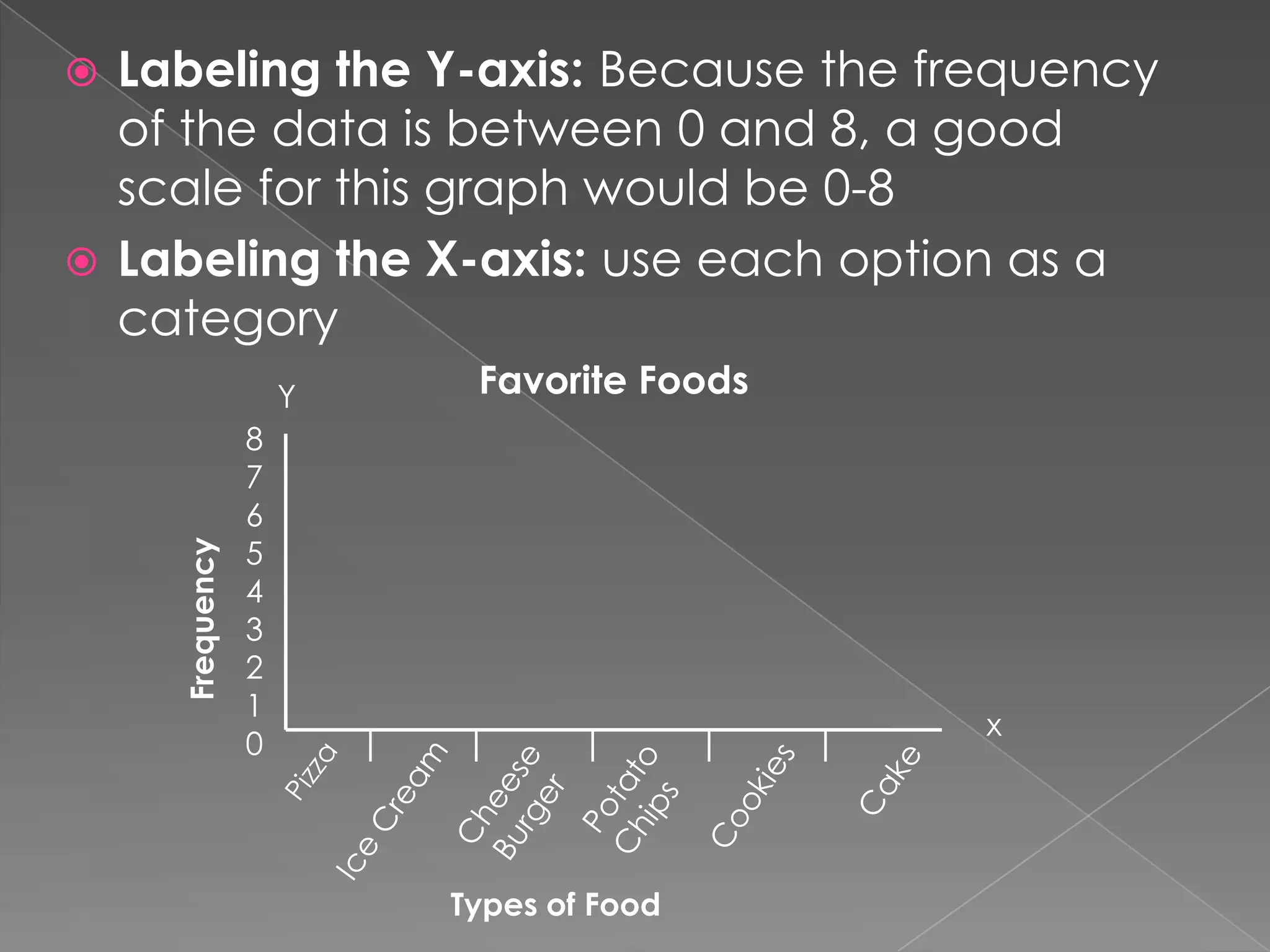
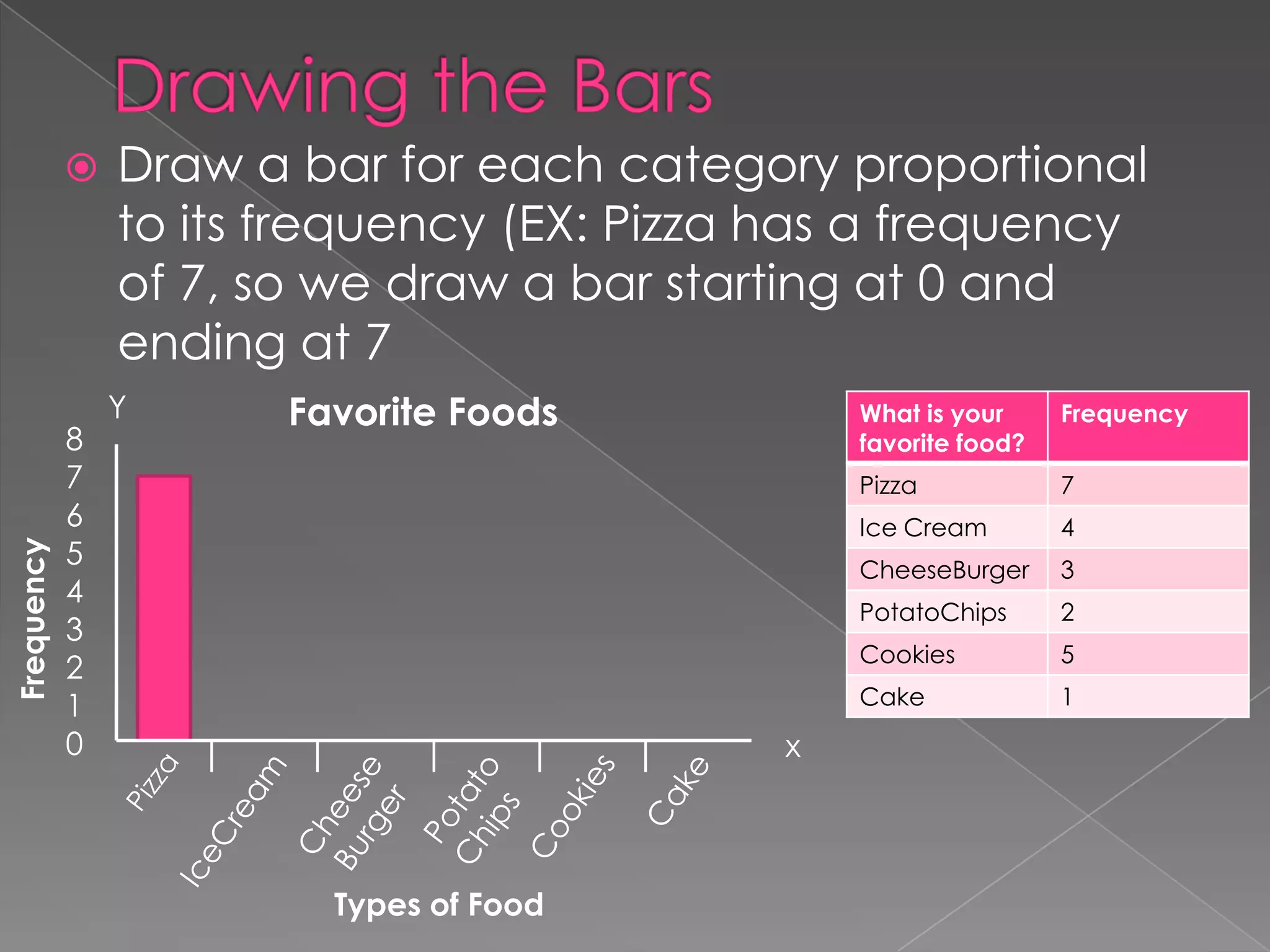
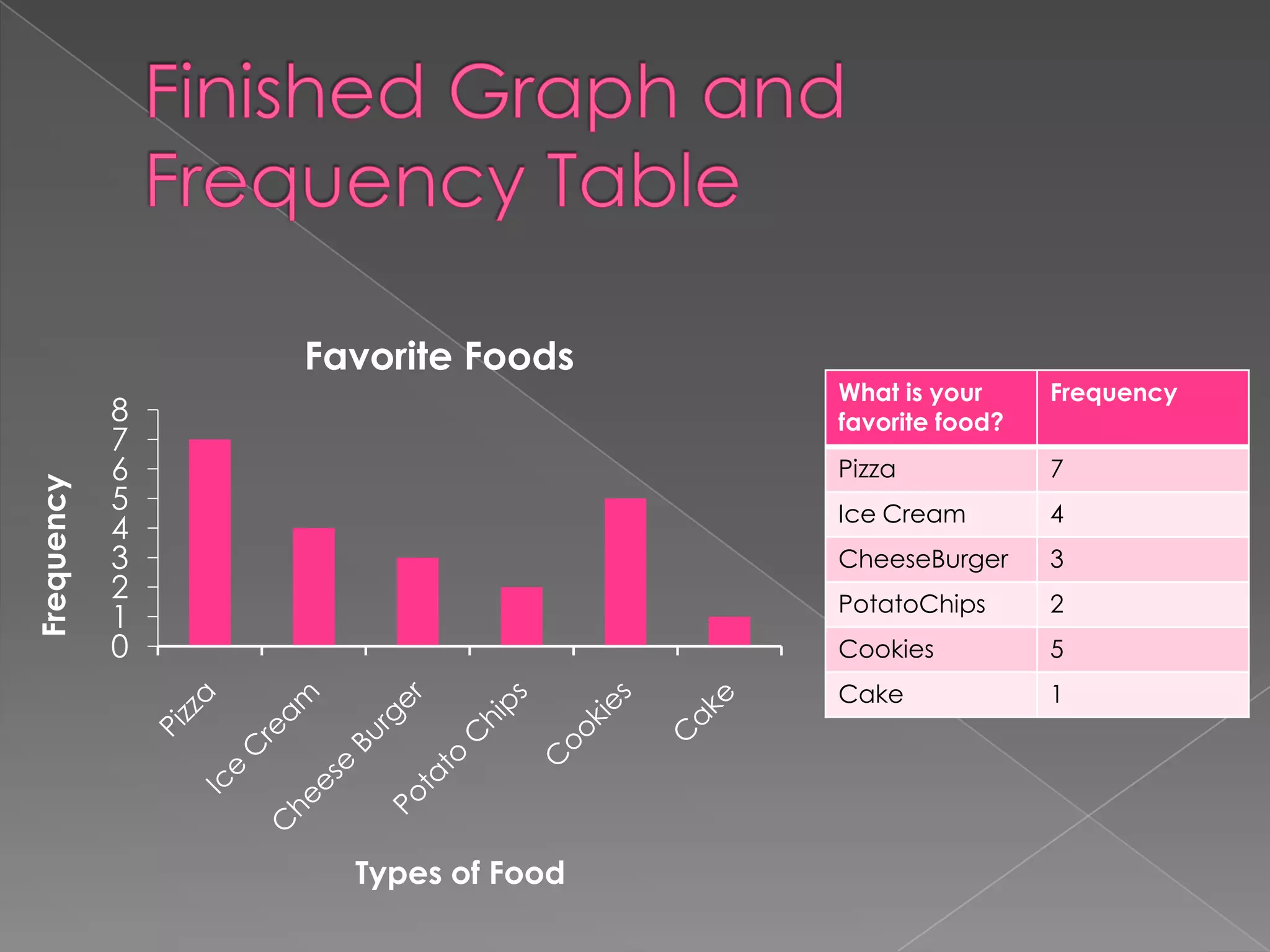
The frequency of a data value is equal
to the number of times that the value
occurs
 A Frequency Table arranges data values
in order from least to greatest with their
corresponding frequency



If given this data

Student survey
What is your favorite food?



The Frequency table
would look like this
Frequency

Pizza

What is your
favorite food?

Ice Cream

Pizza

7

CheeseBurger

Ice Cream

4

PotatoChips

CheeseBurger

3

Cookies

PotatoChips

2

Cake

Cookies

5

Cake

1
Definition: A Graph consisting of vertical
or horizontal bars that proportionally
represent a set of data
 Use: to compare and display data


Vertical

Horizontal
Make a title for your graph
 Label each axis
 Determine a scale for the X and Y axis


Frequency

Y

Favorite Foods

x
Types of Food
Labeling the Y-axis: Because the frequency
of the data is between 0 and 8, a good
scale for this graph would be 0-8
 Labeling the X-axis: use each option as a
category


Frequency

Y

Favorite Foods

8
7
6
5
4
3
2
1
0

x

Types of Food
Frequency



8
7
6
5
4
3
2
1
0

Draw a bar for each category proportional
to its frequency (EX: Pizza has a frequency
of 7, so we draw a bar starting at 0 and
ending at 7
Y

Favorite Foods

What is your
favorite food?
Pizza

4

CheeseBurger

3

PotatoChips

2

Cookies

5

Cake

Types of Food

7

Ice Cream

x

Frequency

1
Frequency

Favorite Foods

Frequency
7

Ice Cream

4

CheeseBurger

3

PotatoChips

2

Cookies

5

Cake

Types of Food

What is your
favorite food?
Pizza

8
7
6
5
4
3
2
1
0

1

Bar graph

  • 2.
    The frequency ofa data value is equal to the number of times that the value occurs  A Frequency Table arranges data values in order from least to greatest with their corresponding frequency 
  • 3.
     If given thisdata Student survey What is your favorite food?  The Frequency table would look like this Frequency Pizza What is your favorite food? Ice Cream Pizza 7 CheeseBurger Ice Cream 4 PotatoChips CheeseBurger 3 Cookies PotatoChips 2 Cake Cookies 5 Cake 1
  • 4.
    Definition: A Graphconsisting of vertical or horizontal bars that proportionally represent a set of data  Use: to compare and display data  Vertical Horizontal
  • 5.
    Make a titlefor your graph  Label each axis  Determine a scale for the X and Y axis  Frequency Y Favorite Foods x Types of Food
  • 6.
    Labeling the Y-axis:Because the frequency of the data is between 0 and 8, a good scale for this graph would be 0-8  Labeling the X-axis: use each option as a category  Frequency Y Favorite Foods 8 7 6 5 4 3 2 1 0 x Types of Food
  • 7.
    Frequency  8 7 6 5 4 3 2 1 0 Draw a barfor each category proportional to its frequency (EX: Pizza has a frequency of 7, so we draw a bar starting at 0 and ending at 7 Y Favorite Foods What is your favorite food? Pizza 4 CheeseBurger 3 PotatoChips 2 Cookies 5 Cake Types of Food 7 Ice Cream x Frequency 1
  • 8.