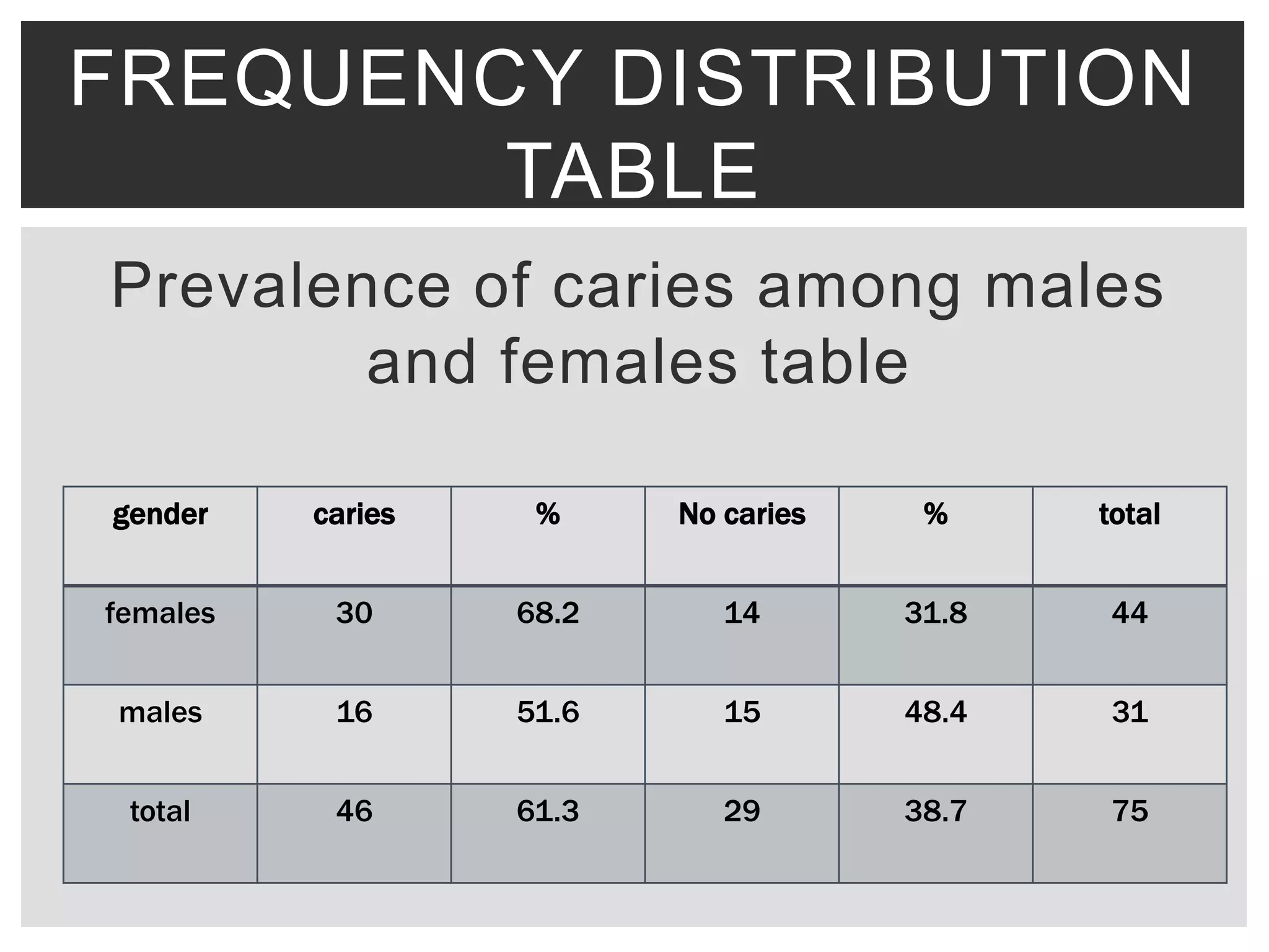
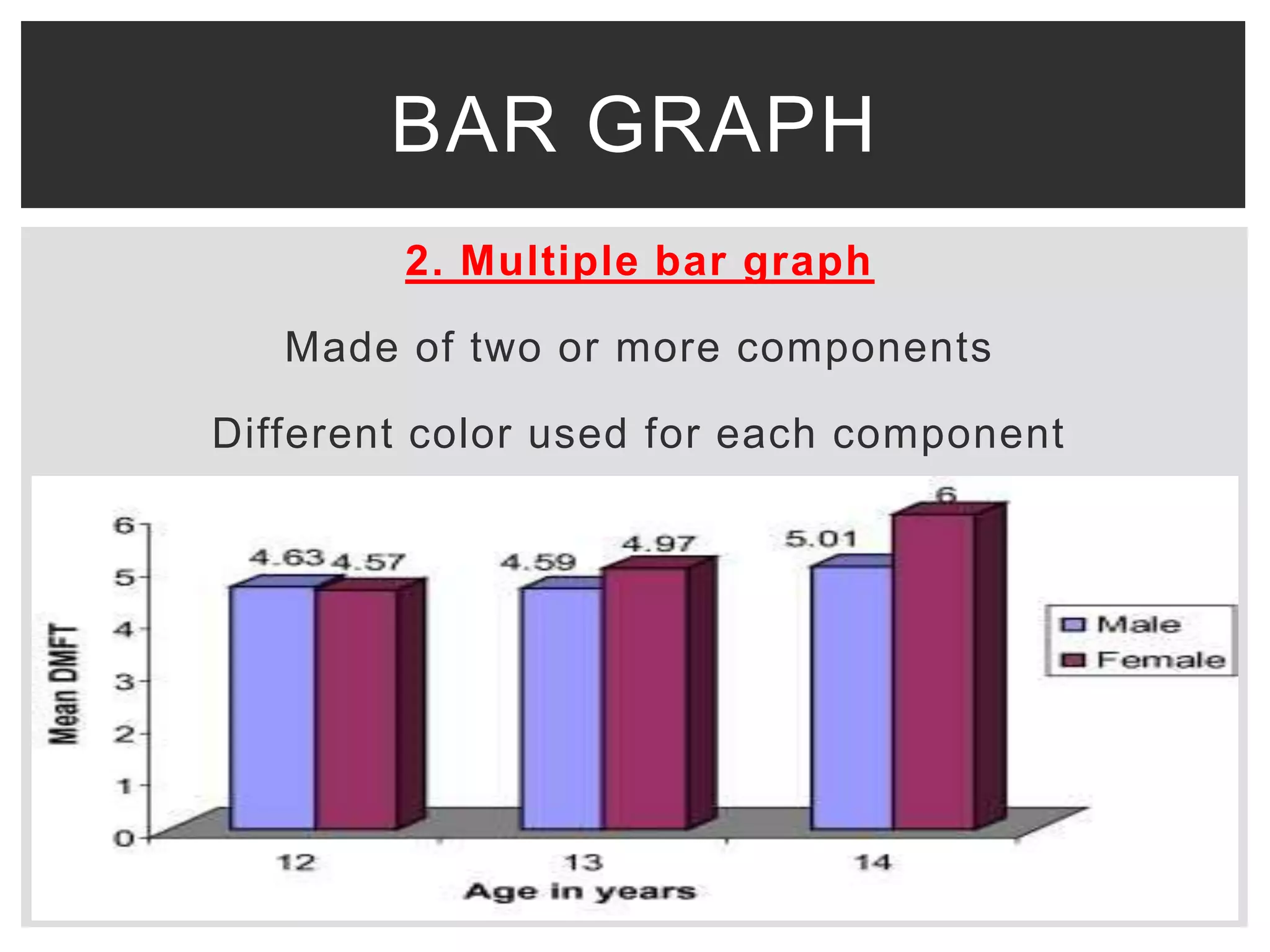
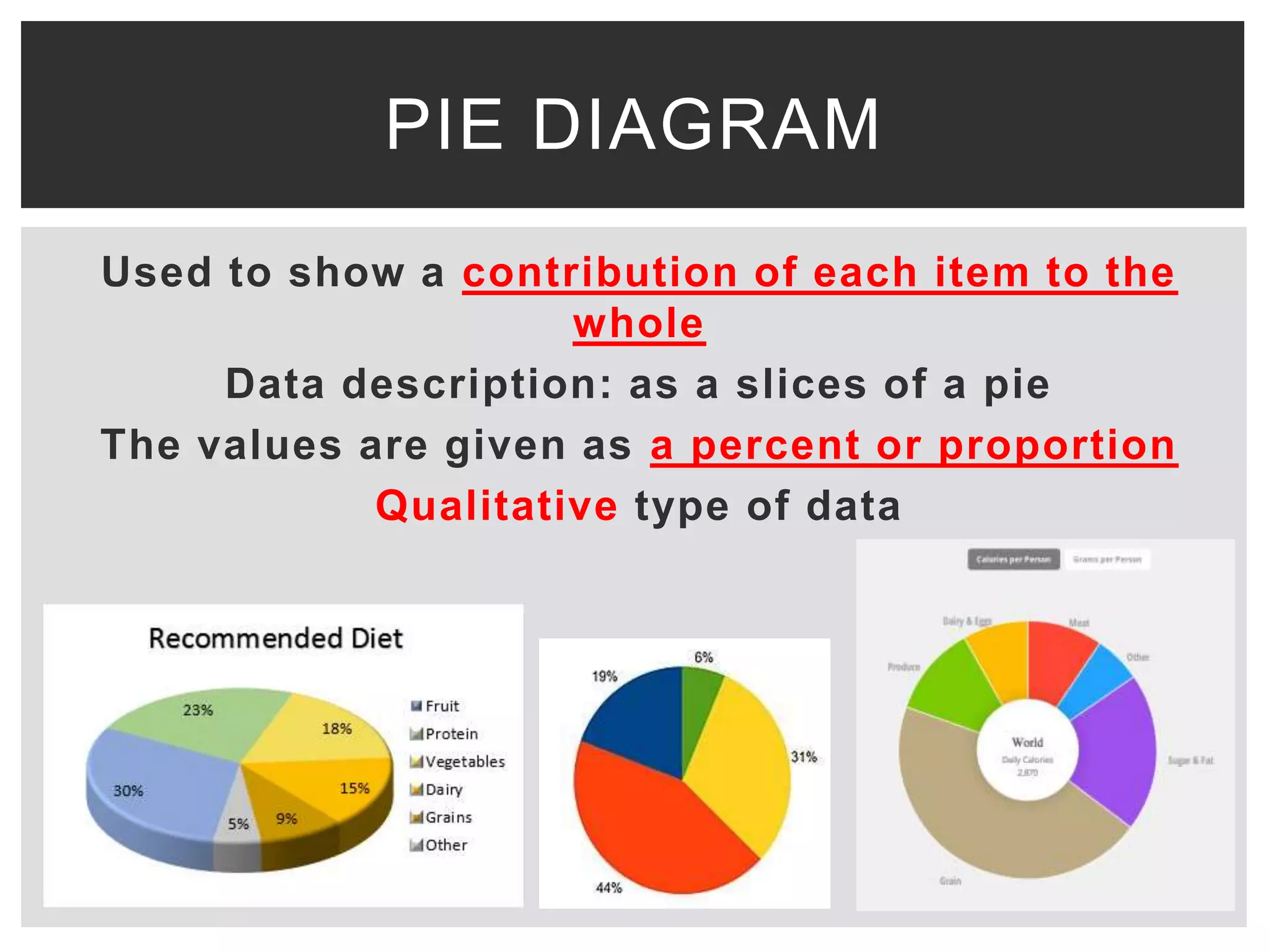
This document discusses various methods for presenting data, including tabular and graphical presentations. It describes common tabular presentations like frequency distribution tables and compares different graphical methods such as histograms, bar graphs, frequency polygons, pie diagrams, line graphs, scatter plots, statistical maps, and pictograms. Specifically, it provides details on histogram, simple/multiple/subdivided bar graphs, frequency polygons, pie diagrams, and scatter plots diagrams. The goal of data presentation is to summarize and analyze large datasets in a way that makes trends and patterns in the data easy to understand visually.