Downloaded 111 times

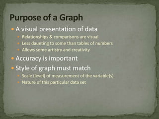
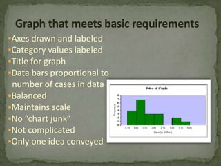
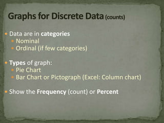
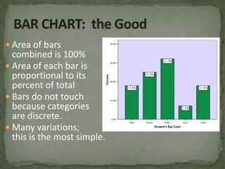
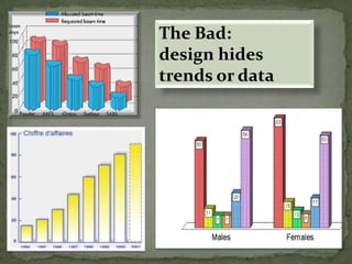
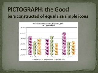
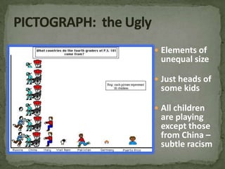

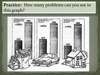
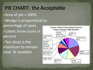
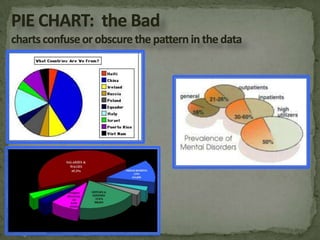
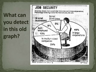
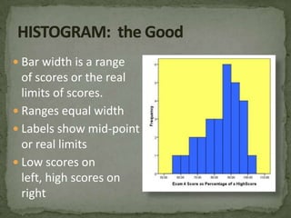
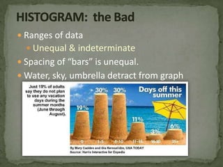
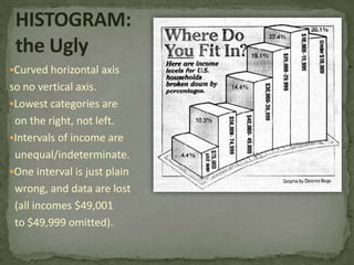

Graphs can effectively visualize data relationships but must be designed carefully. Bar charts and pie charts are appropriate for discrete categorical data. Bar charts compare frequencies as proportional bar widths and heights. Pie charts show category proportions through wedge sizes. Histograms and line graphs effectively display continuous and some ordinal data. Histograms use bar widths to represent value ranges. Line graphs connect data points to show trends over intervals. However, graphs can mislead if they distort data scales, use inappropriate or confusing designs, or include non-data elements. Data representation and readability should always be prioritized in graph creation.