Download to read offline


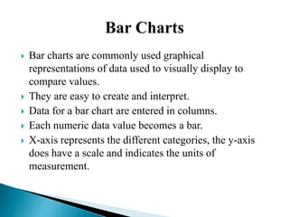
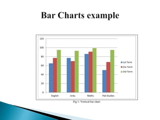
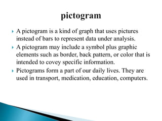
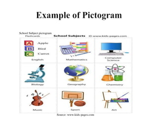
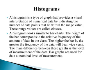
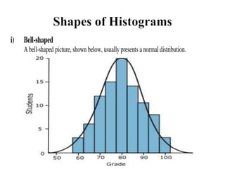
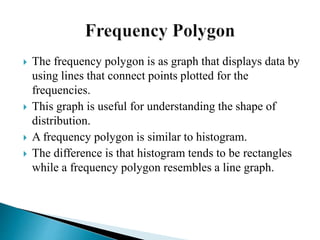
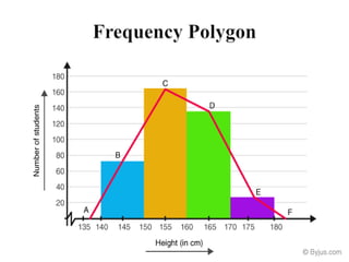
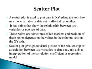
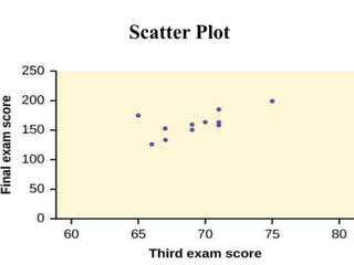
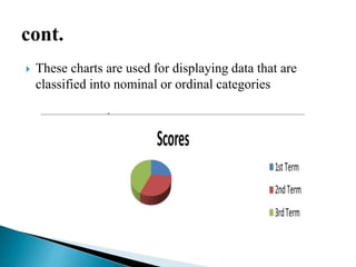


Graphical representations of data enhance interpretation and engagement by presenting facts in interesting ways, with bar charts, pictograms, histograms, and scatter plots being commonly used. Each type of graph serves a unique purpose, such as comparing values, visualizing distribution, or illustrating relationships between variables. For instance, pie charts are effective for comparing segments of categorical data, while histograms display the frequency of data within specified ranges.