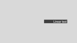
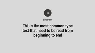
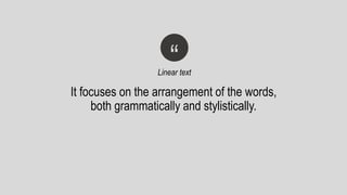
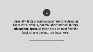
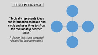
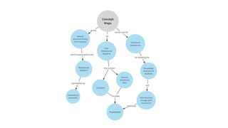
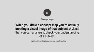
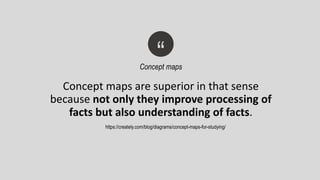
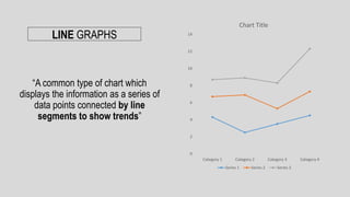
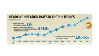
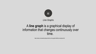
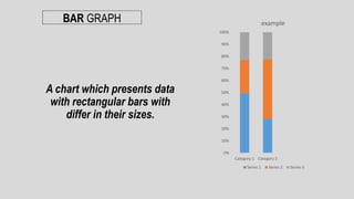
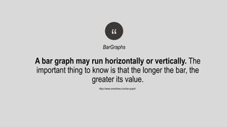
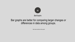
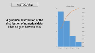
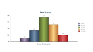
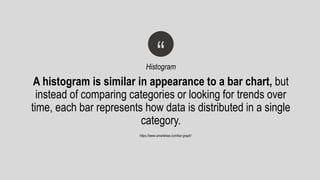
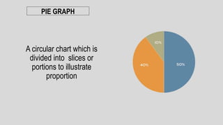
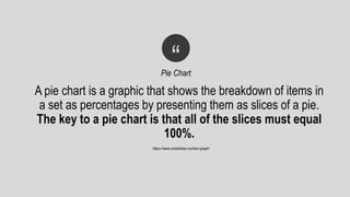
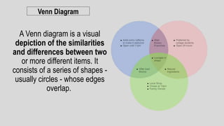
LINEAR & NON-LINEAR text
Linear text
This is the most common type
text that need to be read from
beginning to end
“Linear text
It focuses on the arrangement of the words,
both grammatically and stylistically.
“Linear text
Generally, texts printed on paper are considered as
linear texts. Novels, poems, short stories, letters,
educational texts, all those texts we read from the
beginning to the end, are linear texts.
“
https://www.differencebetween.com/difference-between-linear-and-nonlinear-text/
Non-linear text
The readers do not have to go through
the text in a sequential manner in order to
make sense of the text.
“Non-Linear text
. Most people consider texts with visuals or
graphs along with it as examples for nonlinear
texts.
“Non-Linear text
https://www.differencebetween.com/difference-between-linear-and-nonlinear-text/
EXAMPLES OF NON-LINEAR TEXT
Charts or Graphs.
These are the representation of data
represented by symbols or legends
“Charts or Graphs
Different kinds of
Graphs or Charts.
CONCEPT DIAGRAM
A diagram that shows suggested
relationships between concepts.
“Typically represents ideas
and information as boxes and
circle and uses lines to show
the relationship between
them.”
When you draw a concept map you’re actually
creating a visual image of that subject. A visual
that you can analyze to check your understanding
of a subject.
“Concept maps
https://creately.com/blog/diagrams/concept-maps-for-studying/
Concept maps are superior in that sense
because not only they improve processing of
facts but also understanding of facts.
“Concept maps
https://creately.com/blog/diagrams/concept-maps-for-studying/
LINE GRAPHS
“A common type of chart which
displays the information as a series of
data points connected by line
segments to show trends”
0
2
4
6
8
10
12
14
Category 1 Category 2 Category 3 Category 4
Chart Title
Series 1 Series 2 Series 3
A line graph is a graphical display of
information that changes continuously over
time.
“Line Graphs
https://study.com/academy/lesson/what-is-a-line-graph-definition-examples.html
BAR GRAPH
A chart which presents data
with rectangular bars with
differ in their sizes.
0%
10%
20%
30%
40%
50%
60%
70%
80%
90%
100%
Category 1 Category 2
example
Series 1 Series 2 Series 3
A bar graph may run horizontally or vertically. The
important thing to know is that the longer the bar, the
greater its value.
“BarGraphs
https://www.smartdraw.com/bar-graph/
Bar graphs are better for comparing larger changes or
differences in data among groups.
“BarGraphs
https://www.smartdraw.com/bar-graph/
HISTOGRAM
A graphical distribution of the
distribution of numerical data.
It has no gaps between bars.
“Histogram
https://www.smartdraw.com/bar-graph/
A histogram is similar in appearance to a bar chart, but
instead of comparing categories or looking for trends over
time, each bar represents how data is distributed in a single
category.
PIE GRAPH
A circular chart which is
divided into slices or
portions to illustrate
proportion
“Pie Chart
https://www.smartdraw.com/bar-graph/
A pie chart is a graphic that shows the breakdown of items in
a set as percentages by presenting them as slices of a pie.
The key to a pie chart is that all of the slices must equal
100%.
Venn Diagram
A Venn diagram is a visual
depiction of the similarities
and differences between two
or more different items. It
consists of a series of shapes -
usually circles - whose edges
overlap.
Linear and Non linear texts (English 9)

Linear and Non linear texts (English 9)

  • 1.
  • 2.
  • 3.
    This is themost common type text that need to be read from beginning to end “Linear text
  • 4.
    It focuses onthe arrangement of the words, both grammatically and stylistically. “Linear text
  • 5.
    Generally, texts printedon paper are considered as linear texts. Novels, poems, short stories, letters, educational texts, all those texts we read from the beginning to the end, are linear texts. “ https://www.differencebetween.com/difference-between-linear-and-nonlinear-text/
  • 6.
  • 7.
    The readers donot have to go through the text in a sequential manner in order to make sense of the text. “Non-Linear text
  • 8.
    . Most peopleconsider texts with visuals or graphs along with it as examples for nonlinear texts. “Non-Linear text https://www.differencebetween.com/difference-between-linear-and-nonlinear-text/
  • 9.
  • 10.
  • 11.
    These are therepresentation of data represented by symbols or legends “Charts or Graphs
  • 12.
  • 13.
    CONCEPT DIAGRAM A diagramthat shows suggested relationships between concepts. “Typically represents ideas and information as boxes and circle and uses lines to show the relationship between them.”
  • 15.
    When you drawa concept map you’re actually creating a visual image of that subject. A visual that you can analyze to check your understanding of a subject. “Concept maps https://creately.com/blog/diagrams/concept-maps-for-studying/
  • 16.
    Concept maps aresuperior in that sense because not only they improve processing of facts but also understanding of facts. “Concept maps https://creately.com/blog/diagrams/concept-maps-for-studying/
  • 17.
    LINE GRAPHS “A commontype of chart which displays the information as a series of data points connected by line segments to show trends” 0 2 4 6 8 10 12 14 Category 1 Category 2 Category 3 Category 4 Chart Title Series 1 Series 2 Series 3
  • 19.
    A line graphis a graphical display of information that changes continuously over time. “Line Graphs https://study.com/academy/lesson/what-is-a-line-graph-definition-examples.html
  • 20.
    BAR GRAPH A chartwhich presents data with rectangular bars with differ in their sizes. 0% 10% 20% 30% 40% 50% 60% 70% 80% 90% 100% Category 1 Category 2 example Series 1 Series 2 Series 3
  • 22.
    A bar graphmay run horizontally or vertically. The important thing to know is that the longer the bar, the greater its value. “BarGraphs https://www.smartdraw.com/bar-graph/
  • 23.
    Bar graphs arebetter for comparing larger changes or differences in data among groups. “BarGraphs https://www.smartdraw.com/bar-graph/
  • 24.
    HISTOGRAM A graphical distributionof the distribution of numerical data. It has no gaps between bars.
  • 26.
    “Histogram https://www.smartdraw.com/bar-graph/ A histogram issimilar in appearance to a bar chart, but instead of comparing categories or looking for trends over time, each bar represents how data is distributed in a single category.
  • 27.
    PIE GRAPH A circularchart which is divided into slices or portions to illustrate proportion
  • 28.
    “Pie Chart https://www.smartdraw.com/bar-graph/ A piechart is a graphic that shows the breakdown of items in a set as percentages by presenting them as slices of a pie. The key to a pie chart is that all of the slices must equal 100%.
  • 29.
    Venn Diagram A Venndiagram is a visual depiction of the similarities and differences between two or more different items. It consists of a series of shapes - usually circles - whose edges overlap.

Editor's Notes

  • #5 Syntactic: Syntactic can be defined as to do with the arrangement of words and phrases when forming a sentence.
  • #6 Skimming A technique for fast reading. A reader reads the article in order to get the general idea of it.
  • #17 Recalling and processing images is infinitely easier than paragraphs. But, it’s important to remember that although images are easier to process they don’t necessarily improve the understanding of knowledge.
  • #20 Recalling and processing images is infinitely easier than paragraphs. But, it’s important to remember that although images are easier to process they don’t necessarily improve the understanding of knowledge.
  • #23 In bar graphs are usually used to display "categorical data"
  • #24 Line graphs are useful for displaying smaller changes in a trend over time.
  • #25 Histograms on the other hand are usually used to present "continuous data  A good example is weight. If you measure the weights of a group of adults you might get and numbers between say 90 pounds and 240 pounds
  • #29 Line graphs are useful for displaying smaller changes in a trend over time.