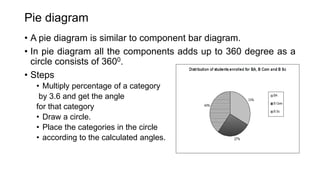
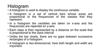
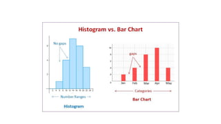
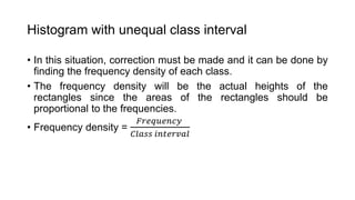
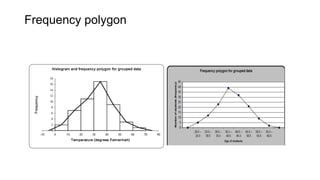
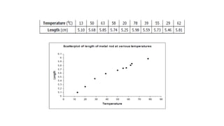
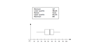
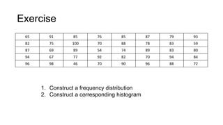
SlideShare a Scribd company logo
Data organization &
presentation
• Once data has been collected, it has to be organized and
classified in such a way that it becomes easily readable and
interpretable.
• Measurements that have not been organized, summarized or
otherwise manipulated are called raw data.
• First step in organizing data is the preparation of an ordered
array.
• An ordered array is listing the values in order of magnitude from
the smallest value to the largest value.
• Summarizing qualitative data is very straight forward, the main
task is being to count the number of observation in each
category. These counts are called frequencies.
• Data can be presented in one of the three ways
• As text: It is the main method of conveying information and it is
used to explain results and trends and provide contextual
information.
• In tabular form: It conveys information by converting words and
numbers into rows and columns. It is easier to see patterns and
relationship.
• In graphical form: Graphs simplify complex information by using
images and emphasizing data patterns or trends and are useful
for summarizing, explaining or exploring quantitative data.
Tabular forms
• Array: An array is a matrix or rows and columns of numbers
which have been arranged in some orders.
• Simple tables: A table needs a heading and names of variables
involved.
• Compound tables: It is an extension of simple table where more
than one variable is used. We may also refer a compound table
as a cross-tabulation or contingency table depending on the
context in which it is used.
• Bivariate table: When two variables are presented in one
table.
• Multivariate table: When more than two variables are used in
one table.
Age
group yr
Male Female
Illiterate Literate Illiterate literate
<40
≥ 40
Total
• Frequency distribution of grouped data: To group a set of
observations first to select a set contiguous, non overlapping
intervals such that each value in the set of observations can be
placed in one and only one of the interval. These intervals are
known as class interval.
• Width of class interval should be of same width. This width may
be determined by dividing the range R by k, the number of class
interval.
• Rule of thumb: Class interval width of 5 units, 10 units.
Following points should be kept in mind for classification
1. The classes should be clearly defined and should not lead to
any ambiguity
2. The classes should be exhaustive and each of the given
values should be included in one of the classes
3. The classes should be mutually exclusive and non
overlapping
4. The classes preferably of equal width
5. The number of classes should neither be too large or too
small
6. There should no gaps between groups
Inclusive & Exclusive Class Interval
1. When the lower and upper class limit is included, then it is an
Inclusive Class Interval. For example 21- 25, 26-30. Usually in
discrete variable, this type of class interval is used.
2. When the lower limit is included, but the upper limit is
excluded, then it is an Exclusive Class Interval. For example,
20 - 25, 25- 30. In case of continuous variable, exclusive class
interval is used.
Drawing/ Graphical presentation
For quantitative data, common graphs are
1. Histogram
2. Frequency polygon
3. Frequency curve
4. Line chart/graph
5. Cumulative frequency polygon or Ogive
6. Scatter plot
7. Stem and leaf
8. Box and Whiskers diagram
• The common diagrams for qualitative variable are:
1. Bar diagram
i. Simple Bar diagram
ii. Multiple bar
iii. Proportional/ component bar
1. Pie chart
2. Pictogram
3. Spot map
Simple bar diagram
• Only one variable is presented in a simple bar diagram.
• Steps of drawing a bar diagram
• Construct scale by a horizontal line which is known as x-axis
and a vertical line which is y – axis.
• Place categories of the variable on the x-axis and y-axis
represents the frequency or percentage of the categories.
• Width of the bars should be equal.
• Gap between the bars should also be equal.
Component bar diagram
• Categories of a variable forms a bar which constitutes 100%.
• Scale the y-axis from 0% to 100%.
• A bar on x-axis should be as tall as 100%.
• The bar is constituted as per proportion of the categories.
Pie diagram
• A pie diagram is similar to component bar diagram.
• In pie diagram all the components adds up to 360 degree as a
circle consists of 3600.
• Steps
• Multiply percentage of a category
by 3.6 and get the angle
for that category
• Draw a circle.
• Place the categories in the circle
• according to the calculated angles.
Pictogram
Spot map
Histogram
• A histogram is used to display the continuous variable.
• A histogram is a set of vertical bars whose areas are
proportional to the frequencies of the classes that they
represent.
• In a histogram the variables are taken on x-axis and the
frequencies are repented on y-axis.
• Each class is then represented by a distance on the scale that
is proportional to the class interval.
• Unlike the bar charts, there are no gaps between successive
rectangles of a histogram.
• A histogram is two-dimensional, here both length and width are
important.
Histogram with unequal class interval
• In this situation, correction must be made and it can be done by
finding the frequency density of each class.
• The frequency density will be the actual heights of the
rectangles since the areas of the rectangles should be
proportional to the frequencies.
• Frequency density =
𝐹𝑟𝑒𝑞𝑢𝑒𝑛𝑐𝑦
𝐶𝑙𝑎𝑠𝑠 𝑖𝑛𝑡𝑒𝑟𝑣𝑎𝑙
Frequency polygon
Line chart/graph
• A line chart shows the frequencies for different values of a
variable. Successive points are joined by means of line
segments so that a glance at the graph tells the distribution of
the variable.
• Simple line chart: When values of one variable is presented.
Trends can be determined.
• Multiple line chart: More than one variables are presented
here. Comparison between variables and also trends can be
understood.
Simple line graph Multiple line graph
Cumulative frequency polygons or Ogives
• It is generated when cumulative frequencies are plotted on real
limits of classes of a distribution.
• Cumulative frequency means that the frequencies of classes
are accumulated over the entire distribution.
• Two types of cumulative frequency
1. ‘Less than’ cumulative frequency: It is the total number of
observations in the entire distribution, which is less than or equal to
the real upper limit of the class.
2. ‘More than’ cumulative frequency: It is the total number of
observations in the entire distribution, which is more than or equal to
the real lower limit of the class.
Scatter plot
• This type of diagram is used to investigate the relationship
between two continuous variables.
• In such a relationship, there is usually an independent variable
and a dependent variable.
• It is a prerequisite diagram in correlation and regression
analysis.
Stem and leaf
• Stem and leaf is also known as stemplot used to represent raw
data, that is individual observation without loss of information.
• The leaves of the diagram are the last digits of the observation
while the stems are the remaining part of the value.
• Suppose, the value 117, here ‘11’ is the stem and ‘7’ is the leaf.
Raw data
Box and Whiskers diagram
• Box and whiskers diagram is usually known as boxplots,
specially designed to display the dispersion and skewness of
the distribution.
• The figure consists of a box in the middle from which two lines
(whiskers) extends toward minimum and maximum values of
the distribution.
• A box plot is drawn according to 5 descriptive statistics
• Minimum value
• Upper quartile
• Median
• Lower quartile
• Maximum value
Exercise
65 91 85 76 85 87 79 93
82 75 100 70 88 78 83 59
87 69 89 54 74 89 83 80
94 67 77 92 82 70 94 84
96 98 46 70 90 96 88 72
1. Construct a frequency distribution
2. Construct a corresponding histogram

More Related Content

Similar to Data presentation.pptx

135. Graphic Presentation
135. Graphic Presentation135. Graphic Presentation
135. Graphic Presentation
LAKSHMANAN S
 
diagrammatic and graphical representation of data
 diagrammatic and graphical representation of data diagrammatic and graphical representation of data
diagrammatic and graphical representation of data
Varun Prem Varu
 
Statistics
StatisticsStatistics
Statistics
Dr. Jayesh Vyas
 
Types of data and graphical representation
Types of data and graphical representationTypes of data and graphical representation
Types of data and graphical representation
Reena Titoria
 
Data presentation
Data presentationData presentation
Data presentation
Weam Banjar
 
GRAPHS AND DIAGRAMS.pptx
GRAPHS AND DIAGRAMS.pptxGRAPHS AND DIAGRAMS.pptx
GRAPHS AND DIAGRAMS.pptx
VinothiniSylvia
 
data collection.pptx
data collection.pptxdata collection.pptx
data collection.pptx
AbhishekRaj508
 
graphic representations in statistics
 graphic representations in statistics graphic representations in statistics
graphic representations in statistics
Unsa Shakir
 
Graphs(Biostatistics and Research Methodology) B.pharmacy(8th sem.)
Graphs(Biostatistics and Research Methodology) B.pharmacy(8th sem.)Graphs(Biostatistics and Research Methodology) B.pharmacy(8th sem.)
Graphs(Biostatistics and Research Methodology) B.pharmacy(8th sem.)
Pranjal Saxena
 
LINE AND SCATTER DIAGRAM,FREQUENCY DISTRIBUTION
LINE AND SCATTER DIAGRAM,FREQUENCY DISTRIBUTIONLINE AND SCATTER DIAGRAM,FREQUENCY DISTRIBUTION
LINE AND SCATTER DIAGRAM,FREQUENCY DISTRIBUTION
ruhila bhat
 
4-types-of-graphs.pptx
4-types-of-graphs.pptx4-types-of-graphs.pptx
4-types-of-graphs.pptx
MJGamboa2
 
Data Presentation using Descriptive Graphs.pptx
Data Presentation using Descriptive Graphs.pptxData Presentation using Descriptive Graphs.pptx
Data Presentation using Descriptive Graphs.pptx
Jeanettebagtoc
 
Diagr-graph-presentation.ppt
Diagr-graph-presentation.pptDiagr-graph-presentation.ppt
Diagr-graph-presentation.ppt
DasariSreenivas
 
Introduction to Descriptive Statistics
Introduction to Descriptive StatisticsIntroduction to Descriptive Statistics
Introduction to Descriptive Statistics
Sanju Rusara Seneviratne
 
PG STAT 531 Lecture 3 Graphical and Diagrammatic Representation of Data
PG STAT 531 Lecture 3 Graphical and Diagrammatic Representation of DataPG STAT 531 Lecture 3 Graphical and Diagrammatic Representation of Data
PG STAT 531 Lecture 3 Graphical and Diagrammatic Representation of Data
Aashish Patel
 
PRESENTATION OF STATISTICAL DATA
PRESENTATION OF STATISTICAL DATAPRESENTATION OF STATISTICAL DATA
PRESENTATION OF STATISTICAL DATA
keerthi samuel
 
FREQUENCY DISTRIBUTION.pptx
FREQUENCY DISTRIBUTION.pptxFREQUENCY DISTRIBUTION.pptx
FREQUENCY DISTRIBUTION.pptx
SreeLatha98
 
Biostatistics_descriptive stats.pptx
Biostatistics_descriptive stats.pptxBiostatistics_descriptive stats.pptx
Biostatistics_descriptive stats.pptx
MohammedAbdela7
 
Graphs- A tool to present data
Graphs- A tool to present dataGraphs- A tool to present data
Graphs- A tool to present data
Dr-Jitendra Patel
 

Similar to Data presentation.pptx (20)

135. Graphic Presentation
135. Graphic Presentation135. Graphic Presentation
135. Graphic Presentation
 
diagrammatic and graphical representation of data
 diagrammatic and graphical representation of data diagrammatic and graphical representation of data
diagrammatic and graphical representation of data
 
Statistics
StatisticsStatistics
Statistics
 
Types of data and graphical representation
Types of data and graphical representationTypes of data and graphical representation
Types of data and graphical representation
 
Data presentation
Data presentationData presentation
Data presentation
 
GRAPHS AND DIAGRAMS.pptx
GRAPHS AND DIAGRAMS.pptxGRAPHS AND DIAGRAMS.pptx
GRAPHS AND DIAGRAMS.pptx
 
Intro to statistics
Intro to statisticsIntro to statistics
Intro to statistics
 
data collection.pptx
data collection.pptxdata collection.pptx
data collection.pptx
 
graphic representations in statistics
 graphic representations in statistics graphic representations in statistics
graphic representations in statistics
 
Graphs(Biostatistics and Research Methodology) B.pharmacy(8th sem.)
Graphs(Biostatistics and Research Methodology) B.pharmacy(8th sem.)Graphs(Biostatistics and Research Methodology) B.pharmacy(8th sem.)
Graphs(Biostatistics and Research Methodology) B.pharmacy(8th sem.)
 
LINE AND SCATTER DIAGRAM,FREQUENCY DISTRIBUTION
LINE AND SCATTER DIAGRAM,FREQUENCY DISTRIBUTIONLINE AND SCATTER DIAGRAM,FREQUENCY DISTRIBUTION
LINE AND SCATTER DIAGRAM,FREQUENCY DISTRIBUTION
 
4-types-of-graphs.pptx
4-types-of-graphs.pptx4-types-of-graphs.pptx
4-types-of-graphs.pptx
 
Data Presentation using Descriptive Graphs.pptx
Data Presentation using Descriptive Graphs.pptxData Presentation using Descriptive Graphs.pptx
Data Presentation using Descriptive Graphs.pptx
 
Diagr-graph-presentation.ppt
Diagr-graph-presentation.pptDiagr-graph-presentation.ppt
Diagr-graph-presentation.ppt
 
Introduction to Descriptive Statistics
Introduction to Descriptive StatisticsIntroduction to Descriptive Statistics
Introduction to Descriptive Statistics
 
PG STAT 531 Lecture 3 Graphical and Diagrammatic Representation of Data
PG STAT 531 Lecture 3 Graphical and Diagrammatic Representation of DataPG STAT 531 Lecture 3 Graphical and Diagrammatic Representation of Data
PG STAT 531 Lecture 3 Graphical and Diagrammatic Representation of Data
 
PRESENTATION OF STATISTICAL DATA
PRESENTATION OF STATISTICAL DATAPRESENTATION OF STATISTICAL DATA
PRESENTATION OF STATISTICAL DATA
 
FREQUENCY DISTRIBUTION.pptx
FREQUENCY DISTRIBUTION.pptxFREQUENCY DISTRIBUTION.pptx
FREQUENCY DISTRIBUTION.pptx
 
Biostatistics_descriptive stats.pptx
Biostatistics_descriptive stats.pptxBiostatistics_descriptive stats.pptx
Biostatistics_descriptive stats.pptx
 
Graphs- A tool to present data
Graphs- A tool to present dataGraphs- A tool to present data
Graphs- A tool to present data
 

Recently uploaded

Adjusting primitives for graph : SHORT REPORT / NOTES
Adjusting primitives for graph : SHORT REPORT / NOTESAdjusting primitives for graph : SHORT REPORT / NOTES
Adjusting primitives for graph : SHORT REPORT / NOTES
Subhajit Sahu
 
一比一原版(Coventry毕业证书)考文垂大学毕业证如何办理
一比一原版(Coventry毕业证书)考文垂大学毕业证如何办理一比一原版(Coventry毕业证书)考文垂大学毕业证如何办理
一比一原版(Coventry毕业证书)考文垂大学毕业证如何办理
74nqk8xf
 
一比一原版(爱大毕业证书)爱丁堡大学毕业证如何办理
一比一原版(爱大毕业证书)爱丁堡大学毕业证如何办理一比一原版(爱大毕业证书)爱丁堡大学毕业证如何办理
一比一原版(爱大毕业证书)爱丁堡大学毕业证如何办理
g4dpvqap0
 
Global Situational Awareness of A.I. and where its headed
Global Situational Awareness of A.I. and where its headedGlobal Situational Awareness of A.I. and where its headed
Global Situational Awareness of A.I. and where its headed
vikram sood
 
Ch03-Managing the Object-Oriented Information Systems Project a.pdf
Ch03-Managing the Object-Oriented Information Systems Project a.pdfCh03-Managing the Object-Oriented Information Systems Project a.pdf
Ch03-Managing the Object-Oriented Information Systems Project a.pdf
haila53
 
My burning issue is homelessness K.C.M.O.
My burning issue is homelessness K.C.M.O.My burning issue is homelessness K.C.M.O.
My burning issue is homelessness K.C.M.O.
rwarrenll
 
一比一原版(Deakin毕业证书)迪肯大学毕业证如何办理
一比一原版(Deakin毕业证书)迪肯大学毕业证如何办理一比一原版(Deakin毕业证书)迪肯大学毕业证如何办理
一比一原版(Deakin毕业证书)迪肯大学毕业证如何办理
oz8q3jxlp
 
哪里卖(usq毕业证书)南昆士兰大学毕业证研究生文凭证书托福证书原版一模一样
哪里卖(usq毕业证书)南昆士兰大学毕业证研究生文凭证书托福证书原版一模一样哪里卖(usq毕业证书)南昆士兰大学毕业证研究生文凭证书托福证书原版一模一样
哪里卖(usq毕业证书)南昆士兰大学毕业证研究生文凭证书托福证书原版一模一样
axoqas
 
Data_and_Analytics_Essentials_Architect_an_Analytics_Platform.pptx
Data_and_Analytics_Essentials_Architect_an_Analytics_Platform.pptxData_and_Analytics_Essentials_Architect_an_Analytics_Platform.pptx
Data_and_Analytics_Essentials_Architect_an_Analytics_Platform.pptx
AnirbanRoy608946
 
一比一原版(Dalhousie毕业证书)达尔豪斯大学毕业证如何办理
一比一原版(Dalhousie毕业证书)达尔豪斯大学毕业证如何办理一比一原版(Dalhousie毕业证书)达尔豪斯大学毕业证如何办理
一比一原版(Dalhousie毕业证书)达尔豪斯大学毕业证如何办理
mzpolocfi
 
办(uts毕业证书)悉尼科技大学毕业证学历证书原版一模一样
办(uts毕业证书)悉尼科技大学毕业证学历证书原版一模一样办(uts毕业证书)悉尼科技大学毕业证学历证书原版一模一样
办(uts毕业证书)悉尼科技大学毕业证学历证书原版一模一样
apvysm8
 
Everything you wanted to know about LIHTC
Everything you wanted to know about LIHTCEverything you wanted to know about LIHTC
Everything you wanted to know about LIHTC
Roger Valdez
 
一比一原版(UIUC毕业证)伊利诺伊大学|厄巴纳-香槟分校毕业证如何办理
一比一原版(UIUC毕业证)伊利诺伊大学|厄巴纳-香槟分校毕业证如何办理一比一原版(UIUC毕业证)伊利诺伊大学|厄巴纳-香槟分校毕业证如何办理
一比一原版(UIUC毕业证)伊利诺伊大学|厄巴纳-香槟分校毕业证如何办理
ahzuo
 
一比一原版(Adelaide毕业证书)阿德莱德大学毕业证如何办理
一比一原版(Adelaide毕业证书)阿德莱德大学毕业证如何办理一比一原版(Adelaide毕业证书)阿德莱德大学毕业证如何办理
一比一原版(Adelaide毕业证书)阿德莱德大学毕业证如何办理
slg6lamcq
 
06-04-2024 - NYC Tech Week - Discussion on Vector Databases, Unstructured Dat...
06-04-2024 - NYC Tech Week - Discussion on Vector Databases, Unstructured Dat...06-04-2024 - NYC Tech Week - Discussion on Vector Databases, Unstructured Dat...
06-04-2024 - NYC Tech Week - Discussion on Vector Databases, Unstructured Dat...
Timothy Spann
 
The Building Blocks of QuestDB, a Time Series Database
The Building Blocks of QuestDB, a Time Series DatabaseThe Building Blocks of QuestDB, a Time Series Database
The Building Blocks of QuestDB, a Time Series Database
javier ramirez
 
Chatty Kathy - UNC Bootcamp Final Project Presentation - Final Version - 5.23...
Chatty Kathy - UNC Bootcamp Final Project Presentation - Final Version - 5.23...Chatty Kathy - UNC Bootcamp Final Project Presentation - Final Version - 5.23...
Chatty Kathy - UNC Bootcamp Final Project Presentation - Final Version - 5.23...
John Andrews
 
一比一原版(CBU毕业证)卡普顿大学毕业证如何办理
一比一原版(CBU毕业证)卡普顿大学毕业证如何办理一比一原版(CBU毕业证)卡普顿大学毕业证如何办理
一比一原版(CBU毕业证)卡普顿大学毕业证如何办理
ahzuo
 
06-04-2024 - NYC Tech Week - Discussion on Vector Databases, Unstructured Dat...
06-04-2024 - NYC Tech Week - Discussion on Vector Databases, Unstructured Dat...06-04-2024 - NYC Tech Week - Discussion on Vector Databases, Unstructured Dat...
06-04-2024 - NYC Tech Week - Discussion on Vector Databases, Unstructured Dat...
Timothy Spann
 
做(mqu毕业证书)麦考瑞大学毕业证硕士文凭证书学费发票原版一模一样
做(mqu毕业证书)麦考瑞大学毕业证硕士文凭证书学费发票原版一模一样做(mqu毕业证书)麦考瑞大学毕业证硕士文凭证书学费发票原版一模一样
做(mqu毕业证书)麦考瑞大学毕业证硕士文凭证书学费发票原版一模一样
axoqas
 

Recently uploaded (20)

Adjusting primitives for graph : SHORT REPORT / NOTES
Adjusting primitives for graph : SHORT REPORT / NOTESAdjusting primitives for graph : SHORT REPORT / NOTES
Adjusting primitives for graph : SHORT REPORT / NOTES
 
一比一原版(Coventry毕业证书)考文垂大学毕业证如何办理
一比一原版(Coventry毕业证书)考文垂大学毕业证如何办理一比一原版(Coventry毕业证书)考文垂大学毕业证如何办理
一比一原版(Coventry毕业证书)考文垂大学毕业证如何办理
 
一比一原版(爱大毕业证书)爱丁堡大学毕业证如何办理
一比一原版(爱大毕业证书)爱丁堡大学毕业证如何办理一比一原版(爱大毕业证书)爱丁堡大学毕业证如何办理
一比一原版(爱大毕业证书)爱丁堡大学毕业证如何办理
 
Global Situational Awareness of A.I. and where its headed
Global Situational Awareness of A.I. and where its headedGlobal Situational Awareness of A.I. and where its headed
Global Situational Awareness of A.I. and where its headed
 
Ch03-Managing the Object-Oriented Information Systems Project a.pdf
Ch03-Managing the Object-Oriented Information Systems Project a.pdfCh03-Managing the Object-Oriented Information Systems Project a.pdf
Ch03-Managing the Object-Oriented Information Systems Project a.pdf
 
My burning issue is homelessness K.C.M.O.
My burning issue is homelessness K.C.M.O.My burning issue is homelessness K.C.M.O.
My burning issue is homelessness K.C.M.O.
 
一比一原版(Deakin毕业证书)迪肯大学毕业证如何办理
一比一原版(Deakin毕业证书)迪肯大学毕业证如何办理一比一原版(Deakin毕业证书)迪肯大学毕业证如何办理
一比一原版(Deakin毕业证书)迪肯大学毕业证如何办理
 
哪里卖(usq毕业证书)南昆士兰大学毕业证研究生文凭证书托福证书原版一模一样
哪里卖(usq毕业证书)南昆士兰大学毕业证研究生文凭证书托福证书原版一模一样哪里卖(usq毕业证书)南昆士兰大学毕业证研究生文凭证书托福证书原版一模一样
哪里卖(usq毕业证书)南昆士兰大学毕业证研究生文凭证书托福证书原版一模一样
 
Data_and_Analytics_Essentials_Architect_an_Analytics_Platform.pptx
Data_and_Analytics_Essentials_Architect_an_Analytics_Platform.pptxData_and_Analytics_Essentials_Architect_an_Analytics_Platform.pptx
Data_and_Analytics_Essentials_Architect_an_Analytics_Platform.pptx
 
一比一原版(Dalhousie毕业证书)达尔豪斯大学毕业证如何办理
一比一原版(Dalhousie毕业证书)达尔豪斯大学毕业证如何办理一比一原版(Dalhousie毕业证书)达尔豪斯大学毕业证如何办理
一比一原版(Dalhousie毕业证书)达尔豪斯大学毕业证如何办理
 
办(uts毕业证书)悉尼科技大学毕业证学历证书原版一模一样
办(uts毕业证书)悉尼科技大学毕业证学历证书原版一模一样办(uts毕业证书)悉尼科技大学毕业证学历证书原版一模一样
办(uts毕业证书)悉尼科技大学毕业证学历证书原版一模一样
 
Everything you wanted to know about LIHTC
Everything you wanted to know about LIHTCEverything you wanted to know about LIHTC
Everything you wanted to know about LIHTC
 
一比一原版(UIUC毕业证)伊利诺伊大学|厄巴纳-香槟分校毕业证如何办理
一比一原版(UIUC毕业证)伊利诺伊大学|厄巴纳-香槟分校毕业证如何办理一比一原版(UIUC毕业证)伊利诺伊大学|厄巴纳-香槟分校毕业证如何办理
一比一原版(UIUC毕业证)伊利诺伊大学|厄巴纳-香槟分校毕业证如何办理
 
一比一原版(Adelaide毕业证书)阿德莱德大学毕业证如何办理
一比一原版(Adelaide毕业证书)阿德莱德大学毕业证如何办理一比一原版(Adelaide毕业证书)阿德莱德大学毕业证如何办理
一比一原版(Adelaide毕业证书)阿德莱德大学毕业证如何办理
 
06-04-2024 - NYC Tech Week - Discussion on Vector Databases, Unstructured Dat...
06-04-2024 - NYC Tech Week - Discussion on Vector Databases, Unstructured Dat...06-04-2024 - NYC Tech Week - Discussion on Vector Databases, Unstructured Dat...
06-04-2024 - NYC Tech Week - Discussion on Vector Databases, Unstructured Dat...
 
The Building Blocks of QuestDB, a Time Series Database
The Building Blocks of QuestDB, a Time Series DatabaseThe Building Blocks of QuestDB, a Time Series Database
The Building Blocks of QuestDB, a Time Series Database
 
Chatty Kathy - UNC Bootcamp Final Project Presentation - Final Version - 5.23...
Chatty Kathy - UNC Bootcamp Final Project Presentation - Final Version - 5.23...Chatty Kathy - UNC Bootcamp Final Project Presentation - Final Version - 5.23...
Chatty Kathy - UNC Bootcamp Final Project Presentation - Final Version - 5.23...
 
一比一原版(CBU毕业证)卡普顿大学毕业证如何办理
一比一原版(CBU毕业证)卡普顿大学毕业证如何办理一比一原版(CBU毕业证)卡普顿大学毕业证如何办理
一比一原版(CBU毕业证)卡普顿大学毕业证如何办理
 
06-04-2024 - NYC Tech Week - Discussion on Vector Databases, Unstructured Dat...
06-04-2024 - NYC Tech Week - Discussion on Vector Databases, Unstructured Dat...06-04-2024 - NYC Tech Week - Discussion on Vector Databases, Unstructured Dat...
06-04-2024 - NYC Tech Week - Discussion on Vector Databases, Unstructured Dat...
 
做(mqu毕业证书)麦考瑞大学毕业证硕士文凭证书学费发票原版一模一样
做(mqu毕业证书)麦考瑞大学毕业证硕士文凭证书学费发票原版一模一样做(mqu毕业证书)麦考瑞大学毕业证硕士文凭证书学费发票原版一模一样
做(mqu毕业证书)麦考瑞大学毕业证硕士文凭证书学费发票原版一模一样
 

Data presentation.pptx

  • 2. • Once data has been collected, it has to be organized and classified in such a way that it becomes easily readable and interpretable. • Measurements that have not been organized, summarized or otherwise manipulated are called raw data. • First step in organizing data is the preparation of an ordered array. • An ordered array is listing the values in order of magnitude from the smallest value to the largest value. • Summarizing qualitative data is very straight forward, the main task is being to count the number of observation in each category. These counts are called frequencies.
  • 3. • Data can be presented in one of the three ways • As text: It is the main method of conveying information and it is used to explain results and trends and provide contextual information. • In tabular form: It conveys information by converting words and numbers into rows and columns. It is easier to see patterns and relationship. • In graphical form: Graphs simplify complex information by using images and emphasizing data patterns or trends and are useful for summarizing, explaining or exploring quantitative data.
  • 4. Tabular forms • Array: An array is a matrix or rows and columns of numbers which have been arranged in some orders. • Simple tables: A table needs a heading and names of variables involved.
  • 5. • Compound tables: It is an extension of simple table where more than one variable is used. We may also refer a compound table as a cross-tabulation or contingency table depending on the context in which it is used. • Bivariate table: When two variables are presented in one table. • Multivariate table: When more than two variables are used in one table. Age group yr Male Female Illiterate Literate Illiterate literate <40 ≥ 40 Total
  • 6. • Frequency distribution of grouped data: To group a set of observations first to select a set contiguous, non overlapping intervals such that each value in the set of observations can be placed in one and only one of the interval. These intervals are known as class interval. • Width of class interval should be of same width. This width may be determined by dividing the range R by k, the number of class interval.
  • 7. • Rule of thumb: Class interval width of 5 units, 10 units. Following points should be kept in mind for classification 1. The classes should be clearly defined and should not lead to any ambiguity 2. The classes should be exhaustive and each of the given values should be included in one of the classes 3. The classes should be mutually exclusive and non overlapping 4. The classes preferably of equal width 5. The number of classes should neither be too large or too small 6. There should no gaps between groups
  • 8. Inclusive & Exclusive Class Interval 1. When the lower and upper class limit is included, then it is an Inclusive Class Interval. For example 21- 25, 26-30. Usually in discrete variable, this type of class interval is used. 2. When the lower limit is included, but the upper limit is excluded, then it is an Exclusive Class Interval. For example, 20 - 25, 25- 30. In case of continuous variable, exclusive class interval is used.
  • 9. Drawing/ Graphical presentation For quantitative data, common graphs are 1. Histogram 2. Frequency polygon 3. Frequency curve 4. Line chart/graph 5. Cumulative frequency polygon or Ogive 6. Scatter plot 7. Stem and leaf 8. Box and Whiskers diagram
  • 10. • The common diagrams for qualitative variable are: 1. Bar diagram i. Simple Bar diagram ii. Multiple bar iii. Proportional/ component bar 1. Pie chart 2. Pictogram 3. Spot map
  • 11. Simple bar diagram • Only one variable is presented in a simple bar diagram. • Steps of drawing a bar diagram • Construct scale by a horizontal line which is known as x-axis and a vertical line which is y – axis. • Place categories of the variable on the x-axis and y-axis represents the frequency or percentage of the categories. • Width of the bars should be equal. • Gap between the bars should also be equal.
  • 12. Component bar diagram • Categories of a variable forms a bar which constitutes 100%. • Scale the y-axis from 0% to 100%. • A bar on x-axis should be as tall as 100%. • The bar is constituted as per proportion of the categories.
  • 13.
  • 14. Pie diagram • A pie diagram is similar to component bar diagram. • In pie diagram all the components adds up to 360 degree as a circle consists of 3600. • Steps • Multiply percentage of a category by 3.6 and get the angle for that category • Draw a circle. • Place the categories in the circle • according to the calculated angles.
  • 16. Histogram • A histogram is used to display the continuous variable. • A histogram is a set of vertical bars whose areas are proportional to the frequencies of the classes that they represent. • In a histogram the variables are taken on x-axis and the frequencies are repented on y-axis. • Each class is then represented by a distance on the scale that is proportional to the class interval. • Unlike the bar charts, there are no gaps between successive rectangles of a histogram. • A histogram is two-dimensional, here both length and width are important.
  • 17.
  • 18. Histogram with unequal class interval • In this situation, correction must be made and it can be done by finding the frequency density of each class. • The frequency density will be the actual heights of the rectangles since the areas of the rectangles should be proportional to the frequencies. • Frequency density = 𝐹𝑟𝑒𝑞𝑢𝑒𝑛𝑐𝑦 𝐶𝑙𝑎𝑠𝑠 𝑖𝑛𝑡𝑒𝑟𝑣𝑎𝑙
  • 19.
  • 21. Line chart/graph • A line chart shows the frequencies for different values of a variable. Successive points are joined by means of line segments so that a glance at the graph tells the distribution of the variable. • Simple line chart: When values of one variable is presented. Trends can be determined. • Multiple line chart: More than one variables are presented here. Comparison between variables and also trends can be understood.
  • 22. Simple line graph Multiple line graph
  • 23. Cumulative frequency polygons or Ogives • It is generated when cumulative frequencies are plotted on real limits of classes of a distribution. • Cumulative frequency means that the frequencies of classes are accumulated over the entire distribution. • Two types of cumulative frequency 1. ‘Less than’ cumulative frequency: It is the total number of observations in the entire distribution, which is less than or equal to the real upper limit of the class. 2. ‘More than’ cumulative frequency: It is the total number of observations in the entire distribution, which is more than or equal to the real lower limit of the class.
  • 24.
  • 25. Scatter plot • This type of diagram is used to investigate the relationship between two continuous variables. • In such a relationship, there is usually an independent variable and a dependent variable. • It is a prerequisite diagram in correlation and regression analysis.
  • 26.
  • 27. Stem and leaf • Stem and leaf is also known as stemplot used to represent raw data, that is individual observation without loss of information. • The leaves of the diagram are the last digits of the observation while the stems are the remaining part of the value. • Suppose, the value 117, here ‘11’ is the stem and ‘7’ is the leaf.
  • 29. Box and Whiskers diagram • Box and whiskers diagram is usually known as boxplots, specially designed to display the dispersion and skewness of the distribution. • The figure consists of a box in the middle from which two lines (whiskers) extends toward minimum and maximum values of the distribution. • A box plot is drawn according to 5 descriptive statistics • Minimum value • Upper quartile • Median • Lower quartile • Maximum value
  • 30.
  • 31. Exercise 65 91 85 76 85 87 79 93 82 75 100 70 88 78 83 59 87 69 89 54 74 89 83 80 94 67 77 92 82 70 94 84 96 98 46 70 90 96 88 72 1. Construct a frequency distribution 2. Construct a corresponding histogram