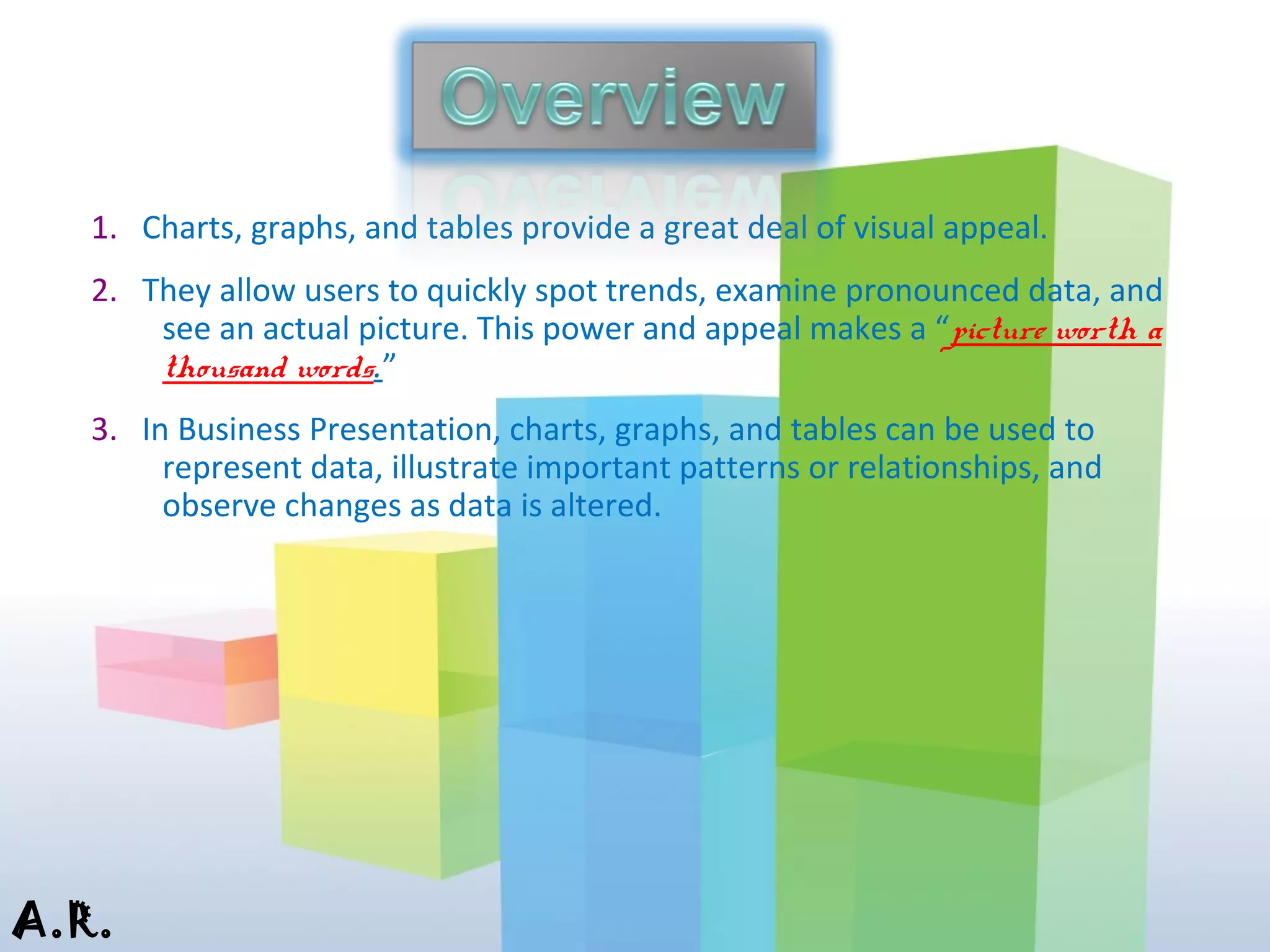
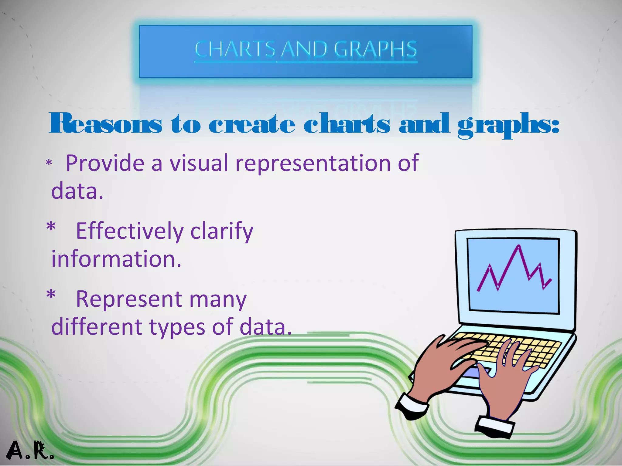
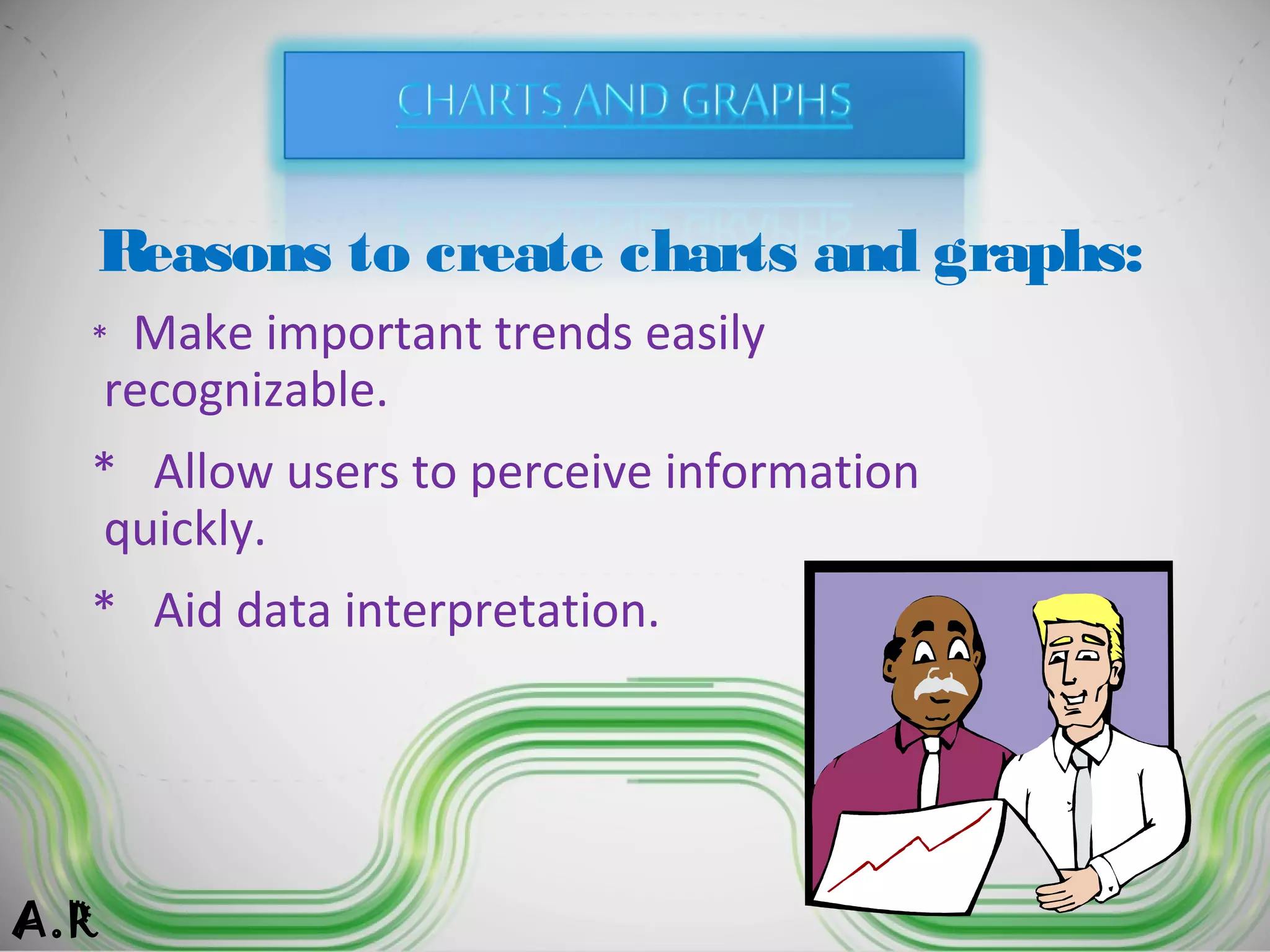
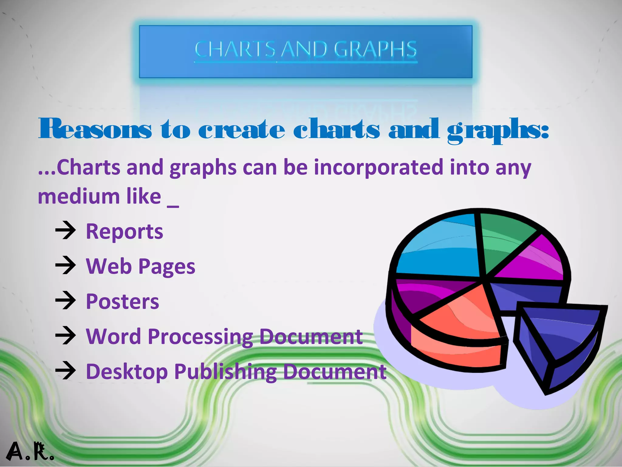
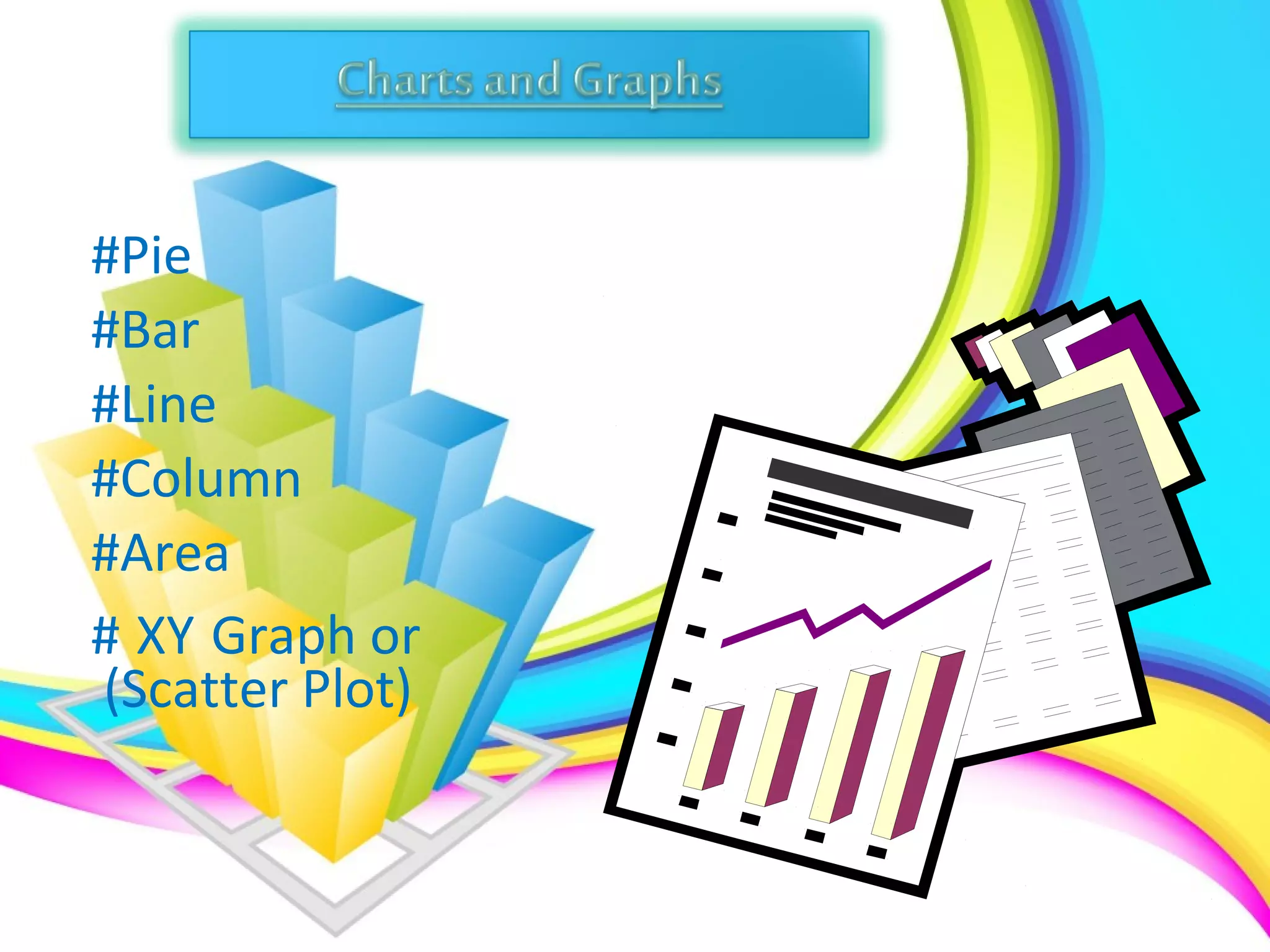
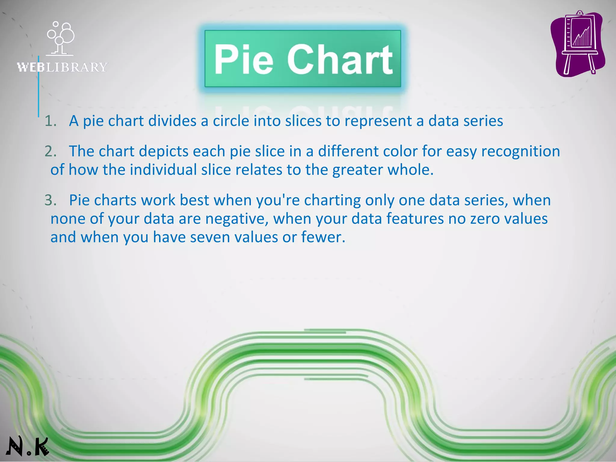
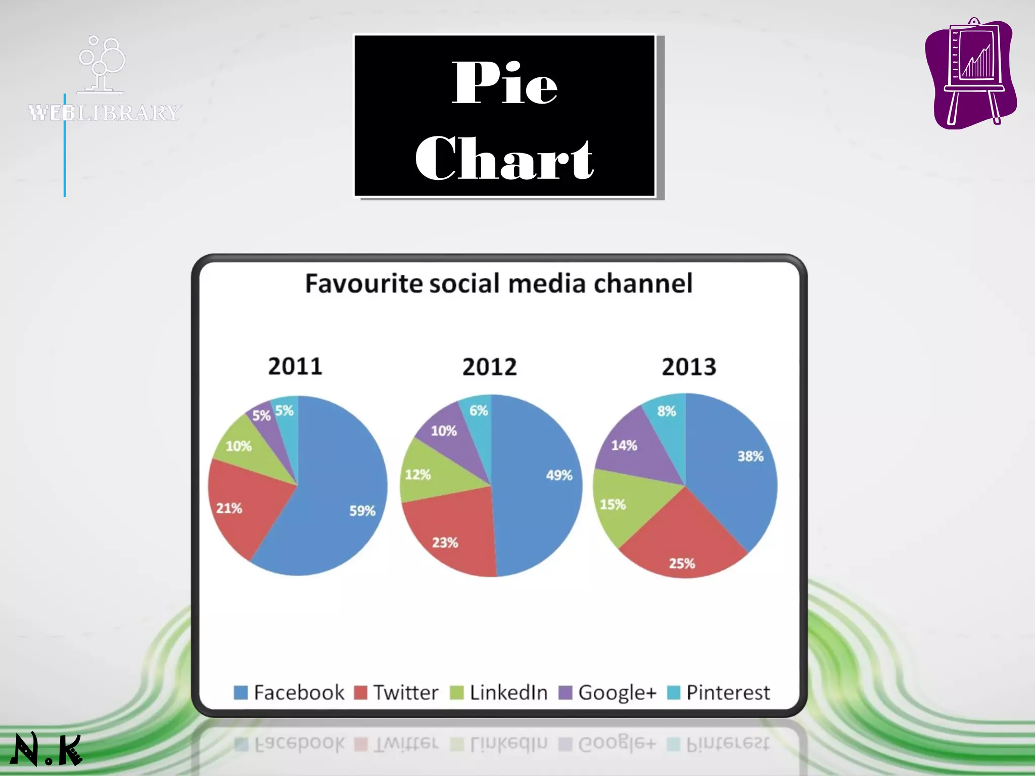
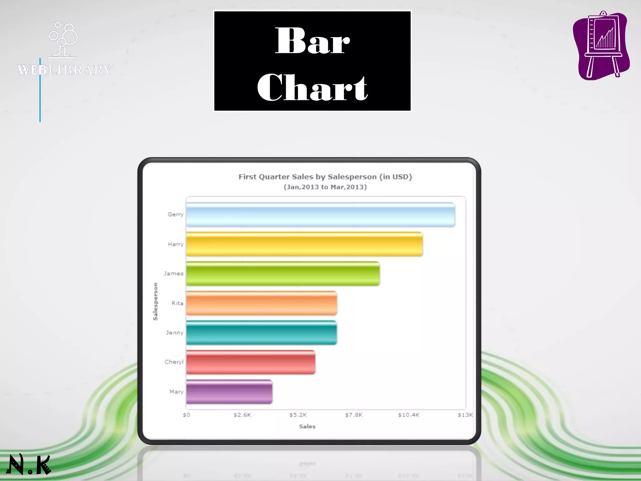
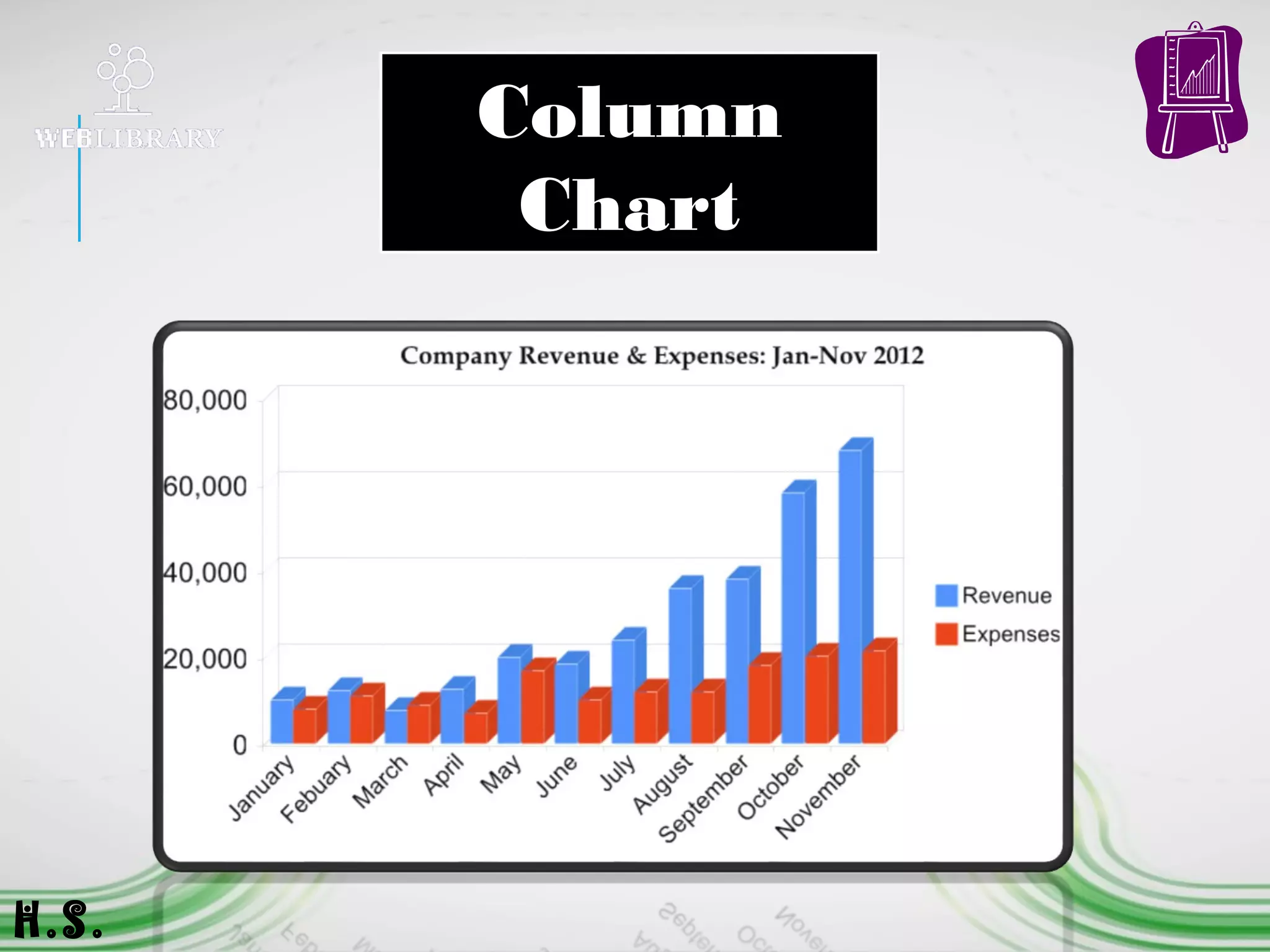
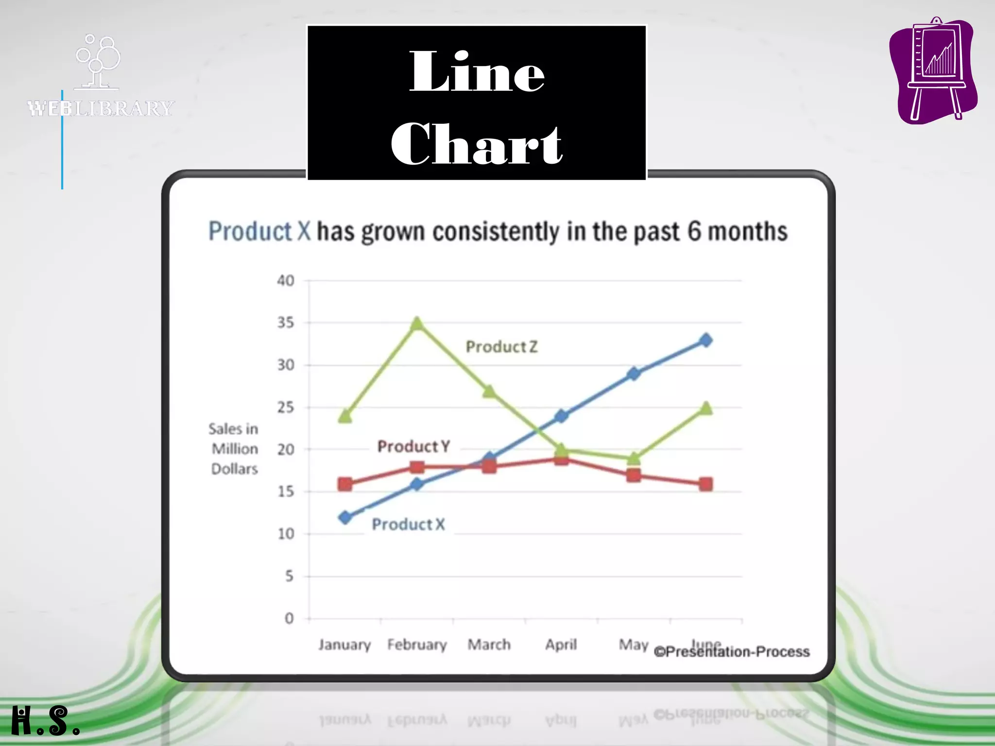
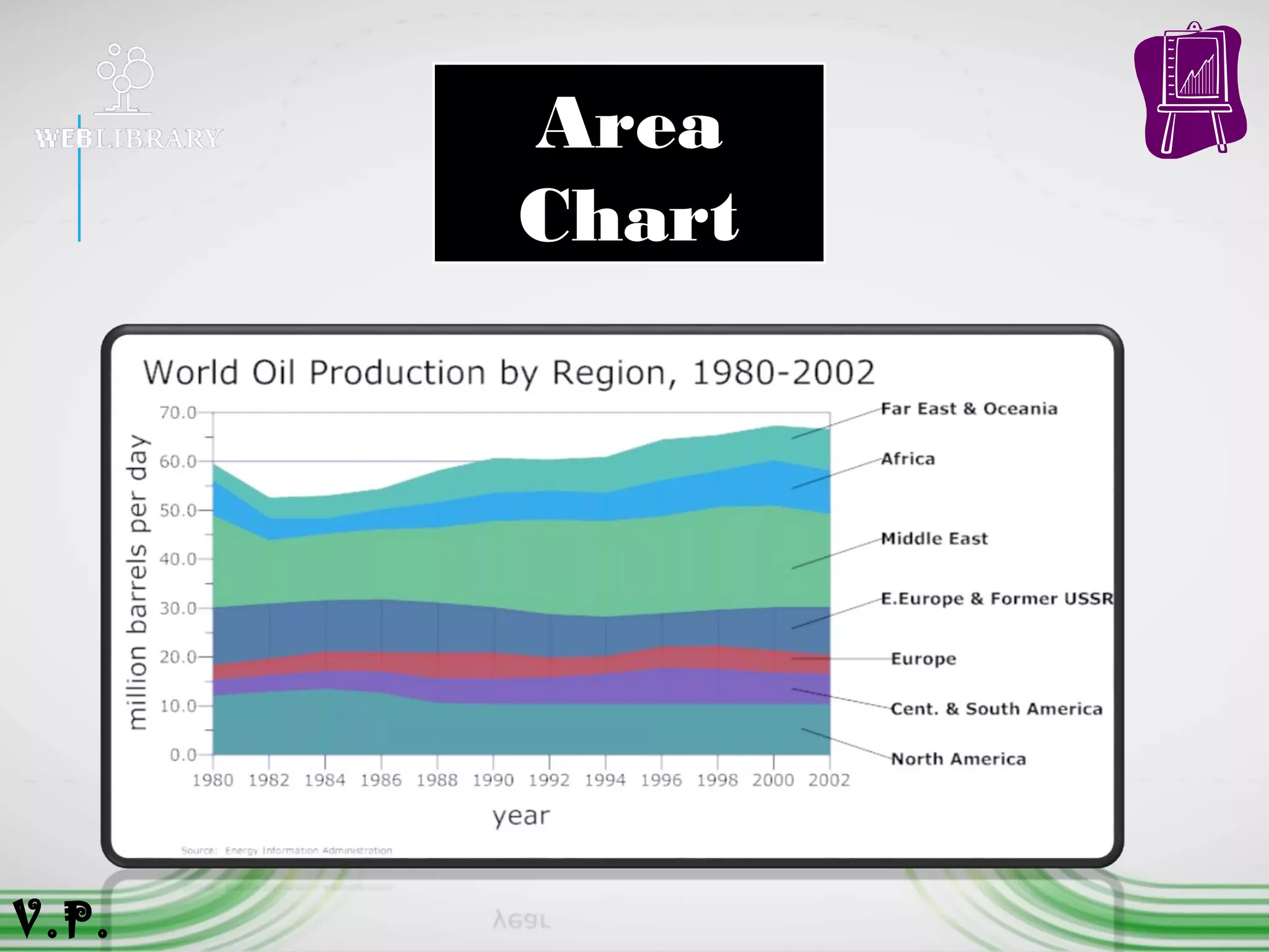
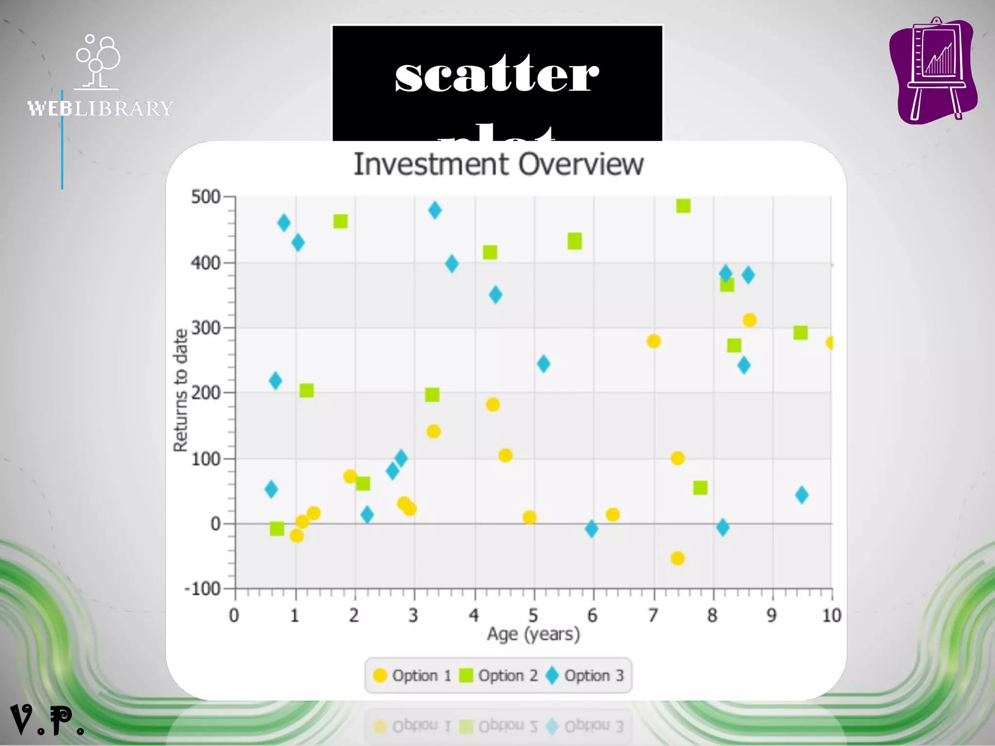
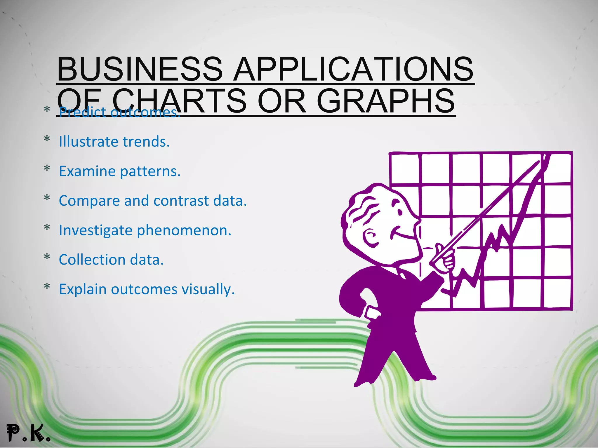
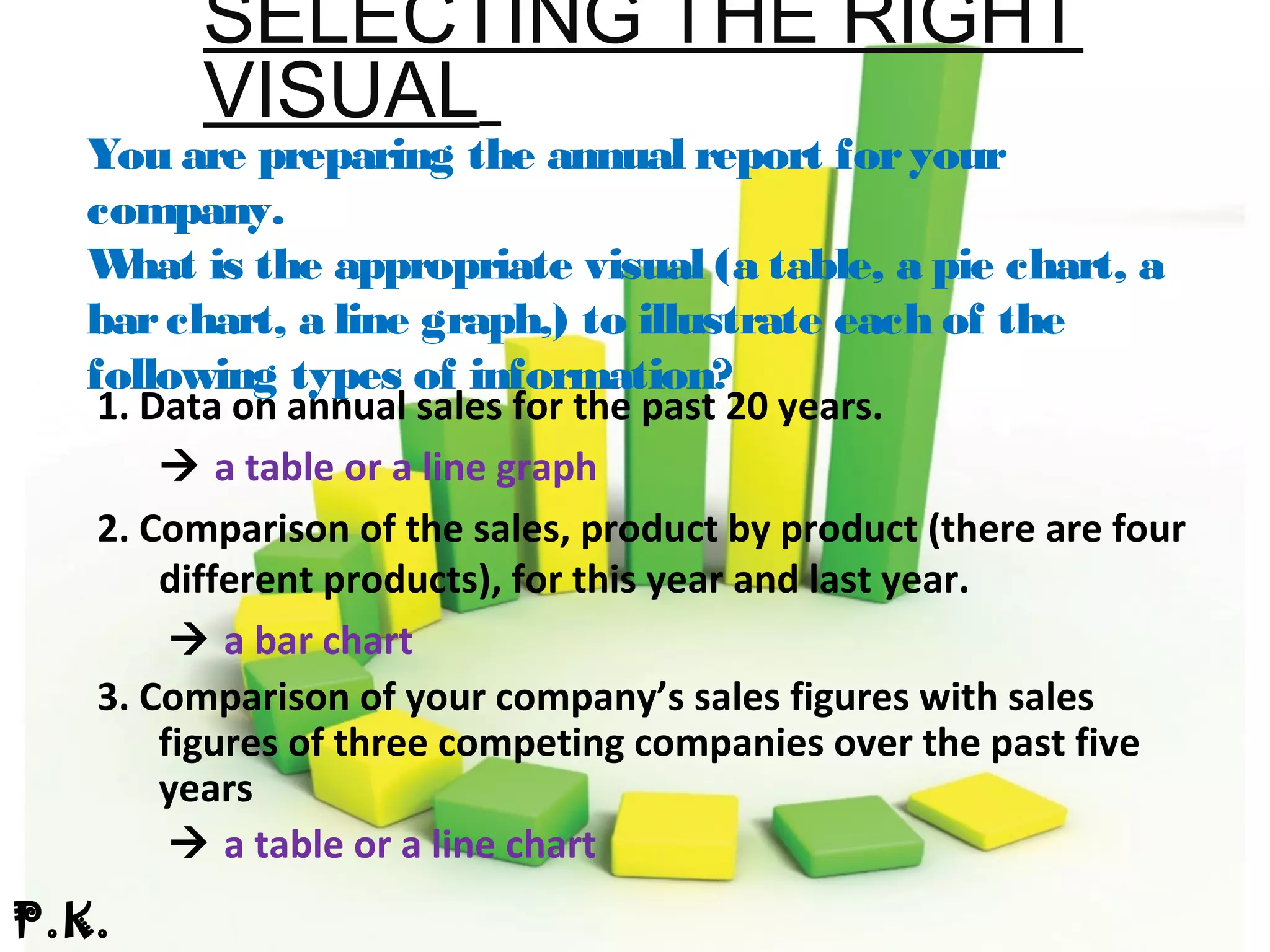
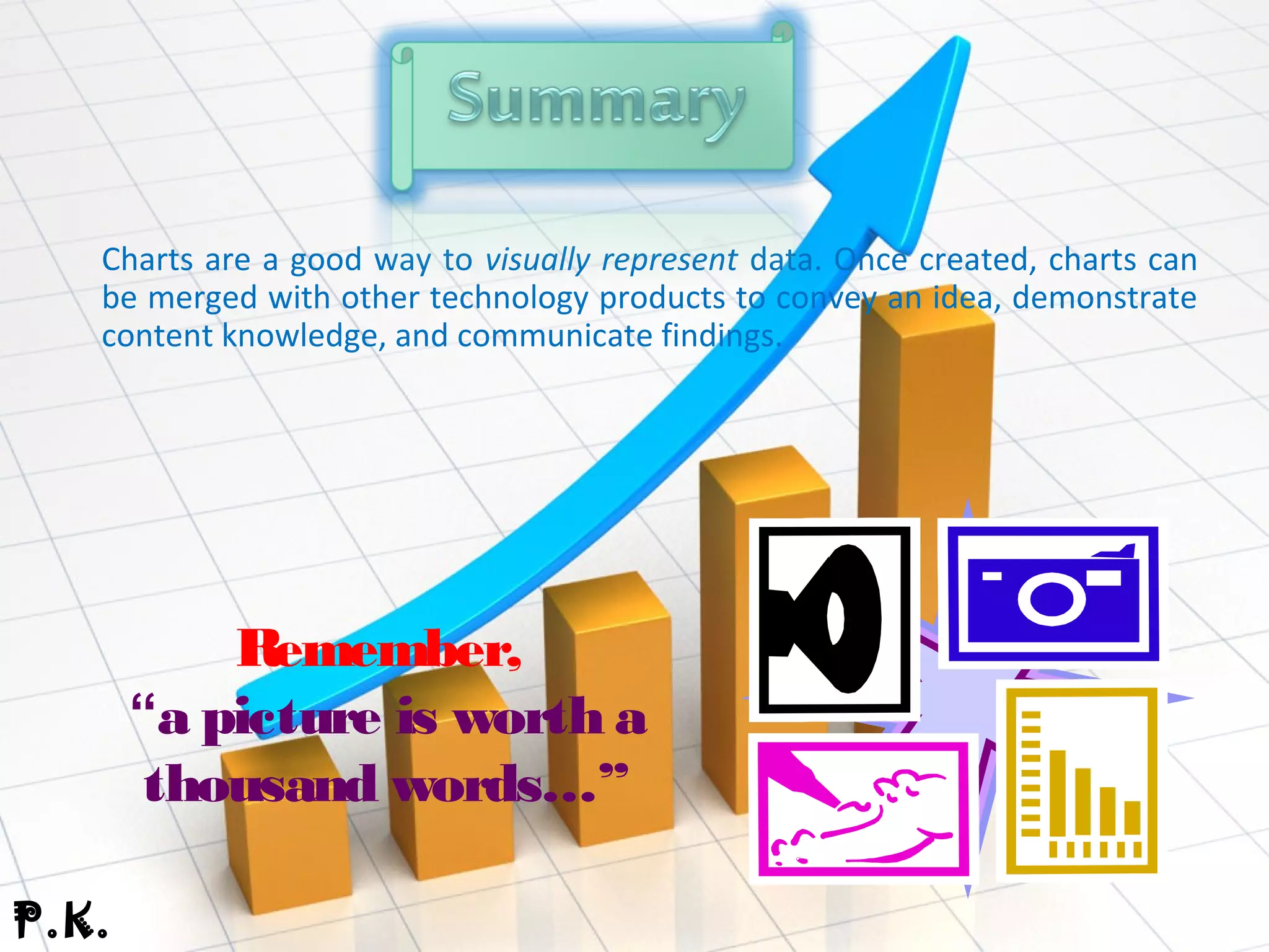
INTERPRETI
NG VISUAL
INFORMATI
ON
Tables,Charts,Graphs
Content
s
1.Overview
2. Reasons to create charts
and graphs
3. Tpyes of Charts and Table
4.Business Applications of
Charts or Graphs
5. Selecting the Right Visual
6. Summary
7.Refernces
1. Charts, graphs, and tables provide a great deal of visual appeal.
2. They allow users to quickly spot trends, examine pronounced data, and
see an actual picture. This power and appeal makes a “picture worth a
thousand words.”
3. In Business Presentation, charts, graphs, and tables can be used to
represent data, illustrate important patterns or relationships, and
observe changes as data is altered.
A.R.
* Provide a visual representation of
data.
* Effectively clarify
information.
* Represent many
different types of data.
Reasons to create charts and graphs:
A.R.
* Make important trends easily
recognizable.
* Allow users to perceive information
quickly.
* Aid data interpretation.
Reasons to create charts and graphs:
A.R
Reasons to create charts and graphs:
...Charts and graphs can be incorporated into any
medium like _
 Reports
 Web Pages
 Posters
 Word Processing Document
 Desktop Publishing Document
A.R.
#Pie
#Bar
#Line
#Column
#Area
# XY Graph or
(Scatter Plot)
1. A pie chart divides a circle into slices to represent a data series
2. The chart depicts each pie slice in a different color for easy recognition
of how the individual slice relates to the greater whole.
3. Pie charts work best when you're charting only one data series, when
none of your data are negative, when your data features no zero values
and when you have seven values or fewer.
N.K
Pie
Chart
Pie
Chart
N.K
1. Bar charts are essentially horizontal column charts.
2. A bar chart organizes the categories along the vertical axis and
the values along the horizontal axis.
3. Horizontal bars stretch left to right across the chart to plot the
data.
4. Bar charts are excellent for charting multiple values over
extended durations, with colored bars representing each value.
N.K
Bar
Chart
N.K
1. The chart's horizontal axis presents the
categories being charted, while the vertical axis
shows the charted values.
2. Vertical columns of differing colors rise from
the horizontal axis to visually represent the
desired data.
3. The simple presentation and colored columns
make for easy visual comparisons.
H.S.
Column
Chart
H.S.
1. Line charts use one or more horizontal lines to visually
depict data points.
2. The chart distributes categories evenly along the horizontal axis
and values evenly along the vertical axis.
3. The horizontal line connects the plotted points, providing a clear
picture of data trends.
4. Line charts work best when presenting data over evenly
distributed time intervals.
H.S.
Line
Chart
H.S.
1. An area chart or area graph displays graphically quantitive data. It
is based on the line chart.
2. Area charts are used to represent cumulated totals using
numbers or percentages (stacked area charts in this case) over time.
3. Use the area chart for showing trends over time among related
attributes.
4. The area chart is like the plot chart except that the area below
the plotted line is filled in with color to indicate volume.
V.P.
Area
Chart
V.P.
1. An X-Y graph, also called a coordinate graph or scatter plot, is a
graph that shows different ordered pairs on an X-Y axis (Cartesian
coordinate system).
2. X-Y graphs are used to look at and find patterns in sets of data and
to plot mathematical formulas.
3. The points on the graph may form a straight line or a curved line,
and may be connected with a line or a bunch of random dots
scattered all over the place.
V.P.
scatter
plot
V.P.
To present individual,exact values
P.K.
BUSINESS APPLICATIONS
OF CHARTS OR GRAPHS* Predict outcomes.
* Illustrate trends.
* Examine patterns.
* Compare and contrast data.
* Investigate phenomenon.
* Collection data.
* Explain outcomes visually.
P.K.
SELECTING THE RIGHT
VISUAL
You are preparing the annual report foryour
company.
What is the appropriate visual (a table, a pie chart, a
barchart, a line graph,) to illustrate each of the
following types of information?
1. Data on annual sales for the past 20 years.
 a table or a line graph
2. Comparison of the sales, product by product (there are four
different products), for this year and last year.
 a bar chart
3. Comparison of your company’s sales figures with sales
figures of three competing companies over the past five
years
 a table or a line chart
P.K.
Charts are a good way to visually represent data. Once created, charts can
be merged with other technology products to convey an idea, demonstrate
content knowledge, and communicate findings.
Remember,
“a picture is worth a
thousand words…”
P.K.
www.wikipedia.org
www.vertex42.com/edu/charts-
and-graphs-in-excel.
Charts And Graphs
Charts And Graphs

Charts And Graphs

  • 3.
  • 4.
    Content s 1.Overview 2. Reasons tocreate charts and graphs 3. Tpyes of Charts and Table 4.Business Applications of Charts or Graphs 5. Selecting the Right Visual 6. Summary 7.Refernces
  • 5.
    1. Charts, graphs,and tables provide a great deal of visual appeal. 2. They allow users to quickly spot trends, examine pronounced data, and see an actual picture. This power and appeal makes a “picture worth a thousand words.” 3. In Business Presentation, charts, graphs, and tables can be used to represent data, illustrate important patterns or relationships, and observe changes as data is altered. A.R.
  • 6.
    * Provide avisual representation of data. * Effectively clarify information. * Represent many different types of data. Reasons to create charts and graphs: A.R.
  • 7.
    * Make importanttrends easily recognizable. * Allow users to perceive information quickly. * Aid data interpretation. Reasons to create charts and graphs: A.R
  • 8.
    Reasons to createcharts and graphs: ...Charts and graphs can be incorporated into any medium like _  Reports  Web Pages  Posters  Word Processing Document  Desktop Publishing Document A.R.
  • 9.
  • 10.
    1. A piechart divides a circle into slices to represent a data series 2. The chart depicts each pie slice in a different color for easy recognition of how the individual slice relates to the greater whole. 3. Pie charts work best when you're charting only one data series, when none of your data are negative, when your data features no zero values and when you have seven values or fewer. N.K
  • 11.
  • 12.
    1. Bar chartsare essentially horizontal column charts. 2. A bar chart organizes the categories along the vertical axis and the values along the horizontal axis. 3. Horizontal bars stretch left to right across the chart to plot the data. 4. Bar charts are excellent for charting multiple values over extended durations, with colored bars representing each value. N.K
  • 13.
  • 14.
    1. The chart'shorizontal axis presents the categories being charted, while the vertical axis shows the charted values. 2. Vertical columns of differing colors rise from the horizontal axis to visually represent the desired data. 3. The simple presentation and colored columns make for easy visual comparisons. H.S.
  • 15.
  • 16.
    1. Line chartsuse one or more horizontal lines to visually depict data points. 2. The chart distributes categories evenly along the horizontal axis and values evenly along the vertical axis. 3. The horizontal line connects the plotted points, providing a clear picture of data trends. 4. Line charts work best when presenting data over evenly distributed time intervals. H.S.
  • 17.
  • 18.
    1. An areachart or area graph displays graphically quantitive data. It is based on the line chart. 2. Area charts are used to represent cumulated totals using numbers or percentages (stacked area charts in this case) over time. 3. Use the area chart for showing trends over time among related attributes. 4. The area chart is like the plot chart except that the area below the plotted line is filled in with color to indicate volume. V.P.
  • 19.
  • 20.
    1. An X-Ygraph, also called a coordinate graph or scatter plot, is a graph that shows different ordered pairs on an X-Y axis (Cartesian coordinate system). 2. X-Y graphs are used to look at and find patterns in sets of data and to plot mathematical formulas. 3. The points on the graph may form a straight line or a curved line, and may be connected with a line or a bunch of random dots scattered all over the place. V.P.
  • 21.
  • 22.
  • 23.
    BUSINESS APPLICATIONS OF CHARTSOR GRAPHS* Predict outcomes. * Illustrate trends. * Examine patterns. * Compare and contrast data. * Investigate phenomenon. * Collection data. * Explain outcomes visually. P.K.
  • 24.
    SELECTING THE RIGHT VISUAL Youare preparing the annual report foryour company. What is the appropriate visual (a table, a pie chart, a barchart, a line graph,) to illustrate each of the following types of information? 1. Data on annual sales for the past 20 years.  a table or a line graph 2. Comparison of the sales, product by product (there are four different products), for this year and last year.  a bar chart 3. Comparison of your company’s sales figures with sales figures of three competing companies over the past five years  a table or a line chart P.K.
  • 25.
    Charts are agood way to visually represent data. Once created, charts can be merged with other technology products to convey an idea, demonstrate content knowledge, and communicate findings. Remember, “a picture is worth a thousand words…” P.K.
  • 26.