Downloaded 260 times

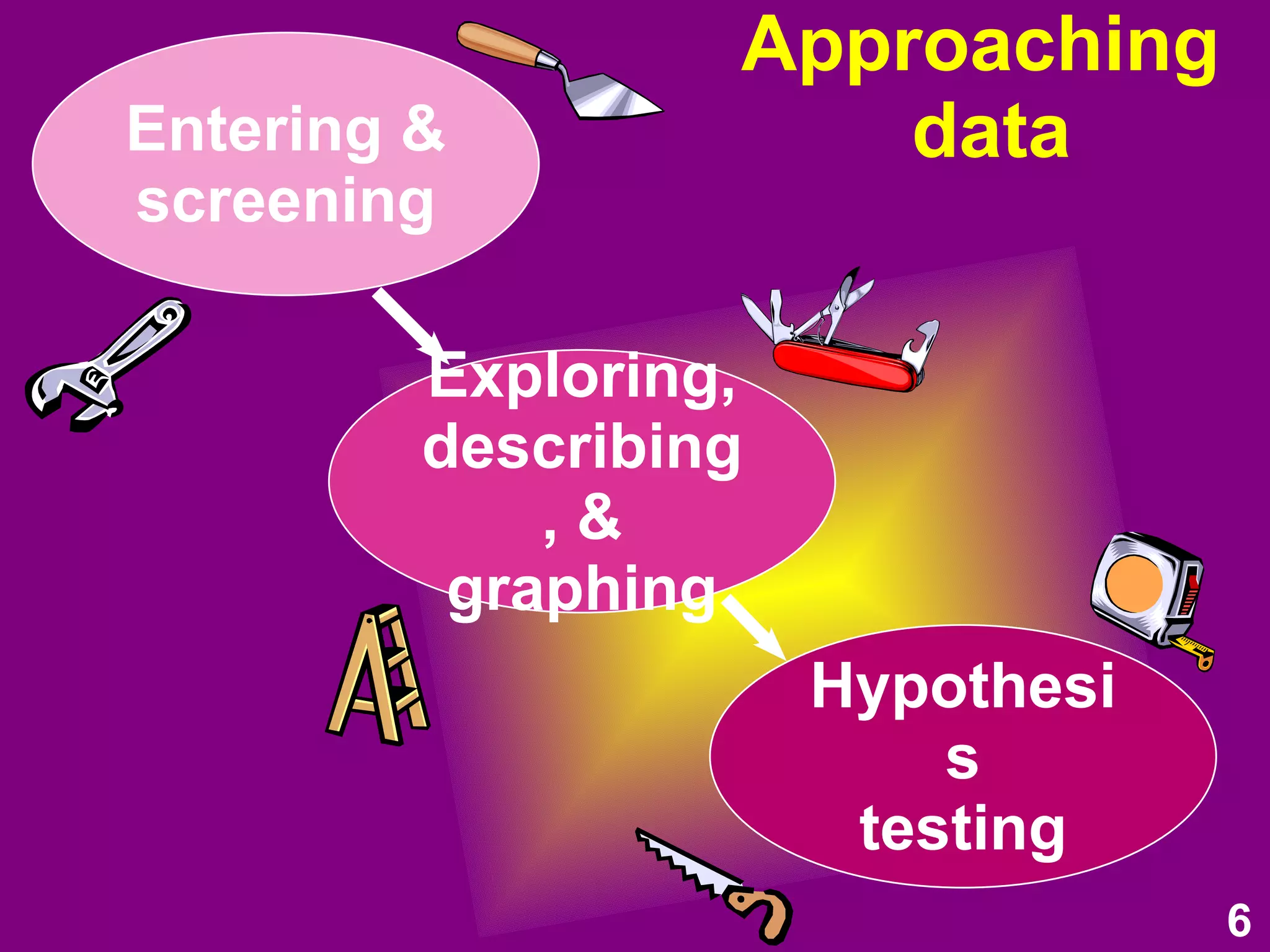
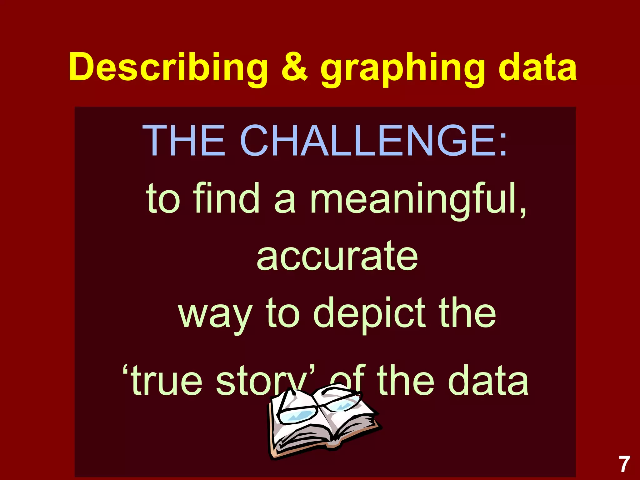


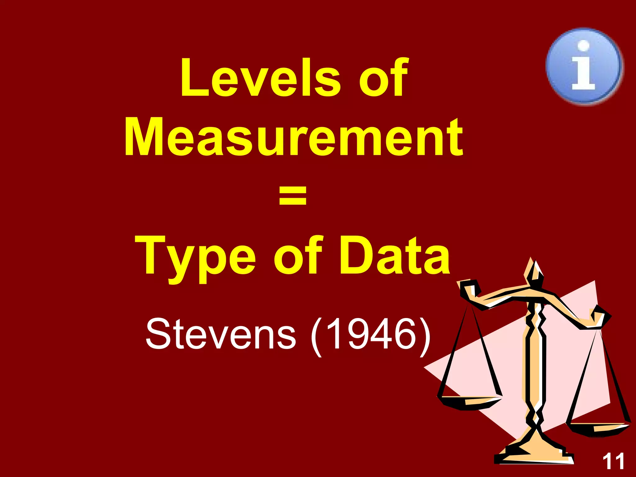
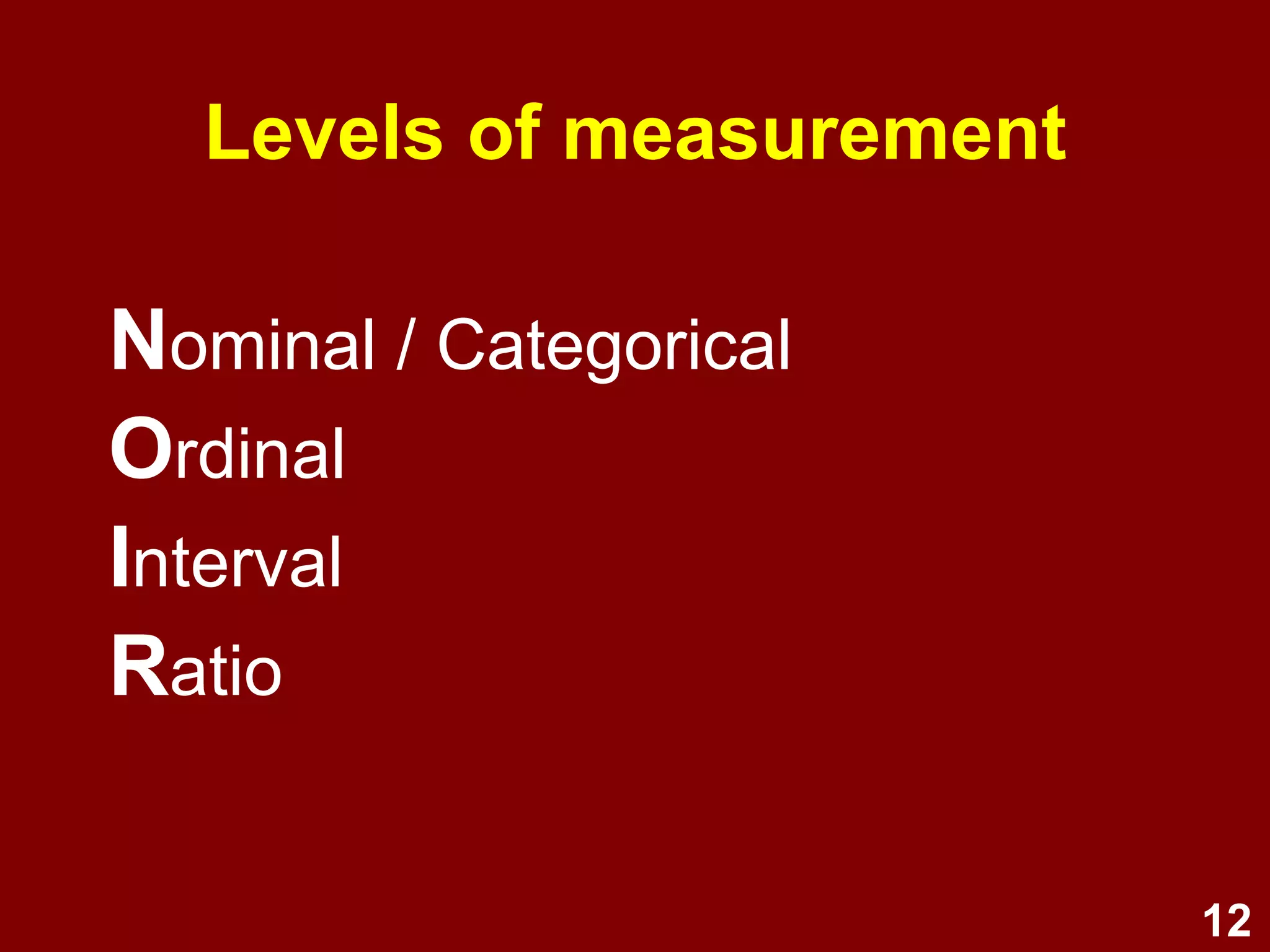
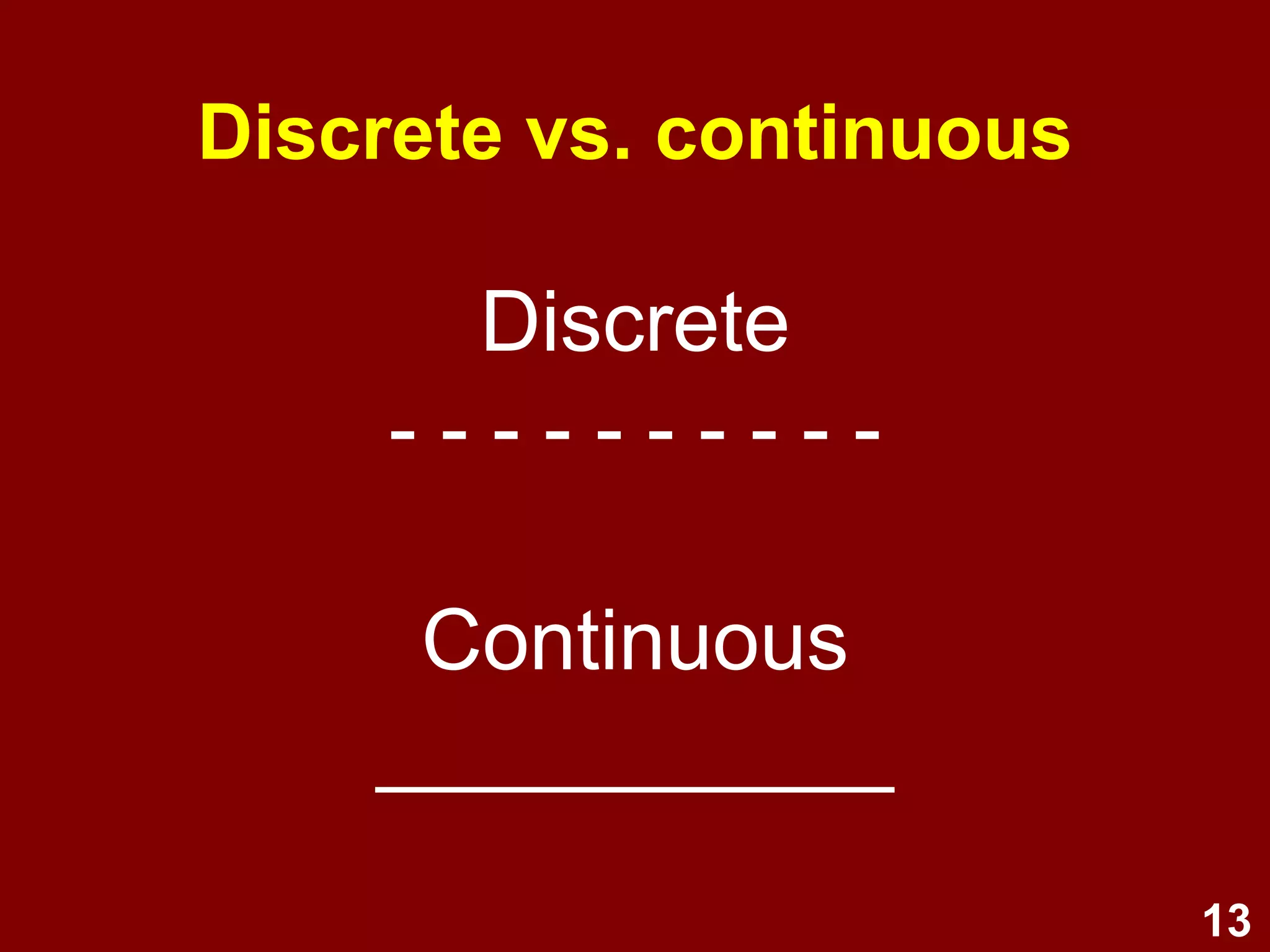
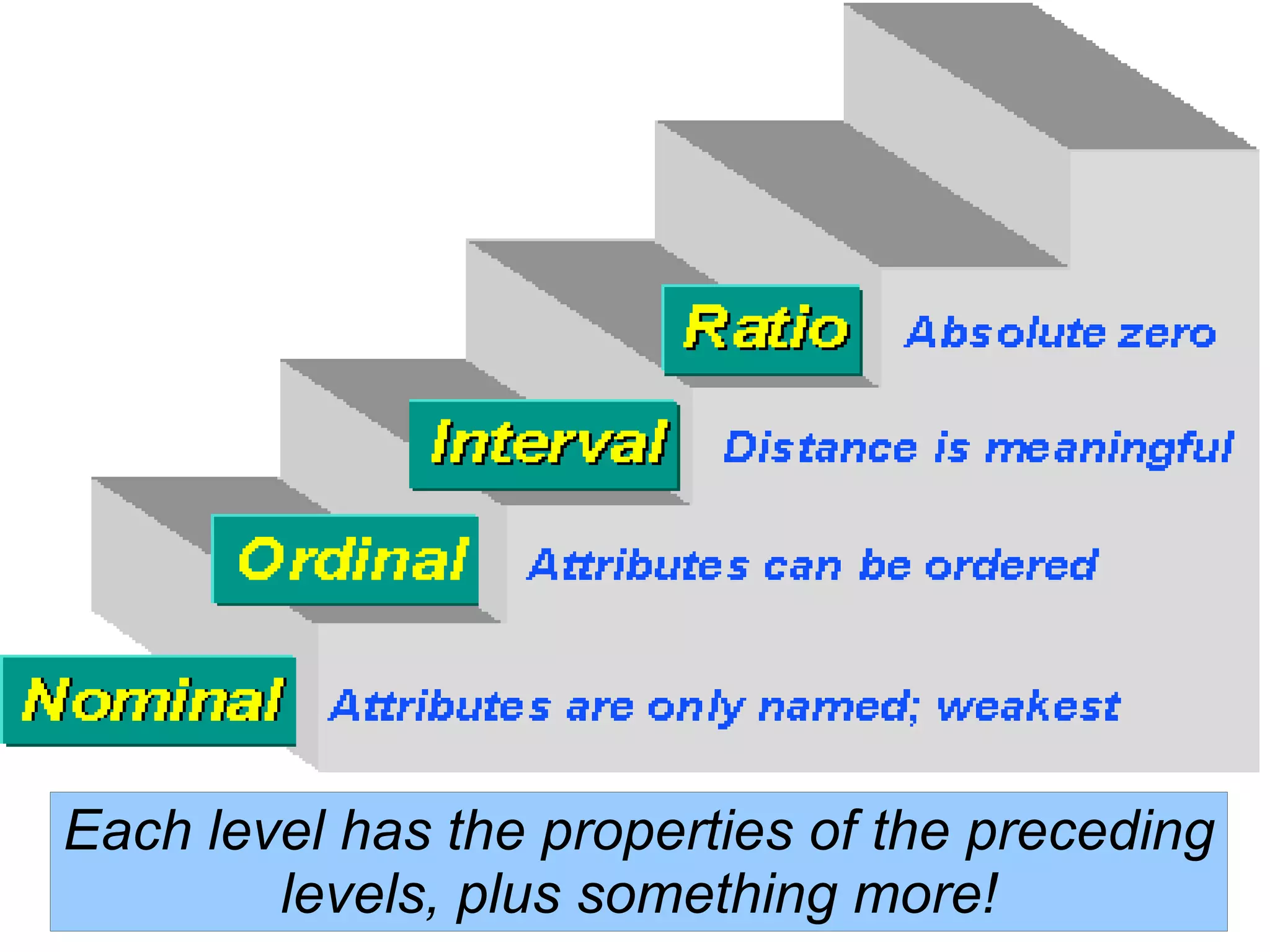
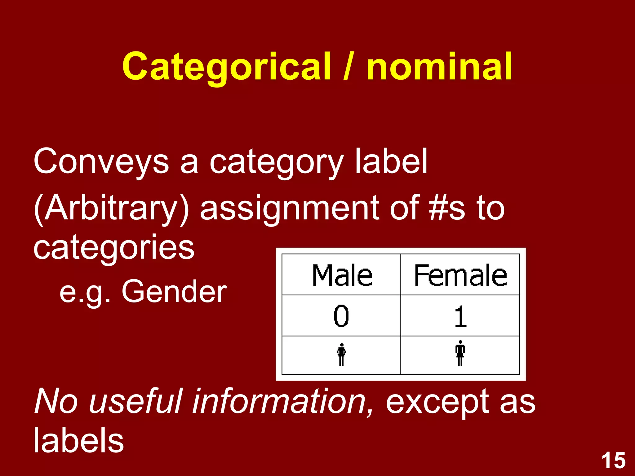
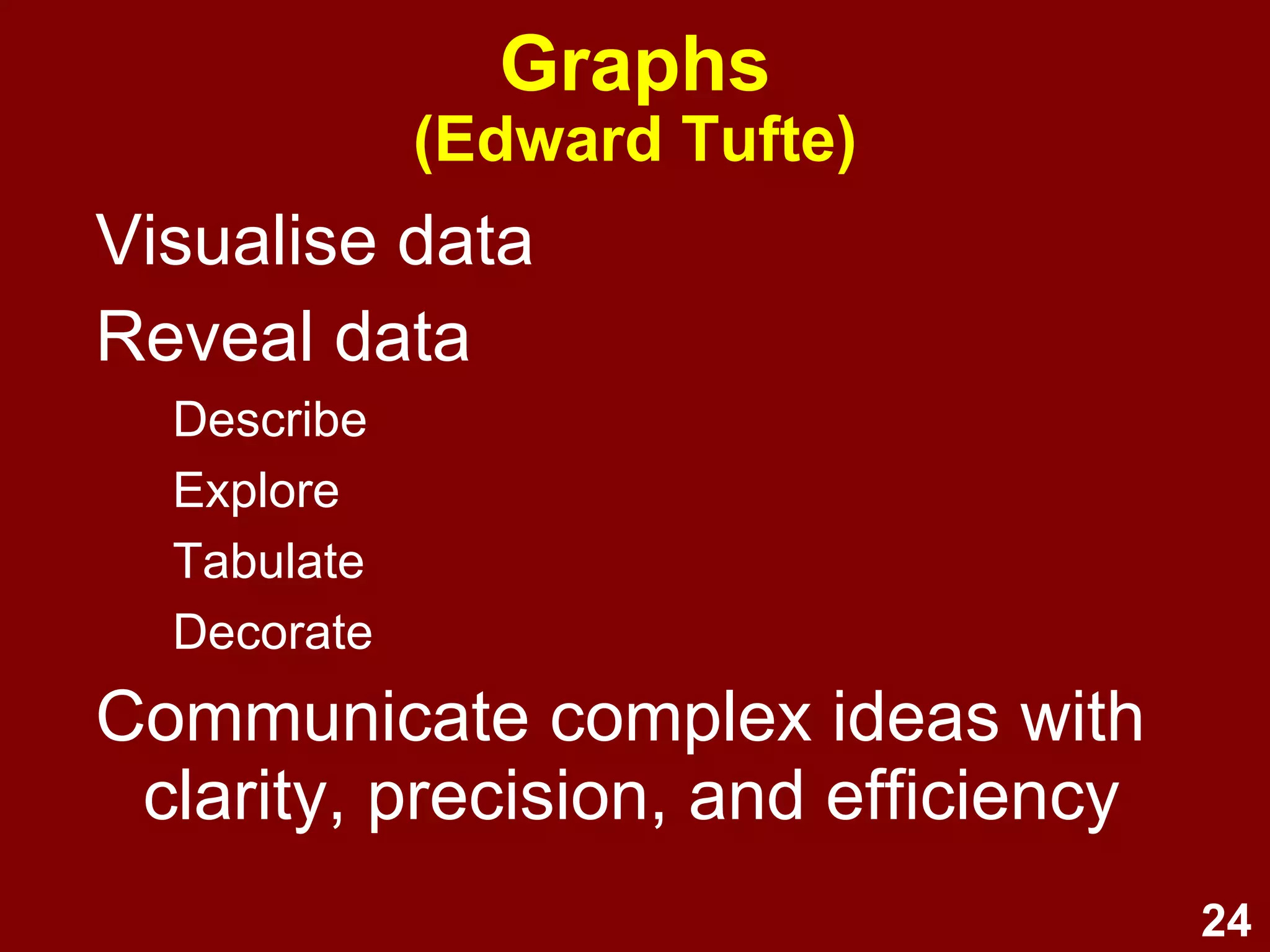
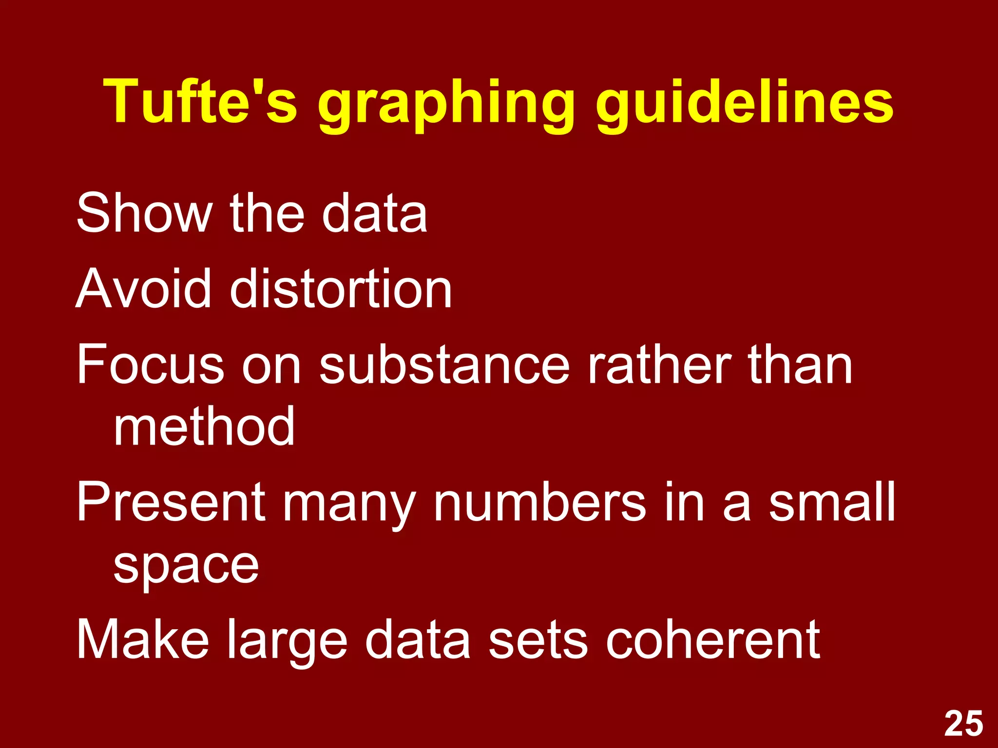
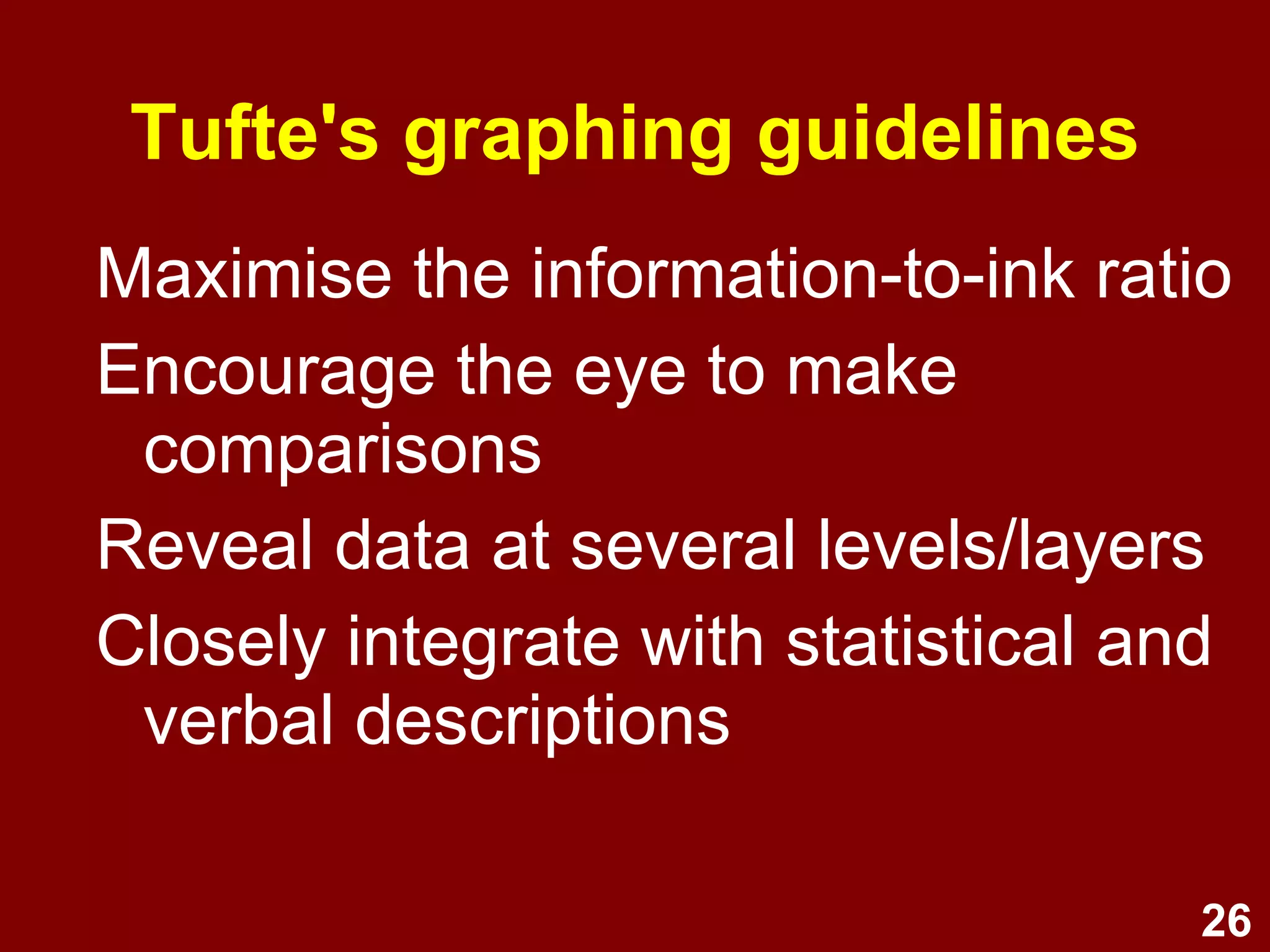
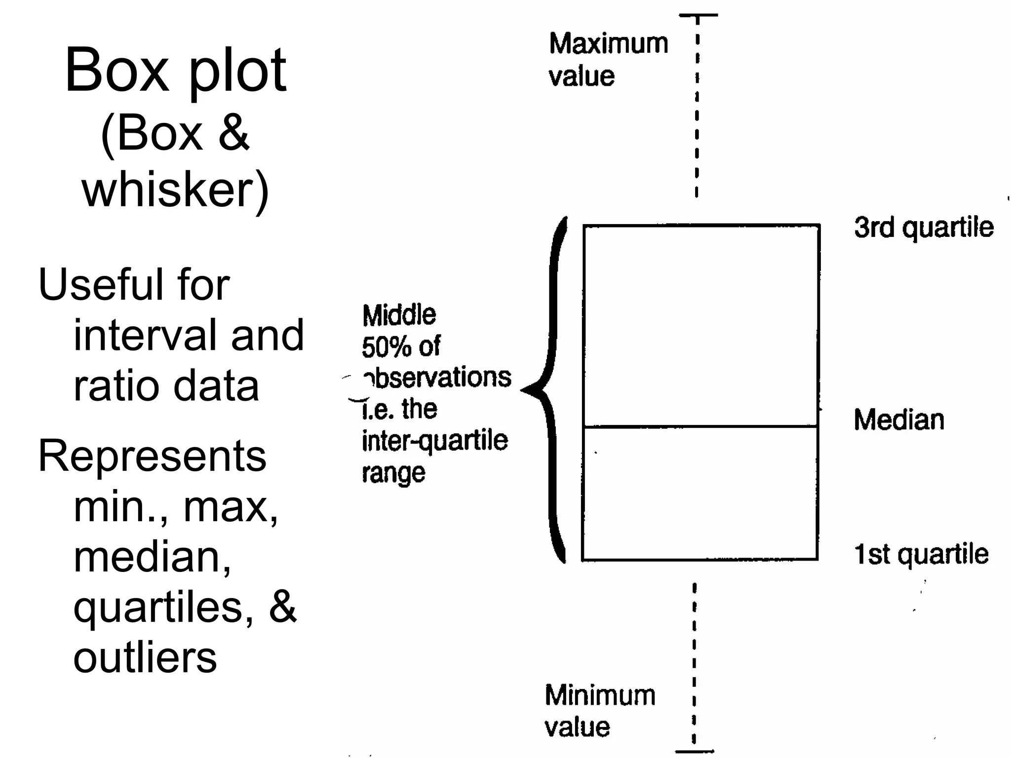
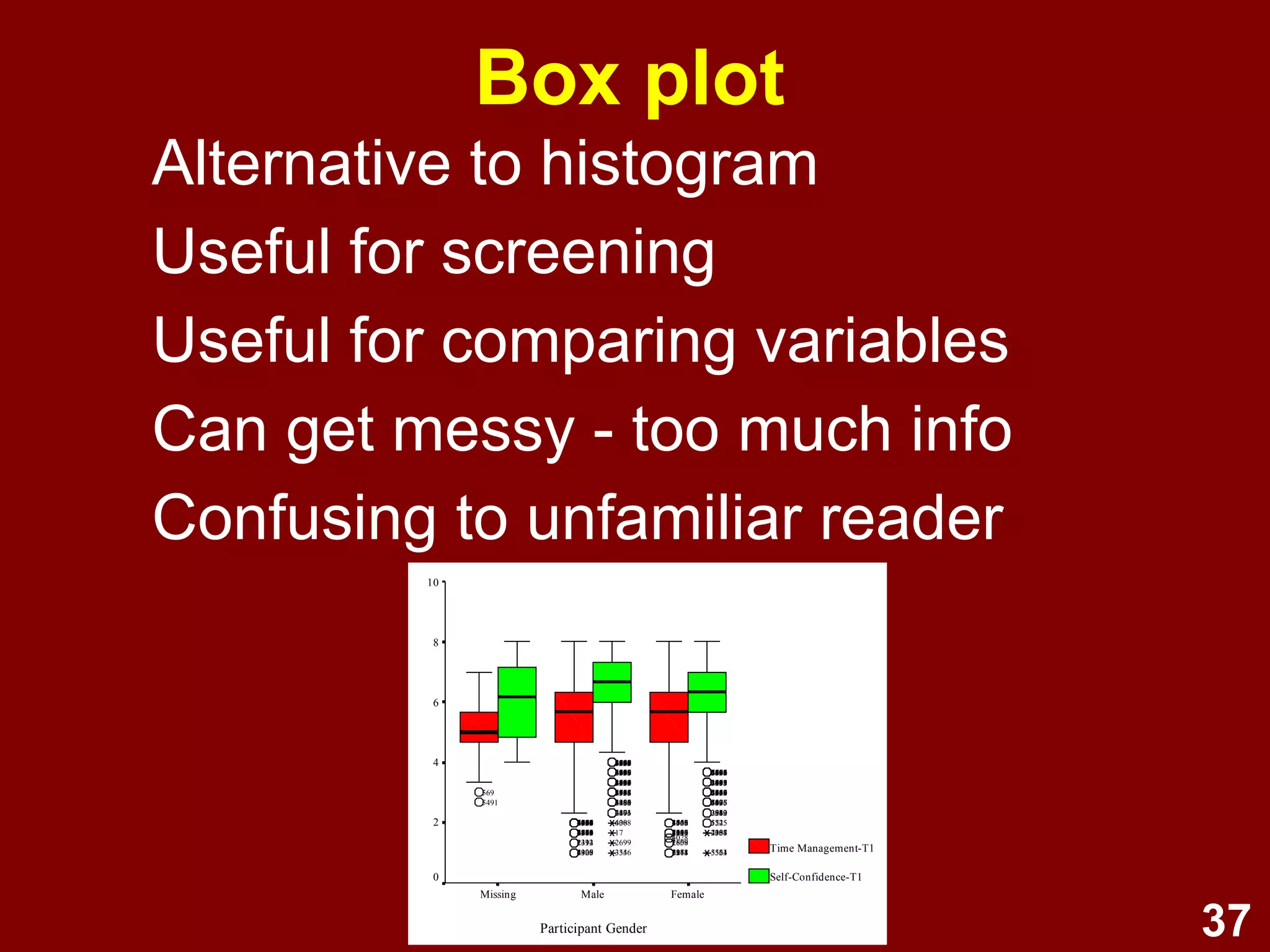
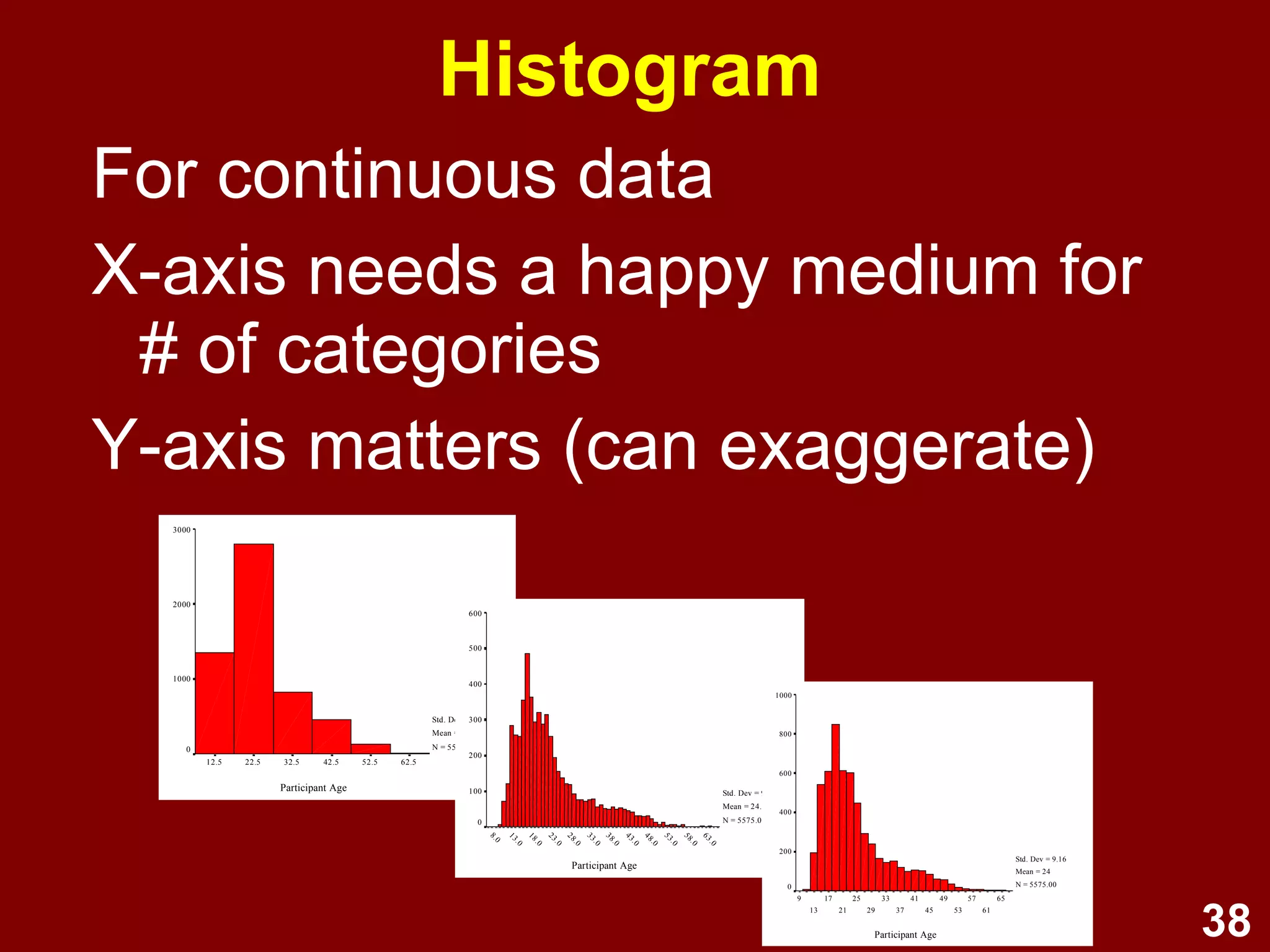
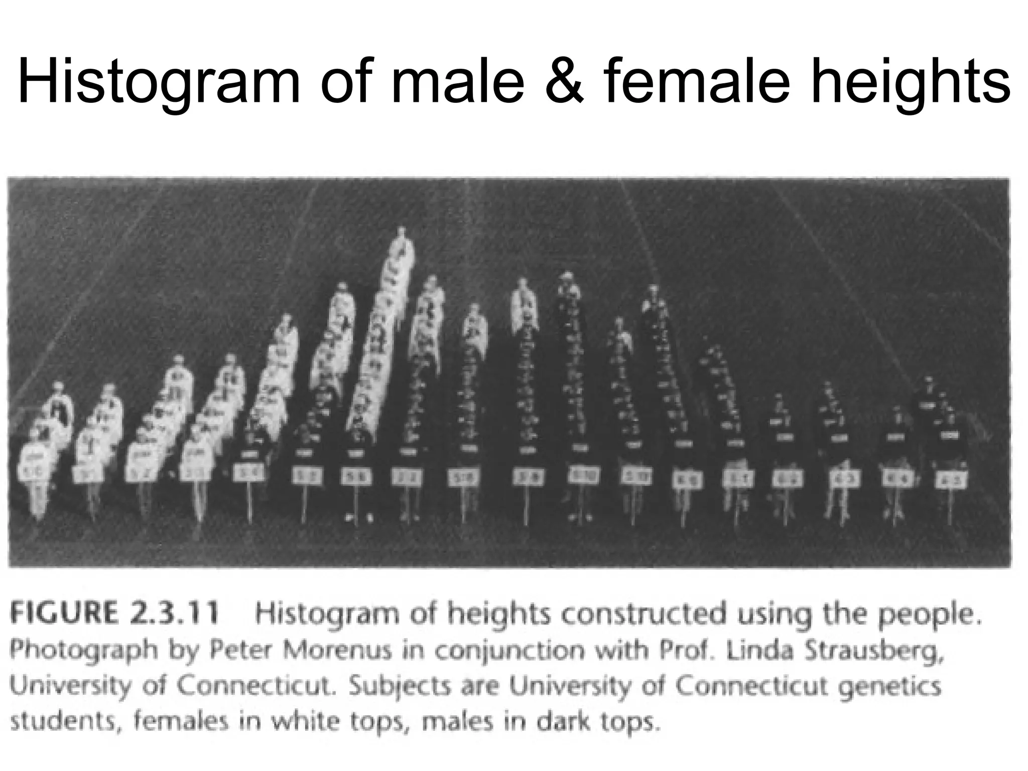
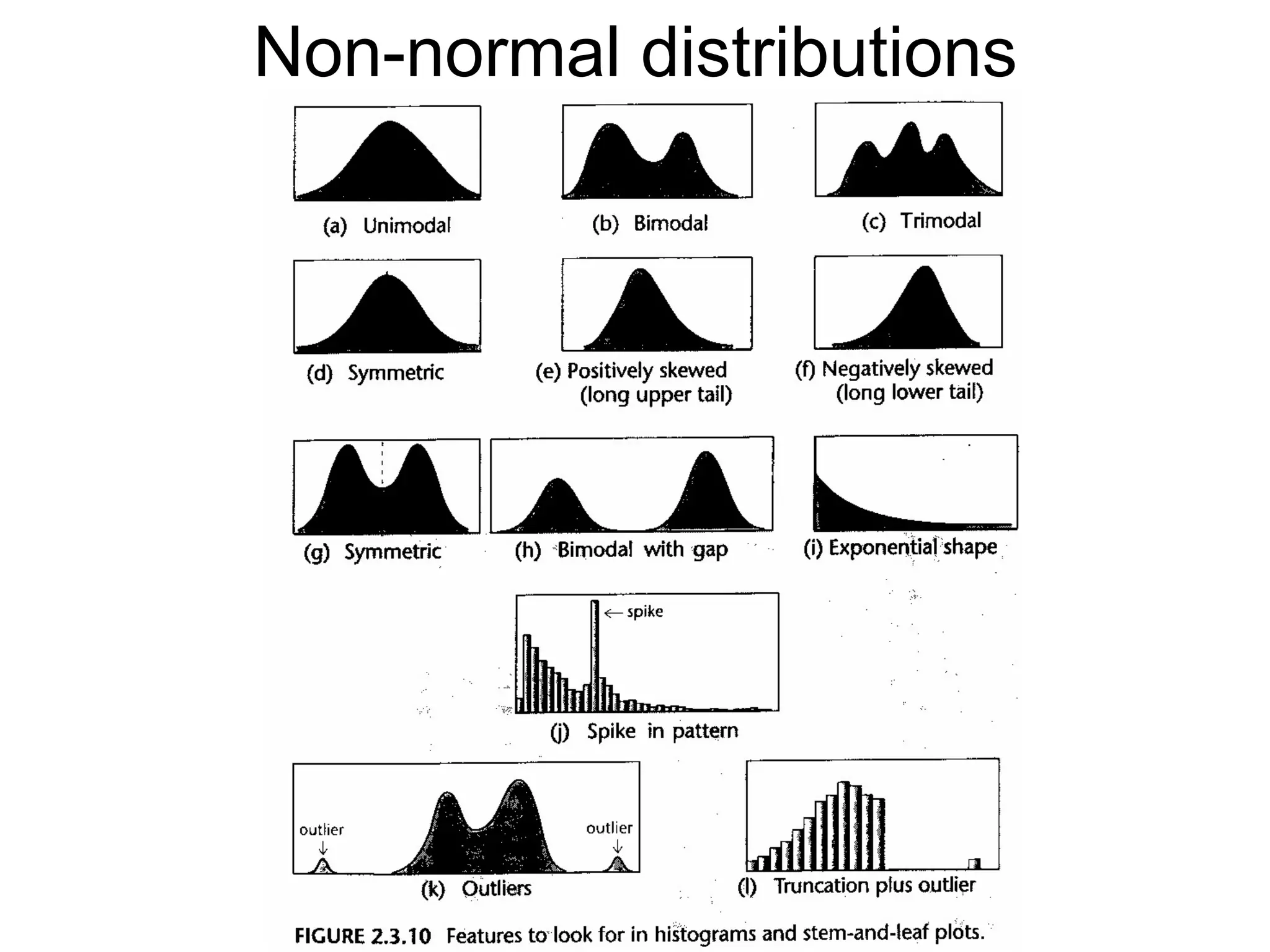
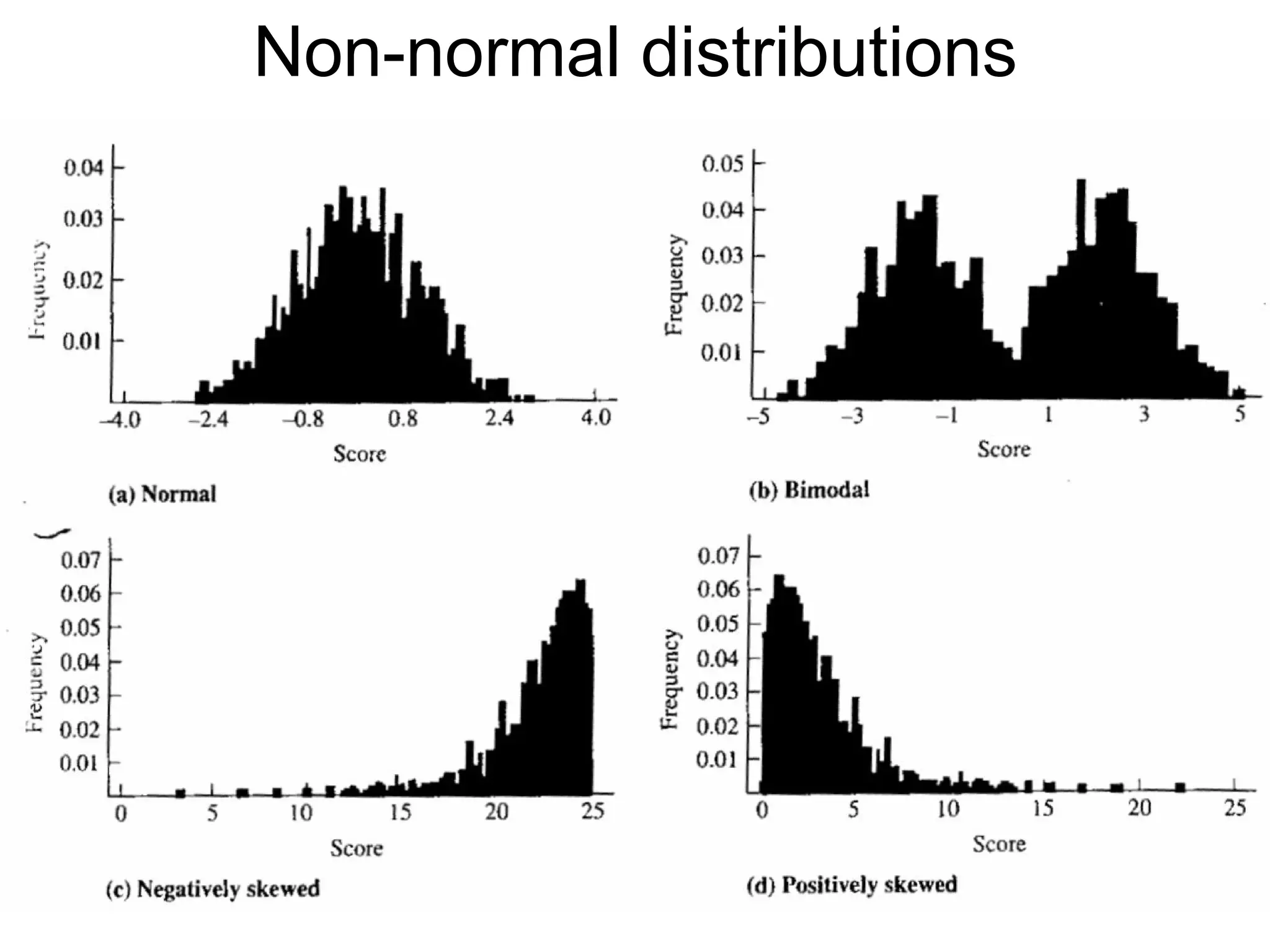
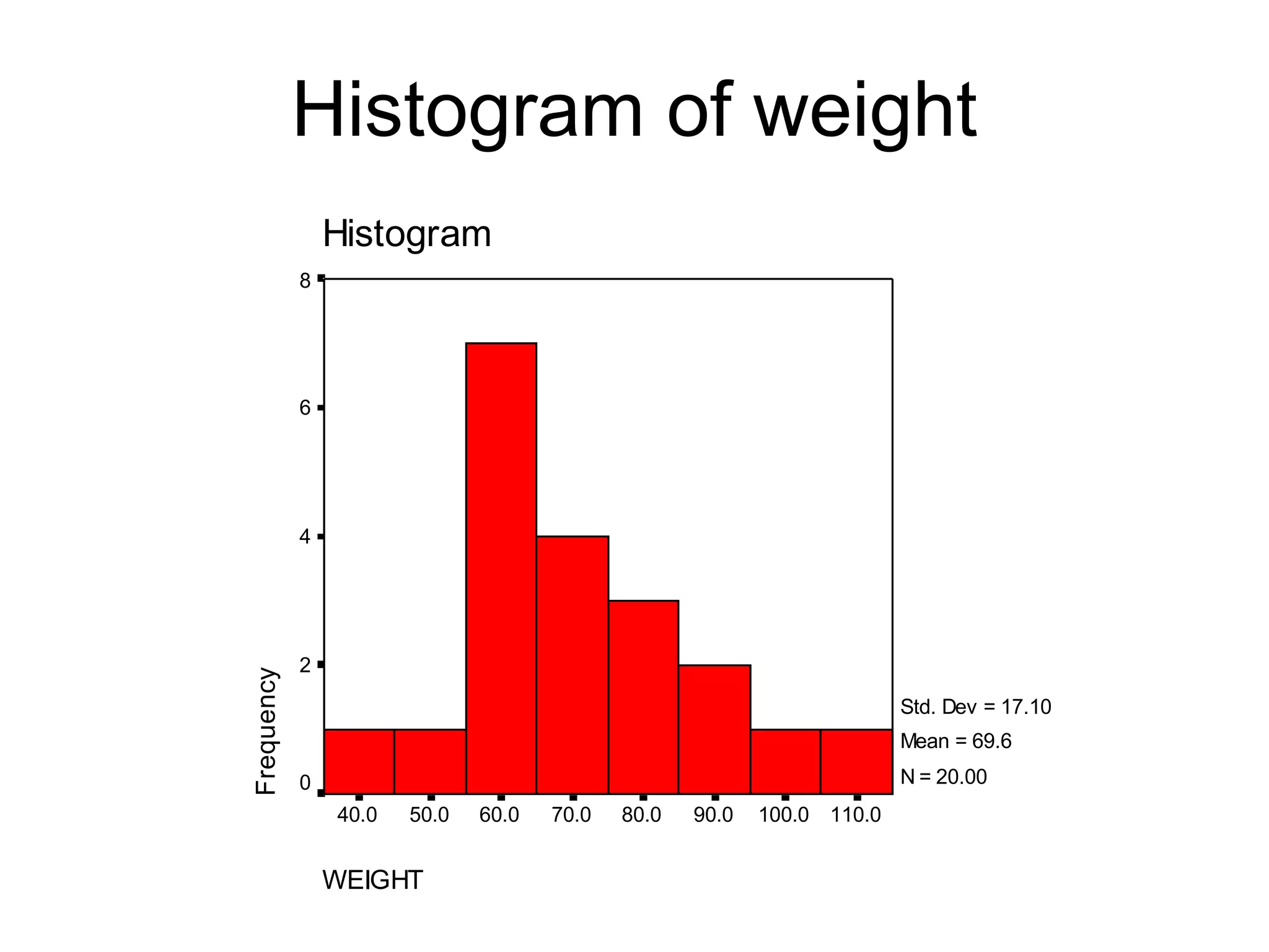
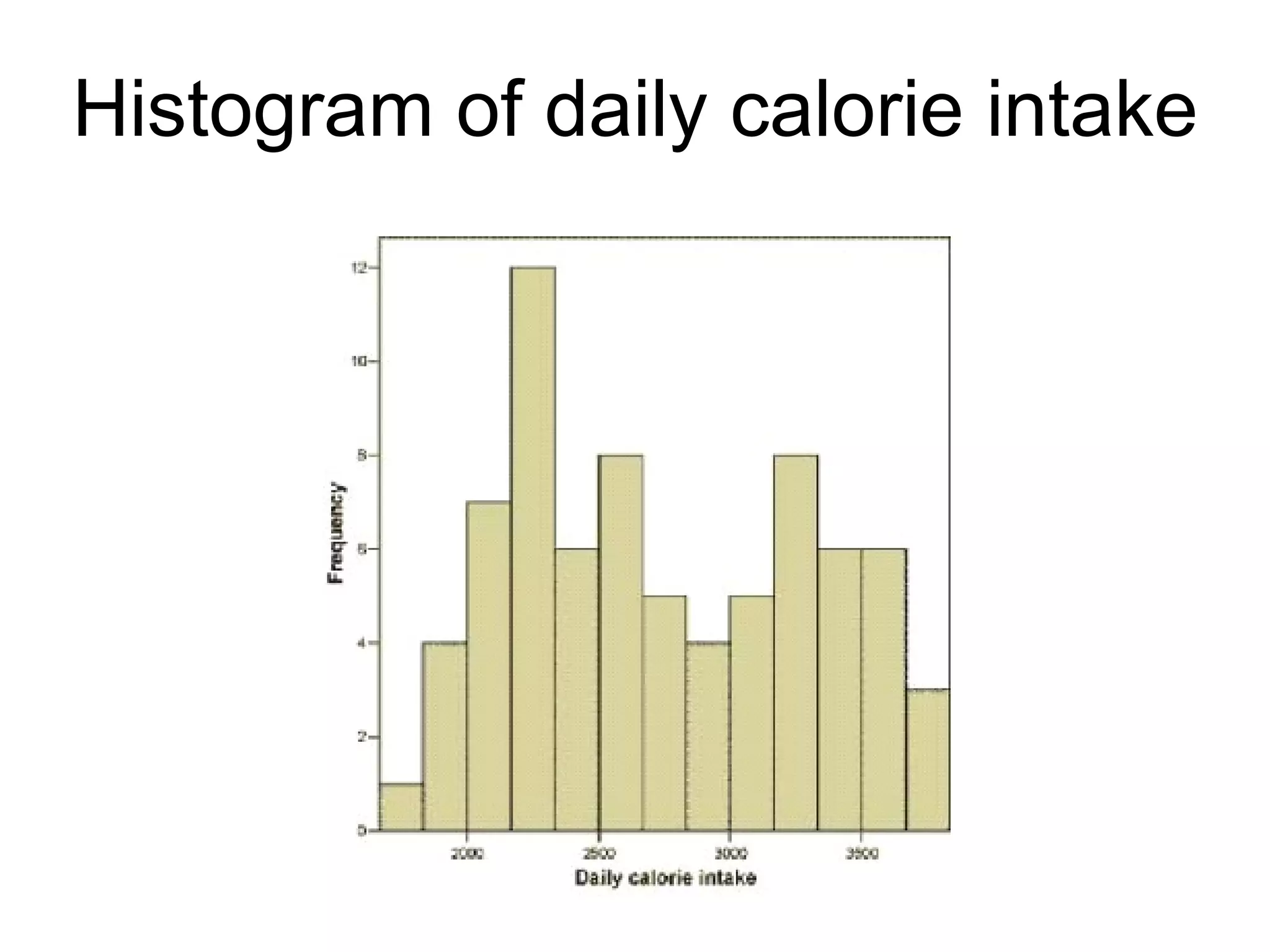
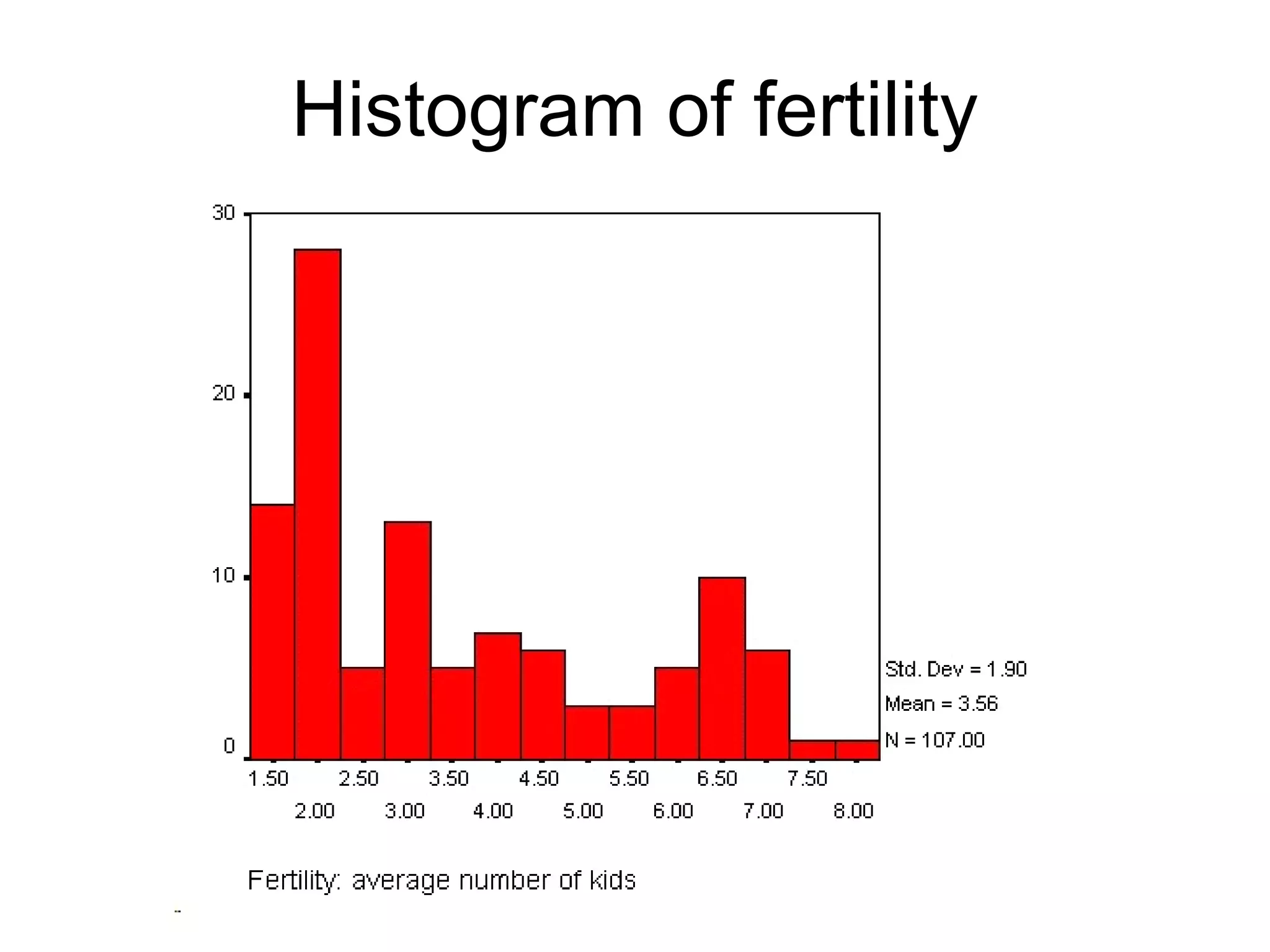

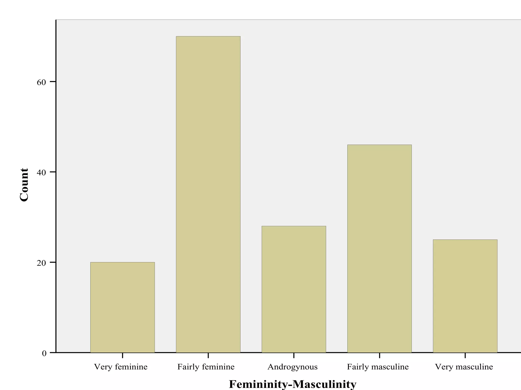
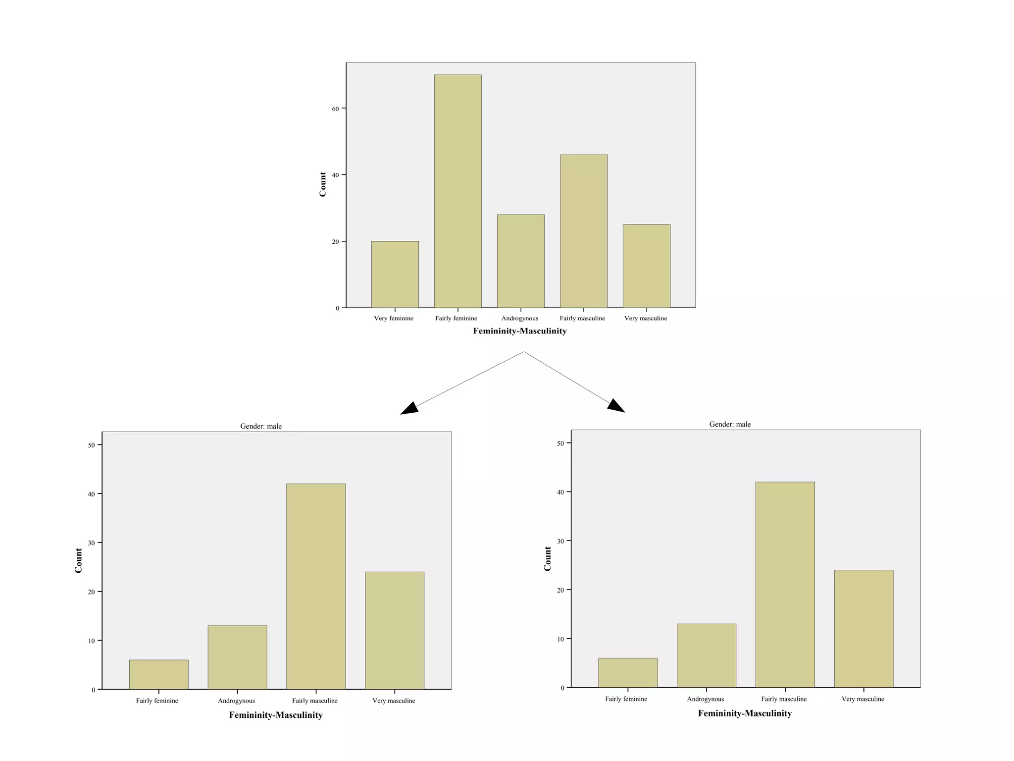
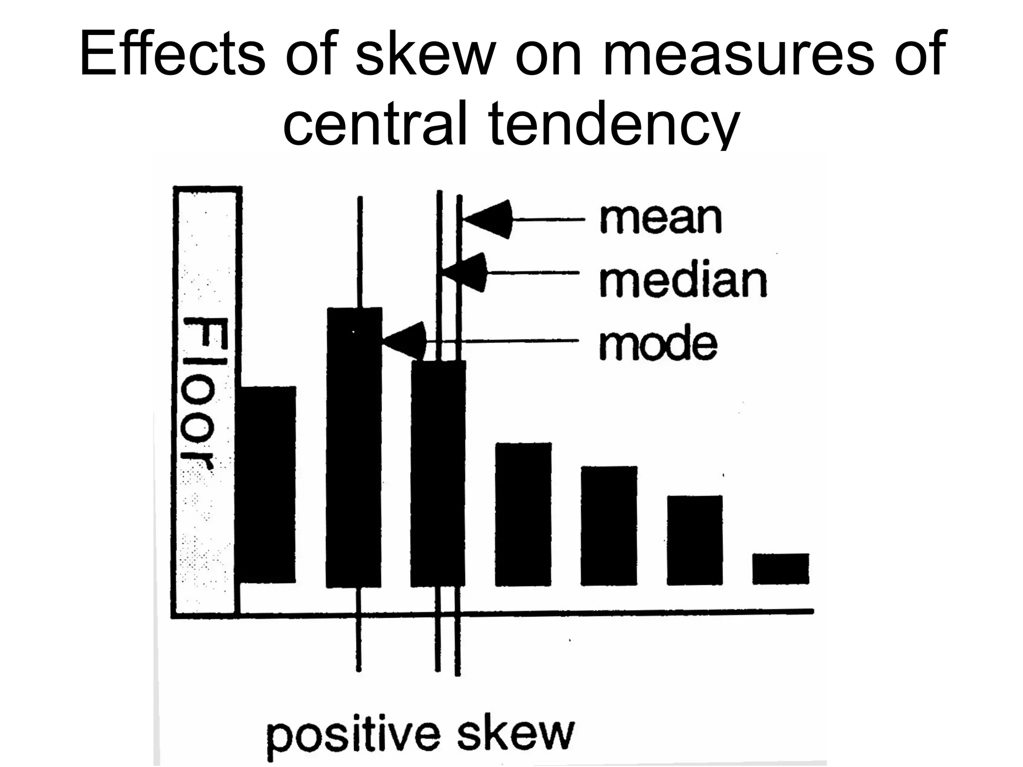
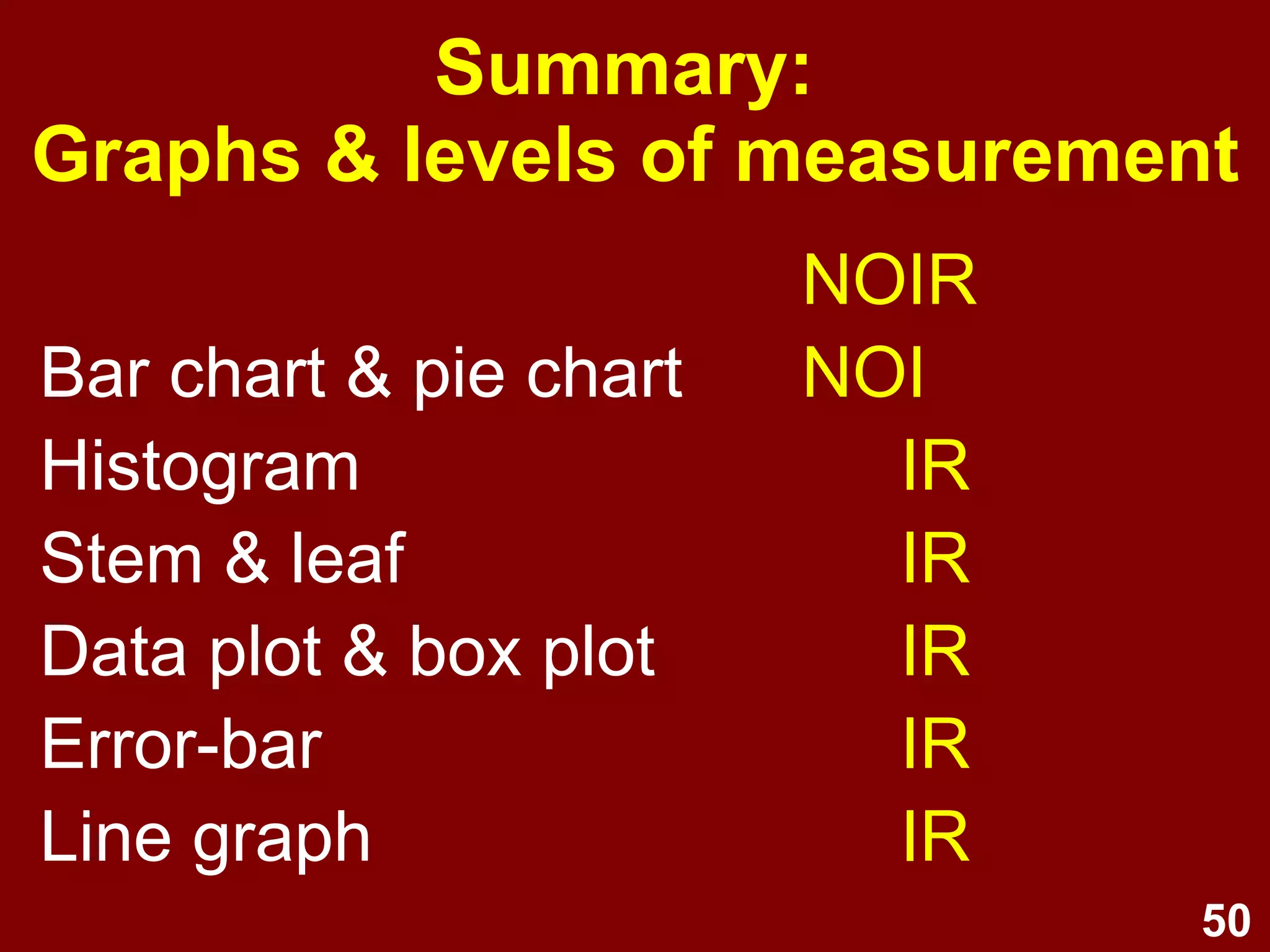


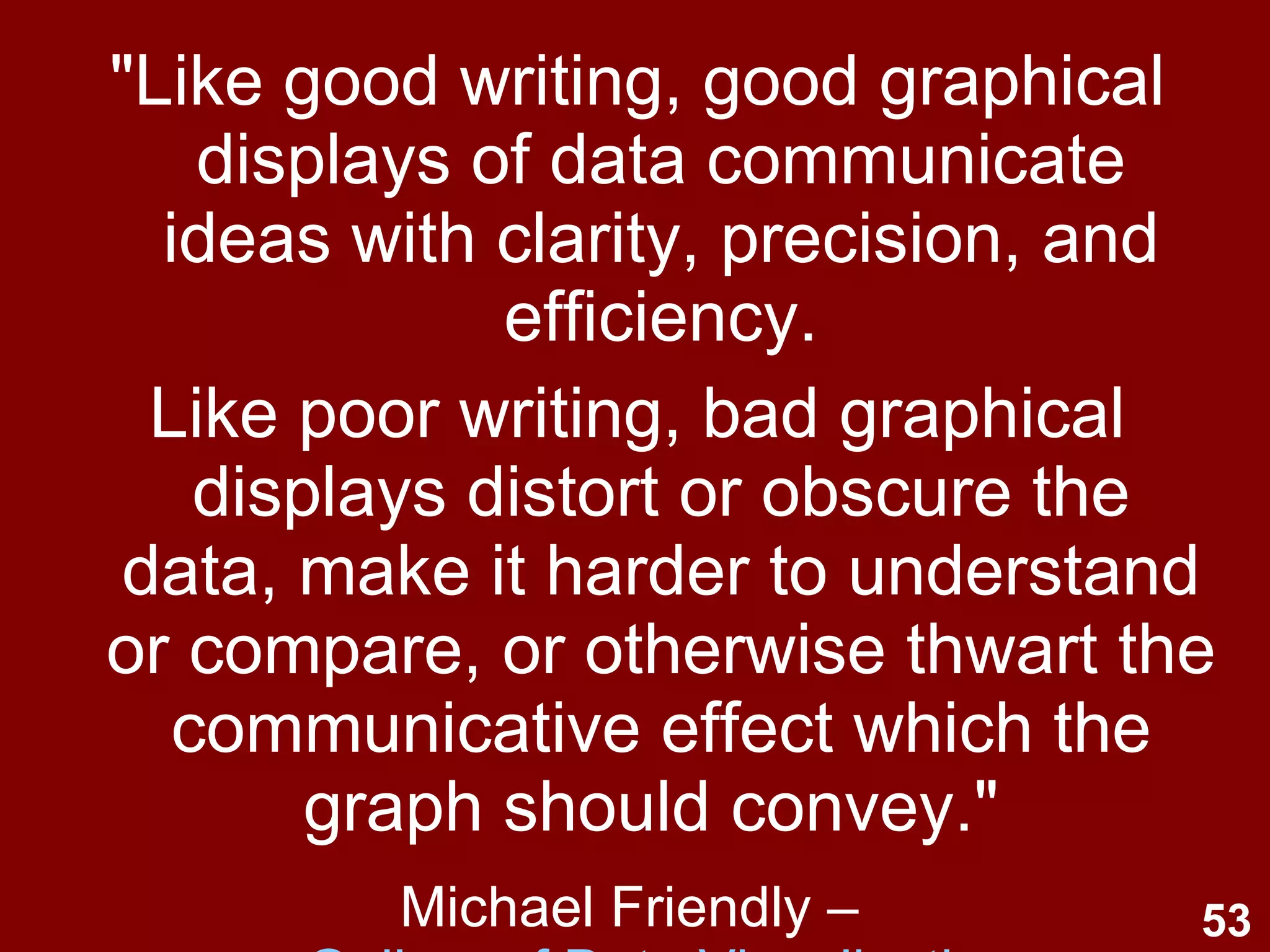
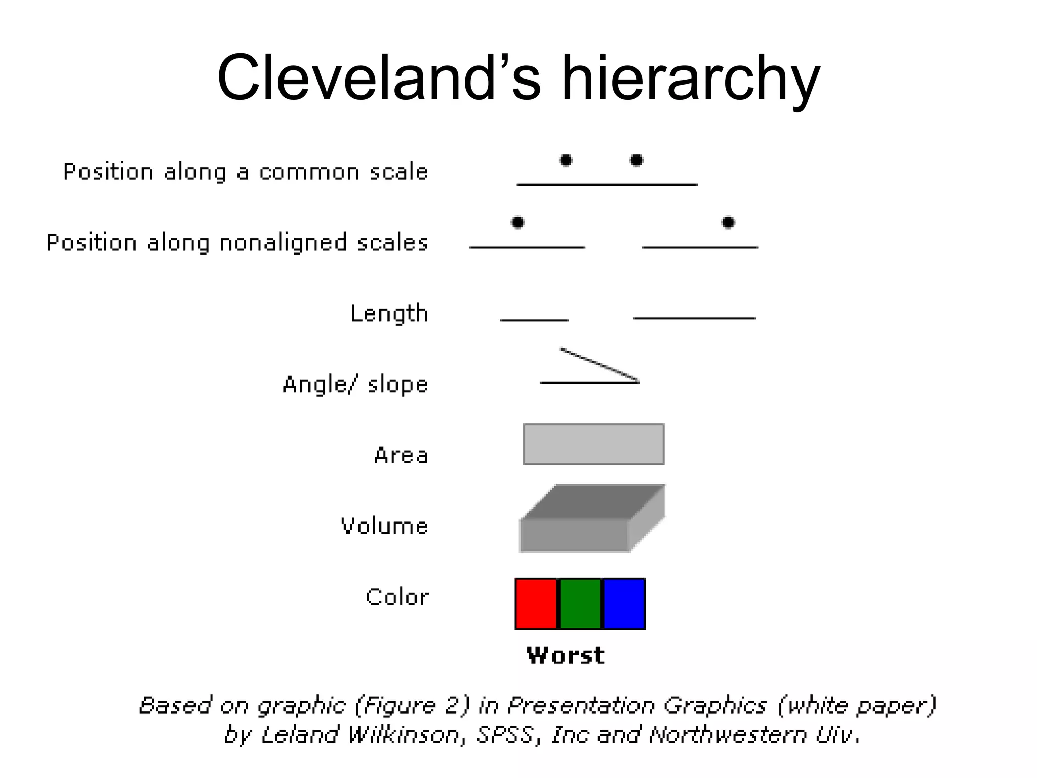
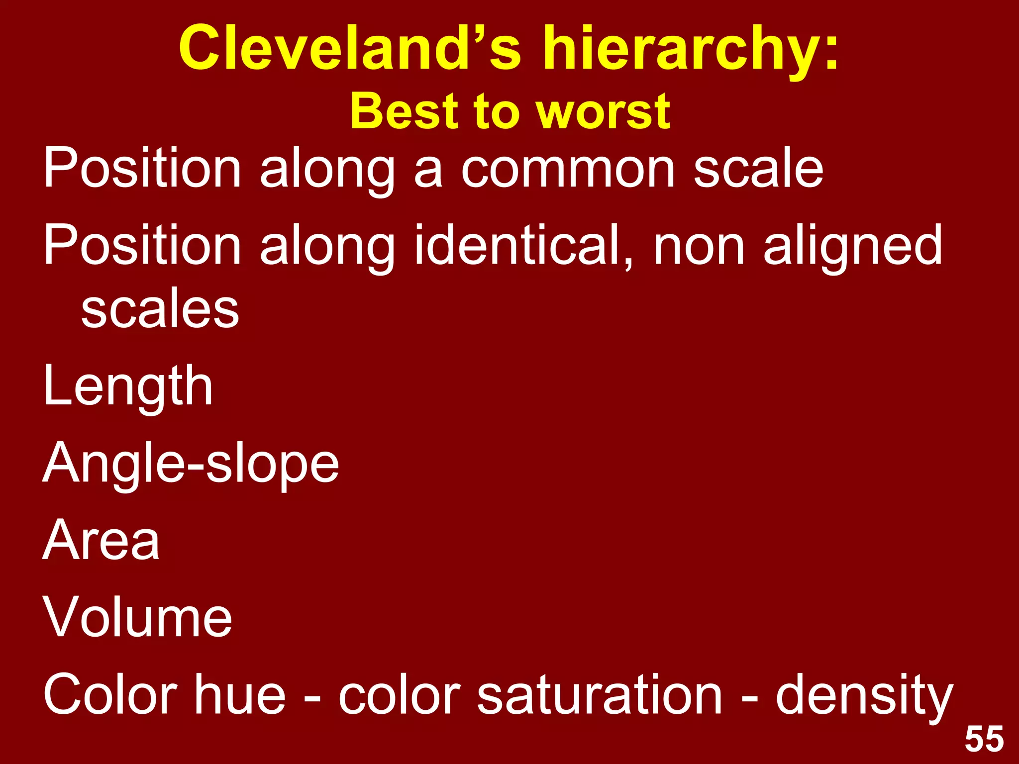
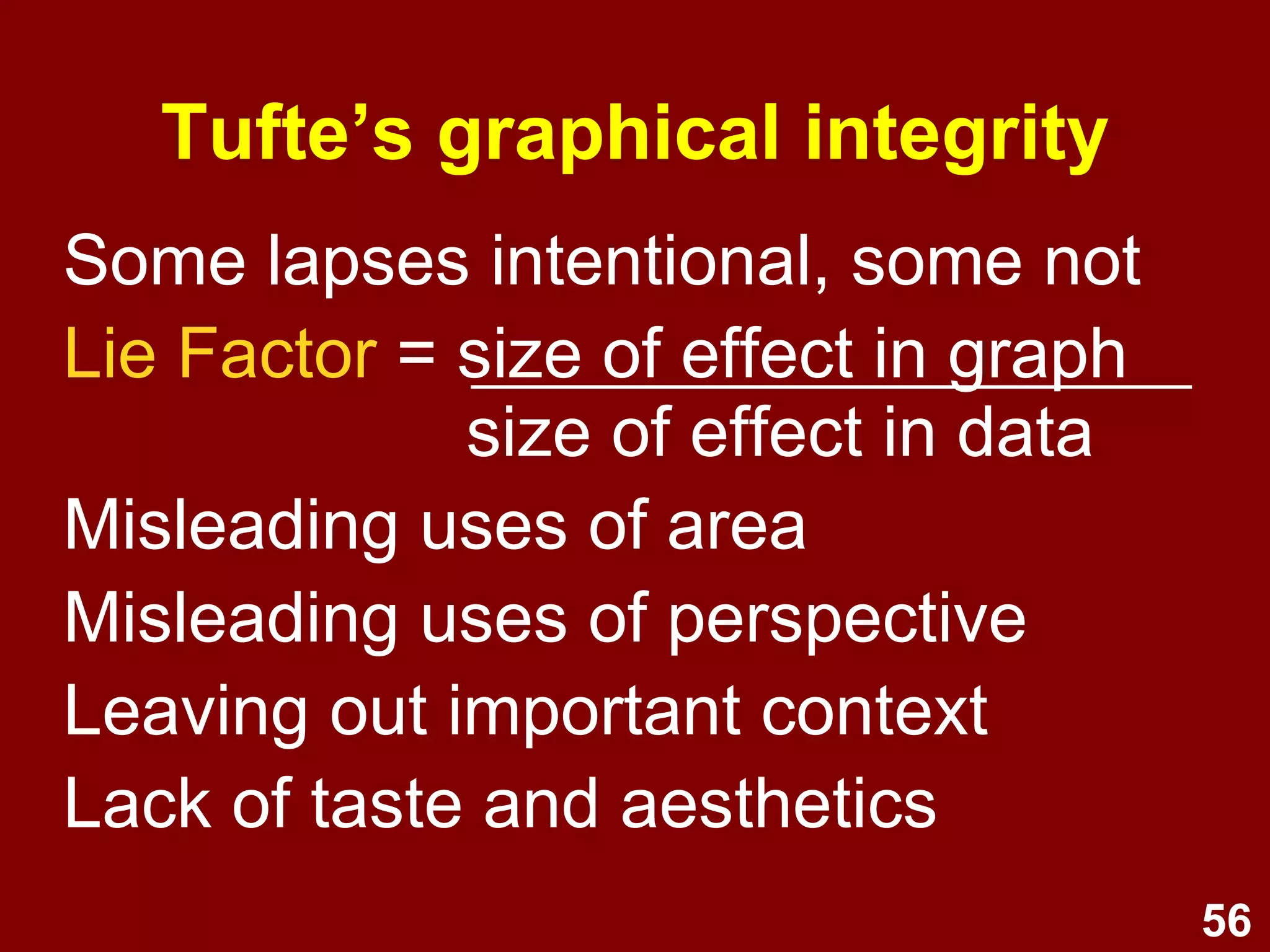

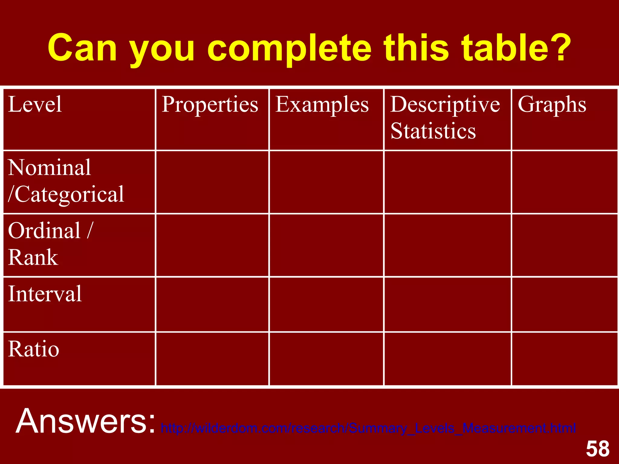

This document discusses data visualization and graphing techniques. It covers levels of measurement, principles of graphing, and types of univariate graphs like bar charts, pie charts, histograms, and box plots. It emphasizes graphical integrity and avoiding distortion to clearly communicate the true story of the data.


![[PAP] 실무자를 위한 인과추론 활용 : Best Practices](https://cdn.slidesharecdn.com/ss_thumbnails/papcon1-220218051343-thumbnail.jpg?width=640&height=640&fit=bounds)


