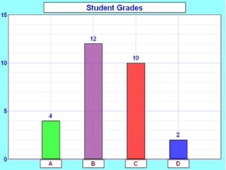
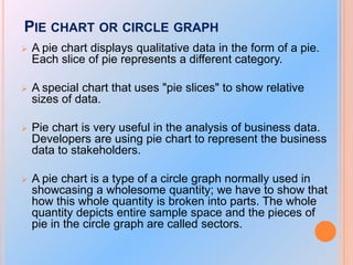
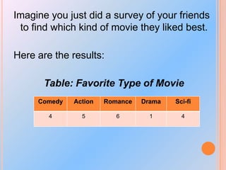
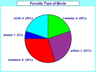
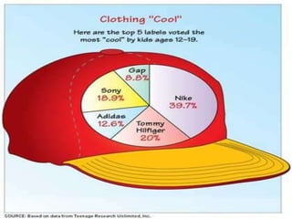
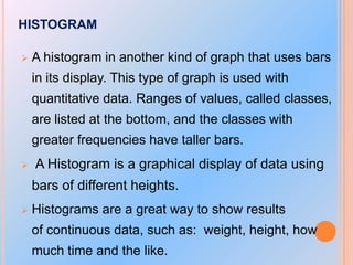
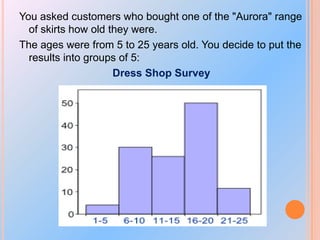
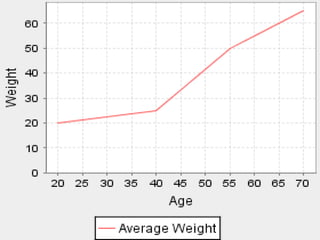
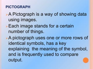
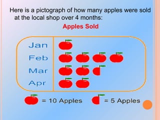
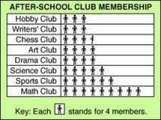
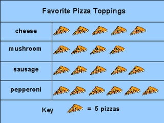
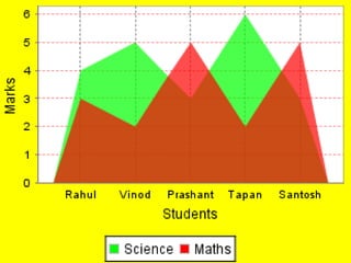
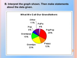
Illustrate the nature of bivariate data;
Construct a scatter plot;
Describe shapes (form), trend (direction), and variation (strength) based on the scatter plot; and
Estimate strength of association between the variables based on a scatter plot.
Visit the website for other Services: https://cristinamontenegro92.wixsite.com/onevs
Introduction to Statistics - Basic Statistical Termssheisirenebkm
This is a presentation which focuses on the basic concepts of statistics. It includes the branches of statistics, population and sample, qualitative and quantitative data, and discrete and continuous variable.
Prelude
PART (A) TYPES OF GRAPHS
Line graphs
Pie charts
Bar graph
Scatter plot
Stem and plot
Histogram
Frequency polygon
Frequency curve
Cumulative frequency or ogives
PART (B) FLOW CHART
PART (C) LOG AND SEMILOG GRAPH
A bar graph is a chart that uses either horizontal ,A Pie Chart (or Pie Graph) is a circular chart divided into sectors,It is also possible to draw bar charts .
A thermometer is an instrument we can use to measure temperature. An analog thermometer consists of a sealed tube with markings on it. These markings are increasing temperatures in Celsius or Fahrenheit. The markings on a clinical and weather thermometer are different, but they work in the same way.
Learn more about the thermometer, how it works, and the different kinds of thermometers with this interactive media article for kids, visit: http://mocomi.com/what-is-a-thermometer/
Top 8 Different Types Of Charts In Statistics And Their UsesStat Analytica
Are you confused about various Types Of Charts In Statistics? In this blog, you will get to learn about the various Types Of Charts In Statistics in detail.
Introduction to interpreting graphical displays of data; bar graphs, histograms, stem-and-leaf plots, time series graphs, circle graphs, dot plots, and ogives.
Chapter 4 Problem 31. For problem three in chapter four, a teac.docxrobertad6
Chapter 4: Problem 3
1. For problem three in chapter four, a teacher wants to display her students number of responses for each day of the week. And she wants to do that with a bar chart. Since she hasn't taken a stats class, she comes to you for help. You first enter her data into SPSS and the results look like this-- When you look at your data set, you'll see that it actually has the wrong level of measurement. Notice that there's a little Venn diagram at the top of each column, which indicates that your data has been entered as nominal. That would be correct if you were noting which day of the week a student participated, but since you're noting how often a given student participated, the correct level of measurement is a scale. Go ahead and change that. Watch how I do that. Under variable view, under measure, you just want to click each one and turn it into a scale. You can also cut and paste these, and I can show you that in another video. Once you have them changed, go back to data view, and you'll see that at the top it has changed in two little rulers. The next question is, how do I get SPSS to display the average score per day rather the total number of individual scores, which might look like a mess, and it's why this question is a toughie. To do that we go under graphs, and you'll see that you have two options, you can do a Chart Builder or a Legacy Dialog. For this question we want to use the Legacy Dialog. We go to Bar and when we click that, there are two questions-- one, what type of bar chart? We want a simple one. And then, how do you want the data in their area displayed? Do we want to summarize for the groups? We really don't. We want summary of separate variables where each day of the week is a variable. We click on Define and then here you'll see every day of the week. You want to bring that over and you see your bar charts are going to represent the mean for every day of the week. As a good habit you want to make sure you title it, I called it "Students' Engagement During Group Discussion." The second one is by day of week. We hit Continue, and then when we hit OK, you're going to see your output pop up. And here is our bar chart-- every day of the week showing the average student engagement. And this is how you answer problem 3 in chapter 4. Good luck.
2. Identify whether these distributions are negatively skewed, positively skewed, or not skewed at all and explain why you describe them that way.
a. This talented group of athletes scored very high on the vertical jump task.
b. On this incredibly crummy test, everyone received the same score.
c. On the most difficult spelling test of the year, the third graders wept as the scores were delivered and then their parents complained.
3. Use the data available as Chapter 4 Data Set 3 on pie preference to create a pie chart ☺ using SPSS.
4. For each of the followin.
BUSINESS INTELLIGENCE AND DATA ANALYTICS presentationMohit Negi
SIX SIGMA APPROACH, DIFFERENT TYPES OF CHARTS AND THEIR FUNCTION, DASHBOARD, BUSINESS INTELLIGENCE, DATA VISUALISATION INFORMATION VISUALISATION, PERFORMANCE DASHBOARD, BUSINESS REPORTING, BALANCE SCORECARD
Let's understand 7QC tool and basic of Graph / Presentation what to use and when to use. It will enable you to apply graph and present your data in more graphical format.
Top 7 types of Statistics Graphs for Data RepresentationStat Analytica
Are you struggling with choosing the right type of graph to represent your data set? if yes then have a look at this presentation to choose the best statistics graph to represent your data set.
Types of charts in Excel and How to use themVijay Perepa
There are different Chart types and some times we face difficulty to find which chart is suitable for a specific Data set. In this series of Videos, we have discussed about each chart type and when to use etc.
How to Split Bills in the Odoo 17 POS ModuleCeline George
Bills have a main role in point of sale procedure. It will help to track sales, handling payments and giving receipts to customers. Bill splitting also has an important role in POS. For example, If some friends come together for dinner and if they want to divide the bill then it is possible by POS bill splitting. This slide will show how to split bills in odoo 17 POS.
The Indian economy is classified into different sectors to simplify the analysis and understanding of economic activities. For Class 10, it's essential to grasp the sectors of the Indian economy, understand their characteristics, and recognize their importance. This guide will provide detailed notes on the Sectors of the Indian Economy Class 10, using specific long-tail keywords to enhance comprehension.
For more information, visit-www.vavaclasses.com
Students, digital devices and success - Andreas Schleicher - 27 May 2024..pptxEduSkills OECD
Andreas Schleicher presents at the OECD webinar ‘Digital devices in schools: detrimental distraction or secret to success?’ on 27 May 2024. The presentation was based on findings from PISA 2022 results and the webinar helped launch the PISA in Focus ‘Managing screen time: How to protect and equip students against distraction’ https://www.oecd-ilibrary.org/education/managing-screen-time_7c225af4-en and the OECD Education Policy Perspective ‘Students, digital devices and success’ can be found here - https://oe.cd/il/5yV
We all have good and bad thoughts from time to time and situation to situation. We are bombarded daily with spiraling thoughts(both negative and positive) creating all-consuming feel , making us difficult to manage with associated suffering. Good thoughts are like our Mob Signal (Positive thought) amidst noise(negative thought) in the atmosphere. Negative thoughts like noise outweigh positive thoughts. These thoughts often create unwanted confusion, trouble, stress and frustration in our mind as well as chaos in our physical world. Negative thoughts are also known as “distorted thinking”.
Unit 8 - Information and Communication Technology (Paper I).pdfThiyagu K
This slides describes the basic concepts of ICT, basics of Email, Emerging Technology and Digital Initiatives in Education. This presentations aligns with the UGC Paper I syllabus.
Welcome to TechSoup New Member Orientation and Q&A (May 2024).pdfTechSoup
In this webinar you will learn how your organization can access TechSoup's wide variety of product discount and donation programs. From hardware to software, we'll give you a tour of the tools available to help your nonprofit with productivity, collaboration, financial management, donor tracking, security, and more.
2024.06.01 Introducing a competency framework for languag learning materials ...Sandy Millin
http://sandymillin.wordpress.com/iateflwebinar2024
Published classroom materials form the basis of syllabuses, drive teacher professional development, and have a potentially huge influence on learners, teachers and education systems. All teachers also create their own materials, whether a few sentences on a blackboard, a highly-structured fully-realised online course, or anything in between. Despite this, the knowledge and skills needed to create effective language learning materials are rarely part of teacher training, and are mostly learnt by trial and error.
Knowledge and skills frameworks, generally called competency frameworks, for ELT teachers, trainers and managers have existed for a few years now. However, until I created one for my MA dissertation, there wasn’t one drawing together what we need to know and do to be able to effectively produce language learning materials.
This webinar will introduce you to my framework, highlighting the key competencies I identified from my research. It will also show how anybody involved in language teaching (any language, not just English!), teacher training, managing schools or developing language learning materials can benefit from using the framework.
The French Revolution, which began in 1789, was a period of radical social and political upheaval in France. It marked the decline of absolute monarchies, the rise of secular and democratic republics, and the eventual rise of Napoleon Bonaparte. This revolutionary period is crucial in understanding the transition from feudalism to modernity in Europe.
For more information, visit-www.vavaclasses.com
The Roman Empire A Historical Colossus.pdfkaushalkr1407
The Roman Empire, a vast and enduring power, stands as one of history's most remarkable civilizations, leaving an indelible imprint on the world. It emerged from the Roman Republic, transitioning into an imperial powerhouse under the leadership of Augustus Caesar in 27 BCE. This transformation marked the beginning of an era defined by unprecedented territorial expansion, architectural marvels, and profound cultural influence.
The empire's roots lie in the city of Rome, founded, according to legend, by Romulus in 753 BCE. Over centuries, Rome evolved from a small settlement to a formidable republic, characterized by a complex political system with elected officials and checks on power. However, internal strife, class conflicts, and military ambitions paved the way for the end of the Republic. Julius Caesar’s dictatorship and subsequent assassination in 44 BCE created a power vacuum, leading to a civil war. Octavian, later Augustus, emerged victorious, heralding the Roman Empire’s birth.
Under Augustus, the empire experienced the Pax Romana, a 200-year period of relative peace and stability. Augustus reformed the military, established efficient administrative systems, and initiated grand construction projects. The empire's borders expanded, encompassing territories from Britain to Egypt and from Spain to the Euphrates. Roman legions, renowned for their discipline and engineering prowess, secured and maintained these vast territories, building roads, fortifications, and cities that facilitated control and integration.
The Roman Empire’s society was hierarchical, with a rigid class system. At the top were the patricians, wealthy elites who held significant political power. Below them were the plebeians, free citizens with limited political influence, and the vast numbers of slaves who formed the backbone of the economy. The family unit was central, governed by the paterfamilias, the male head who held absolute authority.
Culturally, the Romans were eclectic, absorbing and adapting elements from the civilizations they encountered, particularly the Greeks. Roman art, literature, and philosophy reflected this synthesis, creating a rich cultural tapestry. Latin, the Roman language, became the lingua franca of the Western world, influencing numerous modern languages.
Roman architecture and engineering achievements were monumental. They perfected the arch, vault, and dome, constructing enduring structures like the Colosseum, Pantheon, and aqueducts. These engineering marvels not only showcased Roman ingenuity but also served practical purposes, from public entertainment to water supply.
Model Attribute Check Company Auto PropertyCeline George
In Odoo, the multi-company feature allows you to manage multiple companies within a single Odoo database instance. Each company can have its own configurations while still sharing common resources such as products, customers, and suppliers.
2. OBJECTIVES:
1. Present data in graphs, tables
and charts.
2. Analyze and interpret data from
graphs, tables and charts.
3. Appreciate the importance of the
lesson in the real-life situation.
3. GRAPHS
Good
graphs convey information
quickly and easily to the user.
Graphs highlight salient features
of the data. They can show
relationships that are not obvious
from studying a list of numbers.
Graphs can also provide a
convenient way to compare
different sets of data.
4. GUIDELINES IN CONSTRUCTING GRAPHS
a. The length of the vertical axis (y-axis), called the
ordinate, is about two thirds to three-fourths the
length of the horizontal axis (x-axis), called the
abscissa.
b. The vertical axis starts with a zero.
c. Recording the score values is from left to right
and from the lowest to highest.
d. A space of one-half to one column is left
between the vertical axis and the first column,
and between the last column and the end of the
horizontal axis.
e. The graph is given a title.
5. PARETO DIAGRAM OR BAR GRAPH
A
bar graph contains a bar for each
category of a set of qualitative data. The
bars are arranged in order of frequency,
so that more important categories are
emphasized.
It is a really good way to show relative
sizes: it is easy to see which types of
movie are most liked, and which are
least liked, at a glance.
You can use bar graphs to show the
relative sizes of many things, such as
what type of car people have, how
many customers a shop has on different
6. Imagine you just did a survey of your friends
to find which kind of movie they liked best:
Table: Favorite Type of Movie
Comedy
Action
Romance
Drama
Sci-fi
4
5
6
1
4
7.
8.
9. PIE CHART OR CIRCLE GRAPH
A pie chart displays qualitative data in the form of a pie.
Each slice of pie represents a different category.
A special chart that uses "pie slices" to show relative
sizes of data.
Pie chart is very useful in the analysis of business data.
Developers are using pie chart to represent the business
data to stakeholders.
A pie chart is a type of a circle graph normally used in
showcasing a wholesome quantity; we have to show that
how this whole quantity is broken into parts. The whole
quantity depicts entire sample space and the pieces of
pie in the circle graph are called sectors.
10. Imagine you just did a survey of your friends
to find which kind of movie they liked best.
Here are the results:
Table: Favorite Type of Movie
Comedy
Action
Romance
Drama
Sci-fi
4
5
6
1
4
11.
12.
13. HISTOGRAM
A histogram in another kind of graph that uses bars
in its display. This type of graph is used with
quantitative data. Ranges of values, called classes,
are listed at the bottom, and the classes with
greater frequencies have taller bars.
A Histogram is a graphical display of data using
bars of different heights.
Histograms are a great way to show results
of continuous data, such as: weight, height, how
much time and the like.
14. You asked customers who bought one of the "Aurora" range
of skirts how old they were.
The ages were from 5 to 25 years old. You decide to put the
results into groups of 5:
Dress Shop Survey
15. LINE GRAPHS
A
line graph is a way of representing
two pieces of information, which is
usually related and vary with respect
to each other. This is useful when
comparisons are needed.
At
each end of the polygon, a line is
drawn back to zero.
16.
17. PICTOGRAPH
A
Pictograph is a way of showing data
using images.
Each image stands for a certain
number of things.
A pictograph uses one or more rows of
identical symbols, has a key
explaining the meaning of the symbol,
and is frequently used to compare
output.
18. Here is a pictograph of how many apples were sold
at the local shop over 4 months:
Apples Sold
23. A. Choose only one. Make your own
pictograph.
How much money you have (week by
week)
How much exercise you get (each day)
How many hours you watch TV every week
How many sports stories are in each
newspaper
24. B. Interpret the graph shown. Then make statements
about the data given.