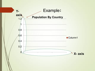
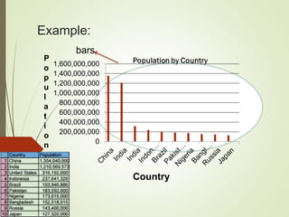
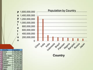
This document provides instructions for making a vertical bar graph in 6 steps:
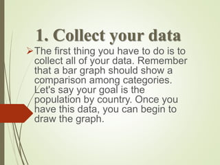
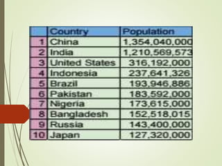
1. Collect the data to be visualized, such as population by country.
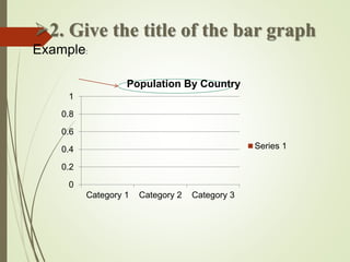
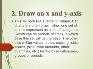
2. Give the graph a title and draw perpendicular x- and y-axes.
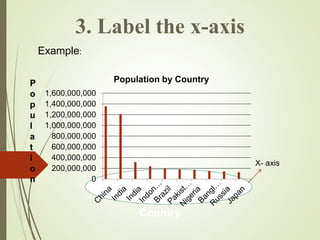
3. Label the x-axis with the categories of data.
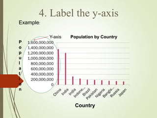
4. Label the y-axis with the values or quantities represented.
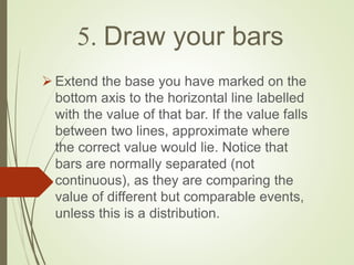
5. Draw vertical bars on the graph extending from the x-axis up to the values on the y-axis for each category.
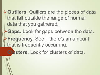
6. Interpret the data by looking for outliers, gaps, frequently occurring values, and clusters.