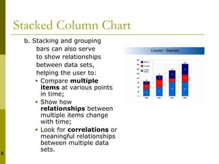
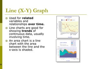
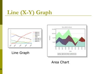
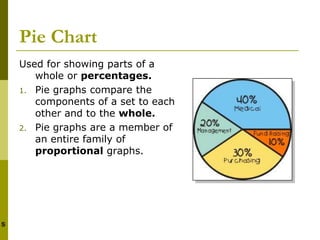
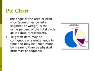
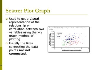
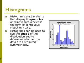
Bar charts, line graphs, pie charts, scatter plots, and histograms are commonly used types of charts. Each type of chart has distinct characteristics that make it suitable for visualizing certain types of data relationships. Bar charts are useful for comparing discrete categories, line graphs show trends over time, pie charts show proportions, scatter plots reveal correlations between two variables, and histograms display frequency distributions. Proper chart selection and design ensure data is presented clearly and accurately.