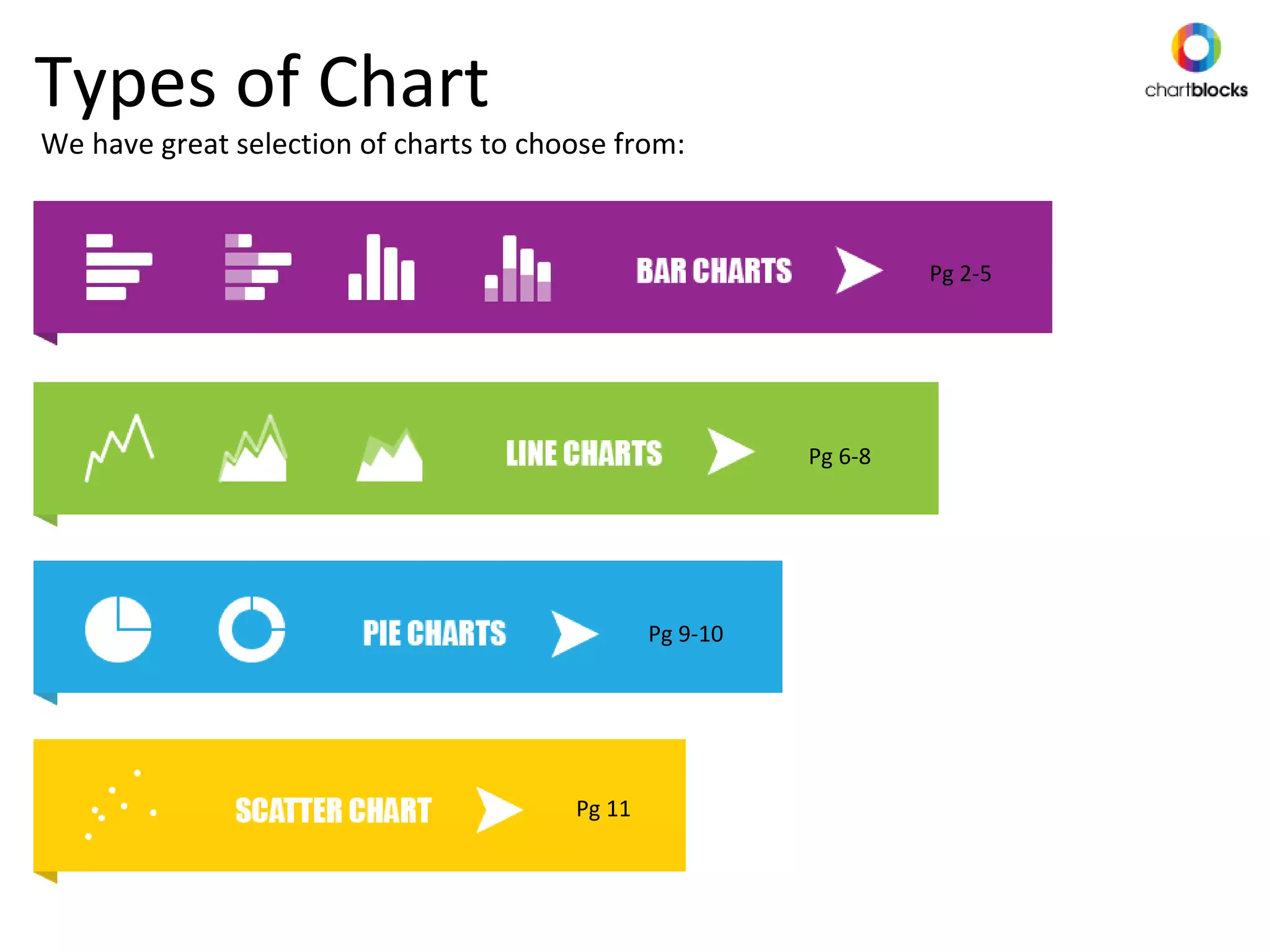
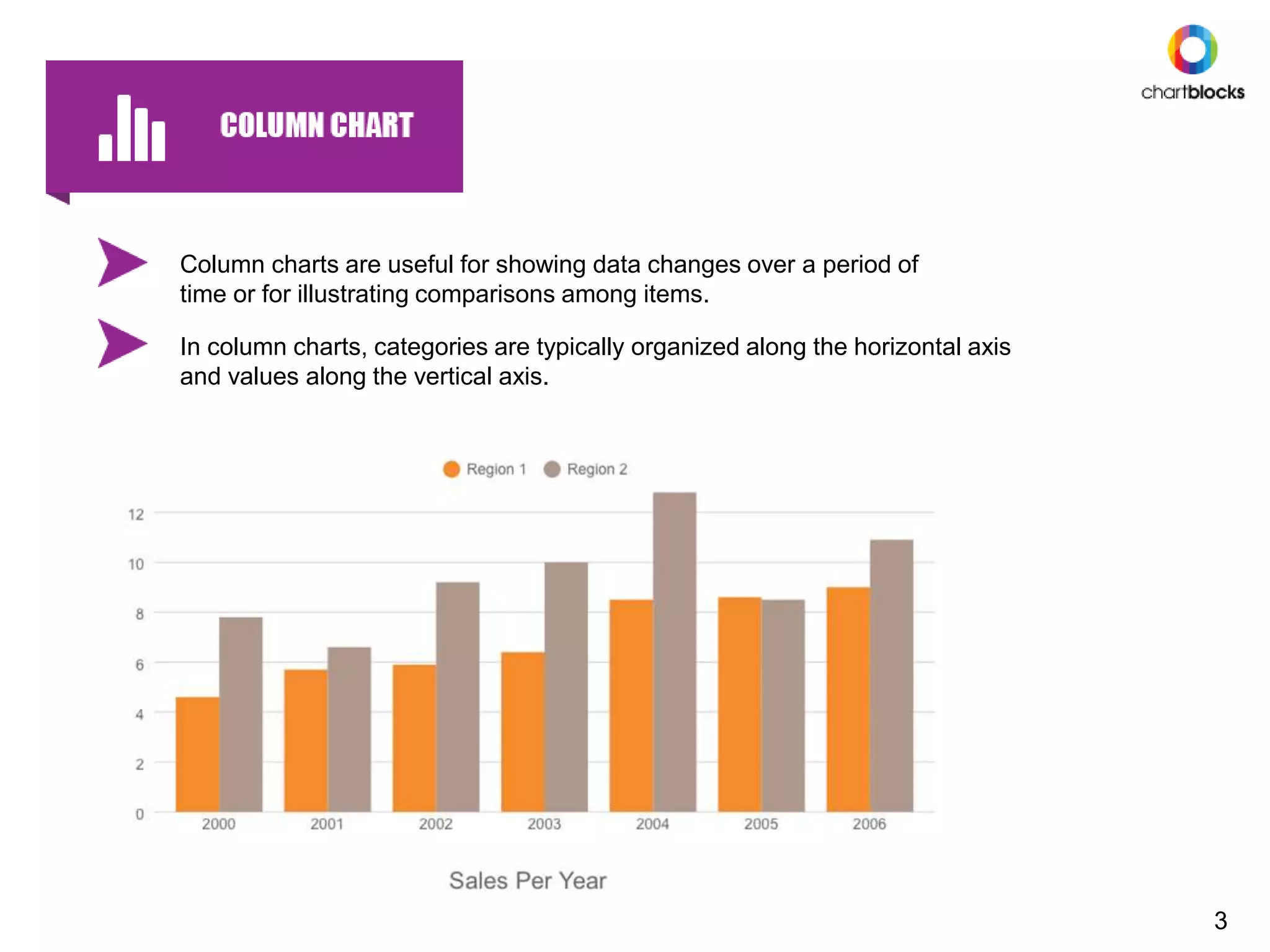
Curious about the different types of chart? This presentation demonstrates the variety of charts and their purpose. All these charts have been created using Chartblocks online chart building tool.
1. Types of Chart
We have great selection of charts to choose from:
Pg 2-5
Pg 11
Pg 9-10
Pg 6-8
2. A bar chart or column bar chart is a chart with rectangular bars with
horizontal lengths proportional to the values that they represent.
The bars can be plotted horizontally.
2
3. In column charts, categories are typically organized along the horizontal axis
and values along the vertical axis.
Column charts are useful for showing data changes over a period of
time or for illustrating comparisons among items.
3
4. Similar to a normal bar chart, a stacked bar chart places related values atop
one another.
It's typically used when a category naturally divides into components.
4
5. A stacked column chart consists of a grid and vertical columns (bars) that
include subgroups, or stacks, of data.
Each of these components shows its relative contribution to the entire bar
and the entity as a whole.
5
6. A line chart or line graph is a type of chart which displays information as
a series of data points called 'markers' connected by straight line
segments.
It is a basic type of chart common in many fields.
6
7. An area chart or area graph displays graphically quantitative data.
The area between axis and line are commonly emphasised with colours,
textures and hatchings.
Commonly one compares with an area chart two or more quantities.
7
8. This is similar to a normal area chart although a stacked area chart
also shows the relationship of parts to a whole.
The raw values can be stacked, showing how the whole changes
over time.
8
9. A pie chart (or pie graph) is a circular graph which is divided in such a
way that it resembles the slices of pie.
It divides your data into sectors, illustrating each numerical proportion
to show the composition of a whole.
9
10. Provides a better data intensity ratio to standard pie charts since the blank
centre can be used to display additional related data.
A donut chart is functionally identical to a pie chart, with the exception of a
blank centre and the ability to support multiple statistics at once.
10
11. A scatter chart or scatter graph is a type of chart that is used
when trying to show the relationship between two sets of
variables.
11
12. Choosing the right chart for your data
Ever wonder what sorts of charts or graphs would be best to represent your data?
COMPOSITION
Collecting different types of data that make up a whole and displaying them together.
Sets variables apart from each other, and shows how they interact.
COMPARISON
This type of data tries to show a correlation between two or more variables.
RELATIONSHIP
DISTRIBUTION
Shows a collection of related/unrelated information to see how it correlates, if at all.
12
There are four different types of categories for your data: