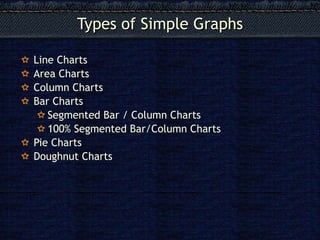
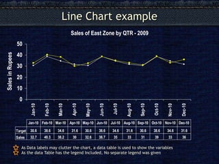
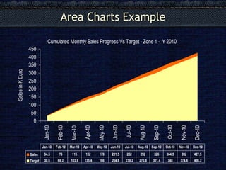
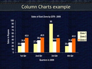
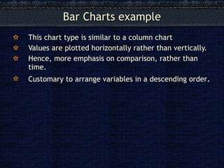
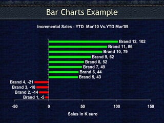
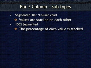
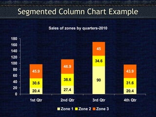
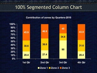
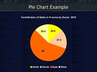
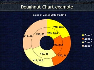
done by : ( ABCD'S &G )
alaa ba-jafar
abrar alshahranii
sahab filfilan
nada alharbi
shahd rajab
Ghadeer suwaimil
I hope that you enjoy and you benefit❤
done by : ( ABCD'S &G )
alaa ba-jafar
abrar alshahranii
sahab filfilan
nada alharbi
shahd rajab
Ghadeer suwaimil
I hope that you enjoy and you benefit❤
Curious about the different types of chart? This presentation demonstrates the variety of charts and their purpose. All these charts have been created using Chartblocks online chart building tool.
Introduction to graph of class 8th students. Find a new easy way to understand graph, histogram, double-bar graph, pie-chart etc....This ppt could lead to u a better picture of maths
Flyers are an effective way to market organizations and events, and are particularly effective when promoting sales or events that are happening soon. The key to marketing with flyers is distribution: by placing the flyers in front of your target audience, you increase the likelihood that your message will have the desired effect.
Types of charts in Excel and How to use themVijay Perepa
There are different Chart types and some times we face difficulty to find which chart is suitable for a specific Data set. In this series of Videos, we have discussed about each chart type and when to use etc.
4 Ways to Create an Interactive Data Visualization StoryHitech BPO
Appropriate data, audience understanding & building a good story for meaningful & powerful visual dashboards that influence & engage the audience for actionable insights; is the key. This infographic is about storytelling with visualization.
Let's understand 7QC tool and basic of Graph / Presentation what to use and when to use. It will enable you to apply graph and present your data in more graphical format.
This PowerPoint presentation is about organizing and presenting data. It will show you which types of graphs to use when presenting your data. Feel free to save and share it! Please do like my PPT THANKS!!
All pictures and descriptions are from Google (I can't find the links).
note: this presentation doesn't have complete information about organizing and presenting data and only shows important pieces of information about organizing and presenting data and the common graphs that are used in data presentation.
This PowerPoint presentation is about organizing and presenting data. It will show you which types of graphs to use when presenting your data. Feel free to save and share it! Please do like my PPT THANKS!!
All pictures and descriptions are from Google (I can't find the links).
Introduction to interpreting graphical displays of data; bar graphs, histograms, stem-and-leaf plots, time series graphs, circle graphs, dot plots, and ogives.