Download as PDF, PPTX


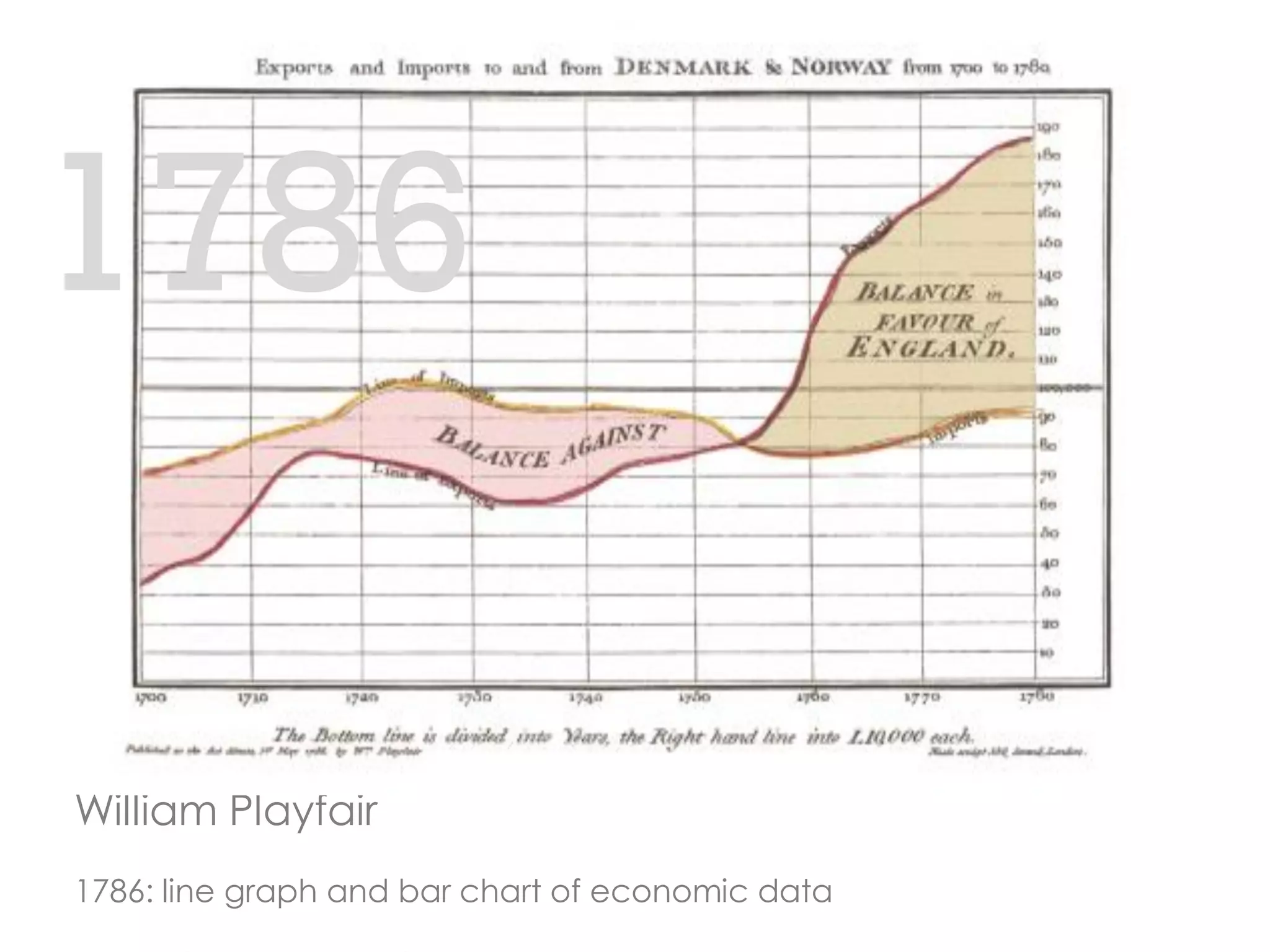


The Routine Health Information Network (RHINO) aims to enhance global health by utilizing high-quality routine health information systems and data visualization techniques. The document outlines the evolution of data visualization and emphasizes the importance of user-centered dashboard design that meets the needs of various data users. It highlights best practices for creating effective visualizations that convey information accurately and engagingly, while promoting accessibility.


![ict_presentation_final_final_final[1].pptx](https://cdn.slidesharecdn.com/ss_thumbnails/ictpresentationfinalfinalfinal1-251230145259-2b4839bd-thumbnail.jpg?width=640&height=640&fit=bounds)


