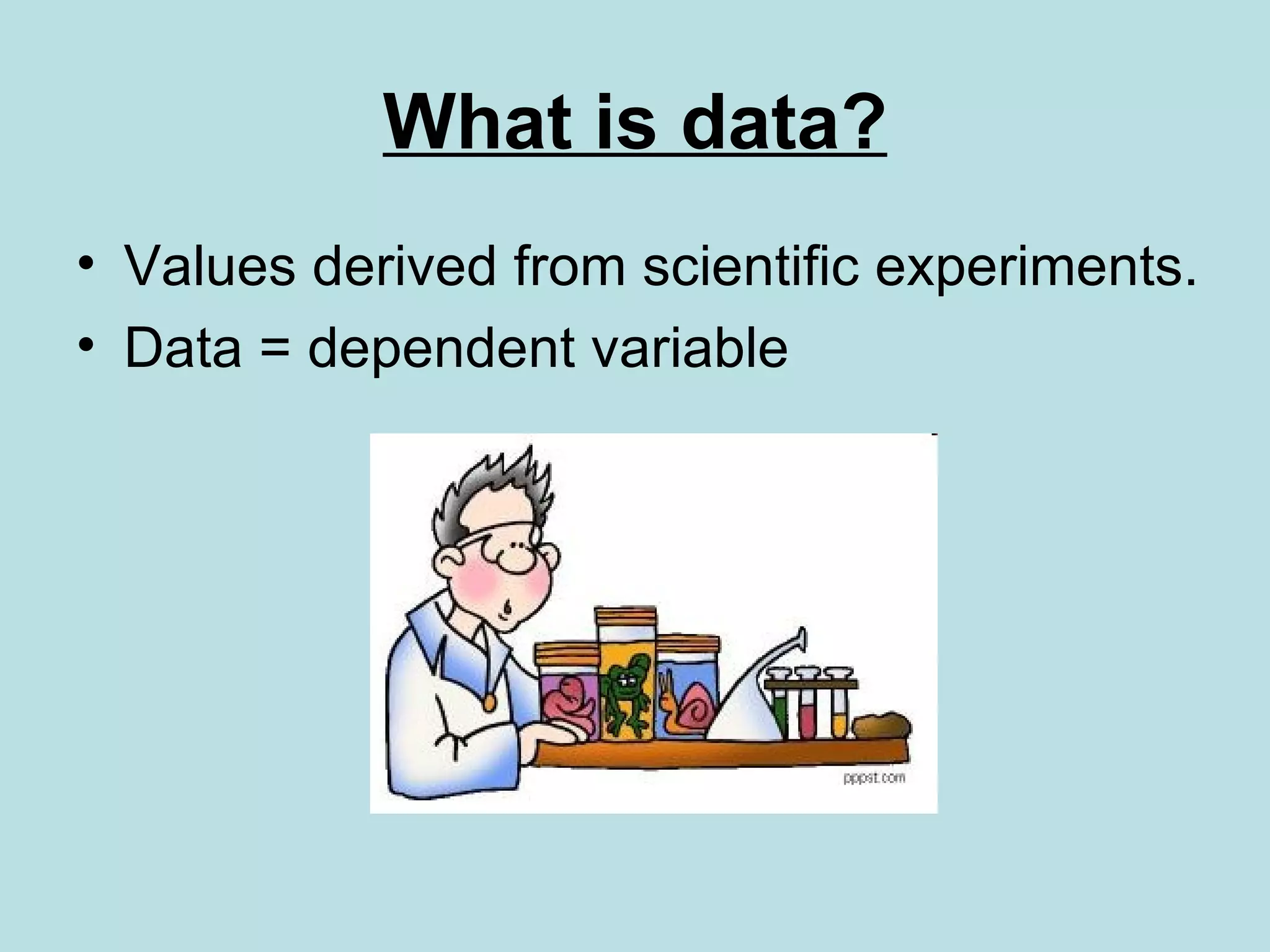
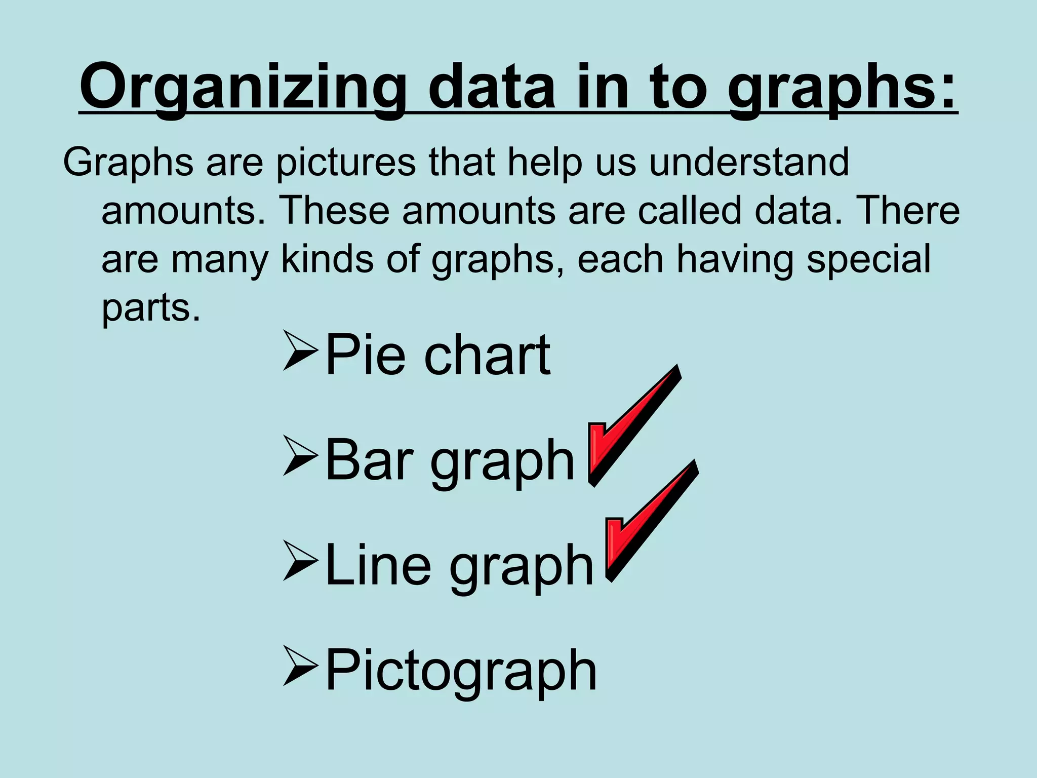
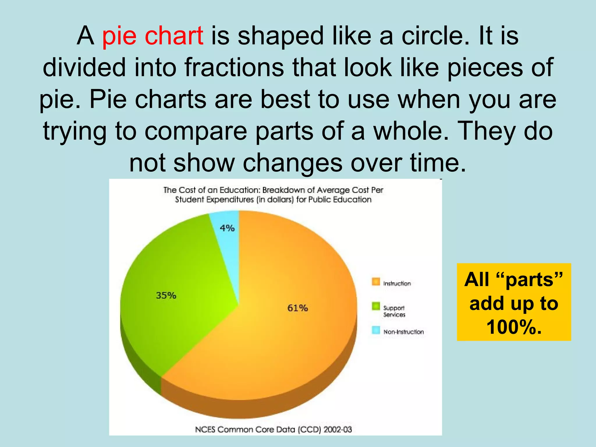
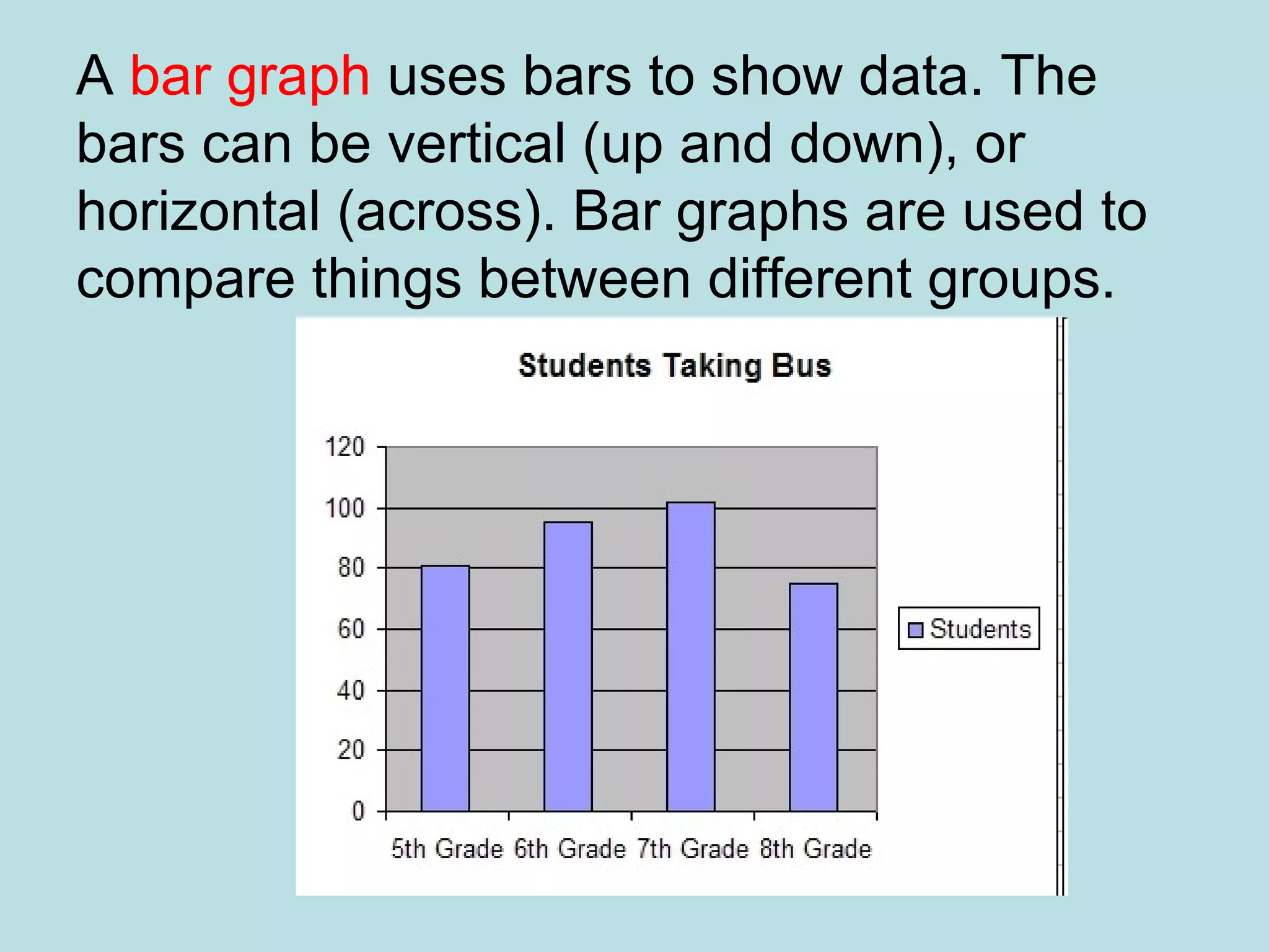
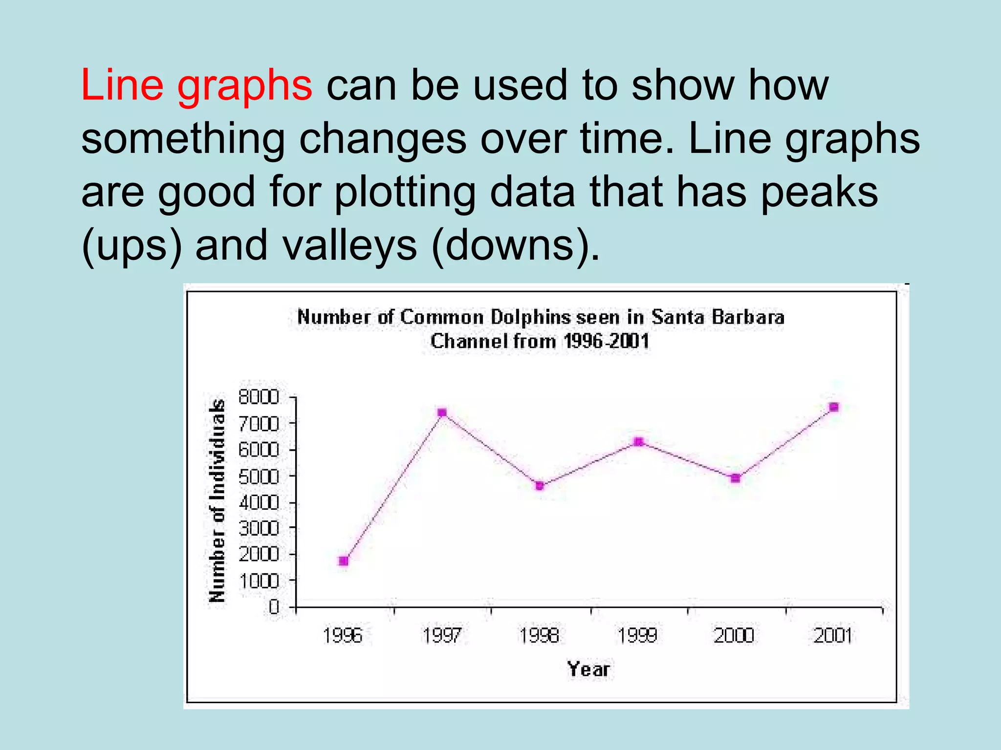
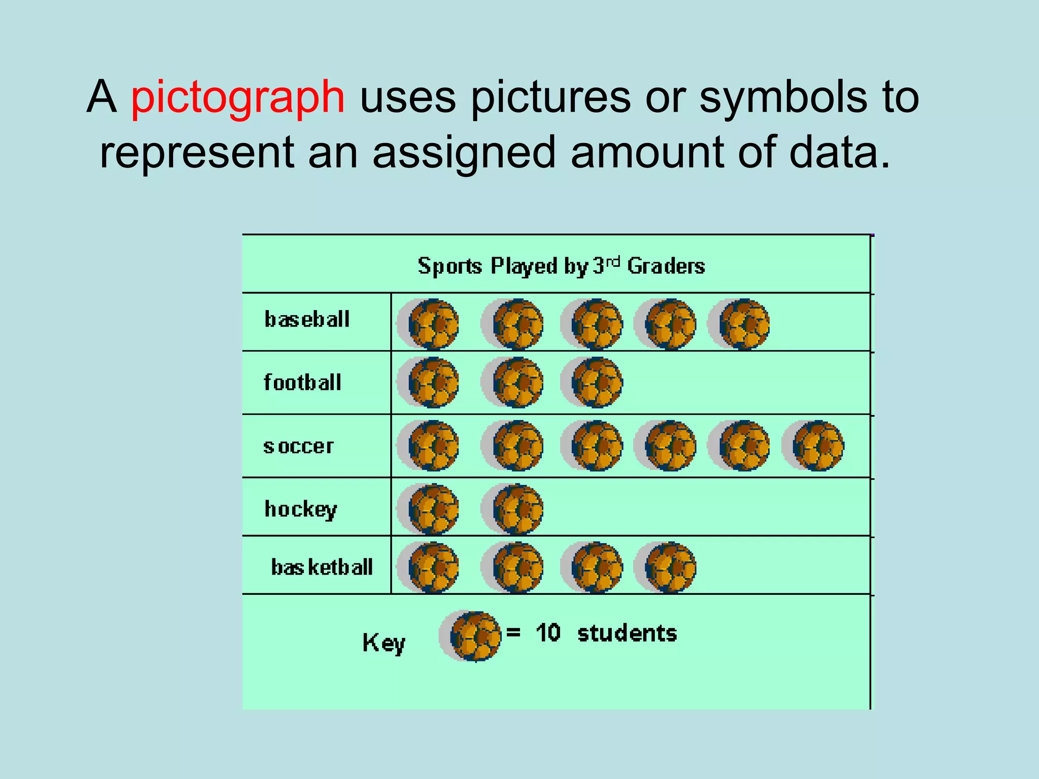
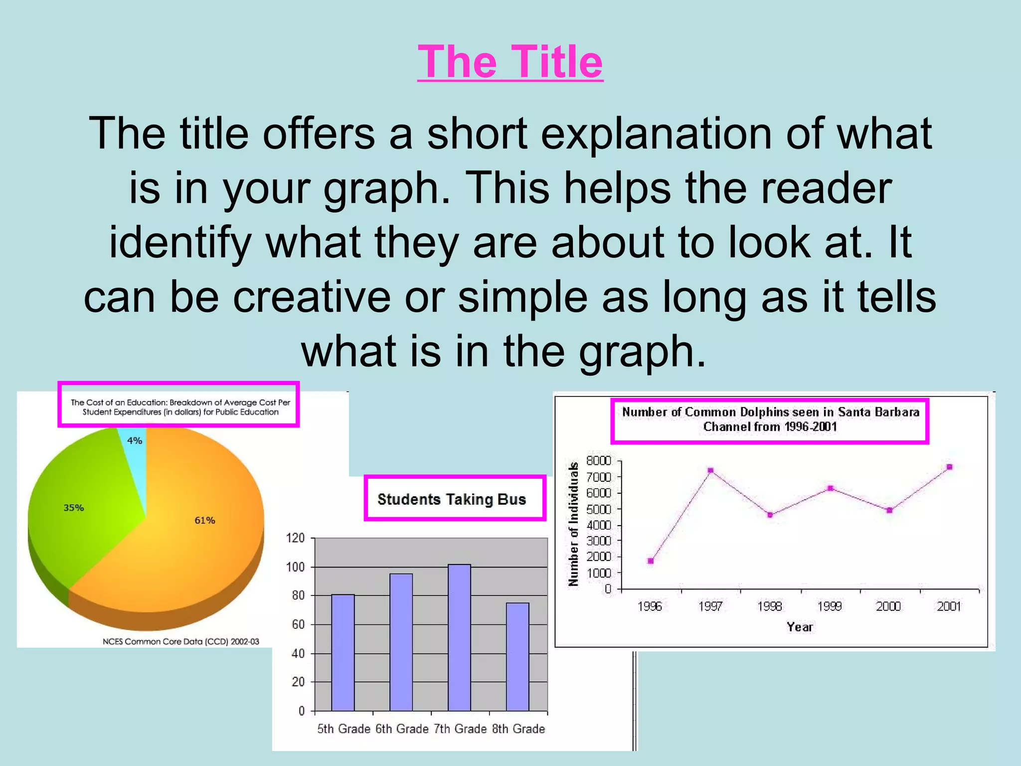
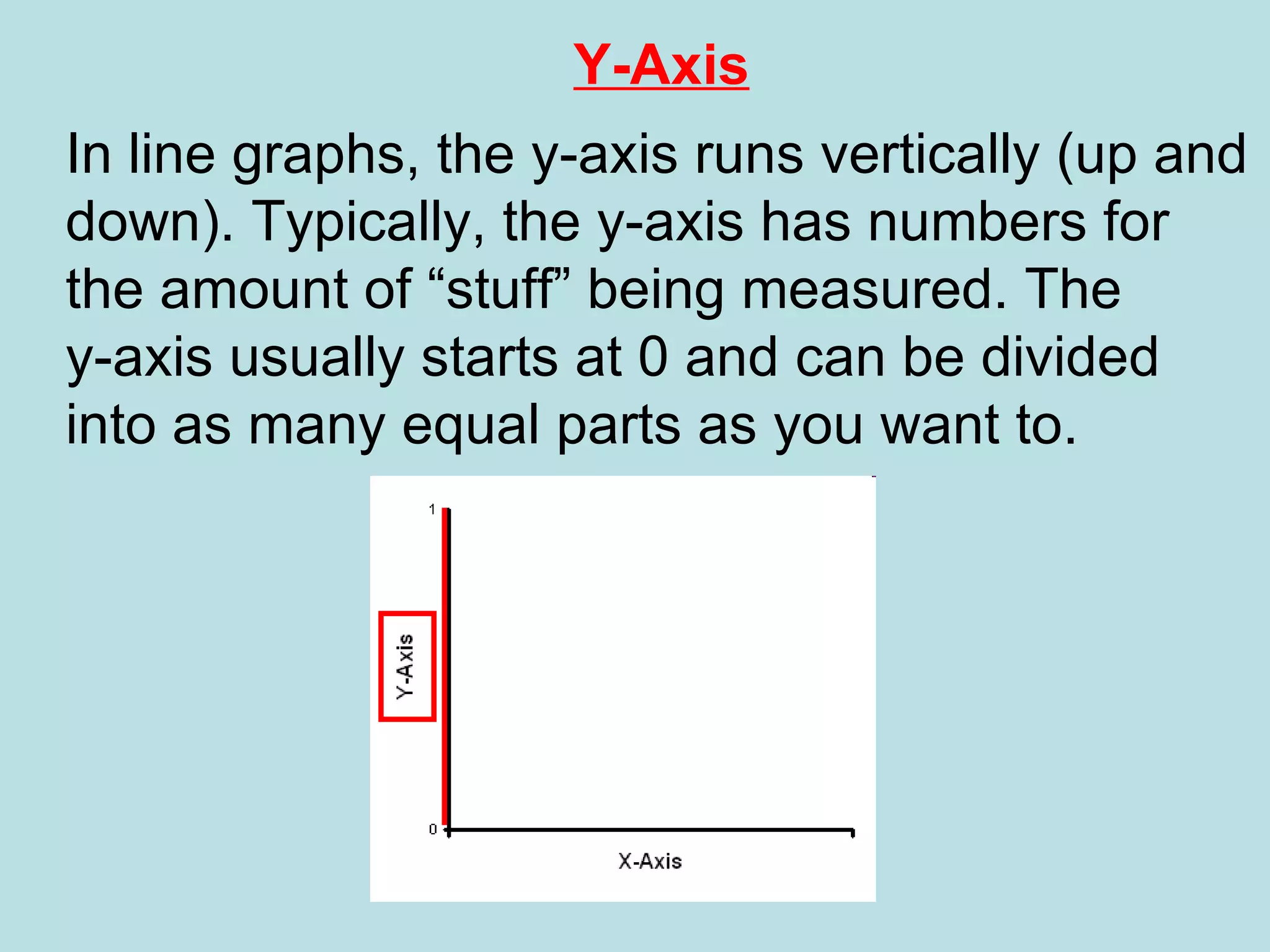
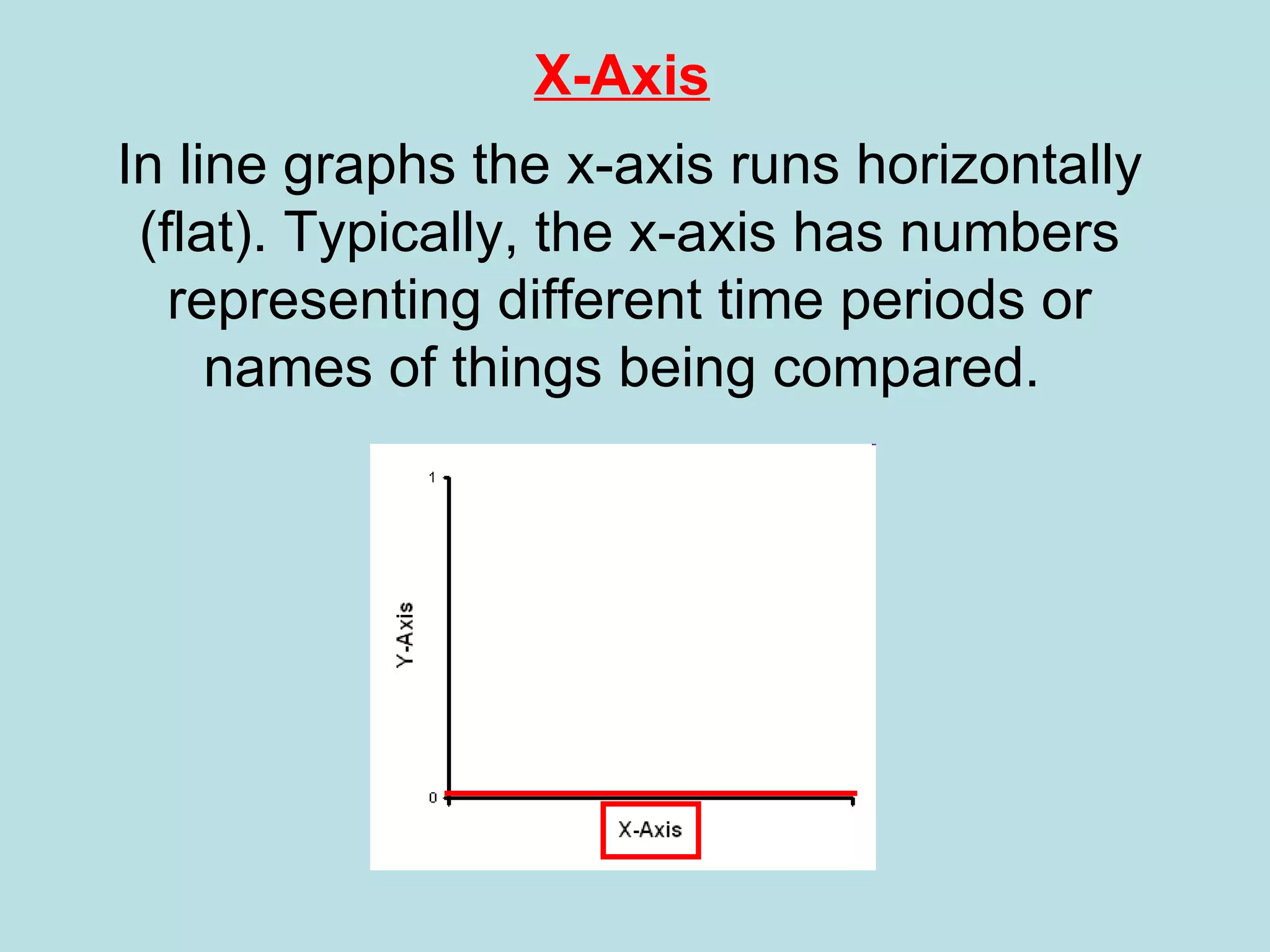
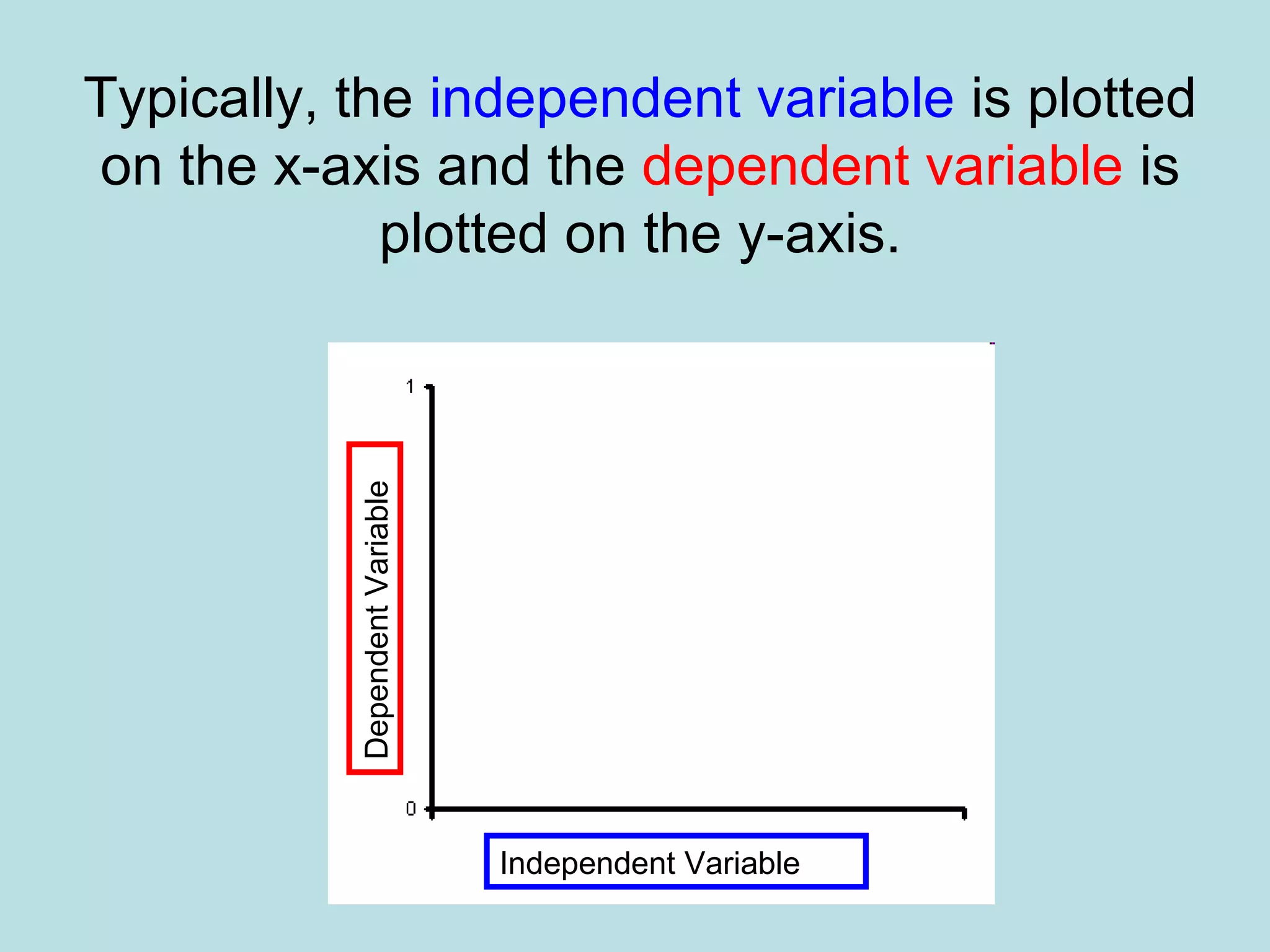
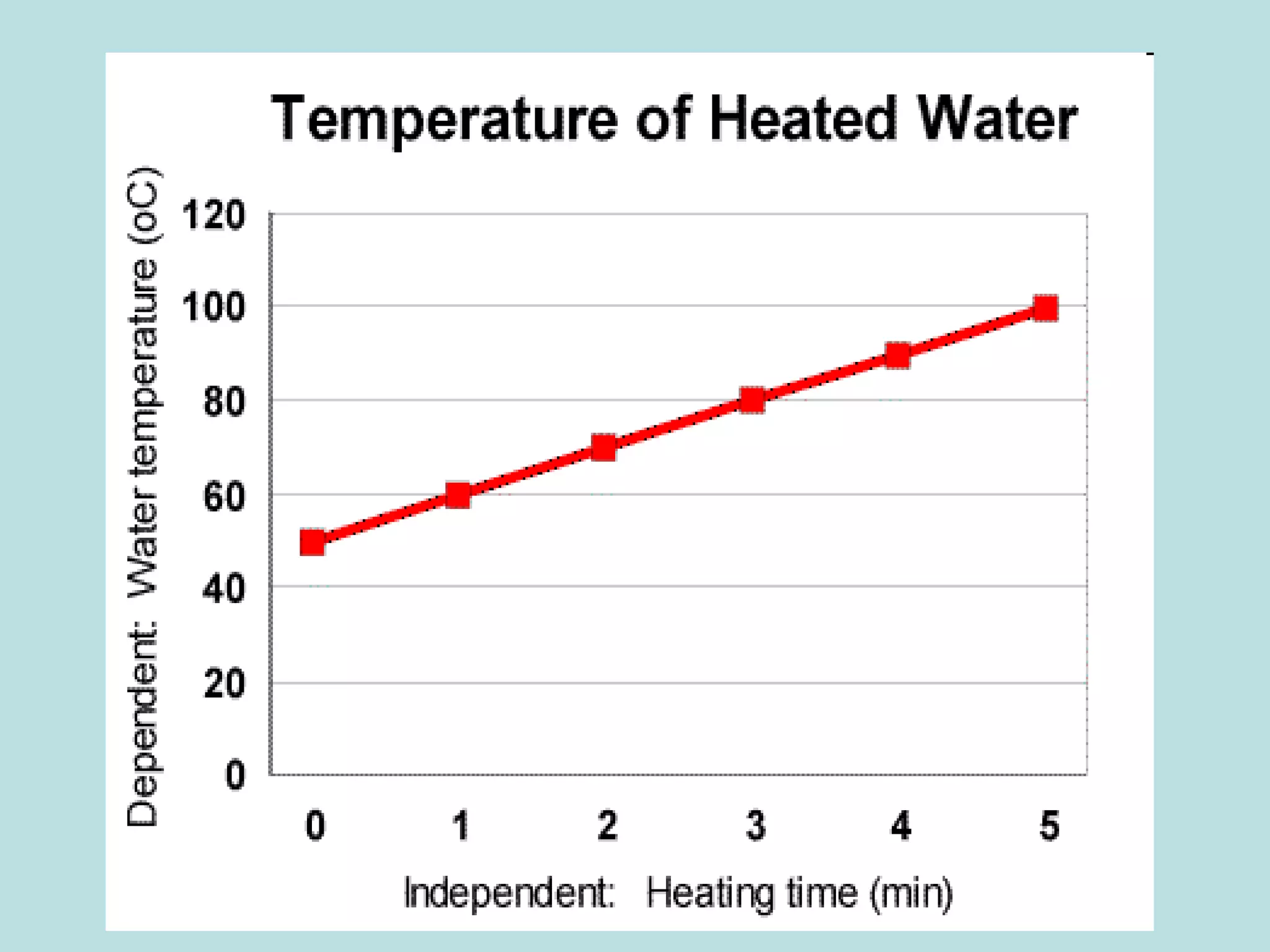
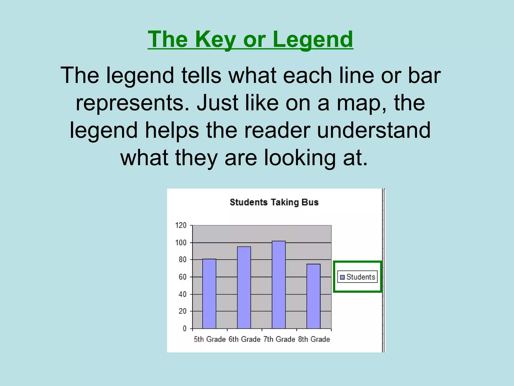
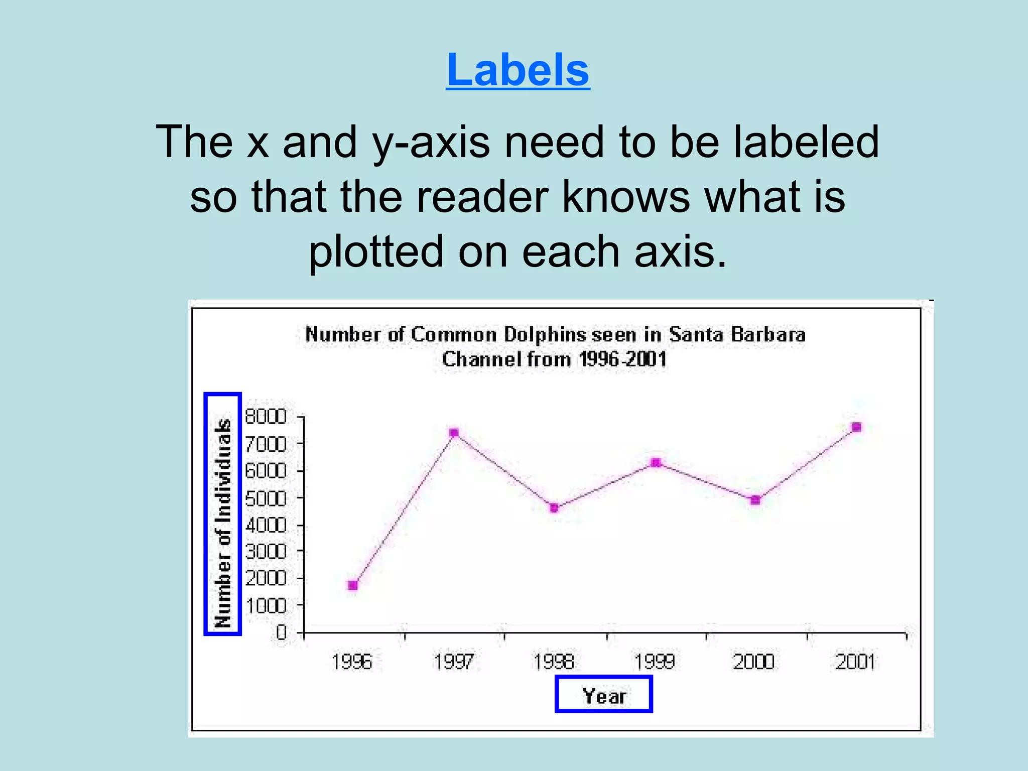
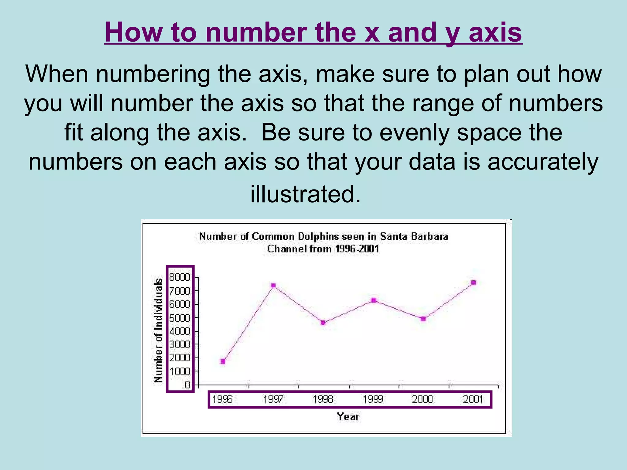
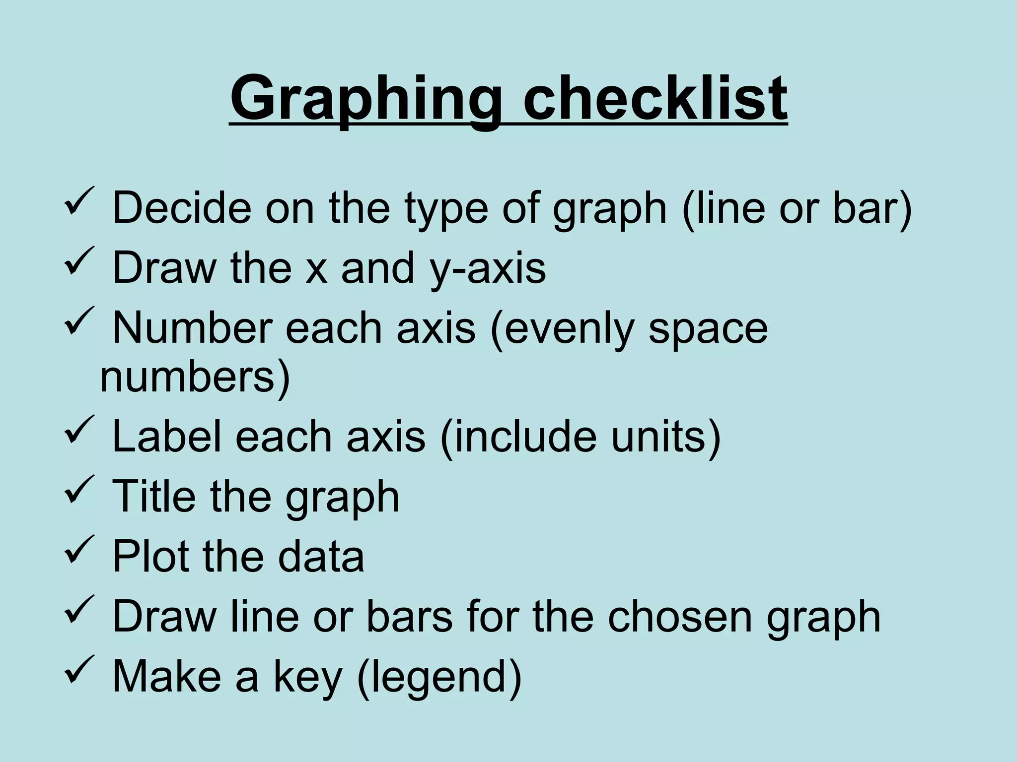
Graphing   Data You will analyze data and decide what type of graph will represent your data most accurately.
What is data? Values derived from scientific experiments.  Data = dependent variable
Organizing data in to graphs: Pie chart Bar graph Line graph Pictograph Graphs are pictures that help us understand amounts. These amounts are called data. There are many kinds of graphs, each having special parts.
All “parts” add up to 100%. A  pie chart  is shaped like a circle. It is divided into fractions that look like pieces of pie.  Pie charts are best to use when you are trying to compare parts of a whole. They do not show changes over time.
A  bar graph  uses bars to show data. The bars can be vertical (up and down), or horizontal (across). Bar graphs are used to compare things between different groups.
Line graphs  can be used to show how something changes over time. Line graphs are good for plotting data that has peaks (ups) and valleys (downs).
A  pictograph  uses pictures or symbols to represent an assigned amount of data.
The Title The title offers a short explanation of what is in your graph. This helps the reader identify what they are about to look at. It can be creative or simple as long as it tells what is in the graph.
Y-Axis In line graphs, the y-axis runs vertically (up and down). Typically, the y-axis has numbers for the amount of “stuff” being measured. The  y-axis usually starts at 0 and can be divided into as many equal parts as you want to.
X-Axis   In line graphs the x-axis runs horizontally (flat). Typically, the x-axis has numbers representing different time periods or names of things being compared.
Typically, the  independent variable  is plotted on the x-axis and the  dependent variable  is plotted on the y-axis. Dependent Variable Independent Variable
 
The Key or Legend The legend tells what each line or bar represents. Just like on a map, the legend helps the reader understand what they are looking at.
Labels The x and y-axis need to be labeled so that the reader knows what is plotted on each axis.
How to number the x and y axis When numbering the axis, make sure to plan out how you will number the axis so that the range of numbers fit along the axis.  Be sure to evenly space the numbers on each axis so that your data is accurately illustrated.
Graphing checklist Decide on the type of graph (line or bar) Draw the x and y-axis Number each axis (evenly space numbers) Label each axis (include units) Title the graph Plot the data  Draw line or bars for the chosen graph Make a key (legend)

Graphing Data

  • 1.
    Graphing Data You will analyze data and decide what type of graph will represent your data most accurately.
  • 2.
    What is data?Values derived from scientific experiments. Data = dependent variable
  • 3.
    Organizing data into graphs: Pie chart Bar graph Line graph Pictograph Graphs are pictures that help us understand amounts. These amounts are called data. There are many kinds of graphs, each having special parts.
  • 4.
    All “parts” addup to 100%. A pie chart is shaped like a circle. It is divided into fractions that look like pieces of pie. Pie charts are best to use when you are trying to compare parts of a whole. They do not show changes over time.
  • 5.
    A bargraph uses bars to show data. The bars can be vertical (up and down), or horizontal (across). Bar graphs are used to compare things between different groups.
  • 6.
    Line graphs can be used to show how something changes over time. Line graphs are good for plotting data that has peaks (ups) and valleys (downs).
  • 7.
    A pictograph uses pictures or symbols to represent an assigned amount of data.
  • 8.
    The Title Thetitle offers a short explanation of what is in your graph. This helps the reader identify what they are about to look at. It can be creative or simple as long as it tells what is in the graph.
  • 9.
    Y-Axis In linegraphs, the y-axis runs vertically (up and down). Typically, the y-axis has numbers for the amount of “stuff” being measured. The y-axis usually starts at 0 and can be divided into as many equal parts as you want to.
  • 10.
    X-Axis In line graphs the x-axis runs horizontally (flat). Typically, the x-axis has numbers representing different time periods or names of things being compared.
  • 11.
    Typically, the independent variable is plotted on the x-axis and the dependent variable is plotted on the y-axis. Dependent Variable Independent Variable
  • 12.
  • 13.
    The Key orLegend The legend tells what each line or bar represents. Just like on a map, the legend helps the reader understand what they are looking at.
  • 14.
    Labels The xand y-axis need to be labeled so that the reader knows what is plotted on each axis.
  • 15.
    How to numberthe x and y axis When numbering the axis, make sure to plan out how you will number the axis so that the range of numbers fit along the axis. Be sure to evenly space the numbers on each axis so that your data is accurately illustrated.
  • 16.
    Graphing checklist Decideon the type of graph (line or bar) Draw the x and y-axis Number each axis (evenly space numbers) Label each axis (include units) Title the graph Plot the data Draw line or bars for the chosen graph Make a key (legend)