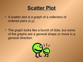
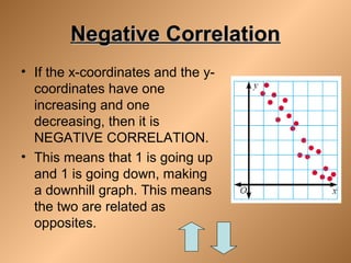
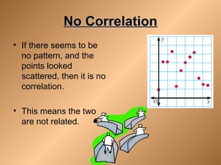
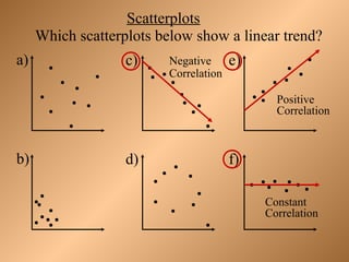
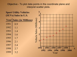
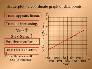
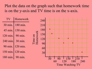
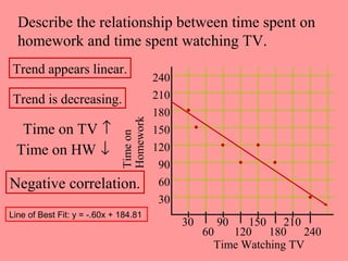
Unit 4 Lesson 2: ScatterUnit 4 Lesson 2: Scatter
PlotsPlots
Scatter PlotScatter Plot
• A scatter plot is a graph of a collection of
ordered pairs (x,y).
• The graph looks like a bunch of dots, but some
of the graphs are a general shape or move in a
general direction.
Positive CorrelationPositive Correlation
• If the x-coordinates and the
y-coordinates both
increase, then it is
POSITIVE CORRELATION.
• This means that both are
going up, and they are
related.
Negative CorrelationNegative Correlation
• If the x-coordinates and the y-
coordinates have one
increasing and one
decreasing, then it is
NEGATIVE CORRELATION.
• This means that 1 is going up
and 1 is going down, making
a downhill graph. This means
the two are related as
opposites.
No CorrelationNo Correlation
• If there seems to be
no pattern, and the
points looked
scattered, then it is no
correlation.
• This means the two
are not related.
Scatterplots
Which scatterplots below show a linear trend?
a) c) e)
b) d) f)
Negative
Correlation
Positive
Correlation
Constant
Correlation
Year
Sport Utility Vehicles
(SUVs) Sales in U.S.
Sales (in Millions)
1991
1992
1993
1994
1995
1996
1997
1998
1999
0.9
1.1
1.4
1.6
1.7
2.1
2.4
2.7
3.2
1991 1993 1995 1997 1999
1992 1994 1996 1998 2000
x
y
Year
VehicleSales(Millions)
5
4
3
2
1
Objective - To plot data points in the coordinate plane and
interpret scatter plots.
1991 1993 1995 1997 1999
1992 1994 1996 1998 2000
x
y
Year
VehicleSales(Millions)
5
4
3
2
1
Trend is increasing.
Scatterplot - a coordinate graph of data points.
Trend appears linear.
Positive correlation.
Year ↑
SUV Sales ↑
Predict the sales in 2001.
3.55 (in millions)
Line of Best Fit: y = .275x + .
8
Plot the data on the graph such that homework time
is on the y-axis and TV time is on the x-axis.
TV Homework
30 min.
45 min.
120 min.
240 min.
90 min.
150 min.
180 min.
180 min.
150 min.
90 min.
30 min.
120 min.
120 min.
90 min.
Time Watching TV
Timeon
Homework
30 90 150 210
60 120 180 240
240
210
180
150
120
90
60
30
Describe the relationship between time spent on
homework and time spent watching TV.
Time Watching TV
Timeon
Homework
30 90 150 210
60 120 180 240
240
210
180
150
120
90
60
30
Trend is decreasing.
Trend appears linear.
Negative correlation.
Time on TV ↑
Time on HW ↓
Line of Best Fit: y = -.60x + 184.81

Scatterplots[1]

  • 1.
    Unit 4 Lesson2: ScatterUnit 4 Lesson 2: Scatter PlotsPlots
  • 2.
    Scatter PlotScatter Plot •A scatter plot is a graph of a collection of ordered pairs (x,y). • The graph looks like a bunch of dots, but some of the graphs are a general shape or move in a general direction.
  • 3.
    Positive CorrelationPositive Correlation •If the x-coordinates and the y-coordinates both increase, then it is POSITIVE CORRELATION. • This means that both are going up, and they are related.
  • 4.
    Negative CorrelationNegative Correlation •If the x-coordinates and the y- coordinates have one increasing and one decreasing, then it is NEGATIVE CORRELATION. • This means that 1 is going up and 1 is going down, making a downhill graph. This means the two are related as opposites.
  • 5.
    No CorrelationNo Correlation •If there seems to be no pattern, and the points looked scattered, then it is no correlation. • This means the two are not related.
  • 6.
    Scatterplots Which scatterplots belowshow a linear trend? a) c) e) b) d) f) Negative Correlation Positive Correlation Constant Correlation
  • 7.
    Year Sport Utility Vehicles (SUVs)Sales in U.S. Sales (in Millions) 1991 1992 1993 1994 1995 1996 1997 1998 1999 0.9 1.1 1.4 1.6 1.7 2.1 2.4 2.7 3.2 1991 1993 1995 1997 1999 1992 1994 1996 1998 2000 x y Year VehicleSales(Millions) 5 4 3 2 1 Objective - To plot data points in the coordinate plane and interpret scatter plots.
  • 8.
    1991 1993 19951997 1999 1992 1994 1996 1998 2000 x y Year VehicleSales(Millions) 5 4 3 2 1 Trend is increasing. Scatterplot - a coordinate graph of data points. Trend appears linear. Positive correlation. Year ↑ SUV Sales ↑ Predict the sales in 2001. 3.55 (in millions) Line of Best Fit: y = .275x + . 8
  • 9.
    Plot the dataon the graph such that homework time is on the y-axis and TV time is on the x-axis. TV Homework 30 min. 45 min. 120 min. 240 min. 90 min. 150 min. 180 min. 180 min. 150 min. 90 min. 30 min. 120 min. 120 min. 90 min. Time Watching TV Timeon Homework 30 90 150 210 60 120 180 240 240 210 180 150 120 90 60 30
  • 10.
    Describe the relationshipbetween time spent on homework and time spent watching TV. Time Watching TV Timeon Homework 30 90 150 210 60 120 180 240 240 210 180 150 120 90 60 30 Trend is decreasing. Trend appears linear. Negative correlation. Time on TV ↑ Time on HW ↓ Line of Best Fit: y = -.60x + 184.81