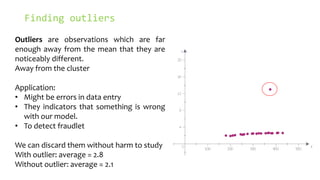
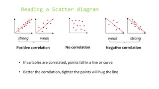
This document discusses scatter plots and their uses:
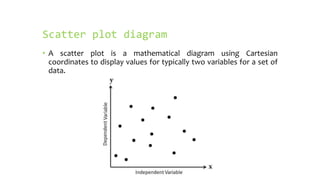
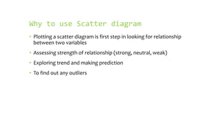
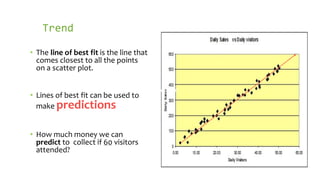
- A scatter plot displays values for two variables using Cartesian coordinates to show their relationship. It can identify if variables are correlated and the strength of their relationship.
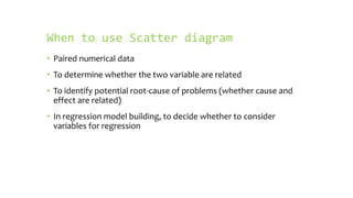
- Scatter plots are used to analyze paired numerical data and determine if variables are related or have a cause-and-effect relationship. They are also used in regression model building.
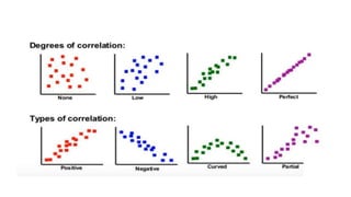
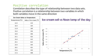
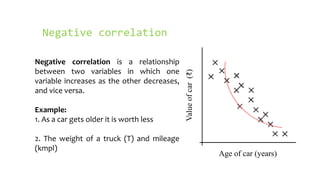
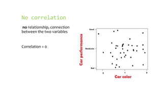
- Positive correlation means variables increase together, while negative correlation means one decreases as the other increases. No correlation means there is no relationship between the variables.


![[DSC Europe 25] Josip Saban - Career building for data professionals.pptx](https://cdn.slidesharecdn.com/ss_thumbnails/zroflcttkm1vmli0txea-josip-saban-career-building-for-data-professionals-260123083019-587cdb8c-thumbnail.jpg?width=640&height=640&fit=bounds)


![[DSC Europe 25] Milos Belcevic - Product Professional's Journey to Full-Stack...](https://cdn.slidesharecdn.com/ss_thumbnails/1zovd6fgsycdg4wvgvls-milos-belcevic-product-professionals-journey-to-full-stack-product-developer-260123083019-d993120d-thumbnail.jpg?width=640&height=640&fit=bounds)


