Download as PPS, PPTX

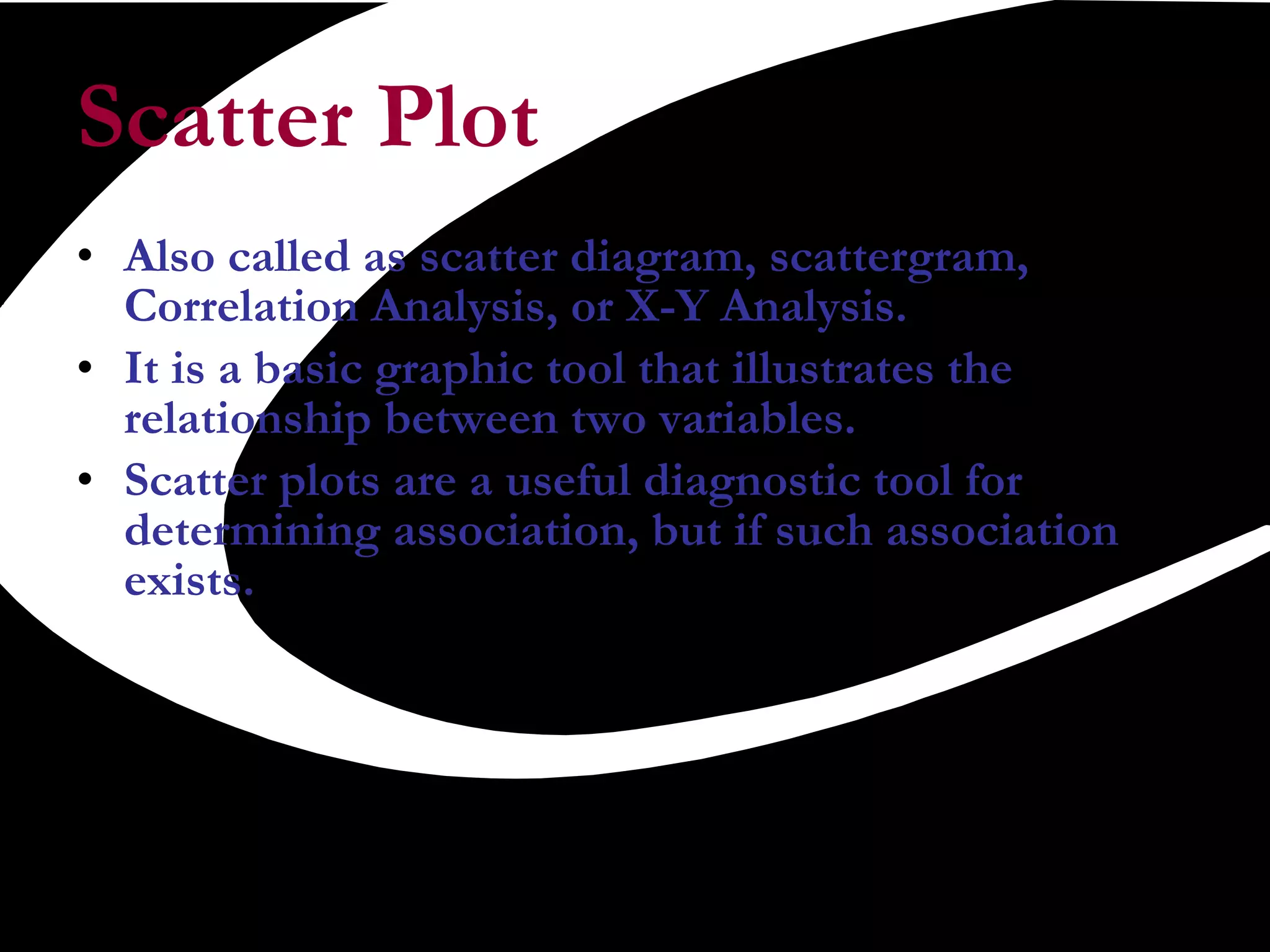
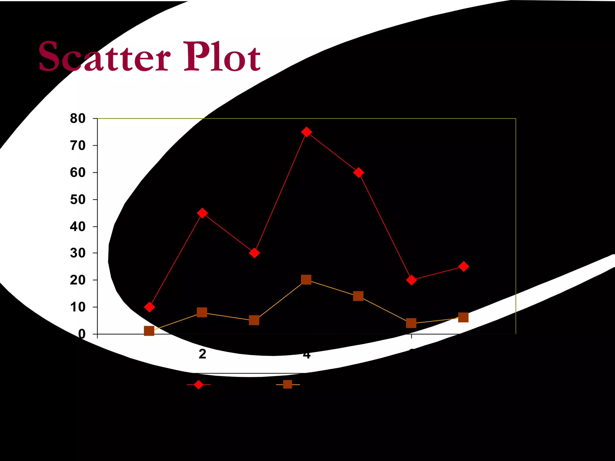
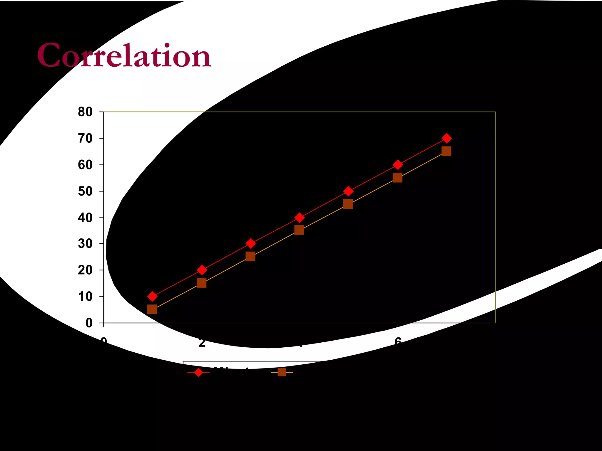

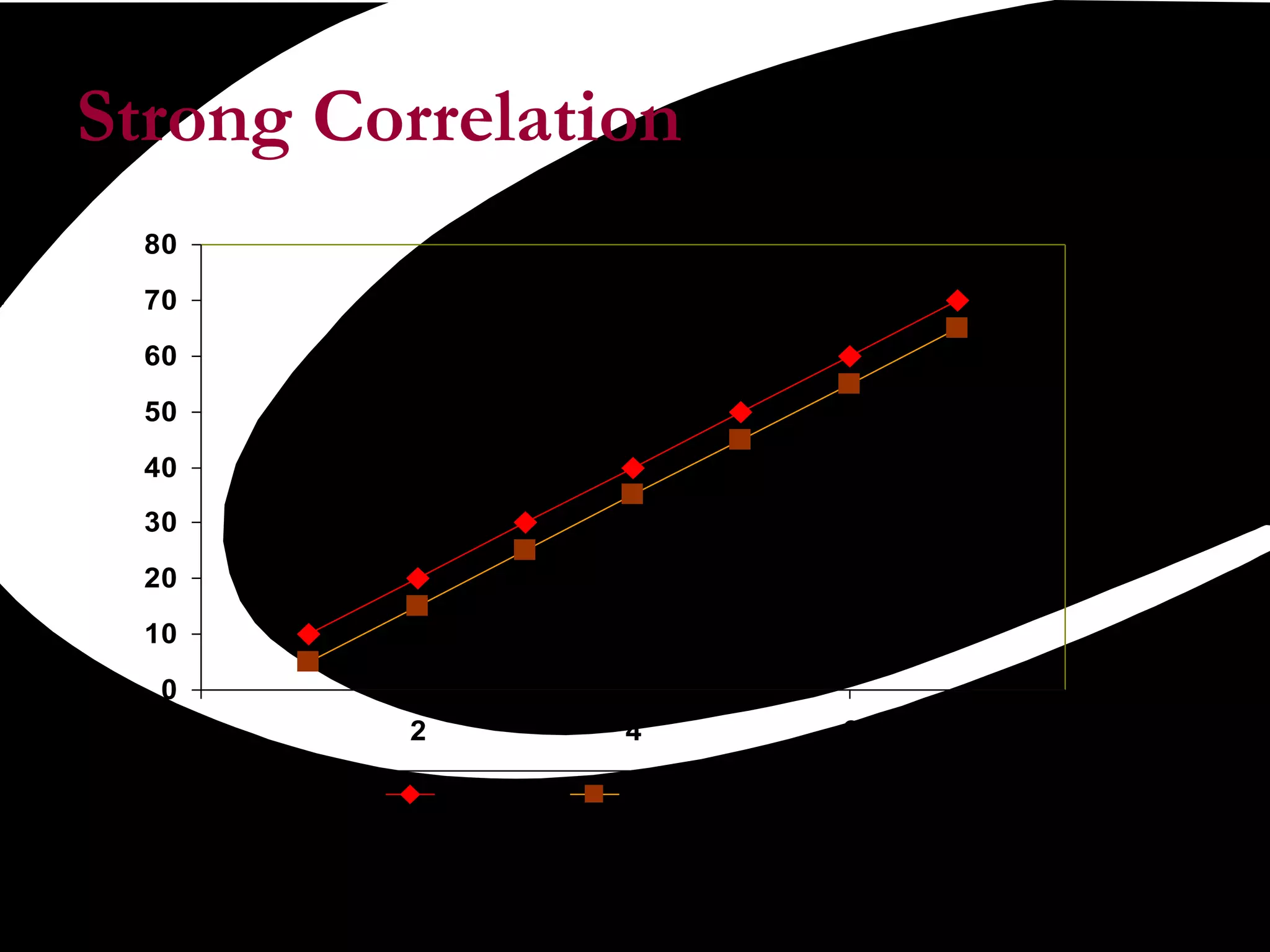
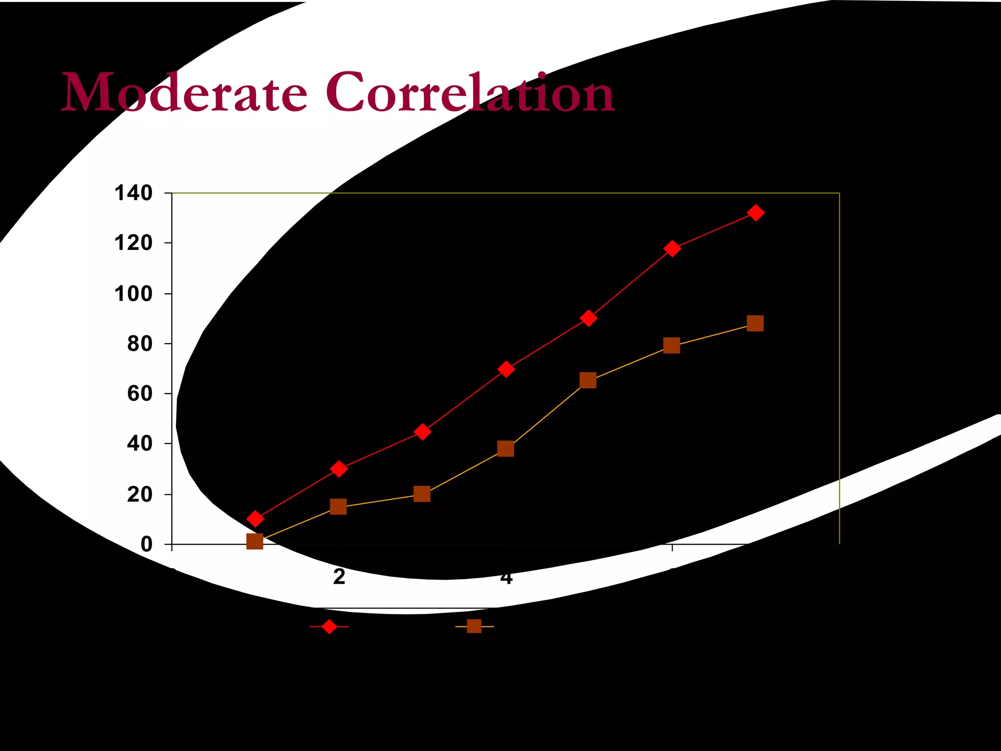
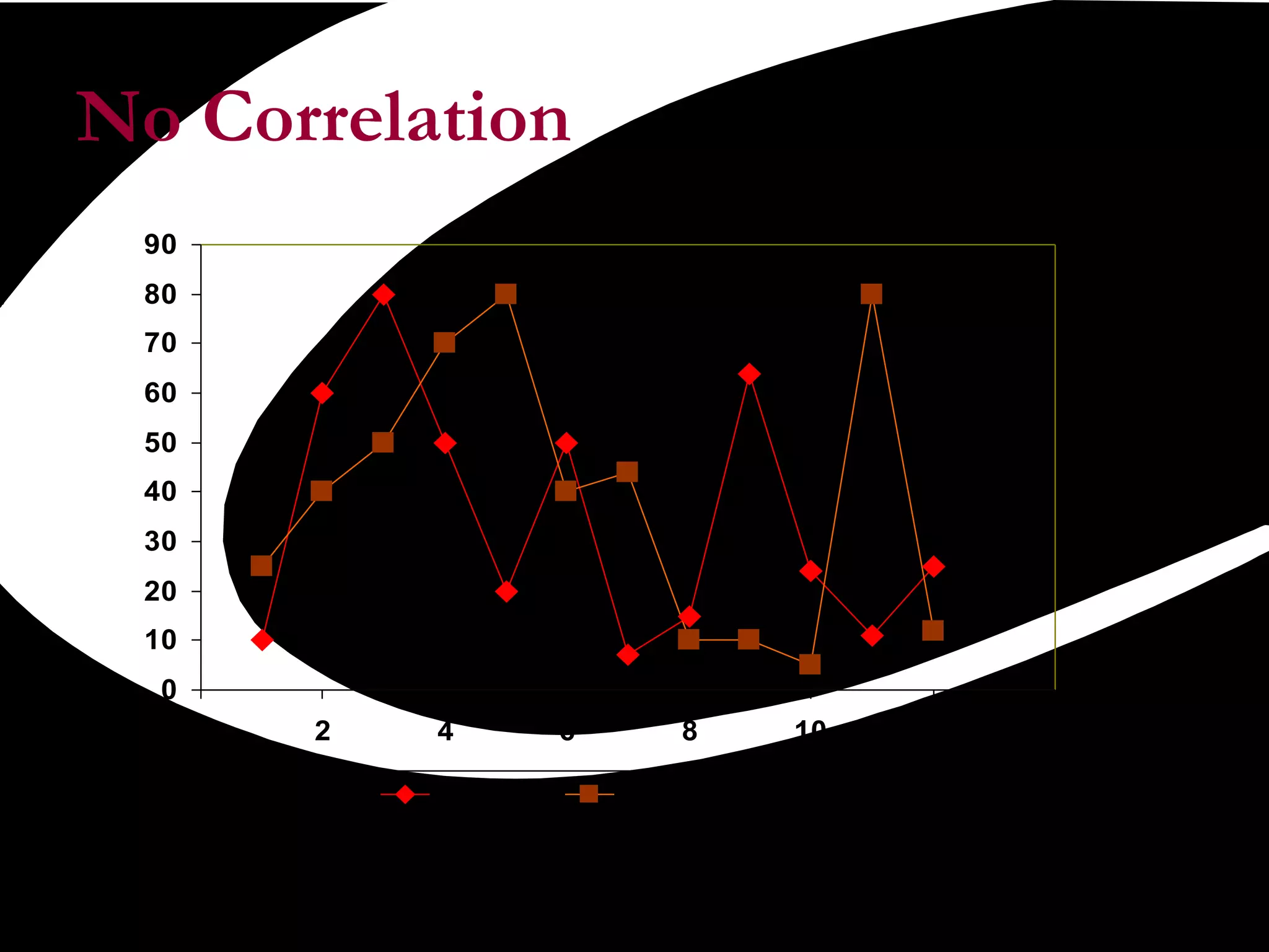
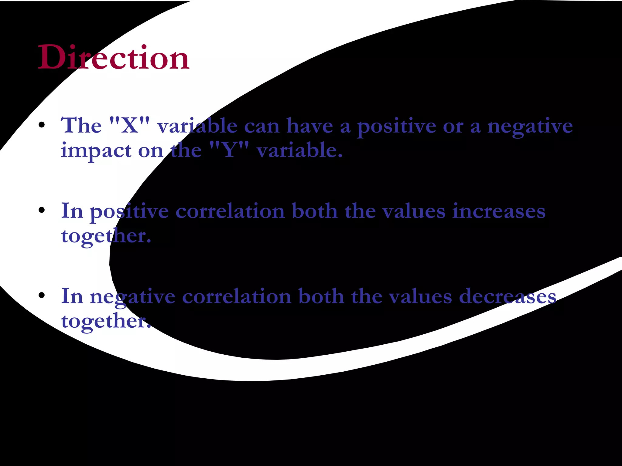
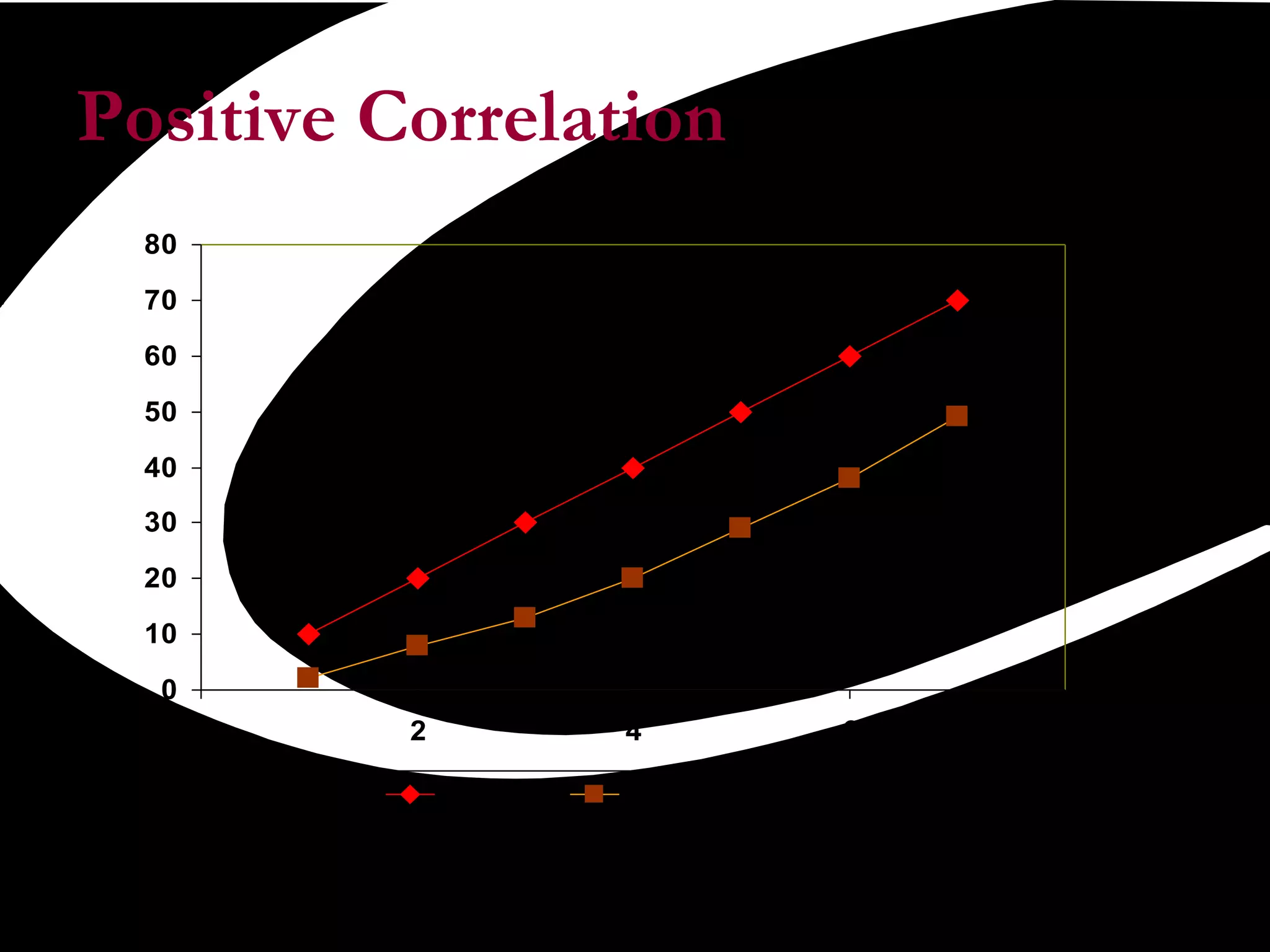
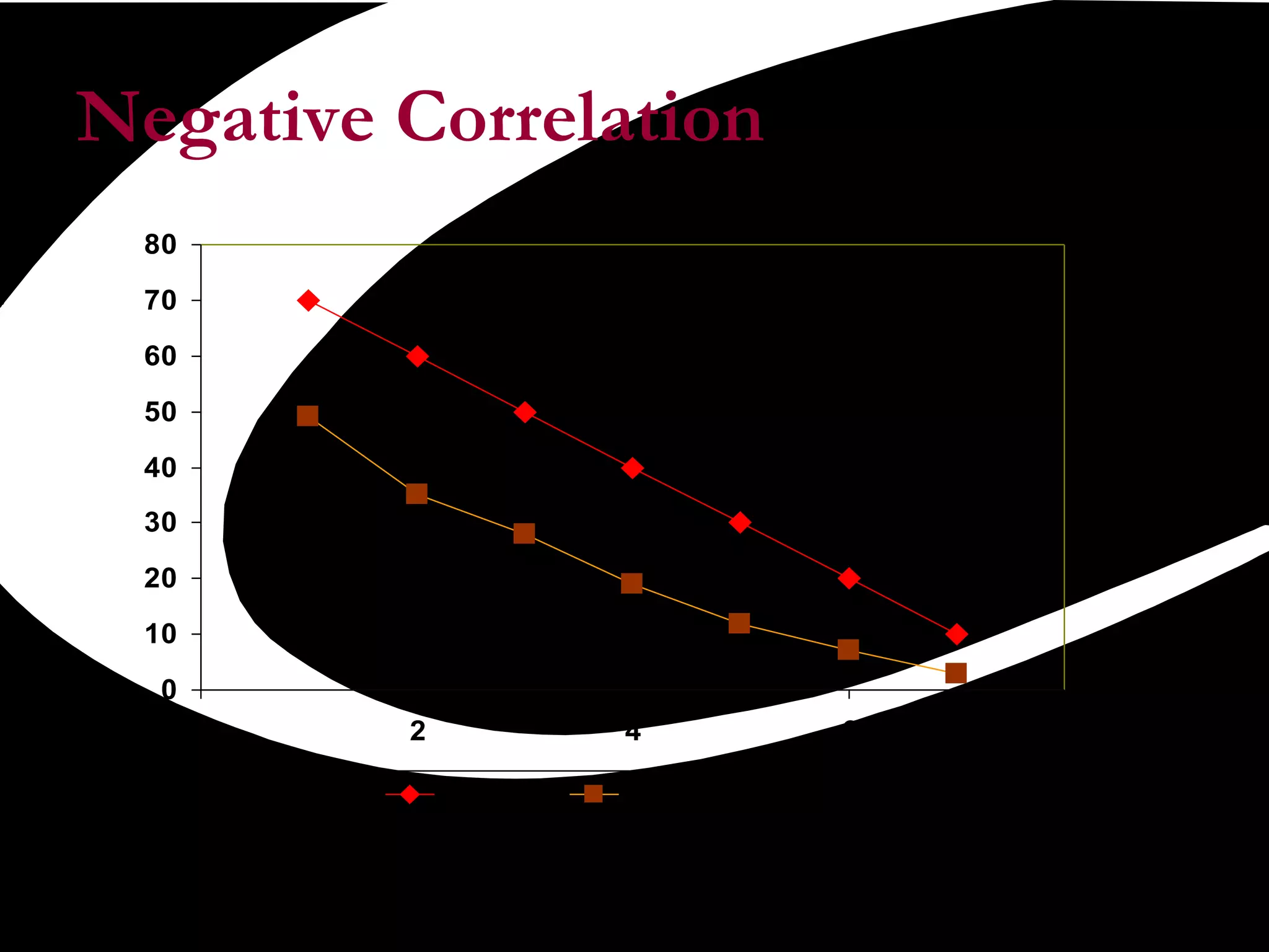
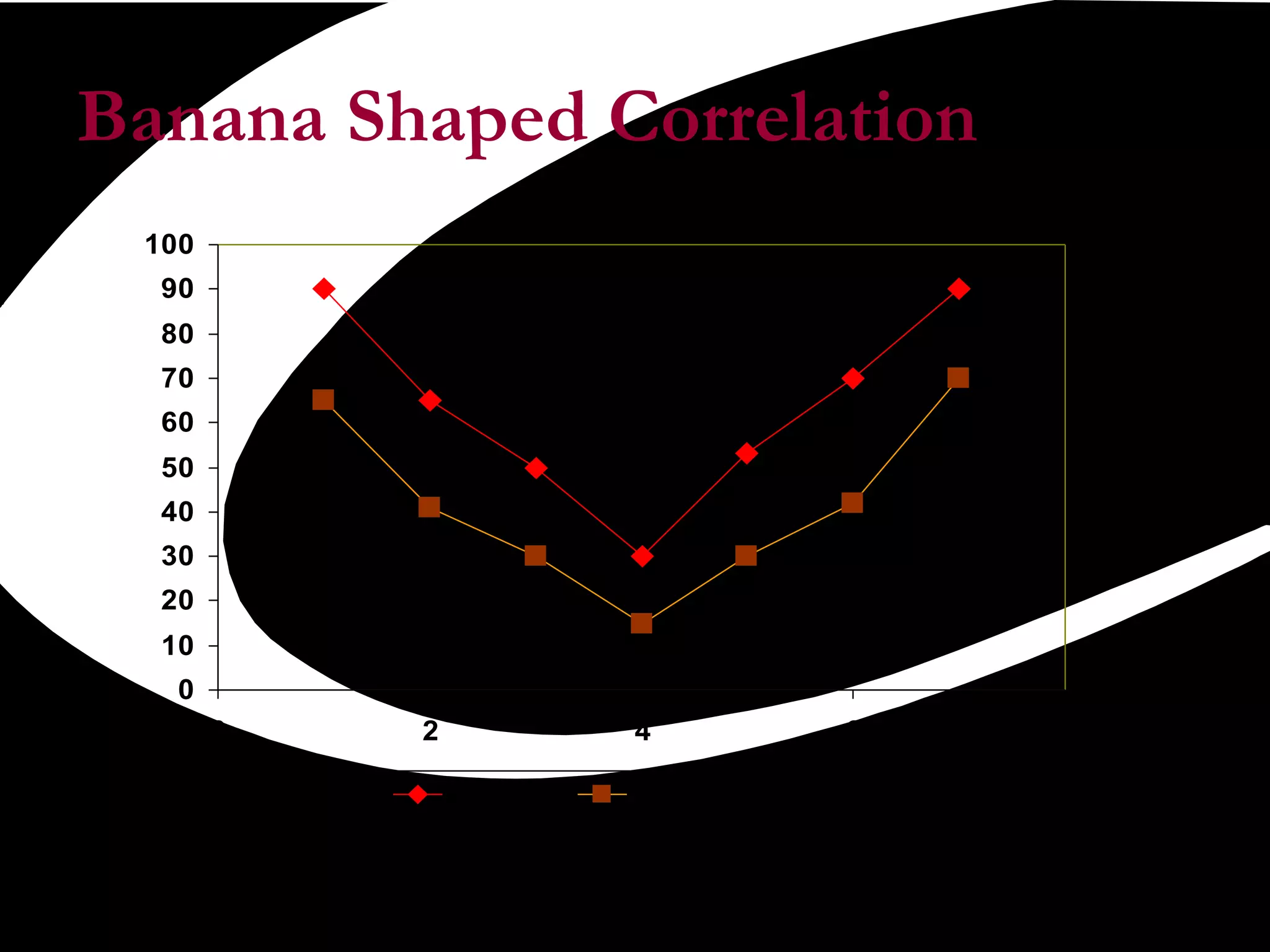
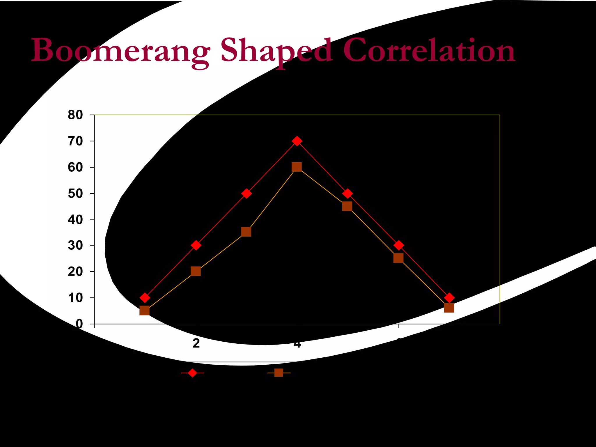


Scatter plots are a quality tool used to show the relationship between two variables. They graph pairs of numerical data with one variable on each axis to look for correlation. If the variables are correlated, the data points will fall along a line or curve, indicating a relationship. Scatter plots are useful for determining potential causes of problems by identifying which process elements are related and how strongly. They involve collecting paired data, plotting the independent variable on the x-axis and dependent variable on the y-axis, and examining the shape and slope of the resulting cluster of points.


![Scatterplots[1]](https://cdn.slidesharecdn.com/ss_thumbnails/scatterplots1-150507144828-lva1-app6892-thumbnail.jpg?width=640&height=640&fit=bounds)