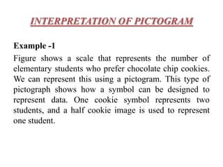
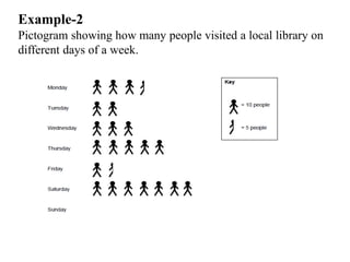
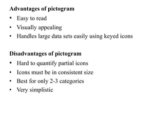
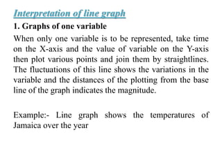
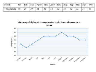
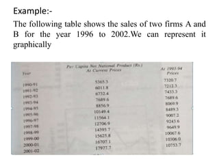
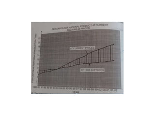
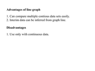
This document discusses pictograms and line graphs for representing data. It defines a pictogram as using picture symbols proportional in size to the data magnitude. Examples show pictograms representing students' cookie preferences and library visitors. Line graphs plot variables over time on an x-y axis, showing fluctuations and comparisons. Examples demonstrate line graphs for temperature over a year and sales for two firms from 1996-2002. The document compares the advantages and disadvantages of each, noting pictograms are easy to read but hard to quantify partially, while line graphs can compare continuous data but use only for continuous variables.