Here are some key ways to tell the relationship shown in a scatter plot:
- Positive relationship: As one variable increases, the other variable also increases. The data points will fall generally above or to the right of the origin.
- Negative relationship: As one variable increases, the other decreases. The data points will fall generally below or to the left of the origin.
- No relationship: There is no consistent pattern to how the variables change together. The data points will be randomly scattered with no discernible upward or downward trend.
Some other clues:
- For positive or negative relationships, the data points tend to fall near a straight line. For no relationship, they are more randomly arranged.
-
Graphs(Biostatistics and Research Methodology) B.pharmacy(8th sem.)Pranjal Saxena
This slides contains the description about the Graphs(Histograms, Pie-Chart, Cubic Graph, Response surface Plot, Counter surface plot ) mainly Histograms with advantages, disadvantages and examples, Pie-chart with advantages, disadvantages and examples, Cubic Graph with examples, Response surface plot and Counter plot with examples and uses.
Honest Reviews of Tim Han LMA Course Program.pptxtimhan337
Personal development courses are widely available today, with each one promising life-changing outcomes. Tim Han’s Life Mastery Achievers (LMA) Course has drawn a lot of interest. In addition to offering my frank assessment of Success Insider’s LMA Course, this piece examines the course’s effects via a variety of Tim Han LMA course reviews and Success Insider comments.
Instructions for Submissions thorugh G- Classroom.pptxJheel Barad
This presentation provides a briefing on how to upload submissions and documents in Google Classroom. It was prepared as part of an orientation for new Sainik School in-service teacher trainees. As a training officer, my goal is to ensure that you are comfortable and proficient with this essential tool for managing assignments and fostering student engagement.
Welcome to TechSoup New Member Orientation and Q&A (May 2024).pdfTechSoup
In this webinar you will learn how your organization can access TechSoup's wide variety of product discount and donation programs. From hardware to software, we'll give you a tour of the tools available to help your nonprofit with productivity, collaboration, financial management, donor tracking, security, and more.
2024.06.01 Introducing a competency framework for languag learning materials ...Sandy Millin
http://sandymillin.wordpress.com/iateflwebinar2024
Published classroom materials form the basis of syllabuses, drive teacher professional development, and have a potentially huge influence on learners, teachers and education systems. All teachers also create their own materials, whether a few sentences on a blackboard, a highly-structured fully-realised online course, or anything in between. Despite this, the knowledge and skills needed to create effective language learning materials are rarely part of teacher training, and are mostly learnt by trial and error.
Knowledge and skills frameworks, generally called competency frameworks, for ELT teachers, trainers and managers have existed for a few years now. However, until I created one for my MA dissertation, there wasn’t one drawing together what we need to know and do to be able to effectively produce language learning materials.
This webinar will introduce you to my framework, highlighting the key competencies I identified from my research. It will also show how anybody involved in language teaching (any language, not just English!), teacher training, managing schools or developing language learning materials can benefit from using the framework.
Synthetic Fiber Construction in lab .pptxPavel ( NSTU)
Synthetic fiber production is a fascinating and complex field that blends chemistry, engineering, and environmental science. By understanding these aspects, students can gain a comprehensive view of synthetic fiber production, its impact on society and the environment, and the potential for future innovations. Synthetic fibers play a crucial role in modern society, impacting various aspects of daily life, industry, and the environment. ynthetic fibers are integral to modern life, offering a range of benefits from cost-effectiveness and versatility to innovative applications and performance characteristics. While they pose environmental challenges, ongoing research and development aim to create more sustainable and eco-friendly alternatives. Understanding the importance of synthetic fibers helps in appreciating their role in the economy, industry, and daily life, while also emphasizing the need for sustainable practices and innovation.
Operation “Blue Star” is the only event in the history of Independent India where the state went into war with its own people. Even after about 40 years it is not clear if it was culmination of states anger over people of the region, a political game of power or start of dictatorial chapter in the democratic setup.
The people of Punjab felt alienated from main stream due to denial of their just demands during a long democratic struggle since independence. As it happen all over the word, it led to militant struggle with great loss of lives of military, police and civilian personnel. Killing of Indira Gandhi and massacre of innocent Sikhs in Delhi and other India cities was also associated with this movement.
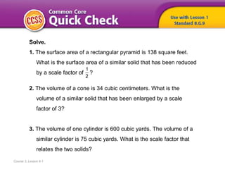
1. Course 3, Lesson 9-1
Solve.
1. The surface area of a rectangular pyramid is 138 square feet.
What is the surface area of a similar solid that has been reduced
by a scale factor of ?
2. The volume of a cone is 34 cubic centimeters. What is the
volume of a similar solid that has been enlarged by a scale
factor of 3?
3. The volume of one cylinder is 600 cubic yards. The volume of a
similar cylinder is 75 cubic yards. What is the scale factor that
relates the two solids?
1
2
5. To
• construct scatter plots,
• interpret data in scatter plots
Course 3, Lesson 9-1
Statistics and Probability
6. • bivariate data
• scatter plot
Course 3, Lesson 9-1
Statistics and Probability
7. 1
Need Another Example?
2
Step-by-Step Example
1. Construct a scatter plot of the number
of viewers who watched new seasons
of a certain television show.
Let the horizontal axis, or x-axis, represent
the number of seasons. Let the vertical
axis, or y-axis, represent the number of
viewers. Then graph the ordered pairs
(season, viewers).
9. Course 3, Lesson 9-1
Statistics and Probability
Variable Association
Positive Association Negative Association No Association
As x increases, y increases. As x increases, y decreases. No obvious pattern.
10. Course 3, Lesson 9-1
Statistics and Probability
Linear Association Linear Nonlinear
The data points lie close to a
line.
The data points lie in the
shape of a curve.
11. 1
Need Another Example?
2
3
4
Step-by-Step Example
2. Interpret the scatter plot
of the data for the amount
of memory in an MP3
player and the cost based
on the shape of the
distribution.
Consider the different associations
and patterns.
Variable Association As the amount of memory increases, the
cost increases. Therefore, the scatter plot
shows a positive association.
Linear Association The data appear to lie close to a line,
so the association is linear.
Other Patterns There appears to be a cluster of data.
One to two gigabytes of memory costs
between $30 and $75. There does not
appear to be an outlier.
12. Answer
Need Another Example?
Interpret the scatter plot of the data for
cups of hot chocolate sold and the
outside temperature based on the
shape of the distribution.
As temperature increases, the number of cups
sold decreases. So, the scatter plot shows a
negative association. The data appear to lie
close to a line, so the association is linear.
There are no clusters or outliers.
13. 1
Need Another Example?
2
3
4
5
6
Step-by-Step Example
3. The table shows public school enrollment from 1999-2010.
Construct a scatter plot of the data. Let the
horizontal axis represent the year since 1999 and
the vertical axis represent the number of students.
Consider the different associations and patterns.
Variable Association As the years increase, the number of students increases.
Therefore, the scatter plot shows a positive association.
Construct and interpret a scatter plot of the
data. If an association exists, make a conjecture
about the number of students that will be
enrolled in public schools in the year 2015.
To make a conjecture about the number of students that will be enrolled in public
schools in the year 2015, follow the pattern until the x-value is 16. Then find the
corresponding y-value.
Linear Association The data appear to lie close to a line, so the association is
linear.
Other Patterns There are no clusters or outliers.
So, there will be about 51 million students enrolled in
public schools in 2015.
14. Answer
Need Another Example?
The table shows the average extra fuel used by drivers in one city due to
travel delays in congested areas. Construct and interpret a scatter plot of
the data. If an association exists, make a conjecture about the excess
fuel that will be used by an average driver in 2020.
As the years increase, the excess fuel
increases. So, the scatter plot shows a
positive association. The data appear to
lie close to a line, so the association is
linear. There are no clusters or outliers;
Sample answer: about 42 gallons.
15. How did what you learned
today help you answer the
How are patterns used
when comparing two quantities?
Course 3, Lesson 9-1
GeometryStatistics and Probability
16. How did what you learned
today help you answer the
How are patterns used
when comparing two quantities?
Course 3, Lesson 9-1
GeometryStatistics and Probability
Sample answers:
• You can graph bivariate data on a coordinate plane to
determine if there are patterns between the data.
• In a scatter plot, patterns in the data can determine
whether the association is positive, negative , or that
there is no association between bivariate data.
• The association can also be linear or nonlinear.
17. How can you tell whether a
scatter plot shows a positive,
negative, or no relationship?
Course 3, Lesson 9-1
Ratios and Proportional RelationshipsFunctionsStatistics and Probability